Core Efficiencies Study
of the Massachusetts Bay Transportation Authority System
Project Manager
Robert Guptill
Project Principals
Annette Demchur
Elizabeth Moore
Data Analysts
Robert Guptill
David Knudsen
Jieping Li
Paul Reim
Graphics
Robert Guptill
Cover Design
Kim Noonan
The preparation of this document was funded in part
by the Federal Transit Administration of the U.S.
Department of Transportation. The contents of this
report do not necessarily reflect the official views or
policies of the U.S. DOT.
Central Transportation Planning Staff
Directed by the Boston Region Metropolitan
Planning Organization. The MPO is composed of
state and regional agencies and authorities, and
local governments.
Draft – November 2012
The Core Efficiencies Study analyzes the service standards and other measures that are used to evaluate transit services, and applies these standards and measures to the existing MBTA core bus and rapid transit system as well as to several potential concepts for MBTA service delivery. The service standards include those currently used by the MBTA—coverage, span of service, frequency, schedule adherence, vehicle load, and cost-effectiveness—as well as standards not currently used by the MBTA that would apply to stop spacing, route competition, and service delivery, among many possible service measures. Additional measures are used to evaluate the MBTA system for the Boston Region MPO’s regional travel demand model set. These additional measures are used to analyze the number of trip origins and destinations and the various costs of transit trips between neighborhoods. Finally, the finances of the MBTA and the potential financial implications of the proposed concepts are also considered.
The Study proposes four different concepts for MBTA service delivery. The rail extension concept essentially maintains the existing service structure with extensions of the radial rail network (heavy and light rail), while primarily using buses as feeder routes or to serve circumferential trips. The bus rapid transit (BRT) corridor concept replaces local bus service in the urban core with a reduced number of high-frequency, BRT-level services, while local bus service outside the core would remain the same. The limited-stop corridor concept replaces local bus service with a combination of local- and limited-stop service during the peak travel periods along Key Bus Routes and other major routes that travel a long distance. The neighborhood services concept presents an entirely revised bus network, with new BRT routes along major radial and circumferential corridors, and other bus routes linking local neighborhoods to these corridors and the rail lines.
Each concept, and also the existing MBTA system, offers varying levels of service depending on which service standards are considered. In several cases, a higher level of service using one standard results in a lower level of service in another. Each concept therefore has positive and negative aspects, and the choice of which concept to more fully study depends on which measures are prioritized.
We wish to thank the MBTA Advisory Board for providing the historical and projected MBTA financial data used in this study.
S.1 Review of Existing Service Standards
S.1.2 Comparison of Peer Agencies by Service Standards
S.1.3 Policy Implications of Service Standard Metrics
S.2.4 Level-of-Service Characteristics
S.2.5 Analysis of Trips and Costs by Transit Route
S.3 Develop Transit Concept and Plans
S.3.1 Potential Service Concepts
S.3.2 Application of Service Standards
S.3.3 Modeled Trips for Each Service Concept
S.3.4 Financial-Constraint Analysis
2 Review of Existing Service Standards
2.1 MBTA Service Delivery Policy
2.2 Comparison of Peer Agencies by Service Standards
2.2.1 Service Standards Used by the MBTA
2.2.2 Service Standards Not Used by the MBTA
2.3 Policy Implications of Service Standard Metrics
2.4 Summary of Review of Service Standards
3.1.4 Green Line Central Subway
3.1.5 Directly-Operated Bus Routes
3.4.2 Summary of Existing Trips
3.4.3 Projected Change in Trips
3.4.4 Summary of Projected Trips
3.5 Level-of-Service Characteristics
3.5.1 Transit Vehicle Frequency
3.5.3 Access, Egress, and Transfer Walk Time
3.5.8 Total Transit Cost Index
3.5.9 Summary of Level-of-Service Characteristics
3.6 Analysis of Trips and Costs by Transit Route
3.6.5 Summary of Trips and Costs
4.1.4 Summary of General Service Patterns
4.2 Potential Service Concepts
4.2.1 Rail Extensions and Expanded Coverage
4.2.4 Radial, Circumferential, and Neighborhood Services
4.2.5 Summary of Potential Service Concepts
4.3 Application of Service Standards
4.3.5 Summary of Service Standard Applications
4.4 Modeled Trips for Each Service Concept
4.4.1 Summary of Existing System
4.4.4 Limited-Stop Corridor Concept
4.4.5 Neighborhood Services Concept
4.4.6 Summary of Modeled Trip Analysis
4.5 Financial-Constraint Analysis
4.5.1 Summary of MBTA Finances
4.5.2 Financial-Constraint Scenarios
4.5.4 Limited-Stop Corridor Concept
4.5.5 Neighborhood Services Concept
4.5.6 Summary of Financial-Constraint Analysis
Figure 1 Transit Coverage in Relation to Population Density by Census Tract
Figure 2 Additional Areas Requiring Transit Coverage Based on Population Density by Census Tract
Figure 3 Extent of Duplication for MBTA Bus Routes
Figure 4 Route 66: Inbound Hourly Passenger Flow and Trip Frequency
Figure 5 Route 66: Outbound Hourly Passenger Flow and Trip Frequency
Figure 6 Percent of Scheduled Service Operated by MBTA Mode, June 2010 through September 2010
Figure 7 Mean Miles between Failures by MBTA Mode, June 2010 through September 2010
Figure 8 Percent of Daily Vehicle Requirement by MBTA Mode, June 2010 through September 2010
Figure 10 Number of Complaints by MBTA Mode, March 2010 through August 2010
Figure 11 Breakdown of Complaints by MBTA Mode, August 2010
Figure 12 Average Weekday Ridership by Percent of On-Time Trips by MBTA Bus Route
Figure 13 Rail Rapid Transit Map
Figure 14 Directly-Operated Bus System Map
Figure 15 Modal Ridership Trends
Figure 16 Study Area Neighborhoods: Suburban South
Figure 17Study Area Neighborhoods: Suburban North
Figure 18 Study Area Neighborhoods: City South
Figure 19 Study Area Neighborhoods: City North
Figure 20 Population Density, Existing
Figure 22 Comparison of Population Density and Projected Percent Change in Population
Figure 21 Projected Population Change
Figure 23 Employment Density, Existing
Figure 24 Projected Employment Change
Figure 25 Comparison of Employment Density and Projected Percent Change in Jobs
Figure 26 Number of Zero-Vehicle Households, Existing
Figure 27 Percentage of Zero-Vehicle Households, Existing
Figure 28 Projected Change in Zero-Vehicle Households
Figure 29 Comparison of Projected Percent Change in Population and Zero-Vehicle Households
Figure 30 Trip Generators within 0.5 Miles of Transit
Figure 31 Existing Trip Origins
Figure 32 Existing Trip Destinations
Figure 33 Top 20 Origin Trip Flows to Downtown Destination
Figure 34 Top 20 Non-Intra-Neighborhood Trip Origin-Destination Pairs
Figure 35 Projected Change in Origin Trips
Figure 36 Projected Change in Destination Trips
Figure 37 Top 20 Projected Absolute Increases in Trips between Neighborhoods
Figure 38 Projected Absolute Change in Trips to and from Waterfront
Figure 39 Projected Absolute Change in Trips to and from Chinatown
Figure 40 Projected Absolute Change in Trips to and from East Cambridge
Figure 41 Projected Absolute Change in Trips to and from East Somerville
Figure 42 Projected Absolute Change in Trips to and from East Lynn
Figure 43 Projected Absolute Change in Trips to and from Downtown
Figure 44 Projected Absolute Change in Trips to and from Chelsea
Figure 45 Projected Absolute Change in Trips to and from South Weymouth
Figure 46 Projected Absolute Change in Trips to and from Fenway
Figure 47 Projected Absolute Change in Trips to and from South End
Figure 48 Projected Absolute Change in Trips to and from Stoughton
Figure 49 Projected Absolute Change in Trips to and from South Quincy
Figure 50 Projected Absolute Change in Trips to and from Westwood
Figure 51 Projected Absolute Change in Trips to and from Burlington
Figure 52 Projected Absolute Change in Trips to and from Longwood
Figure 53 Projected Absolute Change in Trips to and from East Woburn
Figure 54 Existing Bus Frequency by Neighborhood and Stop
Figure 55 Existing Rapid Transit Frequency by Neighborhood and Stop
Figure 56 Existing Commuter Rail Frequency by Neighborhood and Stop
Figure 57 Existing Average AM Peak Transit Fares for Origin Neighborhoods
Figure 58 Existing Average AM Peak Transit Fares for Destination Neighborhoods
Figure 59 Existing Average AM Peak Walk Times for Origin Neighborhoods
Figure 60 Existing Average AM Peak Walk Times for Destination Neighborhoods
Figure 61 Existing Average AM Peak In-Vehicle Travel Times for Origin Neighborhoods
Figure 62 Existing Average AM Peak In-Vehicle Travel Times for Destination Neighborhoods
Figure 63 Existing Average AM Peak Initial Waiting Times for Origin Neighborhoods
Figure 64 Existing Average AM Peak Initial Waiting Times for Destination Neighborhoods
Figure 65 Existing Average AM Peak Number of Transfers for Origin Neighborhoods
Figure 66 Existing Average AM Peak Number of Transfers for Destination Neighborhoods
Figure 67 Existing Average AM Peak Transfer Waiting Times for Origin Neighborhoods
Figure 68 Existing Average AM Peak Transfer Waiting Times for Destination Neighborhoods
Figure 69 Existing Average AM Peak Total Transit Costs for Origin Neighborhoods
Figure 70 Existing Average AM Peak Total Transit Costs for Destination Neighborhoods
Figure 71 Example TAZ Service Areas
Figure 72 Theoretical Concept of a Grid Transit Pattern
Figure 73 Theoretical Concept of a Hub-and-Spoke Transit Pattern
Figure 74 Theoretical Concept of a Trunk Transit Pattern
Figure 75 Rail Extension Concept
Figure 76 BRT Corridor Concept
Figure 77 Limited-Stop Corridor Concept: Inbound Stops.
Figure 78 Limited-Stop Corridor Concept: Outbound Stops
Figure 79 Radial, Circumferential, and Neighborhood Concept
Figure 83 Neighborhood Services Concept: BRT and Neighborhood Route Running Times
Figure 92 Potential MBTA Deficits (Revenues minus Expenses), FY2012─FY2016
Table 1 MBTA Service Objectives and Service Standards
Table 2 Coverage Service Standards
Table 3 MBTA Span-of-Service Standards
Table 4 MBTA Weekday Time-Period Definitions
Table 5 Minimum Frequency-of-Service Standards
Table 6 Summary of Bus Schedule-Adherence Standards
Table 7 Schedule-Adherence Standards for Light Rail and Heavy Rail
Table 8 Schedule-Adherence Standards for Commuter Rail and Commuter Boat
Table 9 MBTA Core Area Boundaries
Table 10 Vehicle-Load Standards by Mode
Table 11 Net-Cost-per-Passenger Standard
Table 12 Profiled Transit Agencies and Transit Modes Provided
Table 13 Peer Agency Comparison of Coverage Standards
Table 14 Peer Agency Comparison of Span-of-Service Standards
Table 15 Peer Agency Comparison of Frequency-of-Service Standards
Table 16 Peer Agency Comparison of Schedule-Adherence Standards
Table 17 Peer Agency Comparison of Vehicle-Load Standards
Table 18 Peer Agency Comparison of Bus Stop-Spacing Standards
Table 19 Peer Agency Comparison of Directness-of-Travel Standards
Table 20 Peer Agency Comparison of Bus Passenger-Productivity Standards
Table 21 Number and Percentage of MBA Stops by Distance to Next Stop
Table 22 Percentage of MBTA Routes by Time Range for Average, Maximum, and Minimum Running Time
Table 23 Route 66 Weekday Outbound Ridecheck Form
Table 24 Percentage of MBTA Routes by Headway
Table 25 Percentage of Pay-per-Ride and Pass Trips by MBTA Mode
Table 26 MBTA Bus Routes Failing the 2008 Span-of-Service Standard
Table 27 MBTA Bus Routes Failing the 2008 Frequency Standard
Table 28 MBTA Bus Routes Failing the 2008 Schedule-Adherence Standard
Table 29 MBTA Bus Routes Failing the 2008 Net-Cost-per-Passenger Standard
Table 30 MBTA Bus Routes Failing the 2008 Vehicle-Load Standard
Table 30 Red Line Station Entries (Typical Weekday)
Table 31 Orange Line Station Entries (Typical Weekday)
Table 32 Blue Line Station Entries (Typical Weekday)
Table 33 Green Line Subway Station Entries (Typical Weekday)
Table 34 Surface Green Line Boardings (Typical Weekday)
Table 37 Existing Population Density by Neighborhood (Top 20)
Table 36 Study Area Towns and Neighborhoods
Table 38 Projected Population Increases by Neighborhood (Top 20)
Table 39 Existing Employment Density by Neighborhood (Top 20)
Table 40 Projected Employment Increases by Neighborhood (Top 20)
Table 41 Existing Number and Percent of Zero-Vehicle Households by Neighborhood (Top 20)
Table 42 Projected Increases in Zero-Vehicle Households by Neighborhood (Top 20)
Table 43 Existing Origin and Destination Trips by Neighborhood (Top 20)
Table 44 Existing Origin-Destination Trip Pairs by Pair (Top 20) Number of Trips in the Origin-Destination Pair, Percent of All Trips from the Origin, and Percent of All Trips to the Destination
Table 45 Existing Non-Intra-Neighborhood Origin-Destination Trip Pairs by Pair (Top 20) Number of Trips in the Origin-Destination Pair, Percent of All Trips from the Origin, and Percent of All Trips to the Destination
Table 46 Top 20 Existing Origin-Destination Trip Pairs for Top 20 Trip Origins Number of Trips in the Origin-Destination Pair, Percent of All Trips from the Origin, and Percent of All Trips to the Destination
Table 46 – Continued Top 20 Existing Origin-Destination Trip Pairs for Top 20 Trip Origins Number of Trips in the Origin-Destination Pair, Percent of All Trips from the Origin, and Percent of All Trips to the Destination
Table 47 Top 20 Existing Origin-Destination Trip Pairs for Top 20 Trip Destinations Number of Trips in the Origin-Destination Pair, Percent of All Trips to the Destination, and Percent of All Trips from the Origin
Table 47 - Continued Top 20 Existing Origin-Destination Trip Pairs for Top 20 Trip Destinations Number of Trips in the Origin-Destination Pair, Percent of All Trips to the Destination, and Percent of All Trips from the Origin
Table 48 Projected Increases in Origin Trips by Neighborhood (Top 20)
Table 49 Projected Increases in Destination Trips by Neighborhood (Top 20)
Table 50 Projected Increases in Origin-Destination Pairs by Pair (Top 20)
Table 51 Top 20 Projected Origin-Destination Trip Pairs for Top 20 Trip Origins Number of Trips in the Origin-Destination Pair, Percent of All Trips from the Origin, and Percent of All Trips to the Destination
Table 51 – Continued Top 20 Projected Origin-Destination Trip Pairs for Top 20 Trip Origins Number of Trips in the Origin-Destination Pair, Percent of All Trips from the Origin, and Percent of All Trips to the Destination
Table 52 Top 20 Projected Origin-Destination Trip Pairs for Top 20 Trip Destinations Number of Trips in the Origin-Destination Pair, Percent of All Trips to the Destination, and Percent of All Trips from the Origin
Table 52 – Continued Top 20 Projected Origin-Destination Trip Pairs for Top 20 Trip Destinations Number of Trips in the Origin-Destination Pair, Percent of All Trips to the Destination, and Percent of All Trips from the Origin
Table 53 Neighborhoods with the Top 20 Projected Absolute Increases in Trips for both Origins and Destinations
Table 54 Neighborhood Pairs (Non-Intra-Neighborhood Trips) with the Top 20 Projected Absolute and Percentage Increases in Trips
Table 56 Neighborhoods with Projected Absolute Decreases in Trips for either Origins or Destinations
Table 55 Top 20 Projected Absolute Increases in Trips between Neighborhoods for Neighborhoods with the Top Projected Absolute Increases Number and Percent Change in Trips (Origins plus Destinations)
Table 57 Neighborhoods by Existing AM Peak Bus Frequency (Vehicles per Hour) (Top 20)
Table 58 MBTA Bus Stops by Existing AM Peak Bus Frequency (Vehicles per Hour) (Top 20)
Table 59 Neighborhoods by Existing AM Peak Rapid Transit Frequency (Vehicles per Hour) (Top 20)
Table 60 Rapid Transit Stations by Existing AM Peak Rapid Transit Frequency (Vehicles per Hour)
Table 61 Neighborhoods by Existing AM Peak Commuter Rail Frequency (Vehicles per Hour) (Top 18)
Table 62 Commuter Rail Stations by Existing AM Peak Commuter Rail Frequency (Vehicles per Hour) (Top 19)
Table 63 AM Peak Transit Frequencies (Vehicle per Hour) and Ranking Percentiles* for Neighborhoods with the Top Projected Absolute Increases in Trips
Table 64 Average AM Peak Transit Fares and Ranking Percentiles* for Origin and Destination Neighborhoods with the Top 20 Projected Absolute Increases in Origins and Destinations
Table 65 Average AM Peak Transit Fares between Neighborhoods and Ranking Percentiles (Rank %)* by Neighborhood for Neighborhoods with the Top Projected Absolute Increases in Trips
Table 66 Average AM Peak Walk Times and Ranking Percentiles* for Origin and Destination Neighborhoods with the Top 20 Projected Absolute Increases in Origins and Destinations
Table 67 Average AM Peak Walk Time for Transit Trips between Neighborhoods and Ranking Percentiles (Rank %)* by Neighborhood for Neighborhoods with the Top Projected Absolute Increases in Trips
Table 68 Average AM Peak In-Vehicle Travel Times and Ranking Percentiles* for Origin and Destination Neighborhoods with the Top 20 Projected Absolute Increases in Origins and Destinations
Table 69 Average AM Peak In-Vehicle Travel Time for Transit Trips between Neighborhoods and Ranking Percentiles (Rank %)* by Neighborhood for Neighborhoods with the Top Projected Absolute Increases in Trips
Table 70 Average AM Peak Initial Waiting Times and Ranking Percentiles* for Origin and Destination Neighborhoods with the Top 20 Projected Absolute Increases in Origins and Destinations
Table 71 Average AM Peak Initial Waiting Time for Transit Trips between Neighborhoods and Ranking Percentiles (Rank %)* by Neighborhood for Neighborhoods with the Top Projected Absolute Increases in Trips
Table 72 Average AM Peak Transfer Rates and Ranking Percentiles* for Origin and Destination Neighborhoods with the Top 20 Projected Absolute Increases in Origins and Destinations
Table 73 Average AM Peak Transfer Rates for Transit Trips between Neighborhoods and Ranking Percentiles (Rank %)* by Neighborhood for Neighborhoods with the Top Projected Absolute Increases in Trips
Table 74 Average AM Peak Transfer Waiting Times and Ranking Percentiles* for Origin and Destination Neighborhoods with the Top 20 Projected Absolute Increases in Origins and Destinations
Table 75 Average AM Peak Transfer Waiting Time for Transit Trips between Neighborhoods and Ranking Percentiles (Rank %)* by Neighborhood for Neighborhoods with the Top Projected Absolute Increases in Trips
Table 76 Average AM Peak Total Transit Cost Index and Ranking Percentiles* for Origin and Destination Neighborhoods with the Top 20 Projected Absolute Increases in Origins and Destinations
Table 77 Average AM Peak Total Cost Index for Transit Trips between Neighborhoods and Ranking Percentiles (Rank %)* by Neighborhood for Neighborhoods with the Top Projected Absolute Increases in Trips
Table 78 Projected Percent Changes in Transit Route Ridership and All Trips to and from Service Areas
Table 79 Percentages of Origins and Destinations Served by Each Transit Route Existing Trips and Projected Change in Trips Percentage of trips with an origin served by the route that also have a destination served by the route (Orig.-Dest.) Percentage of trips with a destination served by the route that also have an origin served by the route (Dest.-Orig.)
Table 80 Ten Greatest Destination Neighborhoods and Associated Number of Trips, Percent of Trips, and Cost of Transit Trips in and outside Service Area: Rail Rapid Transit Lines, Routes 1 – 7
Table 80 – Continued Ten Greatest Destination Neighborhoods and Associated Number of Trips, Percent of Trips, and Cost of Transit Trips in and outside Service Area: Rail Rapid Transit Lines, Routes 8 – 22
Table 80 – Continued Ten Greatest Destination Neighborhoods and Associated Number of Trips, Percent of Trips, and Cost of Transit Trips in and outside Service Area: Rail Rapid Transit Lines, Routes 23 – 34
Table 80 – Continued Ten Greatest Destination Neighborhoods and Associated Number of Trips, Percent of Trips, and Cost of Transit Trips in and outside Service Area: Rail Rapid Transit Lines, Routes 35 – 47
Table 80 – Continued Ten Greatest Destination Neighborhoods and Associated Number of Trips, Percent of Trips, and Cost of Transit Trips in and outside Service Area: Rail Rapid Transit Lines, Routes 48 – 66
Table 80 – Continued Ten Greatest Destination Neighborhoods and Associated Number of Trips, Percent of Trips, and Cost of Transit Trips in and outside Service Area: Rail Rapid Transit Lines, Routes 67 – 78
Table 80 – Continued Ten Greatest Destination Neighborhoods and Associated Number of Trips, Percent of Trips, and Cost of Transit Trips in and outside Service Area: Rail Rapid Transit Lines, Routes 79 – 92
Table 80 – Continued Ten Greatest Destination Neighborhoods and Associated Number of Trips, Percent of Trips, and Cost of Transit Trips in and outside Service Area: Rail Rapid Transit Lines, Routes 93 – 108
Table 80 – Continued Ten Greatest Destination Neighborhoods and Associated Number of Trips, Percent of Trips, and Cost of Transit Trips in and outside Service Area: Rail Rapid Transit Lines, Routes 109 – 132
Table 80 – Continued Ten Greatest Destination Neighborhoods and Associated Number of Trips, Percent of Trips, and Cost of Transit Trips in and outside Service Area: Rail Rapid Transit Lines, Routes 134 – 216
Table 80 – Continued Ten Greatest Destination Neighborhoods and Associated Number of Trips, Percent of Trips, and Cost of Transit Trips in and outside Service Area: Routes 217 – 326
Table 80 – Continued Ten Greatest Destination Neighborhoods and Associated Number of Trips, Percent of Trips, and Cost of Transit Trips in and outside Service Area: Routes 350 – 431
Table 80 – Continued Ten Greatest Destination Neighborhoods and Associated Number of Trips, Percent of Trips, and Cost of Transit Trips in and outside Service Area: Routes 434 – 456
Table 80 – Continued Ten Greatest Destination Neighborhoods and Associated Number of Trips, Percent of Trips, and Cost of Transit Trips in and outside Service Area: Route 459 – 555
Table 80 – Continued Ten Greatest Destination Neighborhoods and Associated Number of Trips, Percent of Trips, and Cost of Transit Trips in and outside Service Area: Routes 556, 558, CT1-3, Silver Line Waterfront, and Silver Line Washington Street
Table 81 Ten Greatest Origin Neighborhoods and Associated Number of Trips, Percent of Trips, and Cost of Transit Trips in and outside Service Area: Rail Rapid Transit Lines, Routes 1 – 7
Table 81 – Continued Ten Greatest Origin Neighborhoods and Associated Number of Trips, Percent of Trips, and Cost of Transit Trips in and outside Service Area: Routes 8 – 22
Table 81 – Continued Ten Greatest Origin Neighborhoods and Associated Number of Trips, Percent of Trips, and Cost of Transit Trips in and outside Service Area: Routes 23 – 34
Table 81 – Continued Ten Greatest Origin Neighborhoods and Associated Number of Trips, Percent of Trips, and Cost of Transit Trips in and outside Service Area: Routes 35 – 47
Table 81 – Continued Ten Greatest Origin Neighborhoods and Associated Number of Trips, Percent of Trips, and Cost of Transit Trips in and outside Service Area: Routes 48 – 66
Table 81 – Continued Ten Greatest Origin Neighborhoods and Associated Number of Trips, Percent of Trips, and Cost of Transit Trips in and outside Service Area: Routes 67 – 78
Table 81 – Continued Ten Greatest Origin Neighborhoods and Associated Number of Trips, Percent of Trips, and Cost of Transit Trips in and outside Service Area: Routes 79 – 92
Table 81 – Continued Ten Greatest Origin Neighborhoods and Associated Number of Trips, Percent of Trips, and Cost of Transit Trips in and outside Service Area: Routes 93 – 108
Table 81 – Continued Ten Greatest Origin Neighborhoods and Associated Number of Trips, Percent of Trips, and Cost of Transit Trips in and outside Service Area: Routes 109 – 132
Table 81 – Continued Ten Greatest Origin Neighborhoods and Associated Number of Trips, Percent of Trips, and Cost of Transit Trips in and outside Service Area: Routes 134 – 216
Table 81 – Continued Ten Greatest Origin Neighborhoods and Associated Number of Trips, Percent of Trips, and Cost of Transit Trips in and outside Service Area: Routes 217 – 326
Table 81 – Continued Ten Greatest Origin Neighborhoods and Associated Number of Trips, Percent of Trips, and Cost of Transit Trips in and outside Service Area: Routes 350 – 431
Table 81 – Continued Ten Greatest Origin Neighborhoods and Associated Number of Trips, Percent of Trips, and Cost of Transit Trips in and outside Service Area: Routes 434 – 456
Table 81 – Continued Ten Greatest Origin Neighborhoods and Associated Number of Trips, Percent of Trips, and Cost of Transit Trips in and outside Service Area: Route 459 – 555
Table 81 – Continued Ten Greatest Origin Neighborhoods and Associated Number of Trips, Percent of Trips, and Cost of Transit Trips in and outside Service Area: Routes 556, 558, CT1-3, Silver Line Waterfront, and Silver Line Washington Street
Table 82 Ten Greatest Destination Neighborhoods and Associated Projected Change in Trips, Percent of Change, and Cost of Transit Trips in and outside Service Area: Rail Rapid Transit Lines, Routes 1 – 7
Table 82 – Continued Ten Greatest Destination Neighborhoods and Associated Projected Change in Trips, Percent of Change, and Cost of Transit Trips in and outside Service Area: Routes 8 – 22
Table 82 – Continued Ten Greatest Destination Neighborhoods and Associated Projected Change in Trips, Percent of Change, and Cost of Transit Trips in and outside Service Area: Routes 23 – 34
Table 82 – Continued Ten Greatest Destination Neighborhoods and Associated Projected Change in Trips, Percent of Change, and Cost of Transit Trips in and outside Service Area: Routes 35 – 47
Table 82 – Continued Ten Greatest Destination Neighborhoods and Associated Projected Change in Trips, Percent of Change, and Cost of Transit Trips in and outside Service Area: Routes 48 – 66
Table 82 – Continued Ten Greatest Destination Neighborhoods and Associated Projected Change in Trips, Percent of Change, and Cost of Transit Trips in and outside Service Area: Routes 67 – 78
Table 82 – Continued Ten Greatest Destination Neighborhoods and Associated Projected Change in Trips, Percent of Change, and Cost of Transit Trips in and outside Service Area: Routes 79 – 92
Table 82 – Continued Ten Greatest Destination Neighborhoods and Associated Projected Change in Trips, Percent of Change, and Cost of Transit Trips in and outside Service Area: Routes 93 – 108
Table 82 – Continued Ten Greatest Destination Neighborhoods and Associated Projected Change in Trips, Percent of Change, and Cost of Transit Trips in and outside Service Area: Routes 109 – 132
Table 82 – Continued Ten Greatest Destination Neighborhoods and Associated Projected Change in Trips, Percent of Change, and Cost of Transit Trips in and outside Service Area: Routes 134 – 216
Table 82 – Continued Ten Greatest Destination Neighborhoods and Associated Projected Change in Trips, Percent of Change, and Cost of Transit Trips in and outside Service Area: Routes 217 – 326
Table 82 – Continued Ten Greatest Destination Neighborhoods and Associated Projected Change in Trips, Percent of Change, and Cost of Transit Trips in and outside Service Area: Routes 350 – 431
Table 82 – Continued Ten Greatest Destination Neighborhoods and Associated Projected Change in Trips, Percent of Change, and Cost of Transit Trips in and outside Service Area: Routes 434 – 456
Table 82 – Continued Ten Greatest Destination Neighborhoods and Associated Projected Change in Trips, Percent of Change, and Cost of Transit Trips in and outside Service Area: Route 459 – 555
Table 82 – Continued Ten Greatest Destination Neighborhoods and Associated Projected Change in Trips, Percent of Change, and Cost of Transit Trips in and outside Service Area: Routes 556, 558, CT1-3, Silver Line Waterfront, and Silver Line Washington Street
Table 83 Ten Greatest Origin Neighborhoods and Associated Projected Change in Trips, Percent of Change, and Cost of Transit Trips in and outside Service Area: Rail Rapid Transit Lines, Routes 1 – 7
Table 83 – Continued Ten Greatest Origin Neighborhoods and Associated Projected Change in Trips, Percent of Change, and Cost of Transit Trips in and outside Service Area: Routes 8 – 22
Table 83 – Continued Ten Greatest Origin Neighborhoods and Associated Projected Change in Trips, Percent of Change, and Cost of Transit Trips in and outside Service Area: Routes 23 – 34
Table 83 – Continued Ten Greatest Origin Neighborhoods and Associated Projected Change in Trips, Percent of Change, and Cost of Transit Trips in and outside Service Area: Routes 35 – 47
Table 83 – Continued Ten Greatest Origin Neighborhoods and Associated Projected Change in Trips, Percent of Change, and Cost of Transit Trips in and outside Service Area: Routes 48 – 66
Table 83 – Continued Ten Greatest Origin Neighborhoods and Associated Projected Change in Trips, Percent of Change, and Cost of Transit Trips in and outside Service Area: Routes 67 – 78
Table 83 – Continued Ten Greatest Origin Neighborhoods and Associated Projected Change in Trips, Percent of Change, and Cost of Transit Trips in and outside Service Area: Routes 79 – 92
Table 83 – Continued Ten Greatest Origin Neighborhoods and Associated Projected Change in Trips, Percent of Change, and Cost of Transit Trips in and outside Service Area: Routes 93 – 108
Table 83 – Continued Ten Greatest Origin Neighborhoods and Associated Projected Change in Trips, Percent of Change, and Cost of Transit Trips in and outside Service Area: Routes 109 – 132
Table 83 – Continued Ten Greatest Origin Neighborhoods and Associated Projected Change in Trips, Percent of Change, and Cost of Transit Trips in and outside Service Area: Routes 134 – 216
Table 83 – Continued Ten Greatest Origin Neighborhoods and Associated Projected Change in Trips, Percent of Change, and Cost of Transit Trips in and outside Service Area: Routes 217 – 326
Table 83 – Continued Ten Greatest Origin Neighborhoods and Associated Projected Change in Trips, Percent of Change, and Cost of Transit Trips in and outside Service Area: Routes 350 – 431
Table 83 – Continued Ten Greatest Origin Neighborhoods and Associated Projected Change in Trips, Percent of Change, and Cost of Transit Trips in and outside Service Area: Routes 434 – 456
Table 83 – Continued Ten Greatest Origin Neighborhoods and Associated Projected Change in Trips, Percent of Change, and Cost of Transit Trips in and outside Service Area: Route 459 – 555
Table 83 – Continued Ten Greatest Origin Neighborhoods and Associated Projected Change in Trips, Percent of Change, and Cost of Transit Trips in and outside Service Area: Routes 556, 558, CT1-3, Silver Line Waterfront, and Silver Line Washington Street
Table 84 Top 20 Neighborhoods Listed in Top 10 Destination Neighborhoods for All Transit Routes for Existing Trips, Count and Percent of Routes Listing the Neighborhood, Percent of Routes for which the Neighborhood Lies in the Routes’ Service Area
Table 85 Top 20 Neighborhoods Listed in Top 10 Origin Neighborhoods for All Transit Routes for Existing Trips, Count and Percent of Routes Listing the Neighborhood, Percent of Routes for which the Neighborhood Lies in the Routes’ Service Area
Table 86 Top 20 Neighborhoods Listed in Top 10 Destination Neighborhoods for All Transit Routes for the Projected Change in Trips, Count and Percent of Routes Listing the Neighborhood, Percent of Routes for which the Neighborhood Lies in the Routes’ Service Area
Table 87 Top 20 Neighborhoods Listed in Top 10 Origin Neighborhoods for All Transit Routes for the Projected Change in Trips, Count and Percent of Routes Listing the Neighborhood, Percent of Routes for which the Neighborhood Lies in the Routes’ Service Area
Table 88 Limited-Stop Corridor Concept: Percentage of Boardings plus Alightings Served by Stops
Table 89 Rail Extension Concept: Distances between New Rapid Transit Stations and Average Line Distance
Table 90 BRT Corridor Concept: Existing Stop Spacing for Selected BRT Routes
Table 91 Limited-Stop Corridor Concept: Stop Spacing for Local and Limited-Stop Routes
Table 92 Rail Extension Concept: Existing Scheduled AM One-Way Running Times and Estimated Additional Running Times by Line
Table 93 BRT Corridor Concept: Existing and Potential AM-Peak Running Times for Selected BRT Routes
Table 94 Limited-Stop Corridor Concept: Existing and Potential AM-Peak Running Times for Selected Limited-Stop Routes
Table 95 Service Structure Standards: Summary of Potential Effects of Proposed Service Concepts
Table 96 Rail Extension Concept: Distances of Rail Extensions
Table 97 BRT Corridor Concept: Existing Route Distances for Selected BRT Routes
Table 98 Limited-Stop Corridor Concept: Existing Route Distances for Limited-Stop Routes
Table 99 Service Provision Standards: Summary of Potential Effects of Proposed Service Concepts
Table 100 BRT Corridor Concept: Existing Net Cost per Passenger for Selected BRT Routes
Table 101 Limited-Stop Corridor Concept: Existing Net Cost per Passenger for Limited-Stop Routes
Table 102 Service Efficiency Standards: Summary of Potential Effects of Proposed Service Concepts
Table 103 Summary of Modeled Trip Analysis
Table 104 MBTA Projected Average Annual Operating and Capital Expenses and Revenues (Millions), FY2012–FY2016
Table 105 Comparison of Average Annual Percentage Change for Operating Budget Revenue and Expenses, FY2012─FY2016 Assumptions versus FY2001─FY2010 Actual
Table 106 Rail Extension Concept: Estimated Capital and Operating Costs and Riders
Table 107 Rail Extension Concept: Revenue Scenarios
Table 108 BRT Corridor Concept: Revenue Scenarios
Table 109 Neighborhood Services Concept: Revenue Scenarios
Keywords
Service standards
Service delivery
MBTA
Transit demand model
Transit finances
As one of the nation’s oldest public transportation systems, the Massachusetts Bay Transportation Authority (MBTA) has undergone many changes since its origin in 1897, when services were provided only by streetcar lines. Over this time, the MBTA has regularly performed analyses of the quality of service delivery and of changing demographic and travel patterns in order to better provide services and to attract riders who have a choice between public and private transportation. Given the prospect of increasing deficits caused by annual expenses exceeding annual revenues, and the infeasibility of addressing these deficits through fare increases and service reductions alone, the MBTA will need to continue to find operational efficiencies and increase ridership. Taken together, these conditions argue for a reevaluation of where and how the MBTA currently provides transit service, as well as a review of the Service Delivery Policy to determine whether existing service standards need to be revised to guide the efficient provision of future services.
The following bullets summarize the service objectives and the service standard(s) or guideline(s) associated with each:
This study performed a review of the service standards used by peer agencies and found that several agencies use the same standards as the MBTA, as well as some additional standards. For the MBTA service standards that are also used by peer agencies, this study found that there is a range in the performance metric and threshold used by the various agencies; however, the MBTA’s standards are generally consistent with those of the peer agencies.
Some service standards used by the peer agencies are not used by the MBTA. These include the following categories of standards:
MBTA service performance was analyzed according to each of the service standards identified in the review of peer agencies. The following recommendations were made for potential changes and additions to the MBTA’s Service Delivery Policy:
The MBTA already has guidelines and policies outside of its Service Delivery Policy that govern the distribution of equipment and amenities; therefore, no changes are recommended.
MBTA ridership has increased on all modes over the past 10 years and, according to the Boston Region MPO’s regional travel demand model, ridership on every mode is projected to increase by an even greater percentage and absolute amount by 2030. From pre-2000 ridership counts to pre-2010 counts conducted after 2000, the greatest percentage increase occurred on the Red Line and the greatest absolute increase occurred on the bus system. The greatest percentage increase from the pre-2010 ridership counts to the 2030 projections was forecast for the surface Green Line, and the greatest absolute increase was forecast for the bus system.
The study area used to analyze trip patterns was limited to the towns that are either served by MBTA bus or rapid transit routes or lie within approximately one mile of these routes and could be considered to be within the service areas of the routes. Several indicators of transit usage, such as population density, employment density, the number of zero-vehicle households, and the locations of trip generators that lie within a half mile of any bus or rapid transit stop, were analyzed for the study area.
The neighborhoods with the greatest existing and projected population and employment densities and number of zero-vehicle households are largely located in or near downtown Boston. These include Chinatown, Downtown, and Longwood. East Cambridge, East Somerville, and Waterfront are among the neighborhoods with the greatest projected absolute and percentage changes in population, employment, and zero-vehicle households.
The regional model set can be used to estimate the volume of daily trips originating from and destined to each transportation analysis zone (TAZ) in the study area as well as the number of origin-destination pairings between any two TAZs. The regional model set provides existing figures for daily trips as well as projections based on assumed changes to the model inputs for factors such as prices, trip times, and land use.
For existing trips, the regional model set showed:
The projected changes in trips do not appear to shift the overall travel patterns of existing trips. For the projected change in trips, the regional model set showed:
Several transit level-of-service characteristics are also analyzed. The first characteristic considered was the frequency of vehicles serving each neighborhood and transit stop or station. As would be expected, neighborhoods, stops, and stations with greater frequencies of service are typically located in areas that are served by multiple transit routes or lines, such as the Downtown neighborhood, which is served by all four rapid transit lines, or Dudley Station, which is served by numerous bus routes.
Other transit trip characteristics that are considered are the transit fare, the walk time to transit from the origin and from transit to the destination, the in-vehicle transit travel time, the initial waiting time, the transfer waiting time, and the number of transfers. All of these characteristics are taken from inputs to the regional model set and are combined to create a relative weighted cost index.
For existing trips, the model set showed:
This section combines the following three analyses described in the previous sections:
The combined analysis makes it possible to summarize all trips between neighborhoods that are served by each transit route and the cost of transit trips between those neighborhoods. The following conclusions can be drawn from this summary:
For the projected change in trips, the model set showed:
The final chapter of this study presents the following potential concepts for modifying and/or redesigning MBTA service delivery:
Each concept was analyzed according to the service-delivery standards presented in the second chapter. Each concept analyzed has positive and negative aspects, and the choice of which concept to more fully study depends on which measures are given the highest priority.
The rail extension concept focuses on strengthening the existing radial structure of the heavy and light rail network by extending several rail lines outward. Most extensions would serve areas outside the urban core; however, two extensions are located entirely within Boston and an area of Somerville that is currently served only by buses. This concept would not dramatically change the MBTA’s performance according to most service standards.
The BRT corridor concept reduces service in the urban core to high-frequency BRT routes, eliminating all local bus routes in this area. Coverage would therefore decrease and passengers would have greater walking distances to access transit. However, transit would offer faster and more efficient trips with reduced headways in the BRT service area. Local bus routes outside the BRT service area would remain.
The limited-stop corridor concept would add a limited-stop variation to several of the routes that have the greatest ridership or longest distances. The vehicles used for this limited-stop variation would be taken away from local-stop service, requiring headways on local-stop service to increase. However, trips with an origin and a destination that are both served by the limited-stop service would have a dramatic decrease in their trip times.
Finally, the neighborhood services concept would also use BRT routes throughout the system. The service area of remaining local routes would largely be limited to specific neighborhoods, and these routes would shuttle riders to the nearest radial or circumferential rapid transit corridor. Therefore, while coverage would remain relatively high, the number of transfers would likely increase and the directness of travel would decrease.
Each proposed service concept was also analyzed to evaluate how well each transit route would serve existing and projected trips that have an origin and/or a destination in that route’s service area. The following conclusions were drawn from the model set:
An additional analysis of each proposed concept focused on the financial situation facing the MBTA and its impact on any potential service changes. If the MBTA continues to face a shortfall between its annual expenses and revenues that is the same as or worse than the projected deficit, it is likely that some of that total deficit would need to be addressed through fare increases and/or service changes to increase operating revenues, or through service changes to reduce operating expenses.
The following conclusions were drawn for each proposed concept:
Reductions in the net cost of operations could address a portion of the average annual operations deficit that is projected for the next five years. If costs and revenues match MBTA budget projections, this average deficit would equal $186.3 million per year. Estimated annual reductions in the net cost of core transit services under the neighborhood services and BRT corridor concepts range from $79.9 million to $103.3 million, respectively.
The following conclusions were drawn from the study:
The study proposes four potential concepts for modifying and/or redesigning MBTA service delivery that reflect these conclusions. Each concept prioritizes different service standards, has a slightly different impact on the percentages of origins or destinations served by transit routes, and affects efficiency and the resulting systemwide net cost in a different way. Since each concept has positive and negative aspects, the choice of which concept to more fully study depends on which measures are prioritized.
This chapter presents a review of the MBTA’s existing and previous service standards as well as the service standards used by peer agencies. As part of this review, the metric(s) used to evaluate each standard will be considered.
The purpose of the MBTA’s Service Delivery Policy is to guide both the design and evaluation of transit services that will meet the needs of the riding public. To do so, the Service Delivery Policy establishes a set of policy objectives that are related to the service-planning process. The Service Delivery Policy also establishes service objectives that define the key performance characteristics of quality transit services. To measure progress toward meeting these objectives, the Service Delivery Policy identifies quantifiable service standards, the performance metrics that are used to measure them, and the thresholds that are used to determine compliance.
The Service Delivery Policy was first formulated in 1996 and last updated in 2010. In 1996, it was anticipated that the Service Delivery Policy would need to be updated over time, particularly as new technologies enhancing the ability to collect and analyze data become available. Updates to the Service Delivery Policy occurred in 2002, 2004, 2006, 2009, and 2010. A forerunner to the Service Delivery Policy was the Service Policy for Surface Public Transportation, which was finalized by the MBTA in 1977. This Service Policy defined a set of policy and service objectives generally consistent with those of later iterations of the Service Delivery Policy. It also discussed the legal policy framework that established the Service Policy and set forth service standards and guidelines that are similar to those in subsequent Service Delivery Policies, but were more expansive and less focused.
The following sections discuss the policy objectives, service objectives, and service standards and metrics found in the MBTA’s current Service Delivery Policy.
While the service standards and objectives of the Service Delivery Policy have changed throughout the years, the policy objectives that these standards attempt to measure have remained relatively consistent. As described in the 2010 update, the policy objectives comprise:
The policy objective of evaluating the equity of MBTA services was added in the 2004 Service Delivery Policy to internalize the requirements of Title VI of the Civil Rights Act of 1964 to ensure that minority populations are not discriminated against (either intentionally or unintentionally) in the provision of transit services. The 1977 Service Policy included several policy objectives not listed in later versions of the Service Delivery Policy. In addition to the goal of offering the best possible level and quality of service for existing public transportation users, the Service Policy also explicitly aimed to reduce auto usage, attract new customers, and address the transportation needs of those traveling locally within and between areas outside the regional core. The 1977 Service Policy also defined as policy goals the conservation of natural resources and the generation of benefits to the regional economy and environment.
This chapter will consider the first two policy objectives of the current Service Delivery Policy, since those are the only policies with explicit service objectives. Specifically, the following sections will focus on the MBTA’s service standards and the respective service objectives and performance measures. This chapter will not explicitly consider, in this discussion of service standards, the equity implications of the service standards. Nor will this chapter discuss the service-planning process itself. However, the results of the Core Efficiencies Study should eventually feed into such a process, which should itself consider the equity implications of adopting, eliminating, or changing any service standards.
The MBTA has several additional policies and guidelines that address issues not covered explicitly by the standards in the Service Delivery Policy. This chapter will reference these reports or programs when discussing the relevant standards. However, several of these standards concern issues that could easily be classified under the first policy objective of the Service Delivery Policy: to establish service objectives that define the key performance characteristics of quality transit services. Issues related to the structure, provision, and efficiency of service all potentially fall under this objective. The distribution of physical infrastructure can also affect the quality of service that riders receive. Indeed, while the Service Delivery Policy has traditionally been understood as a service-planning document, several of its standards reflect operational issues that directly affect service quality. Where standards not covered by the existing Service Delivery Policy, but tied to service quality, are discussed, this chapter generally recommends their inclusion in the Service Delivery Policy.
Through several revisions to the 1996 Service Delivery Policy, the policy and service objectives have been restructured. In the 2004 revisions, the service objectives were refocused to include only those that are directly tied to the established service standards. Thus, the service standards are intended to measure whether or not the service objectives are met, and the service objectives, in turn, measure whether the MBTA’s mission of providing excellent, accessible, and reliable service is met. The following are the service objectives found in the 2010 Service Delivery Policy:
As mentioned above, these service objectives, which were defined in 2004, are somewhat different than those found in the first Service Delivery Policy, in 1996. As with the current Service Delivery Policy, the 1996 policy included objectives related to accessibility, reliability, and cost-effectiveness. It did not, however, specifically include comfort as a service objective, and referred to safety as a policy objective, rather than a service objective. Furthermore, the 1996 Policy included service objectives to encourage market-oriented strategies to derive the highest return and to promote intermodal services and connections. The first of these service objectives could be considered part of the cost-effectiveness objective. The second service objective is not measured by the current service standards and is considered to be an implicit part of the service-planning process. Another 1996 service objective was to involve the public in the service-planning process in a consistent, fair, and thorough manner. This became a policy objective in the 2004 Service Delivery Policy, as it is not measured by the service standards but is an important part of the service-planning process that is outlined in the Service Delivery Policy.
The 1977 Service Policy included many of the same service objectives that are found in subsequent versions of the Service Delivery Policy, such as accessibility, safety, and comfort. However, it also included service objectives such as convenience and speed, and focused on minimizing travel time, wait time, and transfer time, competing with automobile travel times, and providing schedules that are easily remembered by customers when headways exceed 10 minutes. While not identifying cost-effectiveness as a service objective, the 1977 Service Policy did provide a list of “efficiency” goals, such as optimizing utilization, maximizing average operating speeds, and minimizing the ratio of recovery time to revenue-producing time.
As stated in the 2010 Service Delivery Policy, for “each of the service objectives, the MBTA has established quantifiable service standards, which allow the MBTA to evaluate the performance of MBTA services relative to each of the service objectives.” The following table lists the current service objectives with their respective service standards.
Table 1
MBTA Service Objectives and Service Standards
Service Objective |
Service Standard/Guideline |
Accessibility |
Coverage |
|
Span of Service |
|
Frequency of Service |
Reliability |
Schedule Adherence |
Safety and Comfort |
Vehicle Load |
Cost-Effectiveness |
Net Cost per Passenger |
The current service standards are the same ones that were defined in the 1996 Service Delivery Policy, and all except the net-cost-per-passenger standard were also included in the 1977 Service Policy. The 1977 policy measured cost-effectiveness through several other standards, including market potential (a combination of measures of average passengers per vehicle and revenue hours of service and average service-area density), labor productivity, and economic standards (revenue-to-direct-cost ratios, passengers per hour, and passengers per mile).
Unlike the 2010 Service Delivery Policy, the 1977 Service Policy measured the route layout and the directness of service, or the percentage of transfers made in the transit system, to meet the service objective of lowering travel times. The policy also determined standards for passenger stops, such as spacing, length, location, and delineation, and passenger shelters (the MBTA now has a policy for shelter placement that is separate from the Service Delivery Policy). In terms of the service objectives of maximizing convenience and speed, service standards for average operating speeds, average scheduled speeds, and recovery times were determined.
The following section is a discussion of each of the MBTA’s service standards, including the metrics that are used to measure whether or not each service standard is achieved. The descriptions are taken from the 2010 Service Delivery Policy.
An important aspect of providing the region with adequate access to transit services is the geographic coverage of the system. Coverage is expressed as a guideline rather than a standard, because uniform geographic coverage cannot always be achieved due to constraints such as topographical and street network restrictions. In addition, coverage in some areas may not be possible due to the infeasibility of modifying existing routes without negatively affecting their performance.
The coverage service standards (shown in Table 2) are established specifically for the service area in which bus, light rail, and heavy rail operate, as riders most frequently begin their trips on these services by foot. Because commuter rail is usually accessed via the automobile, the coverage guidelines do not apply in areas where commuter rail is the only mode provided by the MBTA.
Table 2
Coverage Service Standards
Service Days |
Minimum Coverage |
Weekdays and Saturdays |
Access to transit service will be provided within a quarter-mile walk to residents of areas served by bus, light rail, and/or heavy rail with a population density of greater than 5,000 persons per square mile. |
Sunday |
On Sunday, this range increases to a half-mile walk. |
The coverage service standards have remained mostly consistent throughout the various iterations of the Service Delivery Policy. The 1977 Service Policy introduced a minimum coverage standard of one-half mile for at least 90 percent of all residences in areas with a population density in excess of 4,000 persons per square mile. The 1996 Service Delivery Policy introduced the concept of different standards for different days of the week, setting the minimum coverage standards to the existing levels, where they have since remained.
Span of service refers to the hours during which service is provided. The MBTA has established span-of-service standards that define the minimum period of time that any given service will operate. This provides customers with the confidence that particular types of services will be available throughout the day.
The span-of-service standards, stated in Table 3, vary by mode and by day of the week, reflecting the predominant travel flows in the region. The standards require that the first trip in the morning in the peak direction of travel (typically toward Boston) must arrive at the route terminal at or before the beginning span-of-service time (e.g., 7:00 AM for local bus). At the end of the service day, the last trip in the evening in the peak direction of travel (typically away from Boston) must depart from the route terminal at or after the ending span-of-service time (e.g., 6:30 PM for local bus). The minimum span of service indicated in the table may be extended at either end of the day, based on customer demand and in accordance with the other service standards.
The span-of-service standards have remained mostly consistent throughout the various iterations of the Service Delivery Policy. In 2004, span-of-service standards were introduced for the newly identified Key Bus Routes, and in the 2009 update the end of service was lengthened to 6:30 PM for modes that previously ended service at 6:00 PM. The 1977 Service Policy specified span-of-service standards for bus, trackless trolley, and surface streetcar services on weekdays only.
Table 3
MBTA Span-of-Service Standards
Mode |
|
Day |
Minimum Span of Service |
Bus |
Local Routes |
Weekday |
7:00 AM – 6:30 PM |
|
|
Guideline for high-density areas: |
|
|
|
Saturday |
8:00 AM – 6:30 PM |
|
|
Sunday |
10:00 AM – 6:30 PM |
|
Community Routes |
Weekday |
10:00 AM – 4:00 PM |
|
Express/ |
Weekday |
7:00 AM – 6:30 PM |
|
Key Bus Routes |
Weekday |
6:00 AM – midnight |
|
Saturday |
6:00 AM – midnight |
|
|
Sunday |
7:00 AM – midnight |
|
Heavy Rail |
Weekday |
6:00 AM – midnight |
|
|
|
Saturday |
6:00 AM – midnight |
|
|
Sunday |
7:00 AM – midnight |
Light Rail |
Weekday |
6:00 AM – midnight |
|
|
|
Saturday |
6:00 AM – midnight |
|
|
Sunday |
7:00 AM – midnight |
Commuter Rail |
Weekday |
7:00 AM – 10:00 PM |
|
|
|
Saturday |
8:00 AM – 6:30 PM |
Boat |
|
Weekday |
7:00 AM – 6:30 PM |
To maintain access to the transportation network within a reasonable waiting period, the MBTA has established minimum frequency-of-service levels for each mode, by time of day (often expressed as maximum headways). On less heavily traveled services, these minimum levels dictate the frequency of service, regardless of customer demand.
Table 4 shows the weekday time-period definitions used by the MBTA for all modes for the frequency-of-service standard as well as for the vehicle-load standard. Because travel patterns on the weekend are different than on weekdays, specific time periods are not defined for Saturdays and Sundays. Table 5 shows the minimum frequency-of-service levels for each mode by time period.
Table 4
MBTA Weekday Time-Period Definitions
Time Period |
Definition |
Early AM |
6:00 AM – 6:59 AM |
AM Peak |
7:00 AM – 8:59 AM |
Midday Base |
9:00 AM – 1:29 PM |
Midday School |
1:30 PM – 3:59 PM |
PM Peak |
4:00 PM – 6:29 PM |
Evening |
6:30 PM – 9:59 PM |
Late Evening |
10:00 PM – 11:59 PM |
Night/Sunrise |
12:00 AM – 5:59 AM |
On heavily used services, the minimum frequency-of-service levels may not be sufficient to meet customer demand. When load levels indicate that additional service is warranted, as defined in the vehicle-load standard, the frequency of service will be increased to provide a sufficient number of vehicles to accommodate passenger demand.
The frequency-of-service standards have remained mostly consistent throughout the various iterations of the Service Delivery Policy. The 2004 update introduced the concept of Key Bus Routes with frequency-of-service standards similar to those of rapid transit. Also in 2004, additional time periods were defined for use in the frequency, schedule-adherence, and vehicle-load standards. In the 2009 updates, the frequency of service for boats was reduced.
The 1977 Service Policy also set minimum service levels for local and community bus routes that match those used today. In addition, the 1977 Service Policy provides greater detail on the setting of frequencies that, while not part of the existing Service Delivery Policy, is no doubt considered when determining frequency levels. For instance, the 1977 Service Policy stipulates that service frequency “will be set to correspond with clock-face values to the maximum extent practicable when frequencies exceed 10 minutes.”
Table 5
Minimum Frequency-of-Service Standards
Mode |
|
Weekday Time Periods |
Minimum Frequency |
Bus |
Local/ |
AM & PM Peak |
30-minute headway |
All Other Periods |
60-minute headway (Midday policy objective of 30-minute headway in high-density areas) |
||
Saturday & Sunday – all day |
60-minute headway |
||
|
Express/ |
AM & PM Peak |
3 trips each in peak direction |
|
AM & PM Peak |
10-minute headway |
|
|
Early AM & Midday Base/School |
15-minute headway |
|
|
Evening & Late Evening |
20-minute headway |
|
|
Saturday & Sunday – all day |
20-minute headway |
|
Light Rail/ |
AM & PM Peak |
10-minute headway |
|
All Other Periods |
15-minute headway |
||
Saturday & Sunday – all day |
15-minute headway |
||
CR |
|
AM & PM Peak |
3 trips each in peak direction |
|
|
All Other Periods |
180-minutes in each direction |
|
|
Saturday & Sunday – all day |
180-minutes in each direction |
Boat |
|
AM & PM Peak |
3 trips each in peak direction |
|
|
Off-Peak |
180-minute headway |
The on-time performance of service is affected by many variables, including traffic congestion, accidents/incidents, weather, road/track conditions, infrastructure maintenance work, vehicle failures, etc. The schedule-adherence standard provides ways of measuring how reliably services adhere to the published schedules. If a service does not pass the schedule-adherence standard, the MBTA will determine the reason why it does not perform reliably and will take action to correct the problems. In terms of service planning, this may mean adjusting running times, changing headways, etc.
The schedule-adherence standard varies by mode and provides the tools for evaluating the on-time performance of individual MBTA routes. The schedule-adherence standard also varies based on frequency of service. The Service Delivery Policy assumes that passengers using high-frequency services are generally more interested in regular, even headways than in strict adherence to published timetables, whereas passengers on less frequent services expect arrivals and departures to occur as published.
The schedule-adherence standards (shown in Table 6) for buses are broken down into two tests. The bus-timepoint test measures the schedule adherence of each trip and the bus-route test demands that 75 percent of all timepoints over the entire service day pass the bus-timepoint test. The bus-timepoint test is applied differently depending on the scheduled headway. For trips with a headway greater than or equal to 10 minutes (scheduled-departure service), the trip must leave its origin timepoint between zero minutes before and three minutes after its scheduled departure time, leave its mid-route timepoint(s) between zero minutes before and seven minutes after its scheduled departure time, and arrive at its destination timepoint between three minutes before and five minutes after its scheduled arrival time. Essentially, these standards attempt to ensure that no trip will run ahead of schedule (since passengers on scheduled-departure service are more likely to time their arrival to a stop based on the bus schedule) and to minimize the extent to which trips run behind schedule. For trips with a headway of less than 10 minutes (walk-up service), the trip must leave its origin and mid-route timepoints within 1.5 times the scheduled headway and have an actual run time within 20 percent of the scheduled run time. These standards place a greater emphasis on consistent service spacing and trip run times (since passengers on walk-up service are more likely to arrive at a stop without looking at a schedule and expect only a brief wait).
Table 6
Summary of Bus Schedule-Adherence Standards
Timepoint Test |
Origin Timepoint |
Mid-Route |
Destination |
Scheduled-Departure Trips (Headways ≥10 minutes) |
Start 0 minutes early to 3 minutes late |
Depart 0 minutes early to 7 minutes late |
Arrive 3 minutes early to 5 minutes late |
Walk-Up Trips |
Start within 1.5 times scheduled headway |
Leave within 1.5 times scheduled headway |
Running time within 20% of scheduled running time |
Route Test |
75% of all timepoints must be on time according to the above definitions |
||
The Service Delivery Policy notes several exceptions to these standards:
Schedule adherence for light rail and heavy rail trips is evaluated according to the same standard as walk-up bus trips—that is, the percent of trips that operate within 1.5 scheduled headways and a comparison of actual to scheduled total trip time. Because headways in the core area for light rail are often less than two minutes, schedule adherence is measured by the percent of trips with headways less than five minutes. Table 7 provides a summary of the schedule-adherence standards for light rail and heavy rail services.
Table 7
Schedule-Adherence Standards for Light Rail and Heavy Rail
Mode |
Headway Performance |
Trip Time Performance |
Light Rail – Surface |
85% of all trips operated within 1.5 scheduled headways over the entire service day |
95% of all trips operated within 5 minutes of scheduled total trip time over the entire service day |
Light Rail – Subway |
95% of all trips operated with headways less than 5 minutes over the entire service day |
95% of all trips operated within 5 minutes of scheduled total trip time over the entire service day |
Heavy Rail |
95% of all trips operated within 1.5 scheduled headways over the entire service day |
95% of all trips operated within 5 minutes of scheduled total trip time over the entire service day |
The schedule-adherence standards for commuter rail and boat measure the percent of trips that depart/arrive within five minutes of scheduled departure/arrival times. These standards reflect the long distances and wide station spacing of commuter rail, and the absence of intermediate stations on most boat services. Table 8 shows the schedule-adherence standards for commuter rail and boat services.
Table 8
Schedule-Adherence Standards for Commuter Rail and Commuter Boat
Mode |
Standard |
Commuter Rail |
95% of all trips departing and arriving at terminals within 5 minutes of scheduled departure and arrival times |
Commuter Boat |
95% of all trips departing and arriving at ports within 5 minutes of scheduled departure and arrival times |
Much attention has been given to the schedule-adherence standards over time. The first time the 1996 schedule-adherence standards were applied, every bus route failed. Since then, a number of changes have been made to the schedule-adherence standard in an attempt to relax it enough to make it useful for diagnosing the routes with the worst problems, while keeping it strong enough to be meaningful.
The 1996 standard required that 75 percent of bus trips operate on time during each time period. In 2002 the standard was changed to apply the 75-percent on-time requirement to the entire service day instead. However, most bus routes still failed the standard. Consideration was also given to allowing buses on routes with headways greater than 10 minutes to arrive early at the end of the route, as many routes failed the standard due to an early arrival at the last stop. Although it is important for buses not to arrive early at intermediate timepoints, most riders are not concerned about arriving early at the end of the route. This change was, however, not adopted in 2002.
The 2006 policy introduced three major changes. First, the schedule-adherence standards were applied to mid-route timepoints as well as those at the beginning and end of a route. Second, buses on routes with headways greater than 10 minutes were allowed to arrive early at the end of the route. The maximum number of minutes a bus could arrive late at a mid-route timepoint was also added. Third, the requirement that the trip time for 95 percent of all trips be no more than 5 minutes greater than the scheduled trip time by time period and direction was dropped.
The 2006 schedule-adherence standard anticipated the rollout of CAD/AVL (computer-aided dispatch/automatic vehicle location) equipment, which allows the measurement of multiple mid-route timepoints and provides large amounts of data that can be averaged over many days. By 2009, it was deemed necessary to revise the schedule-adherence standard again to be able to take advantage of the CAD/AVL data. Most notably, the requirement that, for any given route, 75 percent of all trips must adhere to the arrival/departure standards was changed so that 75 percent of all timepoints must adhere to the arrival/departure standards.
The schedule-adherence standards in the 1977 Service Policy were defined only for bus, trackless trolley, and surface streetcar, and were similar to the bus standards in the 1996 policy.
The public’s perception of comfort and the reality of public safety are influenced by the number of passengers on the vehicle and whether or not a seat is available to each rider for all or most of the trip. The vehicle-load standards, which vary by mode and time of day, establish the average maximum number of passengers allowed per vehicle to provide a safe and comfortable ride.
Because heavy and light rail in the core area are heavily used throughout the day, some standees can be expected during all time periods. For the purposes of this policy, the core area is defined in Table 9, as follows:
Table 9
MBTA Core Area Boundaries
Light Rail and Heavy Rail Core Area |
|
Blue Line |
Bowdoin to Maverick |
Orange Line |
Back Bay to North Station |
Red Line |
Kendall to South Station |
Green Line |
All underground stations as well as Lechmere and Science Park |
By mode and time period, the acceptable levels of crowding are shown in Table 10. The load standards in the table are expressed as a ratio of the number of passengers on the vehicle to the number of seats on the vehicle. To determine whether a service has an acceptable level of crowding, the vehicle loads are averaged over specified periods of time. Due to scheduling constraints and peaking characteristics, some individual trips may exceed the load levels expressed in the standards.
For most modes the load standards shown represent average maximum loads over any time period on weekdays and over the whole day on weekends. For bus (which, for purposes of the vehicle-load standard, encompasses all rubber-tired vehicles, including diesel, CNG, trackless trolley, dual-mode, etc.), on weekdays the loads cannot exceed the standard when averaged over any 30-minute segment of an Early AM, AM Peak, Midday School, or PM Peak period, or any 60-minute segment of a Midday Base, Evening, Late Evening or Night/Sunrise period. On weekend days, the loads cannot exceed the standard when averaged over any 60-minute segment of the whole service day.
Table 10
Vehicle-Load Standards by Mode
Mode |
Time Period |
Passengers/Seats |
Bus |
Early AM, AM Peak, Midday School & PM Peak |
140% |
|
Midday Base, Evening, Night/Sunrise & Weekends |
|
|
Surface Routes |
100% |
|
Tunnel portions of BRT routes |
140% |
Green Line |
Early AM, AM Peak, Midday School & PM Peak |
225% |
|
Midday Base, Evening, Night/Sunrise & Weekends |
|
|
Core Area |
140% |
|
Surface |
100% |
Red Line |
Early AM, AM Peak, Midday School & PM Peak |
270% |
Midday Base, Evening, Night/Sunrise & Weekends |
|
|
Core Area |
140% |
|
Outside Core Area |
100% |
|
Red Line |
Early AM, AM Peak, Midday School & PM Peak |
334% |
Midday Base, Evening, Night/Sunrise & Weekends |
|
|
Core Area |
174% |
|
Outside Core Area |
100% |
|
Orange Line |
Early AM, AM Peak, Midday School & PM Peak |
225% |
|
Midday Base, Evening, Night/Sunrise & Weekends |
|
|
Core Area |
140% |
|
Outside Core Area |
100% |
Blue Line |
Early AM, AM Peak, Midday School & PM Peak |
225% |
|
Midday Base, Evening, Night/Sunrise & Weekends |
|
|
Core Area |
140% |
|
Outside Core Area |
100% |
Commuter Rail |
Early AM, AM Peak, Midday School & PM Peak |
110% |
Midday Base, Evening, Night/Sunrise & Weekends |
100% |
|
Boat |
Inner Harbor – All time periods |
100% |
|
Outer Harbor – All time periods |
100% |
Because there are a number of different types of vehicles in the MBTA’s fleets at any given time, and because the fleets change over time, the actual seating capacity and maximum number of passengers allowed by the load standards will vary for each type of vehicle. For example, as seen in Table 10, the load standard is different depending on the type of Red Line car. The Service Delivery Policy includes an addendum of load standards for all vehicle types that is regularly updated as vehicle fleets change.
The load standards have remained relatively consistent throughout the various iterations of the Service Delivery Policy. The first time the 1996 service standards were applied, every bus route passed the load standard, indicating that the standard was not strict enough. This policy was changed in 2002. Rather than averaging total passengers over seated capacity for an entire time period, the 2002 update introduced the concept of measuring compliance based on any 30-minute segment of a peak period and any 60-minute segment of an off-peak period. Also in 2002, the 100-percent load standard for express buses was increased to match the load standards for local buses (140 percent in the peak, 100 percent in the off-peak). Likewise, the 100-percent load standard for commuter rail was increased to 110 percent. Most recently in the 2009 update, the load standard for Inner Harbor ferries was lowered from 125 percent to 100 percent.
The 1977 Service Policy only defined a load standard for bus, trackless trolley, and surface streetcar services. Like the subsequent versions of the Service Delivery Policy, two different load standards were used for peak and off-peak time periods. However, the 1977 peak load standard was higher for the peak 30 minutes than for the total peak period.
The operation of MBTA service must be conducted within the resource levels budgeted for each mode. It is therefore important to have a measure that can compare the economic productivity of any given route in relation to other routes or to the system average for that mode. The net cost per passenger is calculated by subtracting the average revenue from the cost of operating a route and dividing by the number of passengers (see Table 11). This ratio reflects the benefits of a given service (measured in customers) against the public cost of operating the service.
During the regular service-planning process, all bus routes and their respective net cost per passenger are compared against the bus-system average. Routes that have a net cost per passenger more than three times the system average are considered deficient and are subject to review for modifications that could improve their performance. Exceptions to the net-cost-per-passenger standard can be made, on a case-by-case basis, due to extenuating circumstances such as geographic isolation.
Table 11
Net-Cost-per-Passenger Standard
Net Cost per Passenger: |
Operating Costs – Service Revenue |
Deficient Route: |
≥ 3 times the system average |
As a part of the 1996 Service Delivery Policy, the MBTA developed the net-cost-per-passenger standard to measure the cost-effectiveness of bus routes. This standard was developed only for the bus mode at that time, because bus services were considered most appropriate for this type of comparative analysis. Unlike rail services, bus-route alignments and services can be more easily adjusted to accommodate changes in ridership patterns and demands. Since 2004, the MBTA has considered developing similar service-productivity standards for other modes that would allow comparative evaluations within and across modes. However, the MBTA has yet to adopt such standards.
The 1977 Service Policy utilized a collection of performance indicators to measure bus cost-efficiency. The first standard was a minimum ratio of revenue to direct cost. For regular bus routes, this standard was set at 30 percent. The second standard was a minimum number of 30 passengers per revenue hour. The third standard was a minimum number of passengers per mile (2.5 in the peak periods, 1.5 in the off-peak periods). The 1977 Service Policy also provided for less-stringent standards under any of the following conditions:
This section compares the existing service standards and related performance measures of peer public transportation agencies to those of the MBTA (see Table 12 for a list of the peer agencies for which service delivery policies were discovered). Discussed first are the service standards used by the MBTA, as compared to peer agencies. Subsequent peer comparisons consider additional service standards not used by the MBTA.
As mentioned above, the MBTA uses coverage guidelines that require access to transit within a walking distance of one-quarter mile on weekdays and Saturdays and one-half mile on Sundays for residents in areas served by bus, light rail, and/or heavy rail with a population density of greater than 5,000 persons per square mile.
CTA has a coverage service standard requiring service within one-quarter mile during the peak time period on weekdays in high-density areas (where the distance between bus routes is less than one-half mile). The coverage standard rises to one-half mile at all other times and in low-density areas (where the distance between bus routes is between one-half and one mile) during the peak time period on weekdays, except for late-night Owl service, when the standard rises to one mile. CTA also associates standard distances between routes with typical walk distances in which the recommended distance between routes is two times the typical walk distance (e.g., a typical walk distance of one-quarter mile is associated with a one-half-mile distance between routes).
King County Metro Transit uses one-quarter mile as the typical walking distance at all times, though greater distances are recognized as feasible with more frequent service. King County Metro Transit also uses a standard for bus route spacing of approximately one-half mile in urban, higher-density areas, and one mile in lower-density areas, though it recognizes the need to adjust this standard when the nature of the terrain discourages pedestrian travel.
TransLink’s service guidelines state that at least 90 percent of all residents and employees in urbanized development areas (defined as areas having more than 15 residents or 20 jobs per hectare, approximately 3,880 residents or 5,180 jobs per square mile) should have a walking distance of less than 450 meters (approximately 0.28 miles) to the nearest bus stop.
Nashville MTA, in its Service Delivery Policy, notes the standard transit industry use of a quarter-mile walking distance, but cites CTA’s varying standards, which depend on the density of the area served. Recognizing the comparatively low density of its service area, Nashville MTA uses a half-mile standard. Nashville MTA also cites an industry population-density standard of around 5,000 persons per square mile (around 3 dwelling units per acre) in order to consider justifying fixed-route transit.
YRT uses a maximum walking distance of 500 meters, or approximately 0.31 miles, during daytime service Monday through Saturday, and 1,000 meters for all other periods (weekday evenings, Saturday evenings, and all day Sunday and holidays). YRT endeavors to apply this standard to approximately 90 percent of the urban area.
SEPTA defines its coverage service level as “well-served” or “served,” depending on the maximum walking distance, but it does not appear to require any standard per se. An area is “well-served” if a stop is no more than one-quarter mile from any passenger’s origin point and “served” if a stop is no more than one-half mile from any passenger’s origin point.
AC Transit defines its coverage standard as a maximum walking distance depending on the population density of the area served. High-density areas with population densities greater than 20,000 persons per square mile require a standard of one-quarter mile. Medium-density areas with population densities between 10,000 and 20,000 persons per square mile require a standard of one-half mile. Low-density areas with population densities between 5,000 and 10,000 require a standard of three-quarters mile. Very-low-density areas with population densities less than 5,000 persons per square mile are allowed a maximum walking distance of one mile or greater.
AC Transit also establishes a route-spacing standard that is dependent on the population density and the nature of the transit network. For densities greater than 20,000 persons per square mile with a grid transit network, the average recommended route spacing is one-quarter mile. For densities between 10,000 and 20,000 with a grid transit network, the average recommended route spacing is one-quarter to one-half mile. For densities between 5,000 and 10,000 with a transit network based around a focal point, the average recommended route spacing is
Table 12
Profiled Transit Agencies and Transit Modes Provided
|
|
Transit Modes Provided |
||||
Agency (Acronym) |
Metropolitan Area |
Bus |
Light Rail |
Heavy Rail |
Commuter Rail |
Ferry |
Chicago Transit Authority (CTA)2 |
Chicago |
X |
|
X |
|
|
King County Metro Transit3 |
Seattle |
X |
X |
|
|
|
Greater Vancouver Transportation Authority (TransLink)4 |
Vancouver |
X |
X |
|
|
X |
Nashville Metropolitan Transit Authority (Nashville MTA)5 |
Nashville |
X |
|
|
|
|
York Region Transit (YRT)6 |
Ontario |
X |
|
|
|
|
Southeastern Pennsylvania Transportation Authority (SEPTA)7 |
Philadelphia |
X |
X |
X |
X |
|
San Francisco Municipal Transportation Agency (SFMTA)8 |
San Francisco |
X |
X |
|
|
|
Toronto Transit Commission (TTC)9 |
Toronto |
X |
X |
X |
|
|
Alameda-Contra Costa Transit District (AC Transit)10 |
Oakland |
X |
|
|
|
|
Denver Regional Transportation District11 |
Denver |
X |
X |
|
|
|
Miami-Dade Transit (MDT)12 |
X |
|
|
|
|
|
one-half mile. For densities below 5,000 with a transit network based around a focal point, the average recommended route spacing is one mile.
MDT requires that 90 percent of the county population within the Urban Development Boundary (areas with a combined population and employment density of 10,000 persons per square mile) shall be provided with transit service having an average route spacing of one mile.
Table 13
Peer Agency Comparison of Coverage Standards
Agency |
Maximum Walking Distance (miles) |
Average Route Spacing (miles) |
Day of Week/ |
and/or |
Density Threshold (persons/ |
MBTA |
0.25 |
|
WD & SA |
and |
≥5,000 |
CTA |
0.25 |
0.50 |
WD peak |
and |
high density |
King County Metro |
0.25 |
0.50 |
|
|
high density |
TransLink |
0.28 |
|
|
|
≥3,800 |
Nashville MTA |
0.50 |
|
|
|
≥5,000 |
YRT |
0.31 |
|
WD daytime & SA |
|
|
AC Transit |
0.25 |
0.25 |
|
|
≥20,000 |
MDT |
|
1.00 |
|
|
≥10,000 |
* Day of week codes: WD (weekday); WE (weekend); SA (Saturday); SU (Sunday) |
|||||
In summary, most of the profiled peer transit agencies use a quarter-mile standard as the maximum walking distance to fixed-route bus and heavy and light rail transit (see Table 13). Agencies differ with regard to when and where they require this standard and any less stringent applications. Some agencies distinguish their standards by the day of the week or the time period. Other agencies apply different standards depending on the density of the surrounding service area. The MBTA employs a combination of these approaches, using a quarter-mile standard Monday through Saturday and a half-mile standard on Sunday in areas with a population density greater than 5,000 persons per square mile. YRT uses the same differentiation of standards depending on the day of the week (Monday through Saturday versus Sunday), while CTA makes a further distinction between peak and non-peak time periods on weekdays. Like the MBTA, Nashville MTA also uses a population density of 5,000 persons per square mile as a threshold for application of the coverage service standard. CTA, King County Metro Transit, TransLink, AC Transit, and MDT also use density to determine the necessary coverage standard, though the latter two agencies specify density levels higher than that used by the MBTA. Finally, several agencies also use an average route-spacing standard to evaluate coverage.
As mentioned above, the MBTA uses minimum span-of-service standards that vary by mode and day of the week. Heavy and light rail and Key Bus Routes operate between 6:00 AM and midnight on weekdays and Saturdays and between 7:00 AM and midnight on Sundays. The minimum span-of-service standard for local bus routes is 7:00 AM−6:30 PM on weekdays, 8:00 AM−6:30 PM on Saturdays, and 10:00 AM−6:30 PM on Sundays. The weekday span-of-service standards for community routes is 10:00 AM−4:00 PM, and for express/commuter routes is 7:00 AM−6:30 PM, with no service required between 9:00 AM and 4:00 PM. No weekend service is required for these two bus modes. The span-of-service standard requires commuter rail to operate between 7:00 AM and 10:00 PM on weekdays and 8:00 AM and 6:30 PM on Saturdays; no service is required on Sundays. Boat services are required between 7:00 AM and 6:30 PM on weekdays only.
CTA uses a span-of-service standard for its key routes only, and defines them based on the number of hours of required service rather than by fixed beginning and ending service times. For the 46 key routes, services are offered every day, generally for a minimum of 16 hours. The span-of-service hours for all other bus routes (defined as support routes) are determined by demand on an ongoing basis. CTA has also established a procedure for regularly considering span-of-service extensions when the hour immediately before the end or after the beginning of the current service shows productivity (based on passengers boarding per bus hour) greater than the average system productivity for that hour. Similarly, a key route may become a support route, and lose its guaranteed span of service, if boardings per vehicle hour fall below an established minimum.
TransLink’s minimum span-of-service standards stipulate that 95 percent of trips meet the following conditions: the latest arrival time of the first transit trip at the start of service is no later than 7:00 AM on weekdays, 8:00 AM on Saturdays, and 9:00 AM on Sundays and holidays; and the earliest departure time of the last transit trip at the end of service is no earlier than midnight on weekdays and Saturdays and 11:00 PM on Sundays and holidays.
Nashville MTA defines span-of-service standards according to various service classes and sets a goal for the number of hours of service provided. For example, in the “most frequent” service class, weekday span-of-service standards are defined as 6:00 AM−6:00 PM, but a goal of 18 hours of service for weekdays is also set. On Saturdays and Sundays, there are no span-of-service standards, but there is a goal of 18 hours and 12 hours, respectively, of service provided. For the “frequent” service class, the span-of-service goal drops to 17 hours on weekdays and Saturdays and 10 hours on Sundays. This method of determining when service must be provided allows more flexibility in setting the hours of operation, at the expense of providing customers with a guaranteed beginning and end of service times.
SEPTA only specifies a span-of-service standard for its suburban transit division and does not require certain routes in this division to operate on Saturdays and/or Sundays. For routes within this division that do operate during the weekends, the rail mode has the longest minimum span of service: 6:00 AM−10:00 PM. All bus routes are also required to start service at 6:00 AM. Routes connecting with the Market-Frankford rapid transit line are required to operate until 8:00 PM, while all other routes are required to operate until 6:00 PM. The minimum Saturday and Sunday span-of-service standards are 7:00 AM−9:00 PM and 8:00 AM−8:00 PM, respectively, on rail service, and 8:00 AM−6:00 PM and 10:00 AM−6:00 PM, respectively, on bus service. SEPTA also has span-of-service standards for its regional rail division: 7:00 AM−11:00 PM on weekdays, 8:00 AM−10:00 PM on Saturdays, and 9:00 AM−9:00 PM on Sundays. Finally, SEPTA’s City Transit Division offers 24-hour “Owl” service on some bus routes, two of which replace rapid transit service, based on demonstrated demand.
AC Transit, which operates bus service only, defines its span-of-service according to various service classes based on the total number of hours, not specific beginning- and end-of-service times. A range of 19 to 24 daily hours of service constitutes Night or Owl service; 17 to 18 hours late-evening service; 14 to 16 hours early-evening service; 12 to 13 hours daytime service; 4 to 11 hours peak-hour-only service or limited-weekday service; and up to 3 hours very-limited service.
MDT applies the same span-of-service standard on every day of the week. MDT provides 24-hour service on select busway, Metrobus, and paratransit services. Metrorail and Metromover (a people mover) operate between 5:00 AM and midnight, and express service only operates during peak hours.
In summary, about half of the profiled peer agencies use a span-of-service standard like the MBTA (see Table 14). The MBTA generally has the same required hours of operation as its peer agencies. Only MDT requires 24-hour service, and only on select bus and paratransit services. Like the MBTA, most other agencies define different span-of-service standards depending on the day or time period and the service class. The longest span-of-service standards are generally for rapid transit service during the weekday. Instead of span of service, several agencies define a minimum number of hours, though the number of hours also generally varies depending on the day or time period and the service class.
As mentioned above, the MBTA uses a detailed matrix of frequency standards depending on the type of service and the time period. Generally, a 10-minute headway is required for the services and time periods most in demand. This includes AM and PM peak trips on light rail, heavy rail, and the Key Bus Routes. A 15-minute maximum headway is required at all other times for these services, with the exception of Key Bus Routes, which operate at a 20-minute maximum headway during the evening and on the weekend. Local bus routes are required to have at most a 30-minute headway during the peak periods and a 60-minute headway at all other times. Commuter-oriented services, such as express bus, commuter rail, and boat, are required to operate a minimum of three trips in the peak direction during each peak period; during all other periods, commuter rail and boat are required to operate at least one trip every 180 minutes.
CTA defines its frequency standard based on passenger flow, the type of service, and the time period. The required rail service peak headway ranges from 3 minutes to 15 minutes, and the off-peak headway ranges from 4 minutes to 60 minutes. Bus peak headways range from under 5 minutes for the highest passenger flows to as much as 30 minutes, while off-peak headways range from under 10 minutes to 30 minutes.
Table 14
Peer Agency Comparison of Span-of-Service Standards
Agency |
Span of Service |
Minimum Hours |
Service Class |
Day of Week* |
MBTA |
6:00 AM−12:00 AM |
|
Heavy/light rail and key bus |
WD & SA |
|
7:00 AM−6:30 PM |
|
Local bus |
WD |
|
7:00−9:00 AM and |
|
Express bus |
WD |
|
7:00 AM−10:00 PM |
|
Commuter rail |
WD |
|
7:00 AM−6:30 PM |
|
Ferry |
WD |
CTA |
|
16 |
Key routes |
|
TransLink |
7:00 AM−12:00 AM |
|
|
WD |
Nashville MTA |
|
18 |
Most frequent |
WD & SA |
|
|
17 |
Frequent |
WD & SA |
|
|
6 |
Commuter |
WD |
|
|
17 |
Circulator |
WD |
|
|
18 |
BRT |
WD |
|
|
14 |
Flexible routes |
WD |
SEPTA |
6:00 AM−10:00 PM |
|
Rail |
WD |
|
6:00 AM−8:00 PM |
|
Bus connecting to rail |
WD |
AC Transit |
|
19-24 |
Night or owl service |
|
MDT |
All day |
|
Select bus/paratransit |
|
* Day of week codes: WD (weekday); WE (weekend); SA (Saturday); SU (Sunday); H (Holiday) |
||||
TransLink identifies maximum headways by type of service and time of day. Rapid transit services should be provided at least every 5-6 minutes during weekday peak and midday periods and every 8-10 minutes during evenings (after 6:00 PM). Rapid bus services should be provided at least every 10 minutes during weekday peak and midday periods and every 15 minutes at other times. Local bus services should be provided at least every 30 minutes during weekday peak and midday periods.
Nashville MTA uses frequency to define two of its fixed-route service categories. “Most Frequent” routes have maximum headways of 30-60 minutes, with targeted headways of 15 minutes in the peak, 20 minutes in the midday, and 30 minutes in the evening and weekends. “Frequent” routes have maximum headways of 60 minutes, and targeted headways of 30 minutes in the peak, 45 minutes in the midday, and 30 minutes in the evening and weekends.
YRT defines a 15-minute maximum headway on its most heavily used bus routes at all times. The next level of bus service (“Base Grid”) has a required maximum headway of 20 minutes on weekdays during the peak periods, 30 minutes during the weekday off-peak and Saturday, and 60 minutes on Sunday. The third level of bus service (“Local Routes”) has a required maximum headway of 30 minutes on weekdays during the peak periods and 60 minutes at all other times. The final level of bus service (“Community Bus”) has a required maximum headway of 60 minutes on weekdays during the peak periods and 120 minutes at all other times.
SEPTA has established a matrix of frequency standards based on the type of service and time period, and whether the service is in the city or in the suburbs. For city service, the maximum headways for “high-speed” (rapid transit) service range from 5 minutes during the peak hours to 15 minutes off-peak. “Rail” (streetcar) lines operate at required maximum headways of 15 minutes in the peak to 30 minutes in the off-peak. Urban bus and trackless trolley services have maximum headways of 20 to 30 minutes in the peak and off-peak, respectively. Saturdays from 8:00 AM to 6:00 PM headways are 10 minutes on “high-speed” services, 20 minutes on “rail,” and 30 minutes on bus and trackless trolley. Sunday headways range from 15 minutes on “high-speed” services to 30 minutes on all other city transit services. Lower service frequencies are required for suburban transit services than for comparable city services.
For bus and streetcar routes, TTC has set not only a maximum headway of 30 minutes, but also a minimum headway of 60 minutes.
Table 15
Peer Agency Comparison of Frequency-of-Service Standards
Agency |
Maximum Headway (minutes) |
Number of Trips |
Service Class |
Day/Time Period |
MBTA |
10 |
|
Light/heavy rail & Key Bus |
WD peak |
CTA |
3-15 |
|
Rail (rapid transit) |
WD peak |
TransLink |
5-6 |
|
Rail (rapid transit) |
WD peak |
Nashville MTA |
30-60 |
|
Most frequent service |
|
YRT |
15 |
|
VIVA (BRT) |
|
SEPTA |
5 |
|
High-speed (rapid transit) |
WD peak |
TTC |
30-60 |
|
Bus and streetcar |
|
AC Transit |
10-14 |
|
Rapid corridors (limited stop) |
|
RTD |
30 |
|
Local bus |
WD peak |
MDT |
20 |
|
Metrobus express |
Peak |
* Day of week codes: WD (weekday); WE (weekend); SA (Saturday); SU (Sunday) |
||||
Within this range, headways can be varied based on demand. On subway lines, the minimum service level is 5 minutes.
AC Transit sets the frequency-of-service standard in most urban areas at 10-to-14-minute headways for rapid corridors and 15-to-20-minute headways for other trunk routes and major corridors. In other, less dense areas, the frequency-of-service standard is 21-to-30-minute headways.
RTD sets its maximum allowable local service headways on local bus routes at 30 minutes in the peak periods, 60 minutes for evenings and weekends, and 30 to 60 minutes in the midday, depending on ridership levels. Express and regional trips to the central business district are required to offer three trips in both peak periods on weekdays.
MDT sets maximum headways by service type and time period. Metrobus peak headways range from 20 minutes on express services to 60 minutes on local services. Metrorail headways are as low as 7.5 minutes in the peak period and as high as 30 minutes in the late evening and on weekends. Metromover headways are 1.5 minutes in the peak period and 3 minutes at all other times.
In summary, frequency is defined by the MBTA and all profiled peer agencies as a maximum headway that typically varies depending on the day or time period and the service class (see Table 15). Some agencies, such as CTA and AC Transit, allow for a range of headways that, in the case of CTA, are associated with different passenger volumes. The MBTA’s 10-minute maximum-headway standard for rapid transit during the weekday peak periods is among the lowest for the profiled peer agencies, after CTA (3 minutes), SEPTA (5 minutes), TransLink (5-6 minutes), and MDT (7.5 minutes). Generally, most agencies set the maximum headway during peak periods for all rail and bus modes between 5 and 20 minutes. Like the MBTA, RTD sets a number of trips (three) as the frequency standard for commuter services during the peak periods.
As mentioned above, the MBTA uses two types of metrics to determine bus route schedule adherence: a timepoint test, which varies based on service frequency, and a route test. The timepoint test for scheduled-departure trips (those with a headway of 10 minutes or more) states that trips must depart the origin timepoint 0-3 minutes late, depart the mid-route timepoints 0-7 minutes late, and arrive at the destination timepoint 3 minutes early to 5 minutes late. The timepoint test for walk-up trips (those with a headway of less than 10 minutes) states that trips must depart the origin and mid-route timepoints within 1.5 times the scheduled headway and arrive at the destination timepoint with a trip running time within 20 percent of the scheduled running time. The determination of route schedule adherence is based on the route test, which states that at least 75 percent of all timepoints on a given route must meet the timepoint test.
For light rail operating on the surface, 85 percent of all trips must be operated within 1.5 times the scheduled headways; for light rail operating in the subway, 95 percent of all trips must have headways of less than 5 minutes; and for heavy rail, 95 percent of all trips must be operated within 1.5 times the scheduled headways. In addition, for both light and heavy rail, 95 percent of trip running times must fall within 5 minutes of the scheduled total trip times over the entire service day. For commuter rail and boat, 95 percent of all trips must depart and arrive within 5 minutes of the scheduled departure and arrival times.
TransLink bus service guidelines indicate that 90 percent of bus trips on each route should depart each terminus not more than two minutes late, no trips should depart early, and 90 percent should arrive at each terminus not more than three minutes late. In addition, 85 percent of bus trips on each route should depart each mid-route scheduled timing point not more than three minutes late and no trips should depart early. For TransLink’s SkyTrain light rail service, schedule-adherence guidelines indicate that 98 percent of trips should be provided with no more than two minutes of delay compared to scheduled times.
SEPTA applies its schedule-adherence standard only to services operating in private rights-of-way and defines “on-time” as 0 to 6 minutes late. Within the city and suburban transit divisions of services, for those routes operating at a scheduled headway of less than 10 minutes, 75 percent of departures must meet the standard in the peak period, and 80 percent of departures must meet the standard at other times. For services with scheduled headways greater than 10 minutes, the required on-time departure percentages are 85 percent in the peak period and 95 percent at other times. For the regional (commuter) rail, 90 percent of train departures are required to meet the schedule adherence standard.
MDT Metrobus trips are considered on-time if the actual departure lies within 0 to 5 minutes after the scheduled departure. Metrorail trips are considered on-time if the actual departure lies between 1 minute before and 5 minutes after the scheduled departure. To meet the schedule-adherence standard, 75 percent of Metrobus departures and 95 percent of Metrorail departures must be on time.
In summary, the MBTA generally has a more detailed set of on-time standards than the profiled peer agencies (see Table 16). All of the agencies with a schedule-adherence standard define on-time as the number of minutes late compared to the posted schedule. The acceptable number of late minutes ranges between 0 and 6 minutes for origins and 0 and 7 minutes for midpoints, and trips are considered on-time if they arrive at destinations between 3 minutes early and 5 minutes after the scheduled arrival. The MBTA is the only agency that uses a standard based on the scheduled headway or running time. In terms of the percentage of a route’s timepoints required to meet the on-time standard (the route standard), the MBTA has a lower standard for bus route schedule adherence than only one of the profiled peer agencies, but the MBTA’s standards for rail schedule adherence fall within the range of those for all peer agencies.
As mentioned above, the MBTA defines the vehicle-load standard as a maximum ratio of passengers to seats depending on the mode, vehicle type, time period, and service area. Generally, the highest ratio is applied to the time periods of greatest demand. The maximum ratio for bus is 140 percent; for the Green, Orange, and Blue Lines, it is 225 percent. All three types of Red Line cars have higher capacities than those on other lines; therefore, the maximum ratios are higher: 270 percent for the #1 and #2 cars and 334 percent for the #3 cars. At other time periods for these modes, the vehicle-load standard depends on the service area. For bus, the tunnel portion of the Silver Line has a ratio of 140 percent; otherwise, the maximum ratio is 100 percent for all surface routes. For the Green, Orange, and Blue Lines, and the #1 and #2 cars on the Red Line, service in the core area has a ratio of 140 percent; outside the core area, the maximum ratio is 100 percent. For the #3 Red Line cars, the core area vehicle-load standard is 174 percent and the non-core standard is 100 percent. Commuter rail has a vehicle-load standard of 110 percent during the time periods of greatest demand and 100 percent at other times. Commuter boat has a vehicle-load standard of 100 percent at all times.
CTA establishes its vehicle-load standards by mode based on assumptions about the maximum passenger flow. The resulting maximum ratios of passengers to seats are 150 percent for bus, 143 percent for articulated bus, and 225 percent for rail cars. However, CTA has defined an acceptable maximum range of passengers per bus for the entire range of passenger-flow rates. If the vehicle-load standard for any passenger-flow rate were violated at any point, the resulting consequence would presumably be an increase in frequency in order to reduce the vehicle load. King County Metro Transit’s guidelines provide everyone a seat during non-peak periods and tolerate standees for no longer than 20 minutes during weekday peak hours. The maximum peak-period vehicle-load ratio is 120 percent.
Table 16
Peer Agency Comparison of Schedule-Adherence Standards
Agency |
Timepoint or Trip |
On-Time Standard |
Route Standard |
Headway |
Location |
Service Class |
Time Period |
MBTA |
Timepoints |
0-3 minutes late |
75% |
≥10 min. |
Origin |
Bus |
|
|
Timepoints |
Within 1.5 scheduled headway |
75% |
<10 min. |
Orig. & Mid. |
Bus |
|
|
Trips |
Within 1.5 scheduled headway |
85% |
|
|
Surface light rail |
|
|
Trips |
Within 1.5 scheduled headway |
95% |
|
|
Heavy rail |
|
|
Timepoints |
5 minutes early to 5 minutes late |
95% |
|
Orig. & Dest. |
Commuter rail/boat |
|
TransLink |
Timepoints |
2 minutes late |
90% |
|
Origin |
Bus |
|
SEPTA |
Timepoints |
0-6 minutes late |
75% |
≤10 min. |
Origin |
City and suburban |
Peak |
MDT |
Timepoints |
0-5 minutes late |
75% |
|
Origin |
Metrobus |
|
TransLink has different standards based both on type of vehicle and time of day. It allows some standees during the off-peak and calculates peak maximum loads over both the peak 30-minute and peak 15-minute intervals. During the peak 15 minutes of the peak periods, TransLink uses a maximum vehicle-load ratio of 145 to 158 percent and states that on 90 percent of peak bus trips and on 95 percent of off-peak trips, no passenger should stand for longer than 30 minutes.
Nashville MTA uses a maximum peak vehicle-load ratio of 133 percent on BRT routes, 125 percent on all other non-commuter routes, and 100 percent on commuter routes. A maximum non-peak ratio of 100 percent is used on all routes.
YRT’s maximum vehicle-load standards for local bus routes vary between 120 percent and 138 percent depending on the type of bus. Other express bus, shuttle, and community bus routes use a 100 percent passengers-to-seats ratio.
SEPTA’s maximum vehicle-load standards for bus routes vary between 152 percent and 169 percent depending on the type of bus. Other modes’ ratios of passengers to seats are 167 percent for light rail, 164 percent for trackless trolley, and between 167 and 211 percent for rapid transit. The vehicle-load standard for regional rail permits no standees.
SFMTA uses a 125 percent peak-period vehicle-load standard with a goal that no more than four percent of runs exceed this standard.
TTC defines its maximum vehicle-load standards depending on the time period, frequency, and type of service. TTC has a fleet of 40-foot buses for which the peak standard varies between 145 percent and 179 percent. The non-peak standard depends on whether the frequency of service is greater than once every 10 minutes. For headways greater than 10 minutes, the maximum ratio is 100 percent. For headways less than 10 minutes, the maximum ratio is 125 percent. The various ratios are similar for TTC’s fleet of standard and articulated streetcars. The maximum peak vehicle-load standard for subway trains is 281 percent and the maximum non-peak standard ranges between 125 and 130 percent.
AC Transit uses a vehicle-load standard of 125 percent for most routes and 100 percent for routes traveling in areas of very low density and all-night routes.
RTD uses a 125 percent vehicle-load standard for all local- and limited-stop routes during the peak period. For all other routes, and for these routes during the non-peak period, the standard is 100 percent.
MDT defines its maximum vehicle-load standards depending on the time period, headway, and type of service. For Metrobus headways less than or equal to 15 minutes, the standard ranges between 160 percent during the peak period and 110 percent at night. For Metrobus headways between 16 and 30 minutes, the standard ranges between 130 percent during the peak period and 110 percent during the midday period and on weekends. For Metrobus headways greater than 30 minutes, the peak standard is 110 percent; otherwise, it is 100 percent. For Metrorail headways less than or equal to 10 minutes, the standards are 145 percent in the peak, 125 percent in the midday and on weekends, and 100 percent at night. For Metrorail headways greater than 10 minutes, the standards are 130 percent in the peak, 110 percent in the midday and on weekends, and 100 percent at night. The Metromover vehicle-load standard is 75 percent at all times.
In summary, the MBTA, along with the profiled peer agencies, provides detailed vehicle-load standards that depend on the service class, time period, location, or other factors such as the length of time standing or the headway (see Table 17). Generally, some level of standing is acceptable during high-volume time periods on bus and rapid transit services. Bus peak vehicle-load ratios range between 120 percent and 180 percent. Rail peak vehicle-load ratios are much higher—as much as 334 percent on the #3 Red Line cars used by the MBTA. The MBTA is the only agency among the profiled peer agencies that varies its vehicle-load standard based on location, and MDT and TTC are the only agencies with vehicle-load standards based on the scheduled headway. King County Metro Transit and TransLink both use a standard for an acceptable limit to the amount of time customers must stand. In general, little-to-no standing is acceptable on long-distance, limited stop services, such as commuter rail or express bus.
The MBTA and the profiled peer agencies all use ratios of passengers to seated capacity when setting the load standard. Typically, different ratios are used as the standard for different service classes. Indeed, although the MBTA does not currently make a distinction between service classes, the available standing area on buses differs considerably between bus types. On low-floor buses, slimmer center aisles mean that passengers have less room for standing. In this case, since crowding likely occurs at a ratio of passengers per seated capacity of less than 140 percent, this standard would fail to identify crowding where it occurs. Similarly, buses serving the Silver Line Waterfront have fewer seats because of their luggage racks, but more standing room. In this case, crowding likely occurs at a ratio of passengers per seated capacity of greater than 140 percent; therefore this standard would identify crowding where it does not occur. Another potential metric for measuring passenger crowding could be the ratio of passengers to floor area. Rather than setting a different load standard for passengers per seated capacity based on the vehicle type, a standard of passengers per floor area could be consistently applied across all types.
As mentioned above, the MBTA calculates the net cost per passenger for each bus route. This calculation is the ratio of operating costs minus service revenue to the number of boarding customers. A route is classified as “deficient” if its net cost per passenger is greater than or equal to three times the systemwide average.
The only agency in the list of peer properties compiled for this analysis that uses a strict net-cost-per-passenger standard is MDT, which sets the maximum level of the net cost per passenger at $4.40.Table 17
Peer Agency Comparison of Vehicle-Load Standards
Agency |
Vehicle-Load Ratio |
Service Class |
Time period |
Location |
Other |
MBTA |
140% |
Bus |
Early AM, peak, school |
Outside core |
|
|
225% |
Green, Orange, Blue |
Early AM, peak, school |
|
|
CTA |
150% |
Bus |
|
|
|
King County |
100% |
|
Non-peak |
|
|
TransLink |
145%-158% |
Bus (high/low floor) |
Peak 15 minutes |
|
Standees ≤ 30 min. on 90% of trips |
|
118% |
Bus (high/low floor) |
Off-peak |
|
Standees ≤ 30 min. on 95% of trips |
Nashville MTA |
133% |
BRT |
Peak |
|
|
YRT |
138% |
Local buses |
|
|
|
SEPTA |
159% |
40’ standard bus |
|
|
|
SFMTA |
<4% of trips exceed 125% |
|
Peak |
|
|
TTC |
145%-179% |
40’ buses |
Peak |
|
|
|
161% |
Standard streetcar |
Peak |
|
|
|
220%-281% |
Rapid transit |
Peak |
|
|
AC Transit |
125% |
Most bus routes |
|
|
|
RTD |
125% |
Local and limited routes |
Peak |
|
|
MDT |
160% |
Metrobus |
Peak |
|
Headway ≤ 15 min. |
|
145% |
Metrorail |
Peak |
|
Headway ≤ 10 min. |
|
75% |
Metromover |
|
|
|
These service standards are grouped into general categories in order to facilitate organization and discussion. Multiple categories may potentially cover one standard; however, each standard is grouped with the category considered most relevant.
The following service standards measure the way in which service is structured and how passengers use that service given its structure.
This standard sets a minimum distance between stops or general guidelines for the placement of stops (see Table 18).
CTA sets an average stop distance of approximately 0.125 miles (a standard Chicago block), depending on the population density of a neighborhood.
YRT sets an average stop distance of approximately 0.155 miles in developed areas and 0.311 miles in undeveloped areas, with the provision that specific major trip generators may require variances in the spacing between stops.
SEPTA sets minimum spacing standards that are dependent on the location. In urban areas, established routes have a minimum spacing of 500 feet (0.095 miles, a standard Philadelphia city block). New urban routes have a minimum spacing of 1,000 feet (0.189 miles, approximately two city blocks). In residential suburban areas, the minimum spacing is set at 1,000 feet (0.189 miles). SEPTA also sets minimum spacing standards for its rail division. The minimum average station spacing is 0.25 miles in urbanized areas (population densities between 1,000 and 10,000 persons per square foot) and 0.5 miles in less-dense areas. In all cases, exceptions can be made when considering specific geographic or demographic conditions.
Table 18
Peer Agency Comparison of Bus Stop-Spacing Standards
Agency |
Stop Spacing (miles) |
Type of Area or Service |
CTA |
0.125 |
|
YRT |
0.155 |
Developed areas |
SEPTA |
0.095 |
Urban areas |
MDT |
0.200 |
High-density areas |
|
Closed-door service for at least 50% of route |
Express service |
This standard sets general guidelines for the placement of routes such that they do not duplicate or compete with existing transit services.
King County Metro Transit notes that operation of more than one route on the same street should be avoided when the routes serve common destinations, except for streets approaching a downtown or urban center, transit center, or park-and-ride facility.
SEPTA policy asserts that potential new services cannot compete with existing services, especially the High-Speed and Regional Rail Lines.
This standard sets the maximum transit travel time per one-way trip. Generally, transit routes should be designed to be as short as possible while still serving their markets.
King County Metro Transit sets the maximum transit travel time per one-way trip at 60 minutes.
Unlike private travel, public transit cannot offer the same level of direct travel between origins and destinations. However, this standard compares transit in-vehicle travel times to private vehicle travel times and sets a maximum ratio of the transit time to the private vehicle time (see Table 19).
King County Metro Transit sets the guideline that transit travel times should be no more than 20–25 percent longer than comparable trips by automobile.
Nashville MTA has established six perception grades based on the difference between transit travel times and automobile travel times: A (0-minute difference: transit trips same as automobile); B (1-to-15-minute difference: transit and auto trips close to equal); C (16-to-30-minute difference: tolerable for “choice” riders); D (31-to-45-minute difference: difficult to compete for “choice” riders); E (46-to-60-minute difference: system cannot compete for “choice” riders); and F (60+ minute difference: unacceptable to most riders). Nashville MTA’s guideline is to make most trips achieve a grade of at least C and to minimize the number of trips with an E grade.
YRT distinguishes by mode the acceptable ratio of a route’s actual trip time to the travel time of the most direct path between the start and end points of the route. Base Grid routes and BRT-like routes should have actual travel times between 0 and 10 percent greater than the direct-path time. The travel times of all local bus routes should be between 0 and 20 percent greater than the direct-path times. Travel times of express routes should not exceed the direct-path times within the express or limited-stop portion of the route.
MDT sets the guideline that transit travel times should be no more than 25 percent longer than comparable trips by automobile. In addition, MDT analyzes the additional travel time incurred by through-passengers of deviations from the most direct through-path. The ratio of the total additional through-passenger travel time in minutes to the number of passengers served by the deviation should not exceed five to one. Thus, according to this standard, the total additional travel time for all through-passengers shall not exceed five minutes for each rider boarding or alighting along the route deviation.
Table 19
Peer Agency Comparison of Directness-of-Travel Standards
Agency |
Ratio of Route Time to Direct (Auto) Trip Time |
Absolute |
Type of Trip |
King County Metro Transit |
1.20-1.25 |
|
|
Nashville MTA |
|
16-30 min. |
Perception Grade A-C |
YRT |
1.00-1.10 |
|
Base Grid and BRT routes |
Of the peer properties included in this analysis, only Nashville MTA includes guidelines for ease of use. Nashville MTA specifies better ease of use through the following measures: the extent of clock-face headways so that the service schedule is easy to remember; the use of new technology to provide online access to schedules and real-time information on the service schedule by location; the use of simple fare collection methods such as passes and payment by credit cards; the extent to which routes run consistently throughout the day with minimum variations; and the extent of information or training provided to new users to help them learn how to use the transit system.
While none of the peer agencies included in this analysis have established an explicit standard for transfers, King County Metro Transit, in its guidelines, notes how transfers between routes can add to a rider’s total trip time, but can also provide an increased choice of destinations accessible by transit. The goal in these guidelines, as well as those specified by CTA, is to minimize the transfer waiting time.
The following service standards measure the quality of service provided.
This standard measures the percentage of scheduled service hours that are actually delivered. SFMTA sets a goal of delivering a minimum of 98.5 percent of the scheduled service hours. This minimum increases to 99.0 percent in the AM and PM peak periods.
This standard sets the minimum acceptable miles of operation, averaged by mode, between vehicle failures. SFMTA sets a minimum mean distance between failures of 5,000 miles for its light rail vehicles and 3,400 miles for its motor coaches.
This standard sets maximum employee vacancy rates for various service-critical positions. SFMTA sets a maximum quarterly vacancy rate of five percent for positions in transit operations, crafts, and maintenance.
This standard sets a maximum rate of accidents and incidents. MDT sets a maximum accident and incident rate of six per 100,000 vehicle-miles.
This standard sets a maximum rate of complaints by mode. MDT’s maximum standards for complaints are 1.5 per 100,000 boardings on rail, 11 per 100,000 boardings on bus, and two percent of all paratransit trips.
The following service standards measure the efficiency of service, with regard to either cost or ridership.
Cost-effectiveness is part of the calculation of the net cost per passenger. However, several agencies calculate it separately. It represents the ratio of service revenue to operating costs.
Nashville MTA evaluates the cost-effectiveness of each route. The 10 percent of routes with the highest cost-effectiveness ratios are targeted for frequency improvements, while the 10 percent with the lowest ratios are evaluated for potential ways to improve cost-effectiveness.
SEPTA has established a minimum cost-effectiveness ratio for a given route of 60 percent of the systemwide ratio. Exceptions to this required minimum occur when any route or portion of a route is subsidized by sources outside of the regular SEPTA operating budget or when a route provides the only service coverage for an area.
RTD has adopted a systemwide cost-effectiveness standard of 30 percent, though this ratio includes more categories than just operating revenue and costs.
MTD has a minimum cost-effectiveness standard of 20 percent for all local routes and 100 percent for all express bus routes.
Passenger productivity is another part of the calculation of the net cost per passenger. However, several agencies calculate it separately. It represents the number of passengers per revenue-hour (see Table 20).
CTA has established a minimum bus productivity level of 30 boardings per revenue-hour when the headway is at least 30 minutes.
YRT bases its passenger-productivity standard on the mode and time period. Generally, the Base Grid and local services have a minimum standard of passengers per hour of 10 boardings in the peak period and 7 boardings at all other times. As routes become more specialized, such as express routes or rail shuttles, the minimum passenger-productivity standards increase. YRT also has passenger-productivity standards for fixed-route and demand-responsive paratransit of 5 boardings per hour in the peak period.
SEPTA only has a passenger-productivity standard for its regional rail division. Each station must have a minimum of 75 daily boarding or alighting passengers.
RTD only applies a passenger-productivity standard to routes operating at the minimum service frequency. The number of passengers per hour is calculated for each route and the bottom 10 percent of local routes and 25 percent of limited routes are targeted for evaluation.
MTD applies a passenger-productivity standard to its Metrobus and Metrorail operations based on the day of the week. On weekdays, 30 passengers per hour is the minimum standard for Metrobus, and 60 passengers per hour is the minimum standard for Metrorail. On Saturday, the rates are 25 and 60, respectively. On Sunday, the rates are 25 and 50, respectively.
Table 20
Peer Agency Comparison of Bus Passenger-Productivity Standards
Agency |
Passengers per Revenue Hour |
Criteria for Standard |
CTA |
30 |
Headway at least 30 minutes |
YRT |
10 |
Local services in the peak |
MTD |
30 |
Metrobus on weekdays |
The following standards measure how the provision of various physical infrastructure impacts service delivery and the quality of that service.
Of the peer properties included in this analysis, only CTA and SEPTA include guidelines for considering investment in rail stations. CTA guidelines specify several factors to consider when distributing revenue equipment. The top priority is to ensure that all routes are accessible. Other guidelines are the distribution of buses with air conditioning and the average age of buses (CTA states that all bus garages should have roughly the same proportion of air-conditioned buses and that the average age of buses at the garages should be roughly equal). Finally, CTA guidelines recommend that the number of bus types at each garage be kept to a maximum of four, with an optimum of three types.
SEPTA also has a goal of maintaining an approximately equivalent fleet age in each bus district, with the exception that certain bus types (those with shorter lengths, articulated buses, and buses with hybrid or special fuels) need to be assigned to certain districts.
As with distribution of revenue equipment, there are guidelines associated with the provision of amenities such as benches, shelters, and trash cans. CTA only notes that priority is given to providing amenities at bus stops that have large numbers of passengers who board at the location, lengthy wait times between buses, a high percentage of transfer passengers, and/or a high percentage of seniors or persons with disabilities.
The MDT standard for amenities states that all bus stops with a minimum of 100 daily boardings and/or major transfer points should be supplied with real-time information. All stops with a minimum of 100 daily boardings and sufficient right-of-way should receive a shelter. All stops with less than 100 daily boardings but sufficient right-of-way should receive a bench. Finally, all MDT bus stops with either shelters or benches should receive trash bins. For the Metrorail system, a system map and relevant route schedules, along with trash bins and an emergency phone, should be provided at every station.
The previous section reviewed the various standards and performance metrics that are used to evaluate MBTA and other peer agency services. Organized by service standard and by general themes, this section will consider the metrics used to measure performance and the resulting policy implications of each metric. The relative magnitude of the performance metrics will also be discussed in terms of their policy implications and potential application at the MBTA. Suggestions will be made for potential changes and additions to the current Service Delivery Policy where the specific standard or guideline relates to the stated policy objective of defining key performance characteristics of quality transit services.
Among the agencies profiled, the metric most commonly used to evaluate coverage is the walking distance to the nearest transit service. Some agencies also use the average distance between routes (route spacing). According to these metrics, attainment of the defined standard in every single instance is typically required to reach the coverage standard or guideline. A standard of 0.25 miles is used by several peer agencies as an acceptable walk distance. At an average walking speed of 3 miles per hour, a quarter-mile walk would take approximately five minutes. A half-mile walk (approximately 10 minutes) represents what transit literature typically presents as the maximum acceptable walk distance in an urban context. Distances greater than a half mile are generally considered to be above the threshold at which most potential riders would consider walking to transit. With a grid street pattern and ubiquitous coverage, the maximum route spacing should equal two times the average walking distance. However, smaller maximum route-spacing performance measures may be necessary when the street pattern does not follow a grid structure.
The choice of the coverage metric (maximum walking distance or route spacing) should reflect the way that passengers access transit. A maximum walking distance is more appropriate in areas where walking to transit is a feasible access mode, as it provides the most realistic way of measuring how many passengers have access to transit. It is less likely that riders will access transit by walking in areas with curvilinear street patterns, cul-de-sacs, and poor sidewalk conditions. Indeed, it would be unreasonable to apply a walking-distance standard to some of these areas, as the walkers would likely exceed the maximum walking distance well before they reached the transit stop. The route-spacing standard, because it does not consider walking distances to transit, may be a more appropriate standard in these areas. However, outside of areas where walking is feasible, it may not be practical to apply a coverage standard. It does not appear, therefore, that the route-spacing metric offers any additional level of coverage evaluation beyond that provided by the maximum walking distance.
Many of the profiled agencies, including the MBTA, use a density threshold above which to apply the coverage standard. Routes serving areas below this threshold are not required to meet the coverage standard. Some peer agencies apply a range of coverage standards that corresponds to a range of density levels. Density, in many cases, can serve as a proxy for describing the relative ease of walking accessibility. Figure 1 presents MBTA bus and rapid transit coverage assuming a quarter-mile walking distance layered over population density by census tract using data from the 2000 U.S. Census.
As seen in the figure, it appears as though most areas with a population density greater than 5,000 persons per square mile lie within a quarter-mile walk to bus, light rail, or heavy rail service. According to the 2008 MBTA Title VI Report, 80 percent of street-miles that lie within census tracts with a population density of 5,000 or greater are within a quarter mile of transit service.13 The coverage appears to be consistent for at least most of the areas with a population density between 4,000 and 5,000 persons per square mile, and even a majority of the areas with a population density between 2,500 and 4,000 persons per square mile.
The goal of a coverage standard is to provide the same access to service in the areas with relatively similar transit-demand characteristics. Population density is the most convenient proxy for estimating this demand and required coverage level. While the MBTA currently uses a population-density threshold of 5,000 persons per square mile for applying its coverage standard of a quarter mile as the maximum walking distance, it may make sense, given the existing coverage level already provided by the MBTA, to provide a range of thresholds and corresponding coverage standards. For instance, the population-density threshold could likely be decreased to 0.20 miles for areas with population densities greater than 10,000. Similarly, a threshold of 0.33 miles for population densities between 4,000 and 5,000 and 0.50 miles for population densities between 2,500 and 4,000 likely largely reflects the coverage of existing service. In practice, these multiple thresholds do not dramatically change the extent of the geographic area where coverage is required, increasing total coverage in the entire bus and rapid transit service area of 158 square miles by 29 square miles, an 18 percent increase. Figure 2 shows where the additional coverage would be required by adding multiple thresholds. Instituting a standard for lower population densities would, however, ensure that similarly dense areas receive similar coverage.
Figure 1
Transit Coverage in Relation to Population Density by Census Tract
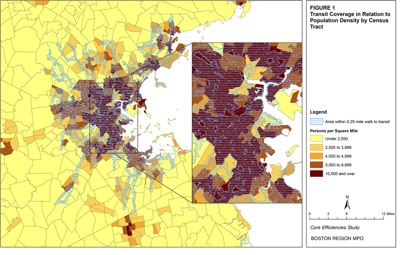
Figure 2
Additional Areas Requiring Transit Coverage Based on Population Density by Census Tract
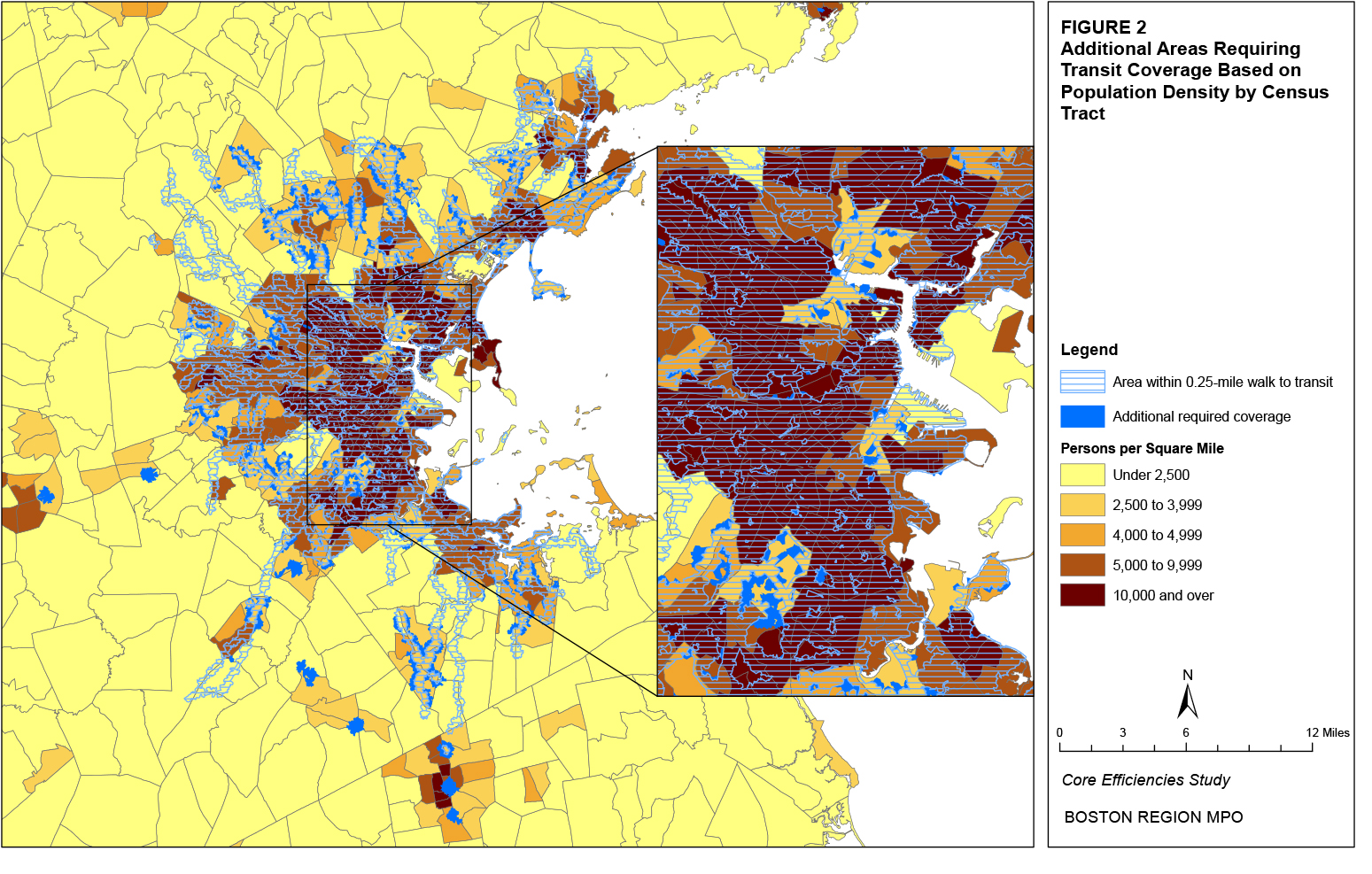
Among the agencies profiled that use the stop-spacing standard, the metric used to evaluate stop spacing is generally an average or minimum distance between stops. Some agencies require the average stop spacing across all routes and/or stops on a route to meet a certain minimum standard while others establish a minimum distance between stops applied to each individual pair of stops. An average stop-spacing standard allows for more flexibility in route planning, but a minimum standard ensures that no two stops are too close together. The required stop-spacing values used by peer agencies in an urban context generally match the average size of a city block (from approximately 0.10 to 0.20 miles). Several profiled peer agencies also have stop-spacing standards for non-urban areas and for rail stations. None of the profiled peer agencies appear to have a maximum stop-spacing standard.
Certain modes obviously cannot be held to a stop-spacing standard. Existing heavy rail stations, for example, have their locations fixed. Express buses operate a significant portion of their routes without any stops. However, the understanding of average or minimum stop spacing, even for these modes, can be useful when considered in relation to those modes for which stop location is flexible for purposes of comparison of the respective service levels. For example, the average stop spacing of any bus route that intends to offer bus rapid transit service should be close to that of heavy rail rapid transit.
For local bus and surface light rail, even if a stop-spacing standard has not been explicitly set, many agencies operate with at least a tacit understanding of what the spacing should be. The MBTA could better justify its decisions with regard to stop location, elimination, and relocation by including a stop-spacing standard in its Service Delivery Policy. However, such a standard would need to recognize that the various municipalities served by the MBTA make the final decisions regarding stop location. As part of this standard, the MBTA could also state general policy guidelines for the location of stops near intersections (near-side vs. far-side).
Table 21 presents the number and percentage of MBTA stops with an average distance between stops at various levels.14 As seen in the table, nearly one-half of the routes have an average stop distance between 0.10 and 0.20 miles. Less than five percent of all stops have a stop distance less than or equal to 0.05 miles. Slightly more than 30 percent have a stop distance less than or equal to 0.10 miles. The percentage of stops with a stop distance less than or equal to 0.15 miles is 63 percent. Slightly less than 20 percent of all stops have a stop distance between 0.15 miles and 0.20 miles, and 8 percent of stops have a stop distance between 0.20 miles and 0.25 miles. More than 10 percent of stops have a distance to the next stop greater than 0.25 miles.
Table 21
Number and Percentage of MBA Stops by Distance to Next Stop
Distance to Next Stop |
Number |
Percent |
0.001-0.050 miles |
1,905 |
4.7% |
0.051-0.100 miles |
10,613 |
26.2% |
0.101-0.150 miles |
12,827 |
31.7% |
0.151-0.200 miles |
7,178 |
17.7% |
0.201-0.250 miles |
3,235 |
8.0% |
Greater than 0.250 miles |
4,699 |
11.6% |
The route-duplication standard prohibits more than one route from serving the same corridor when the routes serve common destinations. The route-competition standard is more general, stating that transit services should not compete with other transit services for riders. Even the route-duplication standard involves some subjective judgment, however, as exceptions are made for routes that use the same road to serve a downtown or urban center, a transit center, or a park-and-ride facility.
A route-duplication standard would be most relevant to a hub-and-spoke transit system. In this type of system, multiple routes each serve distinct service areas (the spokes) except for coming together and allowing for transfer opportunities at a central location (the hub). In this way, no route duplicates or competes with another. Such a standard would not necessarily be appropriate for a system designed around trunk segments that are each served by multiple feeder routes. In this type of system, multiple feeder routes serve distinct service areas, but join together to provide a higher service level along a trunk segment.
To the extent that the existing MBTA bus network is not generally characterized by a hub-and-spoke system, the route-duplication standard would not appear to be relevant. However, should the MBTA employ greater use of such systems, particularly in the suburban context, this standard might be more useful. The relative inflexibility of such a standard, however, conflicts with the common need for flexibility in transit planning, particularly in the suburban context, where travel is often only possible on certain major arterials. While it may be advisable to have a general guideline stating that transit services should not compete with each other, it may not be necessary or advisable to restrict planning through a firm route-duplication standard.
Figure 3 presents the extent to which existing MBTA directly operated bus routes duplicate each other. As seen in the figure, the highest levels of duplication are on the express portion of express bus routes (such as the Massachusetts Turnpike and the Salem Turnpike). High levels of duplication are also seen in and around rapid transit stations, because multiple bus routes converge to serve those stations.Figure 3
Extent of Duplication for MBTA Bus Routes
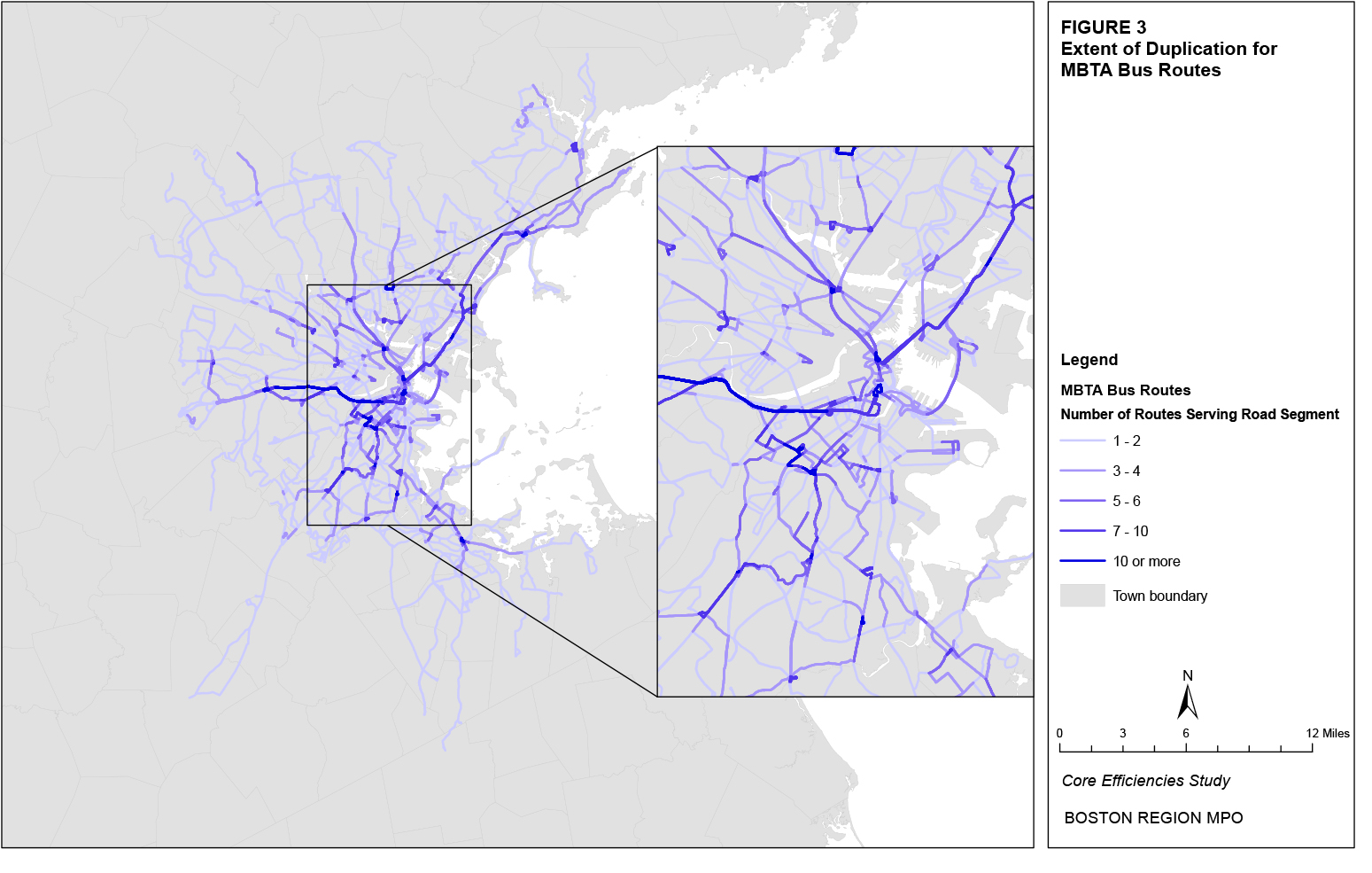
The route-travel-time standard generally sets a maximum travel time for any individual transit vehicle trip. It does not consider the passenger trip time (which may involve transfers and riding only a portion of certain routes), only the one-way travel time from a route’s origin timepoint to its destination timepoint. King County Metro Transit, the only profiled peer agency that used this standard, set it at 60 minutes.
As with the route-duplication standard, the use of this standard is limited by the existing service structure. Certain modes, such as commuter services, will typically have longer trip times. Demand for service between two points separated by a large distance will also often result in long route travel times. At the MBTA, for example, the longest trip times (which are around 90 minutes) are express bus trips from Salem to downtown Boston. Table 22 presents the percentages of MBTA directly-operated bus routes with average, maximum, and minimum route running times at various levels.15 More than 90 percent of all bus routes have an average route running time at or below 45 minutes, while only 10 percent have a maximum route running time greater than 60 minutes. Almost 10 percent of all routes have a minimum route running time greater than 30 minutes, and nearly three-quarters of all routes have at least one route variation with a route running time of less than 20 minutes.
Table 22
Percentage of MBTA Routes by Time Range for
Average, Maximum, and Minimum Running Time
Time Range |
Average |
Maximum |
Minimum |
Less than or equal to 20 minutes |
32% |
11% |
74% |
20.1 to 30 minutes |
35% |
25% |
17% |
30.1 to 45 minutes |
26% |
32% |
6% |
45.1 to 60 minutes |
4% |
22% |
2% |
Greater than 60 minutes |
3% |
10% |
1% |
A route-travel-time standard is perhaps most useful for designing and measuring the performance of service when it reflects passenger trip time. The average passenger-trip time could be estimated for each route using a calculation similar to that for the average passenger-trip length. This calculation equals the trip time at each stop weighted by each stop’s passenger load. For example, Table 23 presents a ridechecked weekday trip from the fall 2009 quarter for Route 66 in the outbound direction. By weighting the elapsed time by the passenger load, the average passenger-trip time equals 27 minutes and 7 seconds. The CTPS ridecheck database could potentially be modified to calculate the average passenger-trip time in addition to its current calculation of average trip-length.
Among the agencies profiled, the metric used to evaluate directness of travel is the comparison of in-vehicle (only the portion of a transit rider’s trip spent in the vehicle) transit trip times to comparable auto trip times. Since transit, by virtue of intermediate stops and deviations from the most direct route, cannot offer the same point-to-point travel time as a direct auto trip, this standard sets a maximum ratio of the transit trip time to the direct/auto trip time. Nashville MTA set the maximum absolute difference in the number of minutes for a route at 30 minutes. The maximum standard set by most of the profiled peer agencies was generally between 120 and 125 percent of the direct/auto trip time, though one agency, YRT, set it at 100-to-110 percent for BRT services.
CTA uses a standard that no route deviation should result in additional travel time for all through passengers (the sum of the number of through passengers multiplied by the additional route travel time for the deviation) greater than five minutes per each rider boarding or alighting along the deviation. For example, a route deviation that added eight minutes to the route travel time, or an additional 80 minutes for the 10 through passengers, would need to have at least 16 passengers boarding or alighting along that deviation for it to meet a standard of five minutes.
A directness-of-travel standard using a comparison of transit to auto trip times for all routes would be a useful tool for identifying routes that are experiencing travel delays that are not caused by traffic conditions. Before implementing a directness-of-travel standard, the MBTA would need to catalog the auto travel times that compare to each MBTA route. Such a comparison could be created for a matrix of trip points including route origins, destinations, and major midpoints. The Boston Region MPO’s travel demand model set contains this type of data and could be used to perform this comparison. As an example, MPO staff compared the in-vehicle travel time of a passenger riding the Silver Line Washington Street between Dudley Station and Temple Place. In the inbound direction (Dudley Station to Temple Place), a bus has an estimated travel time of 19.23 minutes, while a single-occupant vehicle (SOV) has an estimated travel time of 10.30 minutes. In the outbound direction (Temple Place to Dudley Station), the estimated travel times are 17.51 minutes for a bus and 11.17 minutes for a single-occupant vehicle. The calculated ratios of bus to SOV travel times are 187 percent in the inbound direction and 157 percent in the outbound direction. These ratios would fail the directness-of-travel standards of other agencies. The MBTA would want to calculate the travel time ratios for all routes before determining the level at which the MBTA directness-of-travel standard should be set.
A route-deviation standard could also be used to analyze potentially more efficient routings. Demand for through service and corresponding deviations would need to be identified, and the additional deviation time would need to be calculated and compared to the number of passengers served on that deviation to determine if elimination of that deviation might be considered. For instance, Route 59 (Needham Junction – Watertown Square) deviates from Eliot Street in Newton to serve two stops on Chestnut Street at Oak Street and Pennsylvania Avenue. This deviation from the most direct path takes approximately 3.7 minutes, adding approximately 2.6 minutes to the Route 59 travel time in each direction compared to the estimated travel time if Route 59 continued straight on Eliot Street and did not serve these two stops. According to the most recent CTPS ridecheck for Route 59, these two stops have 46 boardings and 8 alightings in the inbound direction and 6 boardings and 56 alightings in the outbound direction. There were also 206 passengers in the inbound direction and 191 passengers in the outbound direction who traveled through this deviation. Therefore, the 397 through passengers incurred an additional 17.9 hours of travel time. According to the CTA route-deviation standard, at least 214 passengers boarding or alighting would need to board or alight along the route deviation (17.9 hours divided by 5 minutes). The 116 passenger-trips using the deviation would therefore not meet the CTA route-deviation standard.Table 23
Route 66 Weekday Outbound Ridecheck Form
Stop # |
Stop Description |
Time at Stop |
Boardings |
Alightings |
Elapsed Time |
Passenger Load |
64000 |
Dudley Station |
9:52:23 |
19 |
0 |
0:00:00 |
0 |
1357 |
Tremont St. opp. Roxbury Crossing |
9:54:39 |
7 |
0 |
0:02:16 |
19 |
1362 |
Tremont St. @ Huntington Ave. |
9:59:29 |
0 |
6 |
0:07:06 |
26 |
1363 |
Huntington Ave @ Fenwood Rd. |
10:00:54 |
1 |
2 |
0:08:31 |
20 |
1365 |
Huntington Ave opp. Parker Hill Ave. |
10:01:50 |
4 |
1 |
0:09:27 |
19 |
1366 |
Huntington Ave. @ Riverway |
10:03:03 |
4 |
0 |
0:10:40 |
22 |
1526 |
Washington St. @ Pearl St. |
10:05:18 |
5 |
1 |
0:12:55 |
26 |
1367 |
Harvard St. @ Kent St. |
10:07:05 |
2 |
2 |
0:14:42 |
30 |
1368 |
Harvard St. @ Linden St. |
10:07:47 |
1 |
0 |
0:15:24 |
30 |
1370 |
Harvard St. opp. Auburn St. |
10:09:23 |
2 |
1 |
0:17:00 |
31 |
1371 |
Harvard St. opp. Vernon St. |
10:09:54 |
1 |
3 |
0:17:31 |
32 |
1372 |
Harvard St. @ Beacon St. |
10:11:45 |
2 |
5 |
0:19:22 |
30 |
1375 |
Harvard St. @ Coolidge St. |
10:14:36 |
1 |
4 |
0:22:13 |
27 |
1376 |
Harvard St. opp. Verndale St. |
10:15:25 |
1 |
2 |
0:23:02 |
24 |
1378 |
Harvard Ave. @ Commonwealth Ave. |
10:19:45 |
7 |
1 |
0:27:22 |
23 |
1379 |
Harvard Ave. @ Brighton Ave. |
10:22:26 |
0 |
3 |
0:30:03 |
29 |
964 |
Brighton Ave. opp. Quint St. |
10:24:22 |
5 |
0 |
0:31:59 |
26 |
965 |
Brighton Ave. @ Craftsman St. |
10:24:43 |
2 |
4 |
0:32:20 |
31 |
1111 |
Cambridge St. @ Craftsman St. |
10:25:44 |
4 |
0 |
0:33:21 |
29 |
1112 |
Cambridge St. @ Harvard Ave. |
10:26:56 |
2 |
0 |
0:34:33 |
33 |
1113 |
Cambridge St. @ Linden St. |
10:27:54 |
2 |
1 |
0:35:31 |
35 |
2558 |
North Harvard St. @ Empire St. |
10:31:24 |
4 |
0 |
0:39:01 |
36 |
2559 |
North Harvard St. @ Oxford St. |
10:32:17 |
1 |
3 |
0:39:54 |
40 |
2561 |
North Harvard St. @ Western Ave. |
10:33:33 |
0 |
4 |
0:41:10 |
38 |
2562 |
Opp. 175 North Harvard St. |
10:34:40 |
0 |
1 |
0:42:17 |
34 |
25641 |
JFK St. @ Eliot St. |
10:38:44 |
0 |
12 |
0:46:21 |
33 |
2168 |
Massachusetts Ave. @ Johnston Gate |
10:42:41 |
0 |
20 |
0:50:18 |
21 |
22549 |
Harvard Square @ Garden St. |
10:43:37 |
0 |
1 |
0:51:14 |
1 |
The ease-of-use standard generally includes measures of several service and physical characteristics. These include the extent of clock-face headways, which make the service schedule easy to remember, the extent to which routes run consistently throughout the day with minimum variations, the use of new technology to provide online access to schedules and real-time information on the service schedule by location, the use of simple fare collection methods such as passes and payment by credit cards, and the extent of the information or training provided to new users to help them learn how to use the transit system.
Table 24 shows the percentage of MBTA bus route headways at various clock-face times (those that can be divided evenly into or by one hour).16 Routes with headways equal to or less than 10 minutes (assumed for walk-up service, where riders are less likely to consult a schedule given the small headway) make up the greatest percentage of all route headways in the AM and PM peak periods; these are not considered clock-face routes, even if their headway is divisible into 60 minutes. Routes with clock-face headways greater than 10 minutes range from 25 percent to 30 percent of all routes over various time periods. Routes without clock-face headways that are also greater than 10 minutes make up between 56 percent and 75 percent of all routes over various time periods.
In terms of minimizing variations, the ratio of route variations to general routes can provide some indication of the extent of consistent routing. For all MBTA directly-operated bus routes, this ratio is predictably the highest on weekdays, at 283 percent. The ratio falls to 170 percent on Saturday and 144 percent on Sunday.
Table 24
Percentage of MBTA Routes by Headway
Headway |
AM Peak |
AM Base |
PM Base |
PM Peak |
Late |
Sat. Peak |
Sun. Peak |
15 |
4% |
0% |
3% |
5% |
1% |
2% |
2% |
20 |
8% |
3% |
4% |
11% |
4% |
3% |
2% |
30 |
15% |
12% |
9% |
11% |
6% |
9% |
3% |
60 |
2% |
14% |
12% |
3% |
14% |
15% |
17% |
120 |
0% |
0% |
0% |
0% |
0% |
0% |
1% |
Total |
29% |
29% |
29% |
30% |
25% |
28% |
25% |
≤10 |
15% |
2% |
5% |
12% |
0% |
3% |
1% |
Currently, schedules and real-time information are available for all directly-operated MBTA bus routes and heavy rail lines via the internet and several smartphone applications. Passengers can use the applications to view the locations of transit vehicles or obtain stop-based predictions for transit vehicles’ arrival times based on real-time data. In terms of fare payment, the automated-fare-collection (AFC) system provides information about how passengers paid for and used their fares and passes. For instance, the extent to which riders are using passes is generally indicative of a simpler fare collection operation, as customers will not need to repeatedly visit fare-vending machines (FVMs) to add stored value or insert cash into an onboard farebox. Table 25 shows the percentages of state fiscal year (SFY) 2010 MBTA passenger-trips using pay-per-ride or passes for different modal categories.17 Subway stations have the highest percentage of pass use, while surface light rail (surface Green Line routes and the Mattapan High-Speed Line) have the highest percentage of pay-per-ride use. Another potential measure of ease of use with regard to fare payment is the extent to which credit cards are used versus cash at FVMs, since FVM sales make up 45 percent of all unit sales and 71 percent of all AFC unit sales. As an example, in June 2010, credit card transactions at FVMs accounted for 40.8 percent of the FVM total.18
It would be difficult to measure the extent of information or training provided to new users in a quantitative manner. Furthermore, as seen
Table 25
Percentage of Pay-per-Ride and Pass Trips by MBTA Mode
Mode |
Pay-per-Ride |
Pass |
Bus |
43% |
57% |
Surface Light Rail |
49% |
51% |
Subway |
39% |
61% |
Total |
42% |
58% |
above, while quantitative measurements could be used to define other ease-of-use standards, this aspect of service is perhaps better considered a guideline, as it would be difficult to explicitly define a standard for the ratio of route variations to general route numbers, or the percentage of routes with clock-face headways, or the percentage of pass trip interactions. Each of the measures could be collected, summarized, and compared year to year, but as they are all generally objectives to which the MBTA could aspire to do better, using them as goals may be preferable.
Standards for the number of transfers and the transfer waiting time may include several different metrics. While none of the profiled peer agencies included such standards, it is possible to conceive a standard for an average of the number of transfers that riders traveling systemwide or by route could be expected to take. The potential to measure the extent of transferring exists with the AFC system, and a transfer study could summarize the number and percentages of transfers to and from each bus route and rapid transit station. Additionally, a standard could be established for an average waiting time based on scheduled headways, assumptions (such as those used in the MBTA’s schedule-adherence standard) as to how early passengers typically arrive at a transit stop, and data on actual travel times. Average transfer waiting times could also be calculated, using a matrix of transfer numbers from AFC transfer study data.
With regard to the transfer standard, routes for which passengers exceed the standard average number of transfers would potentially be candidates for new, more-direct routes. A general waiting-time standard would likely point out issues similar to those indicated by the schedule-adherence standard. However, a standard that is set for transfer waiting time could reveal opportunities for better transit connections. While it does not appear that a general waiting-time standard offers any additional value over that of the schedule-adherence standard, a transfer-waiting-time standard may be useful, as may a transfer standard, in pointing out situations where a more direct service may reduce the need for transfers.
For standards and guidelines that relate to route structure, the following possible changes to the MBTA’s Service Delivery Policy should be considered:
The metric used to evaluate the span of service for the MBTA and the peer agencies included in this analysis is typically a range of hours (with the beginning and ending hours noted). Some of the profiled peer agencies only require a certain number of hours of operation, but do not specify the times at which service should begin and end. Agencies usually require different span-of-service standards depending on the day and the service class. Most standards require service between 7:00 AM and 8:00 PM or the equivalent number of hours, and many require service until midnight or later.
The choice of the metric used to evaluate the span of service depends on a balance of flexibility for the transit agency in terms of when to provide service and usefulness for customers in terms of scheduling their trip. A standard that sets the beginning and ending hours provides no flexibility. A route must provide service even if there is no potential demand, or service could end despite a demonstrated demand. A standard that sets the number of hours of operation permits flexibility with regard to when to provide the service. However, this metric does not provide customers with a clear sense of when service will and will not be offered. In practice, both of these metrics likely represent exactly the same span of service and can be used interchangeably. Stating the beginning and ending hours does provide customers with a better sense of when service is actually offered, however, and is probably more useful to customers. The MBTA’s span-of-service standard does allow for service to be extended at either end of the day, based on demand. Therefore, it is recommended that the MBTA keep its existing minimum span-of-service standard.
According to the MBTA’s 2008 Service Plan, 19 directly-operated weekday MBTA bus routes, composing 11 percent of all service, failed the span-of-service standard. On Saturdays and Sundays, only one bus route failed the span-of-service standard. Table 26 lists the routes that failed the standard. As seen in the table, most routes that failed the span-of-service standard are express/commuter routes that primarily serve work-based trips and have a span-of-service requirement of 7:00 AM to 9:00 AM and 4:00 PM to 6:30 PM. For several of these routes, the failure to meet the span-of-service standard is caused when the last AM peak trip departs before 9:00 AM or the first PM peak trip departs after 4:00 PM.
The metric commonly used to evaluate frequency of service for the MBTA and the peer agencies included in this analysis is a maximum headway. Headway represents the number of minutes between transit vehicles. Frequency represents the number of transit vehicles per some defined time period. Therefore, a headway of 10 minutes would equate to a frequency of six vehicles per hour. The maximum headway for most peer agencies is 10 minutes or less for peak-period rapid transit service. Higher headway standards are typically set for other time periods and service classes. Some commuter modes use a frequency metric of the number of trips during the peak periods.
Table 26
MBTA Bus Routes Failing the 2008 Span-of-Service Standard
Bus Route Number and Description |
Weekday |
Saturday |
Sunday |
4: North Station – World Trade Center |
X |
|
|
5: City Point – McCormack Housing |
X |
|
|
18: Ashmont Station – Andrew Station |
X |
|
|
70A: North Waltham – University Park |
X |
|
|
75: Belmont Center – Harvard Station |
X |
|
|
121: Wood Island Station – Maverick Station |
X |
|
|
170: Oak Park – Dudley Station |
X |
|
|
171: Logan Airport – Dudley Station |
X |
X |
X |
210: Quincy Center Station – North Quincy Station or Fields Corner Station |
X |
|
|
221: Quincy Center Station – Fort Point |
X |
|
|
325: Elm Street – Haymarket Station |
X |
|
|
355: Mishawum Station – State Station |
X |
|
|
424: Eastern and Essex – Haymarket Station or Wonderland Station |
X |
|
|
434: Peabody – Haymarket Station |
X |
|
|
436: Danvers Square – Central Square, Lynn |
X |
|
|
448: Marblehead – Downtown Crossing via Paradise Road |
X |
|
|
449: Marblehead – Downtown Crossing via Humphrey Street |
X |
|
|
468: Danvers Square – Salem Depot |
X |
|
|
Some of the profiled peer agencies use a range of frequencies that correspond to a range of passenger flows. The corresponding standards can then be used to proactively identify routes with frequencies that may need to be adjusted to account for changes in demand. The MBTA does not currently differentiate its headway standards to the level that some other agencies do, preferring instead to set the headway levels for general service classes and offer a minimum level of service regardless of demand. However, while the existing frequency standards may be appropriate for MBTA rapid transit modes, comparing bus passenger flows to the scheduled frequencies may help the MBTA to proactively identify opportunities to increase or decrease bus headways. Resulting guidelines for frequency of service could be developed as a result of this comparison. For instance, Figures 4 and 5 demonstrate how passenger flow generally correlates with trip frequency throughout the day for Route 66.19
Figure 4
Route 66: Inbound Hourly Passenger Flow and Trip Frequency
Figure 5
Route 66: Outbound Hourly Passenger Flow and Trip Frequency
According to the 2008 Service Plan, 48 directly operated weekday MBTA bus routes, composing 27 percent of all service, failed the frequency-of-service standard. On Saturday, the number of failing routes dropped to 18, or 13 percent, and on Sunday, the failing number was 25, or 24 percent. Table 27 lists these routes.
Table 27
MBTA Bus Routes Failing the 2008 Frequency Standard
Bus Route Number and Description |
Weekday |
Saturday |
Sunday |
1: Harvard Square – Dudley Station via Mass. Avenue |
|
|
X |
5: City Point – McCormack Housing |
X |
X |
|
14: Roslindale Square – Heath Street Loop |
X |
|
|
15: Kane Square – Ruggles Station |
X |
X |
|
18: Ashmont Station – Andrew Station |
X |
|
|
28: Mattapan Station – Ruggles Station |
|
|
X |
33: River and Milton Streets – Mattapan Station |
X |
|
|
35: Dedham Mall – Forest Hills Station |
|
|
X |
38: Wren Street – Forest Hills Station |
X |
|
|
52: Dedham Mall – Watertown Yard |
X |
X |
|
57: Watertown Yard – Kenmore Station |
|
|
X |
59: Needham Junction – Watertown Square |
|
X |
X |
60: Chestnut Hill – Kenmore Station |
|
|
X |
62: Bedford V.A. Hospital – Alewife Station |
X |
|
|
62/76: Bedford V.A. Hospital – Alewife Station via Hanscom |
|
X |
|
66: Harvard Square – Dudley Station via Brookline |
X |
X |
X |
70: Cedarwood – Central Square Cambridge |
|
|
X |
70A: No. Waltham – University Pk., Cambridge |
X |
X |
|
74: Belmont Center – Harvard Station via Concord Avenue |
X |
X |
|
75: Belmont Center – Harvard Station via Fresh Pond Parkway |
X |
|
|
76: Hanscom Air Force Base – Alewife Station |
X |
|
|
78: Arlmont Village – Harvard Station |
|
X |
|
85: Spring Hill – Kendal MIT Station |
X |
|
|
86: Sullivan Station – Cleveland Circle |
|
|
X |
90: Davis Square Station – Wellington Station |
X |
|
|
94: Medford Square – Davis Square Station |
X |
|
|
99: Boston Reg. Med. Center Stoneham – Wellington Station |
X |
|
|
100: Elm Street – Wellington Station |
X |
|
|
101: Malden Station – Sullivan Station via Medford Square |
|
X |
X |
104: Malden Station – Sullivan Station via Ferry Street |
|
|
X |
105: Malden Station – Sullivan Station via Main Street |
X |
X |
|
112: Wellington Station – Wood Island Station |
X |
|
X |
119: Northgate Shopping Center – Beachmont Station |
X |
|
|
132: Redstone Shopping Center – Malden Station |
X |
X |
|
134: No. Woburn – Wellington Station |
|
|
X |
136: Reading Depot – Malden Station via Lakeside |
X |
|
|
137: Reading Depot – Malden Station via North Avenue |
X |
|
|
170: Oak Park – Dudley Station |
X |
|
|
171: Logan Airport – Dudley Station |
X |
X |
X |
211: Quincy Center Station – Squantum |
|
|
X |
212: Quincy Center Station – North Quincy Station |
|
X |
|
215: Quincy Center Station – Ashmont Station |
X |
|
|
221: Quincy Center Station – Fort Point |
X |
|
|
230: Quincy Center Station – Montello Station |
X |
|
X |
236: Quincy Center Station – South Shore Plaza |
X |
X |
|
238: Quincy Center Station – Holbrook/Randolph Comm. Rail Station |
|
|
X |
240: Avon Line – Ashmont Station |
X |
|
X |
245: Quincy Center Station – Mattapan Station |
X |
X |
X |
350: North Burlington – Alewife Station |
X |
|
X |
355: Mishawum Station – State Street |
X |
|
|
411: Malden Station – Revere/Jack Satter House |
X |
|
|
429: Northgate Shopping Center – Central Square Lynn |
X |
|
|
430: Saugus, Appleton Street – Malden Station |
X |
|
|
431: Neptune Towers – Central Square Lynn |
X |
|
X |
434: Peabody – Haymarket Station |
X |
|
|
435: Liberty Tree Mall – Central Square Lynn |
X |
|
X |
436: Danvers Square – Central Square, Lynn |
X |
|
X |
442: Marblehead – Haymarket Station or Wonderland Station |
|
|
X |
450: Salem Depot – Haymarket Station or Wonderland Station |
|
|
X |
451: North Beverly – Salem Depot |
X |
|
|
456: Salem Depot – Central Square, Lynn |
X |
|
|
465: Liberty Tree Mall – Salem Depot |
X |
|
|
468: Danvers Square – Salem Depot |
X |
|
|
553: Roberts – Federal and Franklin Streets |
X |
X |
|
554: Waverly Square – Federal and Franklin Streets |
X |
X |
|
555: Riverside Station – Federal and Franklin Streets via Newton |
X |
|
|
The metric most commonly used to evaluate schedule adherence for the MBTA and the peer agencies included in this analysis is an absolute number of late minutes. For most profiled agencies, the acceptable number of late minutes ranges between 0 and 6 minutes for origins and 0 and 7 minutes for midpoints, and trips are considered on-time if they arrive at destinations between 3 minutes early and 5 minutes late. Some agencies only consider schedule adherence at the origin and not at midpoints or the destination. The MBTA is the only agency that uses a standard based on the scheduled headway (greater or less than 10 minutes) or running time. A typical part of any schedule-adherence evaluation is also a route standard that requires a certain percentage of timepoints or trips to meet the on-time standard. This percentage is generally lower for local bus and higher for rapid transit.
Schedule-adherence standards evaluate reliability. This is commonly the most important service characteristic identified by passengers when ranking service qualities. The measurement of on-time performance across the entire route—not only at the origin timepoint but also at mid-route timepoints and the destination timepoint—is therefore likely to be more useful to and relevant for customers. This is the reason that the MBTA includes all timepoints, not just the origin and destination, in its analysis of schedule adherence. However, for transit services that run more frequently, customers generally care more about buses maintaining a constant headway than remaining on schedule.
According to the 2008 Service Plan, the average weekday timepoint on-time percentage weighted across all directly-operated MBTA bus routes by each route’s respective average weekday daily ridership was 59.1 percent. Only six bus routes, or 3 percent of all routes, met the route-level schedule-adherence standard that 75 percent of timepoints adhere to the on-time standards. On Saturdays, the timepoint on-time percentage increased to 61.5 percent, and eight bus routes, or 6 percent of all routes, met the route-level schedule-adherence standard. On Sundays, the timepoint on-time percentage further increased, to 63.5 percent, and 17 bus routes, or 16 percent of all routes, met the route-level schedule-adherence standard. Table 28 lists these routes. The Silver Line Washington Street is the only bus route that meets the schedule-adherence standard on all days of the week.
Table 28
MBTA Bus Routes Failing the 2008 Schedule-Adherence Standard
Bus Route Number and Description |
Weekday |
Saturday |
Sunday |
7: City Point – Otis and Summer Streets |
X |
|
|
17: Fields Corner Station – Andrew Station |
|
|
X |
18: Ashmont Station – Andrew Station |
|
|
X |
24: Wakefield Avenue – Mattapan/Ashmont Station |
|
|
X |
37/38: Baker and Vermont – Forest Hills Station |
|
X |
|
38: Wren Street – Forest Hills Station |
|
X |
|
51: Cleveland Circle – Forest Hills Station |
|
X |
|
57: Watertown Yard – Kenmore Station |
|
X |
|
72/75: Belmont Ctr. – Harvard Station via Huron |
|
X |
X |
75: Belmont Ctr. – Harvard Sta. via Fresh Pond Pkwy. |
|
X |
|
85: Spring Hill – Kendal MIT Station |
X |
|
|
88: Clarendon Hill – Lechmere Station via Highland |
|
|
X |
99: Boston Reg. Med. Ctr. – Wellington Station |
|
|
X |
105: Malden Station – Sullivan Station via Main St. |
|
|
X |
106: Franklin Sq./Lebanon St. Loop – Wellington Sta. |
|
|
X |
108: Linden Square – Wellington Station |
|
X |
|
110: Wonderland Station – Wellington Station |
|
|
X |
136: Reading Depot – Malden Station via Lakeside |
|
|
X |
137: Reading Depot – Malden Station via North Ave. |
|
|
X |
210: Quincy Ctr. Sta. – No. Quincy/Fields Corner Sta. |
|
|
X |
211: Quincy Ctr. Station – Squantum |
|
|
X |
502: Watertown Yard – Copley Square |
X |
|
|
741 Silver Line 1: Logan Airport – South Station |
X |
|
X |
742 Silver Line 2: BMIP – South Station |
X |
|
X |
749 Silver Line 5: Dudley Sta. – Downtown |
X |
X |
X |
Obviously, the MBTA’s schedule-adherence standard, as currently formulated, is difficult to meet. While the inclusion of all timepoints in the analysis of on-time performance does ensure the consistent application of the schedule-adherence standard across the entire route (the origin, destination, and all mid-route timepoints), this consistency is itself difficult to achieve. In particular, the inclusion of multiple mid-route timepoints, which have a more stringent timepoint on-time standard than the origin or destination, make the achievement of the route-level schedule-adherence standard more difficult.20 In essence, therefore, the large number of failures to meet the schedule-adherence standard is due to the large number of timepoints. The resulting percentages of failure more accurately reflect schedule adherence on a timepoint basis. Applying the schedule-adherence standard at only major timepoints would provide a more accurate representation of on-time performance on a route basis. In addition, the 2008 Service Plan reports the timepoint on-time percentage for all routes instead of whether the routes pass or fail the schedule-adherence standard. In this way, the relative performance of routes can be determined, and routes with greater on-time problems can be identified. The schedule-adherence standard could be made more useful for planning purposes if it included a range of percentages of meeting the route-level standard. For instance, while only 3 percent of routes met the existing route-level standard that 75 percent of timepoints adhere to the on-time standards, if the standard were changed to 65 percent, the routes meeting the standard would increase to 27 percent. On the other end, 17 percent of routes have less than 50 percent of timepoints that meet the on-time standard. A schedule-adherence standard using several different route-level standards could better identify the routes with the worst on-time performance.
Only one of the profiled peer agencies, SFMTA, has a service delivery standard. The metric associated with this standard is a minimum percentage of scheduled service hours that are actually delivered. The agency’s goal is to deliver a minimum of 99.0 percent of the scheduled service hours in the AM and PM peak periods and 98.5 percent at all other times. In effect, this standard measures the extent of dropped trips due to any reason. A similar standard would set a maximum percentage of dropped trips.
The MBTA regularly reports via its online ScoreCard the percentage of dropped trips, but does not have a dropped-trip standard. Establishing a standard for service delivery—either in terms of the percentage of service hours delivered or the percentage of dropped trips—would help the MBTA communicate to the public the expected level of dropped service as well as to proactively identify routes with problems.
Figure 6 shows the percentages of scheduled MBTA service operated for the four rapid transit lines and all buses over a four-month period. As seen in the figure, only the Green Line delivered at least 100 percent of scheduled service in each month of the time period.
Figure 6
Percent of Scheduled Service Operated by MBTA Mode,
June 2010 through September 2010
Only one of the profiled peer agencies, SFMTA, has a service failure standard. The metric associated with this standard is a minimum distance, averaged by mode, between vehicle failures. The agency’s goal is to have an average minimum of 5,000 miles for light rail and 3,400 miles for motor coaches between failures. This standard measures one of the potential reasons for a dropped trip. It also includes a safety element.
The MBTA collects data on service failures and has various goals for bus, commuter rail, and each rapid transit line for the average number of miles between failures. As with the service-delivery standard, establishing a standard for service-failure would help the MBTA communicate to the public the maximum acceptable level of vehicle failures as well as to proactively identify problems.
Figure 7 shows the average number of miles between MBTA service failures for the four rapid transit lines and all buses over a four-month period. As seen in the figure, the averages for the three heavy rail lines vary significantly by month, while the averages for the Green Line and buses are more consistent from month to month. More failures usually occur in the summer months, due to failures of air conditioners. This may indicate that different reasons for failures should be classified in different ways.
Figure 7
Mean Miles between Failures by MBTA Mode,
June 2010 through September 2010
Only one of the profiled peer agencies, SFMTA, has an employee vacancy-rate standard. The metric associated with this standard is a maximum vacancy rate for various service-critical positions. The agency’s goal is to have a maximum quarterly vacancy rate of five percent for positions in transit operations, crafts, and maintenance. A similar measure would be vehicle availability, or whether there are enough vehicles available to run the service that is scheduled each day. Both of these standards measure possible reasons for a dropped trip.
The MBTA collects data on vehicle availability and sets a requirement for the number of vehicles that should be available for use. As with the service-failure standard, establishing a standard for vehicle availability would help the MBTA communicate to the public the expected level of dropped trips due to lack of vehicles, as well as to proactively identify services with problems.
Figure 8 shows the ratio of available daily vehicles to the number of vehicles required for the four rapid transit lines and all buses over a four-month period. As seen in the figure, only the Orange Line failed to meet a 100-percent vehicle-availability ratio in some months of the time period.
Figure 8
Percent of Daily Vehicle Requirement by MBTA Mode,
June 2010 through September 2010
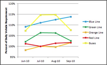
Only one of the profiled peer agencies, MDT, has a standard for accident and incident rates. The metric associated with this standard is a maximum rate of accidents and incidents. The agency’s goal is to have a maximum rate of six per 100,000 vehicle-miles. This standard measures another reason for a dropped trip. It also includes a safety element.
The MBTA collects data on accidents and incidents. As with the service-failure standard, establishing a standard for the accident-and-incident rate would help the MBTA communicate to the public the expected level of dropped trips due to this reason, as well as to proactively identify routes with problems. It would also reinforce the perception that the MBTA has a culture of being concerned with safety.
Figure 9 shows the average number of accidents or incidents per 1,000 vehicle-miles traveled (VMT) for the four rapid transit lines and all buses over a five-month period. As seen in the figure, the rates for the Green Line and buses are generally higher than those for the three heavy rail lines. The rates for the heavy rail lines are also more consistent from month to month.
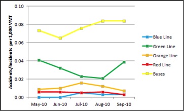
Only one of the profiled peer agencies, MDT, has a passenger-complaints standard. The metric associated with this standard is a maximum rate of complaints. A separate standard is set for each mode. The agency’s goal for complaints is to have a maximum rate of 1.5 per 100,000 rail boardings, 11 per 100,000 boardings on bus, and two percent of all paratransit trips.
The MBTA collects data on passenger complaints. Unfortunately, complaints are subjective in nature, and this makes their categorization and summary difficult. However, to the extent that the MBTA already makes this effort for internal analysis, it might be possible to associate service-related complaints with individual routes or modes. The MBTA could determine the existing rate of passenger complaints and then decide whether setting a standard would be appropriate. Establishing a standard for the passenger-complaints rate would help the MBTA communicate to the public its awareness and consideration of passenger input. Such a standard would also help the MBTA better identify routes or trips that have problems that may not be identified by other service standards, such as those related to operator attitudes, fare collection, or obstruction of the passenger aisle.
Figure 10 shows the number of complaints for all buses and rapid transit lines over a six-month period. As seen in the figure, the bus mode has, on average, more than three times the number of complaints per month compared to the rapid transit mode.
Figure 10
Number of Complaints by MBTA Mode, March 2010 through August 2010
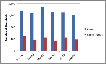
Figure 11 shows the breakdown of complaints into various categories for the month of August 2010. A majority of bus complaints concerned MBTA employees, while the largest percentage of subway complaints concerned service.
Figure 11
Breakdown of Complaints by MBTA Mode, August 2010
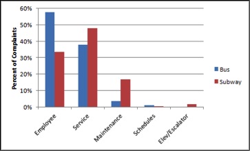
For standards and guidelines that relate to service provision, the following possible changes to the MBTA’s Service Delivery Policy should be considered:
The three service-efficiency standards used by the MBTA and the other peer agencies reviewed—net cost per passenger, cost-effectiveness, and passenger productivity—are all interrelated. Net cost per passenger is the ratio of operating costs, minus service revenue, to the number of passengers; cost-effectiveness is the ratio of service revenue to operating costs; passenger productivity is the ratio of the number of passengers to the amount of service (measured as the number of trips or revenue-hours). Deficient routes are determined by comparing the respective service-efficiency measure to an absolute standard or to a standard percentage of the average of other routes.
The three standards, despite using different metrics, do generally measure service efficiency in the same manner. For example, higher cost-effectiveness is generally associated with higher passenger productivity since greater service revenue is correlated with a greater number of passengers and greater operating costs are correlated with a greater amount of service. Net cost per passenger essentially combines cost-effectiveness and passenger productivity. A lower net cost per passenger is, therefore, associated with higher cost-effectiveness and higher passenger productivity.
Measuring service efficiency through any of these three measures is a useful tool for transit agencies when allocating resources. Services with high efficiency generally are candidates for providing more service or improving service quality. Services with low efficiency are often candidates for service restructuring or elimination. While service efficiency is undoubtedly an important evaluation tool in service planning, other service structure and provision standards may require the operation of certain services or levels of service that are not necessarily efficient.
The MBTA currently uses a net-cost-per-passenger standard to analyze all bus routes. As this standard essentially combines the cost- effectiveness and passenger-productivity measures, it does not appear that the MBTA needs to add any additional cost-efficiency standards for buses. However, there is no reason that similar cost calculations could not be performed for other modes.
According to the 2008 Service Plan, the average weekday net cost per passenger, weighted across all directly operated MBTA bus routes by each route’s respective average weekday daily ridership, was $1.59. Twenty bus routes, or 11 percent of all routes, failed the cost-effectiveness standard because their net cost per passenger exceeds three times this average. On Saturdays, the average net cost per passenger increased to $1.64, and 25 bus routes, or 19 percent of all routes, failed the cost-effectiveness standard. On Sundays, the average net cost per passenger further increased, to $1.82, and 11 bus routes, or 10 percent of all routes, failed the cost-effectiveness standard. Table 29 lists the routes that fail to meet the 2008 net-cost-per-passenger standard. Routes 78, 245, and 436 are the three bus routes that fail the cost-effectiveness standard on all days of the week.
Table 29
MBTA Bus Routes Failing the 2008 Net-Cost-per-Passenger Standard
Bus Route Number and Description |
Weekday |
Saturday |
Sunday |
5: City Point – McCormack Housing |
|
X |
|
6: South Station – Haymarket Station |
X |
|
|
8: Harbor Point/UMass – Kenmore Station |
|
|
X |
48: Centre and Eliot Streets – Jamaica Plain Loop |
X |
X |
|
52: Dedham Mall – Watertown Yard |
X |
X |
|
60: Chestnut Hill – Kenmore Station |
|
|
X |
62/76: Bedford V.A. Hosp. – Alewife Sta. via Hanscom |
|
X |
|
74: Belmont Ctr. – Harvard Station via Concord Ave. |
|
X |
|
76: Hanscom Air Force Base – Alewife Station |
X |
|
|
78: Arlmont Village – Harvard Station |
X |
X |
X |
99: Boston Reg. Med. Ctr. – Wellington Station |
|
X |
X |
100: Elm St. – Wellington Station |
|
X |
|
132: Redstone Shopping Ctr. – Malden Station |
|
X |
|
136: Reading Depot – Malden Station via Lakeside |
|
X |
|
137: Reading Depot – Malden Station via North Ave. |
|
X |
|
170: Oak Park – Dudley Station |
X |
|
|
201/202: Fields Corner Station – Fields Corner Station |
|
X |
X |
211: Quincy Ctr. Station – Squantum |
|
X |
X |
212: Quincy Ctr. Station – No. Quincy Station |
|
X |
|
216: Quincy Ctr. Station – Houghs Neck |
|
X |
|
217: Wollaston Station – Ashmont Station |
X |
|
|
222: Quincy Ctr. Station – East Weymouth |
|
X |
|
230: Quincy Ctr. Station – Montello Sta. |
|
X |
X |
245: Quincy Ctr. Station – Mattapan Sta. |
X |
X |
X |
275: Downtown Boston – Long Island Health Campus |
X |
|
|
325: Elm St. – Haymarket Station |
X |
|
|
350: North Burlington – Alewife Station |
|
|
X |
351: Oak Park – Alewife Station |
X |
|
|
355: Mishawum Station – State Street |
X |
|
|
431: Neptune Towers – Central Square, Lynn |
|
X |
X |
435: Liberty Tree Mall – Central Square, Lynn |
X |
|
|
436: Danvers Sq. – Central Square, Lynn |
X |
X |
X |
439: Bass Point Nahant – Central Square, Lynn |
X |
|
|
448: Marblehead – Downtown Crossing |
X |
|
|
451: North Beverly – Salem Depot |
|
X |
|
465: Liberty Tree Mall – Salem Depot |
X |
X |
|
468: Danvers Sq. – Salem Depot |
X |
|
|
500: Riverside Station – Federal and Franklin Streets |
X |
|
|
553: Roberts – Federal and Franklin Streets |
|
X |
|
554: Waverly St. – Federal and Franklin Streets |
|
X |
|
558: Auburndale – Federal and Franklin Streets |
X |
|
|
The metric used to evaluate vehicle load for the MBTA and the peer agencies included in this analysis is the ratio of passengers to seating capacity. Every one of the profiled peer agencies had a set of vehicle-load standards. Typically, these standards differed depending on the service class, day or time period, or location. Two agencies also included in their standards the maximum amount of time that passengers should be required to stand. Two agencies also used the scheduled headway to set the vehicle-load standard. The minimum standard for most peer agencies was 100 percent (no standing passengers) on certain commuter trips and during non-peak time periods. Bus peak-period vehicle-load ratios ranged from 120 percent to 180 percent. Rail peak-period vehicle-load ratios were much higher—as much as 334 percent on the #3 Red Line cars used by the MBTA.
The vehicle-load standard is partly a measure of passenger comfort. Less stringent standards permit a greater number of standing passengers and general passenger crowding. This typically decreases passenger comfort as personal space is limited and passengers sometimes must force themselves through a crowd to board or alight vehicles. Vehicle load is also tied to the amount of service provided. More stringent standards reduce the number of passengers per vehicle and require reduced headways and more vehicles. Therefore, while not an explicit measure of service efficiency, vehicle load does govern a key component—namely, the cost and resulting hours of operating a certain number of vehicles. Less stringent vehicle-load standards improve both the cost-effectiveness and productivity of transit. However, this comes at a cost of reduced passenger comfort and service quality. Service provision standards for minimum headways may also require correspondingly more stringent vehicle-load standards.
The MBTA already provides a detailed list of vehicle-load standards that depend on service class, time period, and location. However, the MBTA only uses one vehicle-load standard for all bus vehicle types despite differences in the available standing area. Crowding on low-floor and Silver Line Waterfront buses is not well identified by the existing vehicle-load standard of passengers per seated capacity due to lesser and greater amounts of standing area caused by narrow aisles and luggage racks, respectively. The MBTA could introduce separate vehicle-load standards for these two bus types, as it does for different rapid transit vehicle types. Alternatively, the MBTA could use a ratio of passengers to floor area as the standard and consistently apply it across all bus vehicle types.
Another potential change to the vehicle-load standard would be to link it with the schedule-adherence standard. Linking the two would prioritize providing on-time service to routes with a greater number of riders. However, as shown by Figure 12, routes with a greater average weekday ridership actually tend to have better schedule adherence than routes that average lower ridership. According to figures from the 2008 Service Plan, for every additional 1,000 average daily weekday riders, the percentage of trips adhering to the schedule increased by 1.7 percent. In addition, routes that failed the vehicle-load standard performed better, on average, with regard to schedule adherence, with 62.7 percent of trips running on time compared to 58.5 percent of trips on routes that met the vehicle-load standard. Finally, while prioritizing schedule adherence on routes that fail the vehicle-load standard would generally improve routes with greater ridership, this would only benefit 24 percent of riders, as 76 percent of riders use routes that meet the vehicle-load standard.
Figure 12
Average Weekday Ridership by Percent of On-Time Trips
by MBTA Bus Route
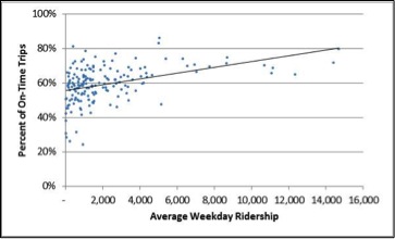
Table 30
MBTA Bus Routes Failing the 2008 Vehicle-Load Standard
Bus Route Number and Description |
Weekday |
Saturday |
Sunday |
1: Harvard Square – Dudley Station via Mass. Avenue |
|
X |
X |
16: Forest Hills Station – UMass |
|
X |
|
19: Fields Corner Station – Ruggles/Kenmore Station |
X |
|
|
21: Ashmont Station – Forest Hill Station |
X |
|
|
23: Ashmont Station – Ruggles Station |
X |
|
|
28: Mattapan Station – Ruggles Station |
X |
X |
|
34: Dedham Line – Forest Hills Station |
X |
|
|
34E: Walpole – Forest Hills Station |
X |
X |
X |
40: Georgetowne – Forest Hills Station |
X |
|
|
55: Queensberry Street – Park and Tremont Streets |
X |
|
|
57: Watertown Yard – Kenmore Station |
X |
|
|
66: Harvard Square – Dudley Station via Brookline |
|
X |
X |
70: Cedarwood – Central Square, Cambridge |
X |
X |
|
73: Waverly Square – Harvard Station |
X |
|
X |
87: Clarendon Hill – Lechmere Station |
X |
|
|
89: Clarendon Hill/David Square – Sullivan Station |
|
|
X |
93: Sullivan Station – Downtown via Bunker Hill |
|
|
X |
104: Malden Station – Sullivan Station via Ferry Street |
|
X |
|
109: Linden Square – Sullivan Station |
|
X |
|
116: Wonderland Station – Maverick Sta. via Revere |
X |
X |
X |
117: Wonderland Station – Maverick Sta. via Beach |
X |
X |
X |
137: Reading Depot – Malden Station via North Ave. |
X |
|
|
225: Quincy Ctr. Station – Weymouth Landing |
X |
|
|
236: Quincy Ctr. Station – South Shore Plaza |
|
X |
|
238: Quincy Ctr. Station – Holbrook/Randolph Station |
|
X |
|
240: Avon Line – Ashmont Station |
X |
|
|
441: Marblehead – Haymarket/Wonderland Station |
|
|
|
442: Marblehead – Haymarket/Wonderland Station |
X |
|
|
450: Salem Depot – Haymarket/Wonderland Station |
X |
|
|
701 CT1: Central Sq. – South End Med. Area |
X |
|
|
741 Silver Line 1: Logan Airport – South Station |
X |
X |
|
742 Silver Line 2:BMIP – South Station |
X |
|
|
743 Silver Line 3: City Point – South Station |
X |
|
|
746 SL Waterfront: Silver Line Way – South Station |
|
|
X |
For standards and guidelines that relate to service efficiency, the following possible change to the MBTA’s Service Delivery Policy should be considered:
One of the profiled peer agencies has guidelines for the distribution of revenue equipment. The top priority is to ensure that all routes are accessible. Other guidelines concern the distribution of buses with air conditioning, the average age of buses, and the number of bus types at each garage.
Although the MBTA does not codify a requirement for air-conditioning in the Service Delivery Policy, it does require that all transit vehicles have air conditioning, and it has established a maximum allowable average age for the bus fleet. In addition, the MBTA has policies that govern how vehicles are assigned throughout the system. These policies vary by mode and are governed by various operational characteristics and constraints. Due to the nature of these policies, they do not have any quantifiable standards associated with them, and may change as fleets turn over.
MBTA vehicle assignment policies are described in the triennial Title VI report, through which the MBTA monitors compliance with Title VI of the Civil Rights Act of 1964. For Title VI monitoring, the MBTA evaluates bus vehicle assignment based on vehicle age and air conditioning operability, and evaluates rail vehicle assignment based only on age. Because the vehicle assignment policies and monitoring are documented in the MBTA’s Title VI report, it does not appear necessary to incorporate them into the Service Delivery Policy.
As with distribution of revenue equipment, one of the profiled peer agencies has guidelines for the distribution of amenities such as benches, shelters, and trash cans. Priority is given to providing amenities at bus stops that have large numbers of passengers who board at the location, lengthy wait times between buses, a high percentage of transfer passengers, and a high percentage of seniors or people with disabilities.
The MBTA has an official policy that governs the placement of bus shelters throughout the system; however, it does not have placement policies for all transit amenities. As with vehicle assignment, the MBTA evaluates and documents the distribution of many amenities through Title VI monitoring and reporting. Therefore, it does not appear necessary for the MBTA to include these in its service standards.
The MBTA already has guidelines and policies outside of its Service Delivery Policy that govern the distribution of equipment and amenities. These are documented and monitored as part of the MBTA’s Title VI reporting; therefore, no changes to the Service Delivery Policy’s standards are recommended.
Service standards are both a reflection of and a driving force behind service conditions and structure. While service standards are generally set at levels representing the minimum level of acceptable service, and therefore guide the design and provision of that service, they can also be used to measure performance and how well the service is functioning in relation to the standard. In turn, the analysis of service standards not only identifies poorly performing services, but also opportunities for improving services when the demand exists.
The MBTA’s existing service standards, as described in its Service Delivery Policy, are: coverage, span of service, frequency of service, schedule adherence, vehicle load, and net cost per passenger. All of these standards are tailored to particular service characteristics that describe the MBTA as well as transit more generally. Characteristics such as service class and the day or time period are commonly used to differentiate the level of each standard. Other differentiating factors, such as the population density, passenger flow, and location, are also used for specific standards.
Other profiled peer agencies do use some additional service standards. These include standards concerning service structure for stop spacing, route travel time, directness of travel, etc. There are also standards concerning service provision for service delivery, miles between service failures, and passenger complaints. Similar to the service standard for net cost per passenger, some profiled peer agencies use measures similar to the MBTA’s, such as cost-effectiveness or passenger productivity. Finally, a few profiled peer agencies also have general guidelines for the distribution of physical infrastructure, such as bus types, air conditioning, benches, shelters, etc.
While the MBTA’s existing service standards do provide a comprehensive evaluation of service structure, provision, and efficiency, there may be some slight modifications to the existing standards, as well as the adoption of some potentially new standards, that may be useful. With regard to existing standards, the coverage standard uses a population-density threshold over which a minimum-distance-to-transit standard is applied. Creating a range of density categories, with a corresponding range in the minimum-distance-to-transit standard, might provide a more consistent level of service across areas with similar population densities. Similarly, adopting general guidelines that associate a range of bus passenger flows with a range of service frequencies could provide a more consistent level of service for bus routes with similar levels of demand. No other changes are recommended for the existing service standards.
As for potentially new standards, one of the policy objectives stated by the Service Delivery Policy is the establishment of service objectives that define the key performance characteristics of quality transit services. However, there are only a few used by the profiled peer agencies that appear to be potentially useful to the MBTA. A stop-spacing standard that establishes a minimum distance between stops would provide a standard to which the MBTA could point when restructuring the stop locations of various routes. A directness-of-travel standard would compare the in-vehicle transit travel time to that of a private automobile and establish a minimum ratio. This could help the MBTA target routes or route segments for which significant delays are caused by non-traffic factors. An adjustment to this metric could also be used to evaluate the effectiveness of route deviations. A transfer standard that establishes a maximum average number of transfers for each bus route or rapid transit station could identify particular groups of passengers who may be candidates for receiving direct service with no required transfers. Finally, various standards relating to service delivery, such as the percentage of service hours delivered, the percentage of dropped trips, miles per service failure, miles per accident or incident, and the vacancy rate, would likely only formalize policies that the MBTA already has. Several other guidelines and/or standards used by the profiled peer agencies for employee vacancy rates, passenger complaints, ease of use, and the distribution of revenue equipment and transit amenities could be used as guidelines by the MBTA. These guidelines would state general policies but would not establish strict standards.
As changes are considered to the structure and amount of MBTA core service, the resulting service concepts will consider the standards described in this chapter. Indeed, the rationale behind several of the concepts will draw from particular emphasis on one or several of these service standards. A long-range vision for MBTA core service may emphasize certain standards over others, but since each of these standards represents an important element of transit service, they will all be considered.This chapter presents an evaluation of ridership trends on existing MBTA services, existing and forecasted residential and employment population densities and transit dependency, predicted changes in neighborhood-to-neighborhood trip flows, and an analysis of neighborhood-to-neighborhood transit-trip costs.
This section examines the change in recorded MBTA bus and rapid transit ridership over approximately 10 years using data largely from the MBTA Blue Book and presents 2030 projections from the Boston Region MPO travel demand model. Note that the projections assume no limits on the capacity of buses, rail cars, or parking lots.
Figure 13 presents a map of the rail rapid transit system, including the Red Line. Table 30 shows the average weekday station entries for all Red Line stations. Three figures are presented for each station: a 1997 count and a 2009 count from the 2009 MBTA Blue Book, and a projected 2030 count based on ridership change rates from the regional travel demand model set. Most Red Line stations experienced a double-digit percentage growth in ridership from 1997 to 2009 and even greater increases are projected from 2009 to 2030. All stations in the Cambridge section of the Red Line had ridership increases from 1997 to 2009, though the three largest percentage increases were for Charles/MGH, Shawmut, and Braintree stations. The largest absolute increase occurred for Central Station. Only five stations experienced a decline in ridership. Overall, ridership increased on the entire Red Line from 1997 to 2009 by 10 percent. Between 2009 and 2030, all stations are projected to have ridership increases. The largest projected percentage increases are for Broadway and Central stations, while the largest projected absolute increases are for South Station and Central Station. The entire Red Line ridership is projected to increase from 2009 to 2030 by 31 percent.
Table 30
Red Line Station Entries (Typical Weekday)
Station |
1997 |
2009 |
1997-2009 % Change |
Projected 2030 |
2009-2030 % Change |
Alewife |
9,409 |
10,657 |
+13% |
12,885 |
+21% |
Davis |
10,695 |
11,628 |
+9% |
14,778 |
+27% |
Porter |
7,355 |
8,552 |
+16% |
10,913 |
+28% |
Harvard |
20,212 |
21,868 |
+8% |
25,991 |
+19% |
Central |
11,736 |
14,531 |
+24% |
22,723 |
+56% |
Kendall/MIT |
11,214 |
13,975 |
+25% |
19,129 |
+37% |
Charles/MGH |
7,855 |
10,615 |
+35% |
15,634 |
+47% |
Park Street |
6,535 |
8,237 |
+26% |
9,958 |
+21% |
Downtown Crossing |
12,381 |
11,746 |
-5% |
15,586 |
+33% |
South Station |
20,778 |
20,647 |
-1% |
29,937 |
+45% |
Broadway |
3,742 |
4,200 |
+12% |
7,134 |
+70% |
Andrew |
4,646 |
5,586 |
+20% |
7,681 |
+38% |
JFK/UMass |
7,561 |
7,834 |
+4% |
10,468 |
+34% |
Savin Hill |
1,769 |
1,863 |
+5% |
2,717 |
+46% |
Fields Corner |
4,697 |
4,152 |
-12% |
4,946 |
+19% |
Shawmut |
1,745 |
2,241 |
+28% |
3,274 |
+46% |
Ashmont |
8,536 |
6,019 |
-29% |
6,450 |
+7% |
North Quincy |
5,955 |
7,132 |
+20% |
8,300 |
+16% |
Wollaston |
4,269 |
4,347 |
+2% |
4,587 |
+6% |
Quincy Center |
6,426 |
7,913 |
+23% |
8,656 |
+9% |
Quincy Adams |
4,477 |
4,383 |
-2% |
6,297 |
+44% |
Braintree |
3,424 |
4,387 |
+28% |
4,821 |
+10% |
Total |
175,417 |
192,513 |
+10% |
252,864 |
+31% |
Fig Figure 13 presents a map of the rail rapid transit system, including the Orange Line. Table 31 shows the average weekday station entries for all Orange Line stations. Three figures are presented for each station: a 1997 count and a 2009 count from the 2009 MBTA Blue Book, and a projected 2030 count based on ridership change rates from the regional travel demand model set. Just over half of the Orange Line stations experienced growth in ridership from 1997 to 2009, while ridership increases are projected for all stations from 2009 to 2030. Ridership increases from 1997 to 2009 were interspersed throughout the Orange Line, with the three largest percentage increases occurring at Chinatown, Haymarket, and Stony Brook stations. The largest absolute increase occurred for Chinatown Station. Of the nine stations that experienced a decline in ridership, both the largest percentage and absolute decrease occurred at State Station. Overall, ridership increased on the entire Orange Line from 1997 to 2009 by less than 0.1 percent. The largest projected percentage increases are for Chinatown and Stony Brook stations, while the largest projected absolute increases are for Chinatown and Downtown Crossing stations. The entire Orange Line ridership is projected to increase from 2009 to 2030 by 13 percent.
Table 31
Orange Line Station Entries (Typical Weekday)
Station |
1997 |
2009 |
1997-2009 % Change |
Projected 2030 |
2009-2030 % Change |
Oak Grove |
4,582 |
5,994 |
+31% |
6,566 |
+10% |
Malden |
10,335 |
11,258 |
+9% |
12,696 |
+13% |
Wellington |
7,078 |
7,464 |
+5% |
8,081 |
+8% |
Sullivan Square |
8,667 |
9,004 |
+4% |
10,272 |
+14% |
Community College |
3,663 |
3,695 |
+1% |
4,334 |
+17% |
North Station |
8,312 |
8,210 |
-1% |
9,335 |
+14% |
Haymarket |
4,162 |
6,019 |
+45% |
6,604 |
+10% |
State |
11,249 |
7,323 |
-35% |
8,455 |
+15% |
Downtown Crossing |
13,102 |
11,563 |
-12% |
13,283 |
+15% |
Chinatown |
3,957 |
5,822 |
+47% |
7,715 |
+33% |
Tufts Medical Center |
6,594 |
5,684 |
-14% |
6,333 |
+11% |
Back Bay |
17,345 |
16,769 |
-3% |
17,779 |
+6% |
Massachusetts Avenue |
5,261 |
5,248 |
>-1% |
6,008 |
+14% |
Ruggles |
8,421 |
8,378 |
-1% |
9,038 |
+8% |
Roxbury Crossing |
4,199 |
3,693 |
-12% |
4,400 |
+19% |
Jackson Square |
4,810 |
4,968 |
+3% |
6,151 |
+24% |
Stony Brook |
2,477 |
3,163 |
+28% |
4,188 |
+32% |
Green Street |
3,387 |
3,229 |
-5% |
3,650 |
+13% |
Forest Hills |
13,422 |
13,568 |
+1% |
14,458 |
+7% |
Total |
141,023 |
141,052 |
<+1% |
159,347 |
+13% |
Figure 13 presents a map of the rail rapid transit system, including the Blue Line. Table 32 shows the average weekday station entries for all Blue Line stations. Three figures are presented for each station: a 1997 count and a 2009 count from the 2009 MBTA Blue Book, and a projected 2030 count based on ridership change rates from the regional travel demand model set. Only four of the twelve Blue Line stations experienced growth in ridership from 1997 to 2009, while ridership increases are projected for all stations from 2009 to 2030. Ridership increases from 1997 to 2009 were interspersed throughout the Blue Line, with the three largest percentage increases occurring at Airport, Aquarium, and Revere Beach stations. The largest absolute increase occurred for Airport Station. Of the eight stations that experienced a decline in ridership, both the largest percentage and absolute decrease occurred at Wood Island Station. Despite the larger number of stations with ridership decreases, the total ridership on the entire Blue Line increased from 1997 to 2009 by 5 percent. The largest projected percentage increases are for Aquarium and Revere Beach stations, while the largest projected absolute increases are for Aquarium and Airport stations. The entire Blue Line ridership is projected to increase from 2009 to 2030 by 12 percent.
Table 32
Blue Line Station Entries (Typical Weekday)
Station |
1997 |
2009 |
1997-2009 % Change |
Projected 2030 |
2009-2030 % Change |
Bowdoin |
1,491 |
1,454 |
-2% |
1,454 |
0% |
Government Center |
1,825 |
1,556 |
-15% |
1,616 |
+4% |
State |
5,738 |
5,230 |
-9% |
5,874 |
+12% |
Aquarium |
2,962 |
4,444 |
+50% |
5,764 |
+30% |
Maverick |
8,801 |
8,134 |
-8% |
8,799 |
+8% |
Airport |
4,557 |
6,901 |
+51% |
7,676 |
+11% |
Wood Island |
2,245 |
1,450 |
-35% |
1,497 |
+3% |
Orient Heights |
3,724 |
4,121 |
+11% |
4,447 |
+8% |
Suffolk Downs |
1,025 |
794 |
-23% |
902 |
+14% |
Beachmont |
2,190 |
1,936 |
-12% |
2,005 |
+4% |
Revere Beach |
2,104 |
2,693 |
+28% |
3,394 |
+26% |
Wonderland |
5,617 |
5,520 |
-2% |
6,318 |
+14% |
Total |
42,279 |
44,233 |
+5% |
49,746 |
+12% |
Figure 13 presents a map of the rail rapid transit system, including the subway portion of the Green Line. 21 Table 33 shows the average weekday station entries for all Green Line central subway stations. Three figures are presented for each station: a 1997 count and a 2009 count from the 2009 MBTA Blue Book, and a projected 2030 count based on ridership change rates from the regional travel demand model set. Just over two-thirds of the Green Line subway stations experienced growth in ridership from 1997 to 2009, while ridership increases are projected for all stations from 2009 to 2030. Ridership increases from 1997 to 2009 were interspersed throughout the Green Line, with the three largest percentage increases occurring at Prudential, North, and Boylston stations. The largest absolute increase occurred for North Station. Of the four stations that experienced a decline in ridership, both the largest percentage and absolute decrease occurred at Government Center Station. Overall, ridership increased on all Green Line subway stations from 1997 to 2009 by 8 percent. The largest projected percentage increase is for Kenmore, followed by Boylston and Science Park stations, while the largest projected absolute increases are for Copley, Kenmore, and Park Street stations. The entire Green Line subway ridership is projected to increase from 2009 to 2030 by 28 percent.
Table 33
Green Line Subway Station Entries (Typical Weekday)
Station |
1997 |
2009 |
1997-2009 % Change |
Projected 2030 |
2009-2030 % Change |
Lechmere |
5,421 |
6,645 |
+23% |
8,019 |
+21% |
Science Park |
1,360 |
1,179 |
-13% |
1,591 |
+35% |
North Station |
4,906 |
8,491 |
+73% |
10,528 |
+24% |
Haymarket |
4,465 |
5,204 |
+17% |
6,011 |
+16% |
Government Center |
14,263 |
10,072 |
-29% |
12,047 |
+20% |
Park Street |
10,445 |
11,169 |
+7% |
14,681 |
+31% |
Boylston |
5,934 |
7,618 |
+28% |
10,617 |
+39% |
Arlington |
8,970 |
8,378 |
-7% |
10,938 |
+31% |
Copley |
13,777 |
13,500 |
-2% |
17,573 |
+30% |
Hynes |
8,579 |
9,525 |
+11% |
11,916 |
+25% |
Kenmore |
7,610 |
8,653 |
+14% |
12,344 |
+43% |
Prudential |
1,446 |
3,732 |
+158% |
4,491 |
+20% |
Symphony |
1,623 |
1,993 |
+23% |
2,399 |
+20% |
Total |
88,799 |
96,159 |
+8% |
123,155 |
+28% |
Figure 13 presents a map of the rail rapid transit system, including the Mattapan High-Speed Trolley and the surface portion of the Green Line. Table 34 shows the average weekday boarding totals for all surface light rail lines, including those of the Green Line and the Mattapan High-Speed Trolley. Three figures are presented for each line: a 1997 count and a 2009 count from the 2009 MBTA Blue Book, and a projected 2030 count based on ridership change rates from the regional travel demand model set. Three of the four Green Line surface branches experienced a percentage growth in ridership from 1997 to 2009 while the Mattapan Trolley experienced a ridership decline. The largest percentage and absolute increase occurred on the E branch. Despite its decline in ridership, the B branch remains the surface line with the highest ridership. Overall, ridership increased on all surface Green Lines from 1997 to 2009 by 5 percent. From 2009 to 2030, all surface lines are projected to experience ridership increases, and the largest projected percentage and absolute increases again occur on the E branch such that this branch has the second greatest ridership total after the B branch. The entire surface light rail ridership is projected to increase from 2009 to 2030 by 38 percent.
Table 34
Surface Green Line Boardings (Typical Weekday)
Station |
1997 |
2009 |
1997-2009 % Change |
Projected 2030 |
2009-2030 % Change |
B (Boston College) |
30,745 |
28,486 |
-7% |
37,210 |
+31% |
C (Cleveland Circle) |
14,522 |
14,718 |
+1% |
20,907 |
+42% |
D (Riverside) |
20,960 |
22,922 |
+9% |
29,420 |
+28% |
E (Heath Street) |
14,647 |
19,149 |
+31% |
30,813 |
+61% |
Mattapan High-Speed Trolley |
7,104 |
6,684 |
-6% |
8,355 |
+25% |
Total |
87,978 |
91,959 |
+5% |
126,704 |
+38% |
Figure 14 presents a map of the directly-operated bus system.22 Table 35 shows the average weekday station entries for all directly-operated MBTA bus routes. Three figures are presented for each station: pre-2000 counts and pre-2010 counts from summaries of MBTA route ridechecks, and projected 2030 counts from the regional travel demand model set.
Just under half of the bus routes experienced growth in ridership from 1997 to 2009. The three largest percentage increases occurred on Routes 41 (Centre & Eliot Sts. – JFK/UMass Sta.), 4 (North Sta. – World Trade Ctr.), and 428 (Oaklandvale – Haymarket), while the three largest absolute increases occurred on Routes 66 (Harvard Sq. – Dudley Sta. via Brookline), 57 (Watertown Yard – Kenmore Sta.), and 19 (Fields Corner Sta. – Ruggles or Kenmore Sta.). Of the bus routes that experienced a decline in ridership, the three largest percentage decreases occurred on Routes 500 (Riverside Sta. – Federal & Franklin Sts.), 468 (Danvers Sq. – Salem Depot), and 439 (Nahant – Central Square, Lynn), while the three largest absolute decreases occurred on Routes 39 (Forest Hills Sta. – Back Bay Sta.), 8 (Harbor Point/UMass – Kenmore Sta.), and 43 (Ruggles Sta. – Park & Tremont Sts.). Overall, ridership increased on all directly-operated MBTA bus routes from 1997 to 2009 by 6 percent.
Most bus routes are projected to experience ridership growth by 2030. The three largest percentage increases are projected for Routes 5 (City Point – McCormack Housing), 68 (Harvard Square – Kendall/MIT), and 4 (North Sta. – World Trade Center), while the three largest absolute increases are projected for Routes 66 (Harvard Sq. – Dudley Sta. via Brookline), 741 (Silver Line 1, Logan Airport – South Sta.), and 742 (Silver Line 2, Boston Marine Industrial Park – South Sta.). Only five routes are projected to experience a decline in ridership. The three largest percentages decreases are projected for Routes 439 (Bass Point, Nahant – Central Sq., Lynn), 428 (Oaklandvale – Haymarket Sta. via Granada Highlands), and 451 (No. Beverly – Salem Depot), while the three largest absolute decreases are projected for Routes 222 (Quincy Ctr. Sta. – East Weymouth), 220 (Quincy Ctr. Sta. – Hingham), and 451 (No. Beverly – Salem Depot). Overall, ridership on all directly-operated MBTA bus routes is projected to increase from 2009 to 2030 by 18 percent.
Despite these changes, the bus routes with the greatest ridership totals are largely consistent from past counts to future projections. The introduction of the Silver Line routes between the pre-2000 counts and the pre-2010 counts shifted the relative ranking of various routes, but the other Key Bus Routes (Routes 1, 15, 22, 23, 28, 32, 39, 57, 66, 71, 73, and 111) along with Routes 34, 77, and 86 are listed among the routes with the 20 greatest ridership totals in all three counts.
Figure 13
Rail Rapid Transit Map
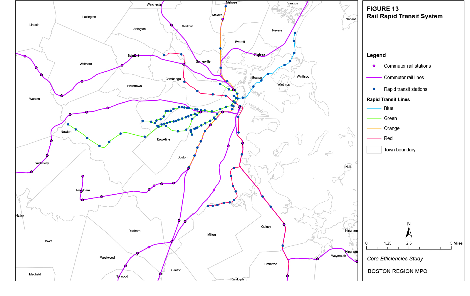
Figure 14
Directly-Operated Bus System Map
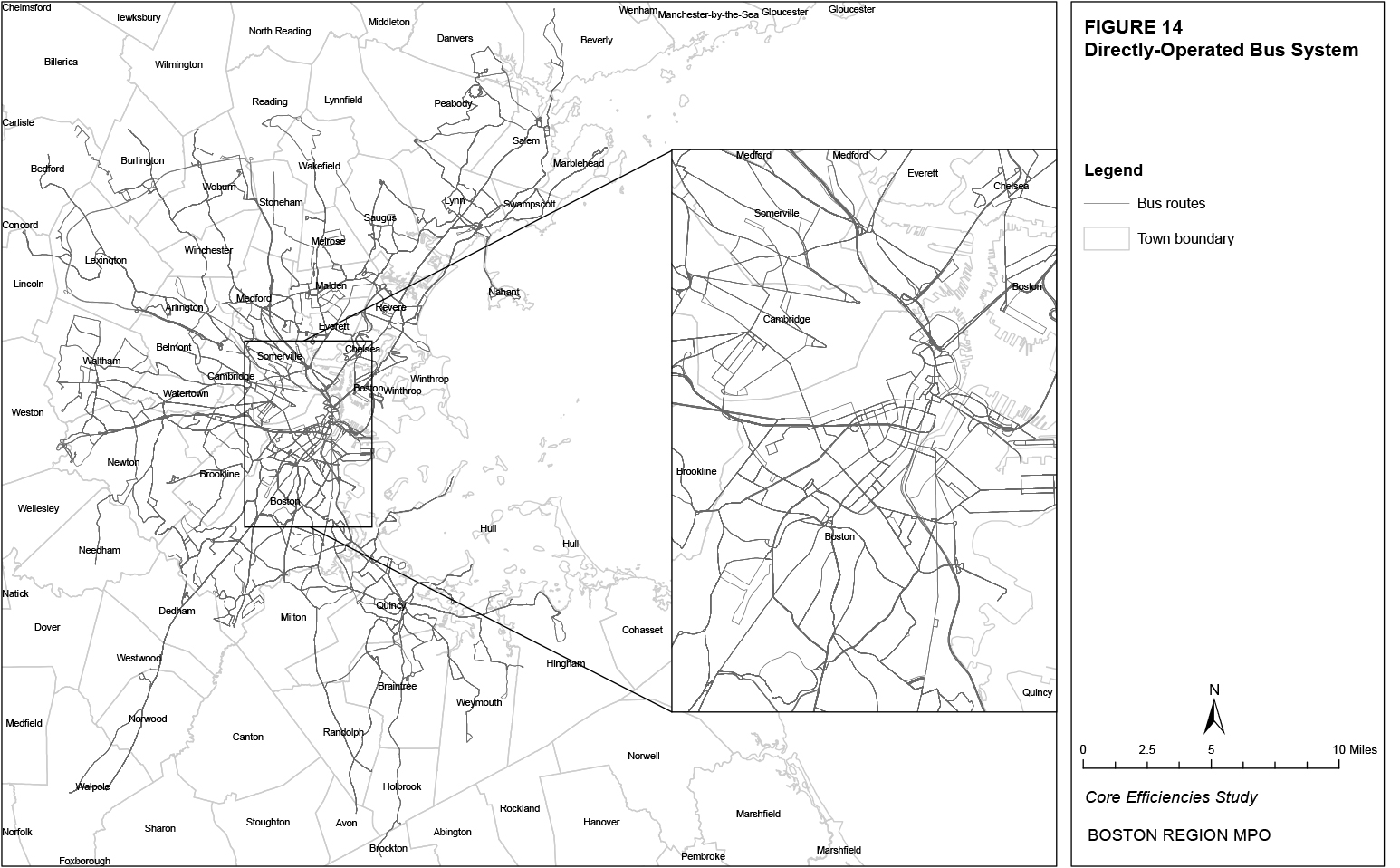
Alt text: Table 35: Bus Route Boardings (Typical Weekday) Pre-2000, Pre-2010, and 2030 and Percent Change 2000-2010 and 2010-2030. This table shows the typical weekday entries by bus route (column 1) in pre-2000 (column 2), pre-2010 (column 3), and projected for 2030 (column 5). Column 4 calculates the percent change between 1997 and 2009 and column 6 calculates the percent change between 2030 and 2009.
Figure 15 shows the trends in total modal ridership from the three sets of counts presented in previous sections. From the pre-2000 counts to the pre-2010 counts, all modes increased total ridership. The greatest percentage increase in ridership occurred on the Red Line (9%), followed by the Green Line central subway (8%), bus system (6%), Green Line surface (5%), Blue Line (5%), and Orange Line (<1%). The greatest absolute increase in ridership occurred on the bus system, followed by the Red Line, Green Line central subway, Green Line surface, Blue Line, and Orange Line. From the pre-2010 counts to the 2030 ridership projections (which are not constrained by transit vehicle capacity), the regional travel demand model set predicted growth across all modes. The greatest percentage increase in ridership is projected for the surface Green Line (39%), followed by the Red Line (31%), Green Line central subway (28%), bus system (18%), Orange Line (13%), and Blue Line (12%). The greatest absolute increase in ridership is projected for the bus system, followed by the Red Line, Green Line surface, Green Line central subway, Orange Line, and Blue Line.
Figure 15
Modal Ridership Trends
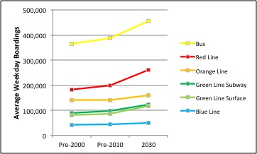
The study area generally includes towns that are either served by MBTA bus routes or rapid transit lines or lie within approximately one mile of these routes or lines and could be considered to be serviced by them. The study area includes all towns within the Interstate 95 loop around Boston as well as the towns just outside the loop, but does not extend to Interstate 495. Within the study area, towns are subdivided into neighborhoods where appropriate in order to define distinct travel areas, particularly with regard to potential transit trips. For instance, towns in the urban core such as Boston, Cambridge, and Somerville are divided into multiple neighborhoods while suburban towns such as Hingham, Needham, and Bedford are each considered as an entire neighborhood. Subsequent sections of this report refer to the neighborhoods defined in the following figures. Figures 16 and 17 show the neighborhoods within the southern and northern suburban sections of the study area, respectively. Figures 18 and 19 show the neighborhoods within the southern and northern urban-core sections of the study area, respectively. Table 36 lists the municipalities included in the study area and their respective neighborhoods, where relevant.
There are several demographic indicators that can be used to estimate the potential for transit usage; perhaps the most common is population density. Greater population densities are traditionally associated with more dense urban development. This density encourages a greater concentration of trip attractors such as jobs and services that can be accessed by means other than a private vehicle and thus encourages transit usage. The following sections discuss the existing ranges and forecasted changes of population densities, employment densities, and percentages of households with no vehicles, as well as the trip generators outside of Boston and Brookline that lie within a half-mile of any bus or rapid transit stop. Each of the maps shows the respective metric for the entire study area as well as for an inset zoomed in on the urban core, which includes neighborhoods in the towns of Arlington, Boston, Brookline, Cambridge, Chelsea, Everett, Malden, Medford, Milton, Quincy, Revere, Somerville, and Watertown. All existing and projected values for population, employment, and vehicle-ownership come from the Boston Region MPO’s travel demand model set. The distribution of trip generators is compiled from CTPS field surveys.
Figure 20 shows existing population density by transportation analysis zones (TAZs) in the study area. The TAZs with the greatest population densities (20,000 or more persons per square mile) are primarily located in Boston, Cambridge, and Somerville. Table 37 shows the 20 neighborhoods with the greatest average existing population densities, the average for the entire study area, and the percentage of the population within each neighborhood and the study area that falls into the five TAZ population-density categories shown in Figure 18. The distribution of population among these categories demonstrates the extent to which population density is consistent throughout the TAZs of each neighborhood. For example, population density in the South Allston neighborhood is uniform across its individual TAZs at 20,000 or more persons per square mile, while there are areas in the West End neighborhood with varying levels of population densities.
Table 37
Existing Population Density by Neighborhood (Top 20)
|
|
Percent of Population in TAZs with Population Density: |
||||
Neighborhood |
Average |
Under 2,500 |
2,500-4,999 |
5,000-9,999 |
10,000-19,999 |
20,000 and Over |
North End |
38,752 |
0% |
0% |
2% |
4% |
94% |
South Allston |
38,032 |
0% |
0% |
0% |
0% |
100% |
Chinatown |
34,561 |
0% |
0% |
4% |
8% |
87% |
Fenway |
34,492 |
0% |
1% |
0% |
8% |
91% |
South End |
29,859 |
0% |
1% |
1% |
12% |
86% |
BU |
28,102 |
0% |
0% |
0% |
0% |
100% |
Beacon Hill |
26,262 |
0% |
0% |
2% |
0% |
98% |
Central Square |
24,478 |
0% |
0% |
4% |
12% |
84% |
Back Bay |
23,453 |
0% |
6% |
2% |
8% |
83% |
Mission Hill |
21,729 |
0% |
3% |
5% |
8% |
84% |
North Brookline |
20,670 |
0% |
0% |
0% |
43% |
57% |
Longwood |
20,521 |
1% |
0% |
0% |
27% |
73% |
Spring Hill |
20,511 |
0% |
1% |
2% |
13% |
84% |
Davis Square |
20,307 |
0% |
0% |
0% |
20% |
80% |
Winter Hill |
20,291 |
0% |
0% |
0% |
17% |
83% |
Harvard Square |
20,236 |
0% |
1% |
7% |
22% |
70% |
South Brighton |
20,014 |
0% |
0% |
12% |
25% |
63% |
Chelsea |
18,862 |
0% |
0% |
5% |
21% |
74% |
South Boston |
16,796 |
0% |
7% |
12% |
3% |
78% |
West End |
15,128 |
1% |
2% |
19% |
12% |
66% |
Entire Study Area |
3,540 |
18% |
20% |
18% |
23% |
21% |
Within the top 20 neighborhoods, the three with the highest average population densities are the North End, South Allston, and Chinatown. Most TAZs within each of these neighborhoods have population densities of 20,000 and over, indicating that population density is relatively consistent across each neighborhood’s various TAZs. The three neighborhoods with the greatest percentage of population living in TAZs with a population density of 20,000 and over are South Allston, BU, and Beacon Hill. Across the entire study area, 21 percent of the population resides in TAZs with population densities of 20,000 and over and 44 percent resides in TAZs with population densities of 10,000 and over. However, 18 percent of the entire study area’s population resides in TAZs with population densities under 2,500. Therefore, while the population density of the top neighborhoods is highly concentrated, a significant portion of study area residents live in neighborhoods with lower population densities.
Table 36
Study Area Towns and Neighborhoods
| Town |
Neighborhood |
|---|---|
Abington |
Abington |
Arlington |
East Arlington |
- |
West Arlington |
Avon |
Avon |
Bedford |
Bedford |
Belmont |
North Belmont |
- |
South Belmont |
Beverly |
East Beverly |
- |
West Beverly |
Billerica |
Billerica |
Boston |
Back Bay |
- |
Beacon Hill |
- |
BU |
- |
Charlestown |
- |
Chinatown |
- |
Downtown |
- |
East Boston |
- |
Fenway |
- |
Harbor Islands |
- |
Hyde Park |
- |
Jamaica Plain |
- |
Logan Airport |
- |
Longwood |
- |
Mattapan |
- |
Mission Hill |
- |
North Allston |
- |
North Brighton |
- |
North Dorchester |
- |
North End |
- |
North Roxbury |
- |
Roslindale |
- |
South Allston |
- |
South Boston |
- |
South Brighton |
- |
South Dorchester |
- |
South End |
- |
South Roxbury |
- |
Waterfront |
- |
West End |
- |
West Roxbury |
Winthrop |
Winthrop |
Braintree |
North Braintree |
- |
South Braintree |
Brockton |
Brockton |
Brookline |
Chestnut Hill |
- |
North Brookline |
- |
South Brookline |
Burlington |
Burlington |
Cambridge |
Central Square |
- |
East Cambridge |
- |
Fresh Pond |
- |
Harvard Square |
- |
Kendall/MIT |
- |
North Cambridge |
Canton |
Canton |
Chelsea |
Chelsea |
Concord |
Concord |
Danvers |
North Danvers |
- |
South Danvers |
Dedham |
East Dedham |
- |
West Dedham |
Dover |
Dover |
Everett |
East Everett |
- |
West Everett |
Hingham |
Hingham |
Holbrook |
Holbrook |
Hull |
Hull |
Lexington |
East Lexington |
- |
West Lexington |
Lincoln |
Lincoln |
Lynn |
East Lynn |
- |
West Lynn |
Lynnfield |
Lynnfield |
|
|
- |
West Malden |
Marblehead |
Marblehead |
Medfield |
Medfield |
Medford |
East Medford |
- |
Medford Hillside |
- |
North Medford |
- |
South Medford |
- |
West Medford/Medford Square |
Melrose |
Melrose |
Milton |
North Milton |
- |
South Milton |
Nahant |
Nahant |
Needham |
Needham |
Newton |
North Newton |
- |
South Newton |
Norwood |
Norwood |
Peabody |
North Peabody |
- |
South Peabody |
Quincy |
North Quincy |
- |
South Quincy |
Randolph |
Randolph |
Reading |
Reading |
Revere |
East Revere |
- |
West Revere |
Salem |
North Salem |
- |
West Salem |
Saugus |
North Saugus |
- |
South Saugus |
Sharon |
Sharon |
Somerville |
Davis Square |
- |
East Somerville |
- |
Spring Hill |
- |
Winter Hill |
Stoneham |
Stoneham |
Stoughton |
Stoughton |
Swampscott |
Swampscott |
Wakefield |
Wakefield |
Walpole |
Walpole |
Waltham |
North Waltham |
- |
South Waltham |
Watertown |
East Watertown |
- |
West Watertown |
Wellesley |
Wellesley |
Wenham |
Wenham |
Weston |
Weston |
Westwood |
Westwood |
Weymouth |
North Weymouth |
- |
South Weymouth |
Wilmington |
Wilmington |
Winchester |
Winchester |
Winthrop |
Winthrop |
Woburn |
East Woburn |
- |
West Woburn |
Holbrook |
Holbrook |
Hull |
Hull |
Lexington |
East Lexington |
Figure 16
Study Area Neighborhoods: Suburban South
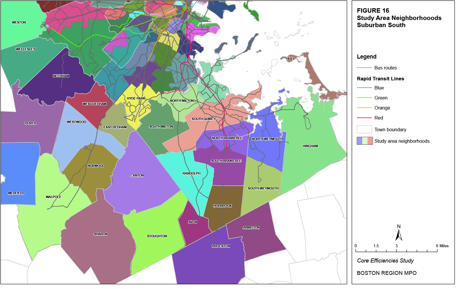
Figure 17
Study Area Neighborhoods: Suburban North
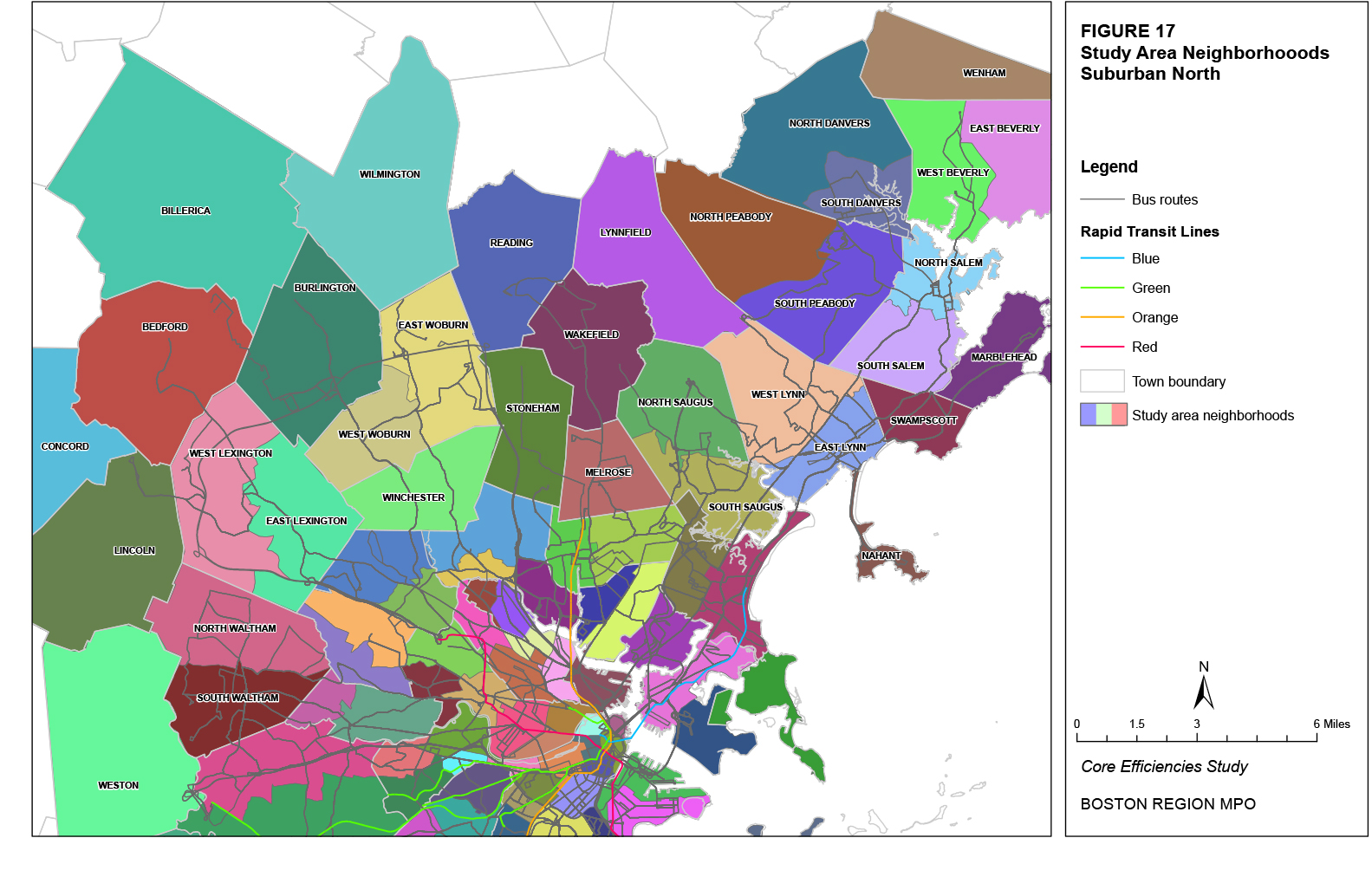
Figure 18
Study Area Neighborhoods: City South
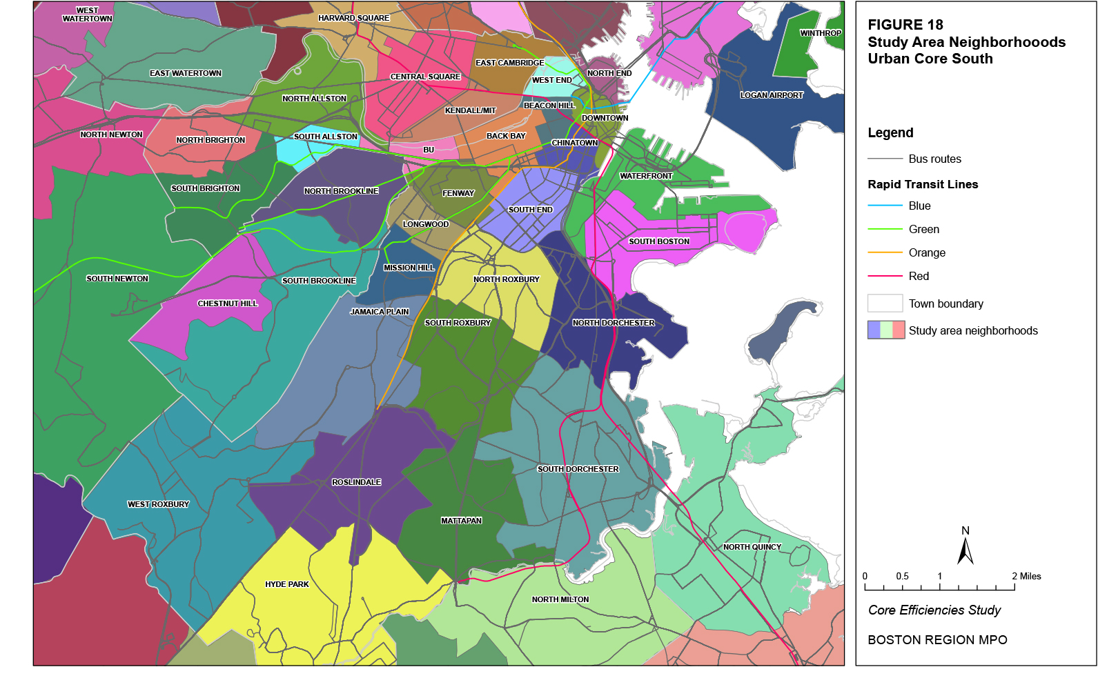
Figure 19
Study Area Neighborhoods: City North
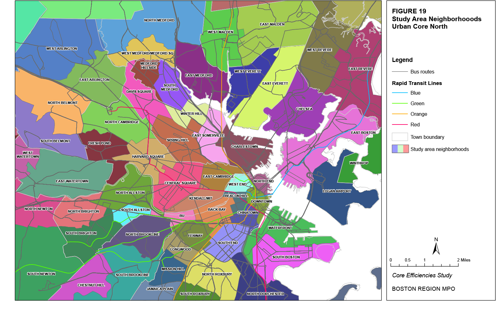
Figure 20
Population Density, Existing
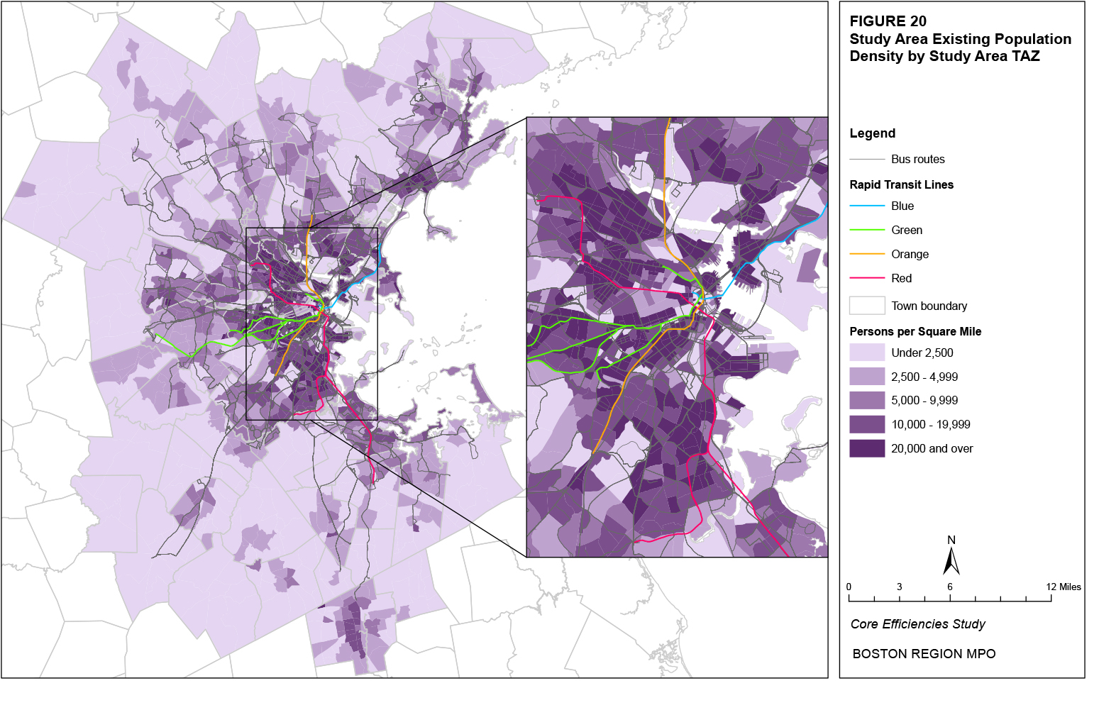
Figure 21 shows the projected 2030 changes in population by TAZ across the study area and Table 38 shows the 20 neighborhoods with the greatest projected percent changes in population as well as the projected average percent change across the entire study area. As shown in the figure, most TAZs are projected to have an increase in population by 2030. A percentage increase between 0 percent and 10 percent is projected for a majority (56 percent) of all TAZs while a decrease in population is projected for 15 percent of all TAZs. The projected population decreases are located throughout the study area but largely outside the more urban areas, in which they represent a minority of neighborhood TAZs except for Somerville. As shown in the table, the neighborhoods with the top 20 projected percentage increases in population are located primarily in Boston, but also in Cambridge, Somerville, Medford, Burlington, Lexington, Dedham, Malden, and Chelsea. The list of the top 20 projected absolute increases in population includes a greater number of suburban towns. The entire projected population increase across the entire study area is 7.6 percent and 200,254 residents.
Figure 21
Projected Population Change
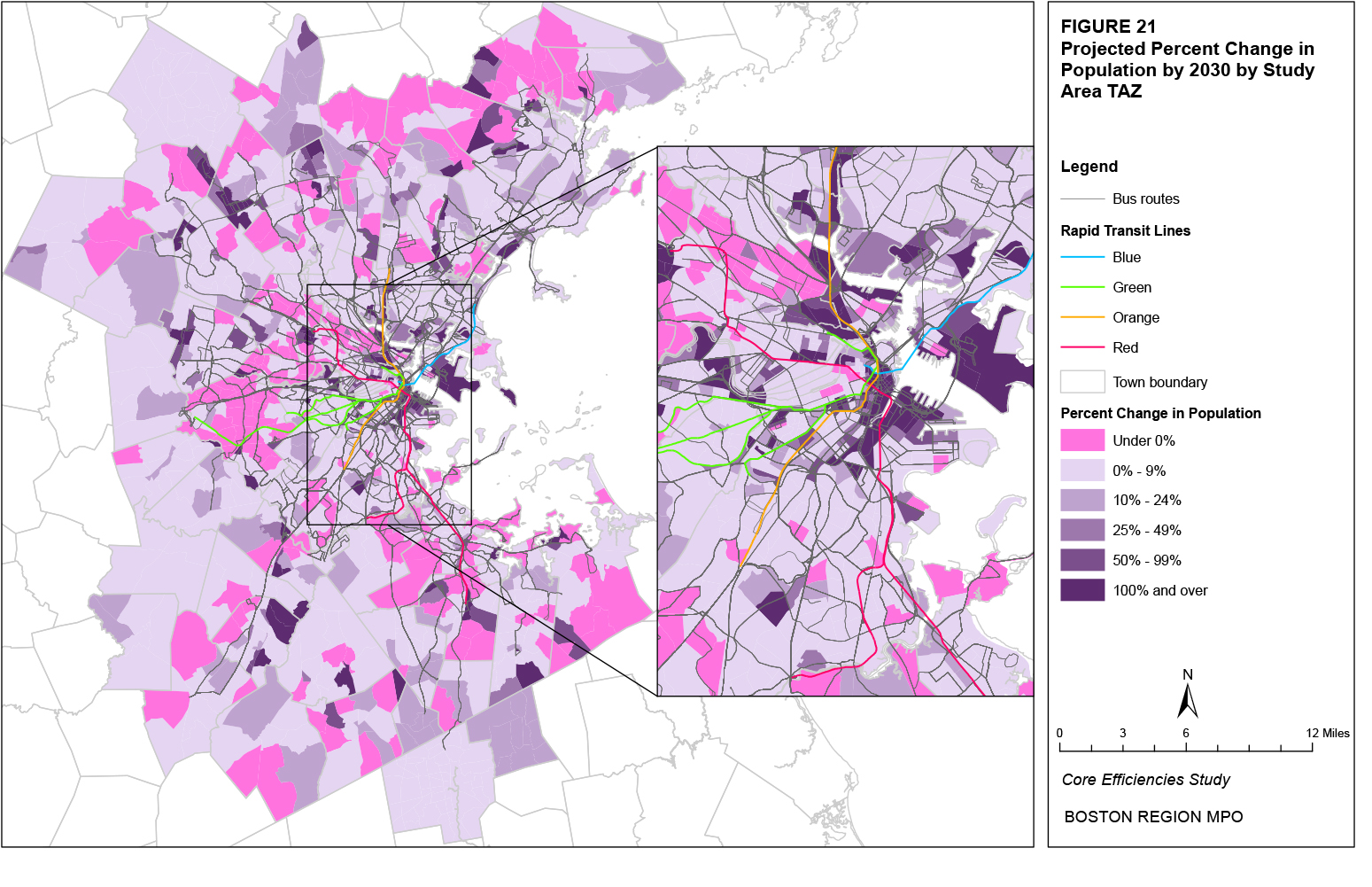
Table 38
Projected Population Increases by Neighborhood (Top 20)
Top 20 Percent Increases |
Top 20 Absolute Increases |
||||
Neighborhood |
% Change |
# Change |
Neighborhood |
% Change |
# Change |
North Allston |
523.1% |
1,584 |
Waterfront |
13,028 |
125.0% |
Logan Airport |
175.0% |
28 |
East Lynn |
7,806 |
15.0% |
Downtown |
133.1% |
2,666 |
Chinatown |
7,555 |
87.3% |
Waterfront |
125.0% |
13,028 |
Brockton |
6,465 |
6.7% |
East Somerville |
90.2% |
3,787 |
East Cambridge |
6,314 |
52.6% |
Chinatown |
87.3% |
7,555 |
Chelsea |
5,510 |
36.2% |
Charlestown |
68.5% |
1,728 |
East Boston |
5,391 |
32.7% |
Kendall/MIT |
67.1% |
851 |
Fenway |
4,056 |
28.5% |
Longwood |
61.4% |
1,450 |
East Somerville |
3,787 |
90.2% |
West End |
56.5% |
1,218 |
North Cambridge |
3,770 |
53.9% |
East Medford |
55.5% |
1,775 |
South Weymouth |
3,662 |
29.3% |
North Cambridge |
53.9% |
3,770 |
Hingham |
3,130 |
17.7% |
East Cambridge |
52.6% |
6,314 |
South Quincy |
3,019 |
16.9% |
Burlington |
51.2% |
1,636 |
South End |
2,989 |
34.9% |
BU |
47.8% |
1,455 |
Stoughton |
2,935 |
17.3% |
Back Bay |
42.7% |
1,767 |
Abington |
2,907 |
17.4% |
West Lexington |
42.2% |
485 |
Mattapan |
2,829 |
13.0% |
West Dedham |
38.9% |
1,363 |
Randolph |
2,775 |
8.9% |
West Malden |
38.4% |
2,697 |
West Malden |
2,697 |
38.4% |
Chelsea |
36.2% |
5,510 |
Downtown |
2,666 |
133.1% |
Entire Study Area |
7.6% |
200,524 |
Entire Study Area |
200,524 |
7.6% |
While some of the largest percentage increases in population are projected for TAZs in Boston, these TAZs tend have lower existing population densities compared to others in Boston. Indeed, there appears to be a generally negative correlation between population density and projected population change. Figure 22 presents a scatter plot of the two variables, omitting outliers. As shown in the figure, the largest percentage increases tend to occur in TAZs with lower existing population densities, particularly in the neighborhoods that already have a high population density. This indicates that an increasing study-area population is largely expected to move to neighborhoods with lower-existing population densities, pushing those densities upward and making population density more uniform in already high-density neighborhoods in 2030.
Figure 22
Comparison of Population Density and
Projected Percent Change in Population
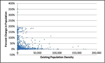
Figure 23 shows existing employment density by TAZ in the study area. Employment density is more concentrated than population density both in terms of location and level. Table 39 shows the 20 neighborhoods with the greatest average existing employment densities, the average for the entire study area, and the percentage of the jobs within each neighborhood and the study area that fall into the six TAZ employment-density categories shown in Figure 23. The distribution of jobs among these categories demonstrates the extent to which employment density is consistent throughout the TAZs of each neighborhood. For example, employment density in the Downtown neighborhood is practically uniform across its individual TAZs at 100,000 or more jobs per square mile, while areas in the South End neighborhood have a much greater variation in employment densities.
Within the top 20 neighborhoods, the three with the highest average employment densities are Downtown, Chinatown, and the West End. Only five neighborhoods have a majority of TAZs with employment densities of 100,000 and over. Among most of the top 20 neighborhoods, the largest job percentages are located in TAZs with a 20,000─100,000 employment-density range. This indicates that high employment density is consistent in only a few neighborhoods. The three neighborhoods with the greatest percentage of jobs located in TAZs with an employment density of 100,000 and over are also Downtown, Chinatown, and the West End.
Across the entire study area, 20 percent of the jobs are located in TAZs with employment densities of 100,000 or more and 35 percent in TAZs with employment densities of 20,000 or more. However, 19 percent of the entire study area’s jobs resides in TAZs with employment densities under 2,000 and the greatest percentage of jobs, 30 percent, are located in TAZs with employment densities between 5,000 and 20,000. These TAZs are located throughout the study area, indicating that despite high employment densities in certain neighborhoods, a significant portion of jobs exists outside of the traditional central business district.
Table 39
Existing Employment Density by Neighborhood (Top 20)
|
|
Percent of Jobs in TAZs with Employment Density: |
|||||
Neighborhood |
Average |
Under 1,000 |
1,000-1,999 |
2,000-4,999 |
5,000-19,999 |
20,000-99,999 |
100,000 and Over |
Downtown |
332,280 |
0% |
0% |
0% |
0% |
1% |
99% |
Chinatown |
126,735 |
0% |
0% |
0% |
1% |
18% |
81% |
West End |
88,024 |
0% |
0% |
0% |
9% |
4% |
87% |
Back Bay |
69,499 |
0% |
0% |
1% |
3% |
15% |
80% |
Longwood |
66,684 |
0% |
0% |
1% |
3% |
31% |
66% |
North End |
34,059 |
0% |
0% |
1% |
6% |
93% |
0% |
Fenway |
30,248 |
0% |
0% |
1% |
11% |
89% |
0% |
Kendall/MIT |
29,677 |
0% |
0% |
6% |
1% |
93% |
0% |
East Cambridge |
25,693 |
0% |
0% |
0% |
24% |
57% |
19% |
South End |
23,232 |
0% |
0% |
3% |
21% |
28% |
47% |
Harvard Square |
19,300 |
1% |
0% |
4% |
20% |
61% |
15% |
BU |
18,644 |
0% |
0% |
0% |
33% |
67% |
0% |
Waterfront |
18,489 |
0% |
0% |
4% |
30% |
27% |
39% |
Central Square |
15,964 |
0% |
1% |
5% |
29% |
46% |
18% |
Beacon Hill |
13,030 |
2% |
0% |
6% |
23% |
70% |
0% |
South Allston |
12,995 |
0% |
0% |
9% |
40% |
51% |
0% |
Charlestown |
11,206 |
0% |
2% |
7% |
39% |
52% |
0% |
Mission Hill |
10,095 |
1% |
0% |
14% |
24% |
61% |
0% |
North Cambridge |
8,691 |
1% |
1% |
12% |
47% |
39% |
0% |
North Dorchester |
8,454 |
1% |
2% |
12% |
53% |
33% |
0% |
Entire Study Area |
2,091 |
11% |
8% |
15% |
30% |
15% |
20% |
Figure 24 shows the projected 2030 changes in employment by TAZ across the study area and Table 40 shows the 20 neighborhoods with the greatest projected percent changes in employment as well as the projected average percent change across the entire study area. As shown in the figure, there are a number of TAZs that are projected to have a decrease in jobs by 2030. A percentage decrease is projected for almost a majority (43 percent) of all TAZs while an increase between 0 and 10 percent in jobs is projected for 38 percent of all TAZs. The projected job decreases are located throughout the study area.
As shown in the table, there is greater geographic distribution in the neighborhoods with the top 20 projected percentage increases in employment compared to population. East Somerville has the largest projected employment percentage increase, and Boston and Cambridge neighborhoods make up several of the top 20, but several suburban towns and neighborhoods also have large projected increases in employment. As is the case with population density, several more suburban towns and neighborhoods are in the list of the top 20 absolute increases in projected jobs. The projected employment increase across the entire study area is 8.0 percent and 124,821 jobs.
Figure 23
Employment Density, Existing
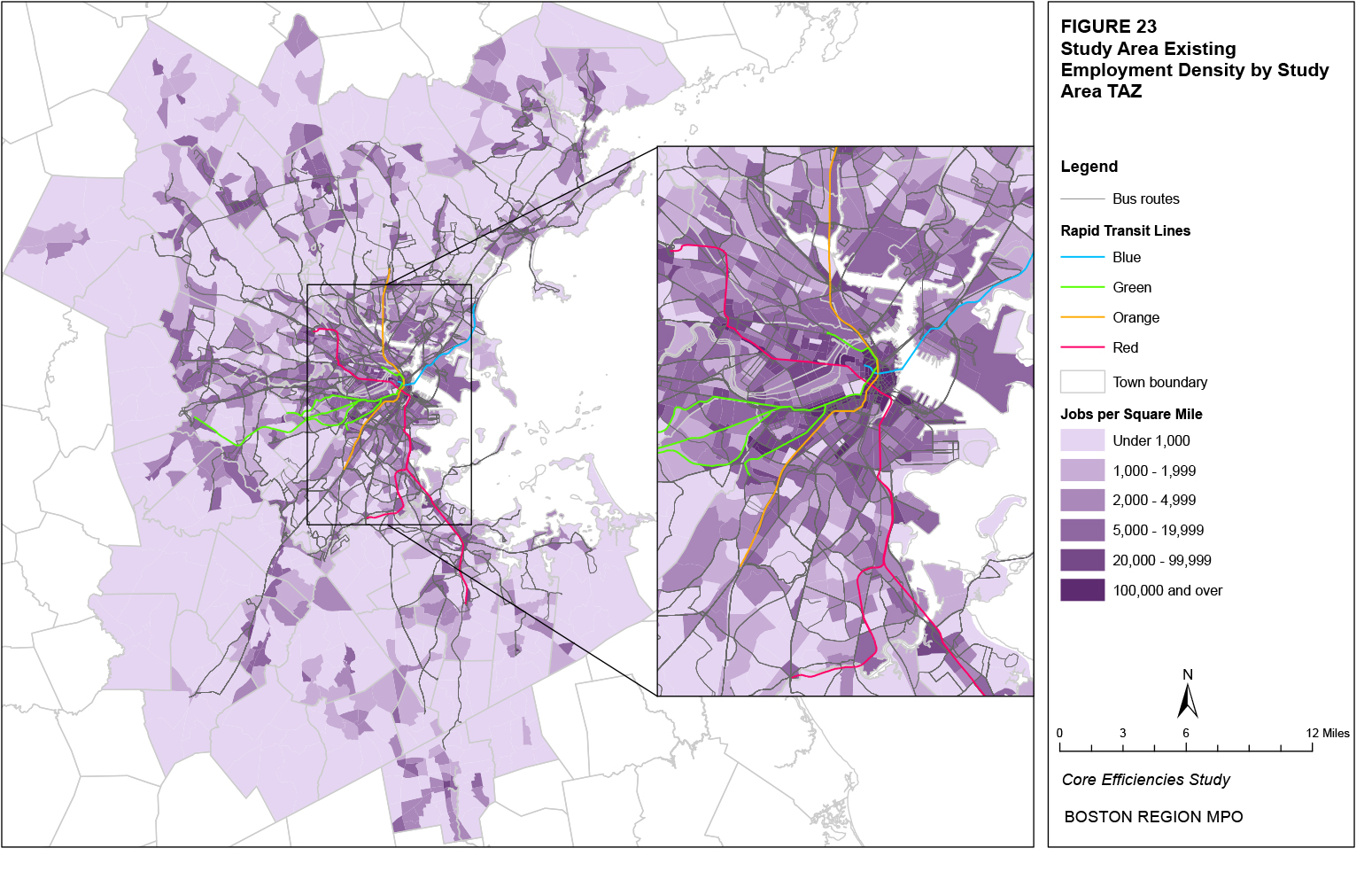
Figure 24
Projected Employment Change
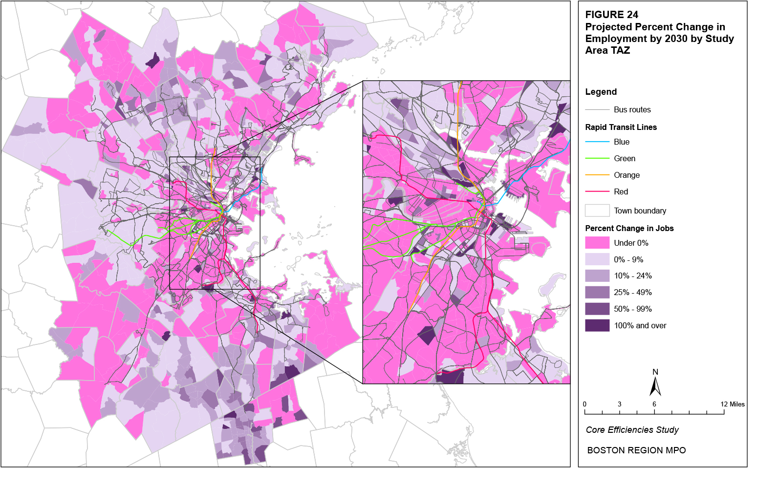
Table 40
Projected Employment Increases by Neighborhood (Top 20)
Top 20 Percent Increases |
Top 20 Absolute Increases |
||||
Neighborhood |
% Change |
# Change |
Neighborhood |
% Change |
# Change |
East Somerville |
1219.4% |
6,266 |
Waterfront |
13,955 |
114.6% |
South Weymouth |
174.9% |
2,996 |
Downtown |
7,660 |
8.0% |
North Allston |
160.8% |
4,480 |
Brockton |
7,013 |
24.4% |
Waterfront |
114.6% |
13,955 |
East Somerville |
6,266 |
1219.4% |
West End |
90.9% |
3,416 |
Longwood |
5,762 |
19.4% |
South Quincy |
30.1% |
2,523 |
North Allston |
4,480 |
160.8% |
Medford Hillside |
29.4% |
170 |
East Woburn |
4,399 |
16.1% |
South End |
29.4% |
3,144 |
East Cambridge |
3,897 |
19.0% |
Mission Hill |
29.3% |
1,207 |
West End |
3,416 |
90.9% |
East Revere |
29.1% |
1,824 |
Burlington |
3,393 |
10.0% |
Brockton |
24.4% |
7,013 |
Westwood |
3,267 |
15.3% |
Avon |
23.8% |
960 |
South End |
3,144 |
29.4% |
West Revere |
23.5% |
625 |
Back Bay |
3,078 |
3.0% |
North Milton |
22.4% |
265 |
South Weymouth |
2,996 |
174.9% |
Kendall/MIT |
22.4% |
819 |
Central Square |
2,871 |
7.5% |
Charlestown |
20.5% |
2,468 |
Stoughton |
2,570 |
17.7% |
Longwood |
19.4% |
5,762 |
South Quincy |
2,523 |
30.1% |
East Cambridge |
19.0% |
3,897 |
Charlestown |
2,468 |
20.5% |
Stoughton |
17.7% |
2,570 |
Wilmington |
2,458 |
14.9% |
East Woburn |
16.1% |
4,399 |
Chinatown |
2,114 |
3.9% |
Entire Study Area |
8.0% |
124,821 |
Entire Study Area |
124,821 |
8.0% |
While some of the largest percentage increases in employment are projected for TAZs in Boston, these TAZs tend have lower existing employment densities compared to others in Boston. Indeed, there appears to be a generally negative correlation between employment density and projected change in jobs. Figure 25 presents a scatter plot of the two variables, omitting outliers. As shown in the figure, the largest percentage increases tend to occur in TAZs with lower existing employment densities. When considering Figures 23 and 24 and Table 40, it appears that employment, which is already more concentrated in certain TAZs and neighborhoods than population, will also grow in a very concentrated manner, with relatively fewer TAZs experiencing employment growth. However, as is the case with population, much of this growth is projected to occur in TAZs with relatively lower employment densities compared to the surrounding TAZs.
Figure 25
Comparison of Employment Density and
Projected Percent Change in Jobs
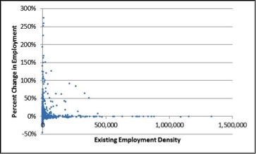
Figures 26 and 27 show the number and percentage, respectively, of households in each TAZ that own no vehicles. Table 41 shows the 20 neighborhoods with the greatest number and percentage of zero-vehicle households as well as the total number and average percentage of zero-vehicle households across the entire study area with the percentage weighted by total number of all households by TAZ. Many of these zero-vehicle households likely depend on transit for their mobility needs. Therefore, TAZs with large numbers or concentrations of zero-vehicle households traditionally have a significant demand for transit. Both figures and the table show that the neighborhoods with the greatest numbers and percentages of zero-vehicle households are primarily located in Boston. Within the top 20 neighborhoods, the three with the highest number of zero-vehicle households are East Boston, South Dorchester, and Brockton and the three with the highest percentage of zero-vehicle households are the West End, Chinatown, and Fenway.
Figure 26
Number of Zero-Vehicle Households, Existing
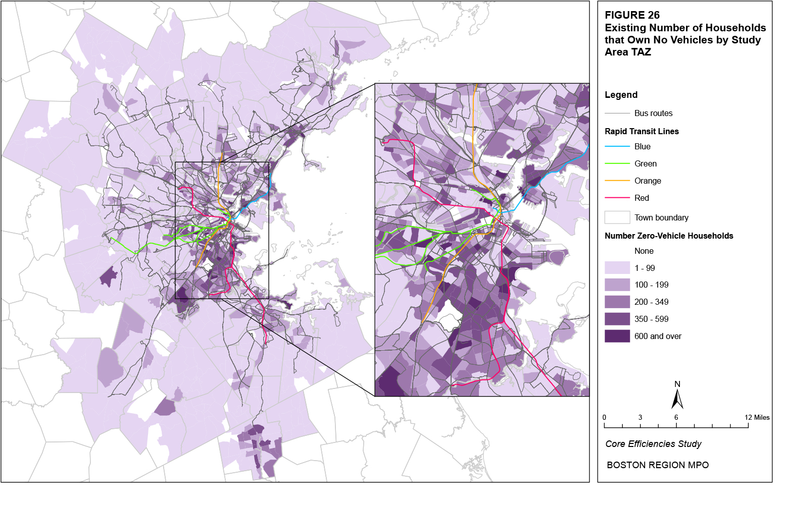
Figure 27
Percentage of Zero-Vehicle Households, Existing
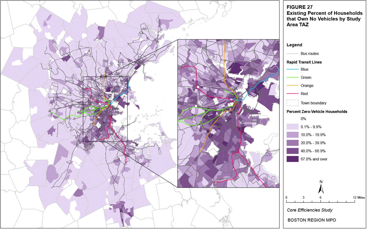
Table 41
Existing Number and Percent of Zero-Vehicle Households by Neighborhood (Top 20)
Neighborhood |
Number |
Neighborhood |
Percent |
East Boston |
7,300 |
West End |
75.0% |
South Dorchester |
7,054 |
Chinatown |
74.7% |
Brockton |
6,671 |
Fenway |
60.7% |
South Roxbury |
6,036 |
Longwood |
60.6% |
East Lynn |
5,981 |
BU |
58.6% |
Fenway |
5,586 |
Downtown |
57.9% |
South End |
5,517 |
East Boston |
50.2% |
Mattapan |
4,280 |
Logan Airport |
49.9% |
Central Square |
4,279 |
North Roxbury |
48.7% |
Chinatown |
4,274 |
South Roxbury |
46.4% |
North Dorchester |
4,271 |
South End |
44.6% |
South Quincy |
4,146 |
North Dorchester |
44.4% |
South Boston |
4,106 |
Mission Hill |
43.0% |
Chelsea |
4,034 |
Waterfront |
40.7% |
Hyde Park |
3,915 |
Back Bay |
40.4% |
North Roxbury |
3,817 |
Mattapan |
34.7% |
South Brighton |
3,681 |
North Allston |
33.6% |
North Brookline |
3,590 |
Chelsea |
33.0% |
Back Bay |
3,422 |
Harvard Square |
31.9% |
East Revere |
3,417 |
Charlestown |
31.7% |
Entire Study Area |
214,028 |
Entire Study Area |
12.2% |
Figure 28 shows the projected 2030 changes in the number of zero-vehicle households by TAZ across the study area and Table 42 shows the 20 neighborhoods with the greatest projected absolute and percentage changes in zero-vehicle households as well as the projected average percentage change across the entire study area. As shown in the figure, most TAZs are projected to have an increase in zero-vehicle households by 2030. A percentage increase between 0 and 20 percent is projected for almost a majority (49 percent) of all TAZs while an increase between 20 and 50 percent in zero-vehicle households is projected for 26 percent of all TAZs. Only 4 percent of TAZs are projected to have a decrease in the number of zero-vehicle households. The projected increases are located throughout the study area with the greatest percentage increases located in the urban core. As shown in the table, Logan Airport has the largest projected percentage increase in zero-vehicle households (because its rounded absolute change of six is more than three times its small existing number of two), with Boston and Cambridge neighborhoods making up several of the top 20, but several suburban towns and neighborhoods also have large projected percentage increases. Most of the neighborhoods in the list of the top 20 absolute increases in zero-vehicle households are in the urban core. The entire projected increase in zero-vehicle households across the entire study area is 21.6 percent and 40,245 households.
Table 42
Projected Increases in Zero-Vehicle Households by Neighborhood (Top 20)
Top 20 Percent Increases |
Top 20 Absolute Increases |
||||
Neighborhood |
% Change |
# Change |
Neighborhood |
% Change |
# Change |
Logan Airport |
215.8% |
6 |
Chinatown |
3,991 |
125.2% |
Downtown |
182.3% |
1,495 |
Waterfront |
3,434 |
176.4% |
Waterfront |
176.4% |
3,434 |
East Boston |
2,266 |
37.6% |
West End |
127.4% |
915 |
East Cambridge |
1,978 |
87.8% |
Chinatown |
125.2% |
3,991 |
East Lynn |
1,791 |
16.1% |
East Somerville |
111.2% |
835 |
Fenway |
1,587 |
47.6% |
East Cambridge |
87.8% |
1,978 |
Downtown |
1,495 |
182.3% |
East Medford |
87.0% |
168 |
South End |
1,243 |
48.9% |
Longwood |
84.9% |
360 |
Back Bay |
1,189 |
59.4% |
Charlestown |
82.6% |
330 |
East Revere |
1,138 |
33.1% |
Bedford |
81.7% |
84 |
South Quincy |
1,064 |
38.3% |
Kendall/MIT |
75.9% |
79 |
West End |
915 |
127.4% |
Westwood |
68.8% |
194 |
West Malden |
864 |
59.2% |
BU |
66.5% |
53 |
East Somerville |
835 |
111.2% |
West Dedham |
66.3% |
120 |
Mattapan |
766 |
25.4% |
South Braintree |
66.1% |
154 |
Chelsea |
683 |
47.0% |
North Cambridge |
65.5% |
485 |
Spring Hill |
566 |
21.1% |
Burlington |
60.9% |
298 |
North End |
552 |
51.3% |
Back Bay |
59.4% |
1,189 |
Central Square |
502 |
21.0% |
West Malden |
59.2% |
864 |
North Cambridge |
485 |
65.5% |
Entire Study Area |
21.6% |
40,245 |
Entire Study Area |
40,245 |
21.6% |
When comparing the figures of the existing percentage to the percentage change in zero-vehicle households, it does appear that the greatest percentage increases typically occur in those TAZs that do not have the greatest existing percentages, particularly in the urban core. Similarly, TAZs with the greatest existing percentages of zero-vehicle households appear to have lower percentage increases. However, a stronger correlation appears to exist between the percentage change in zero-vehicle households and the percentage change in population.
Figure 28
Projected Change in Zero-Vehicle Households
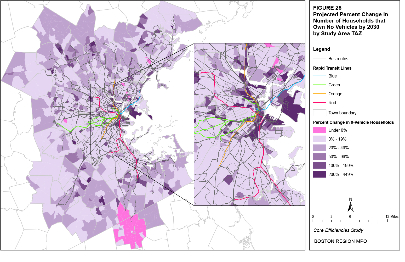
Figure 29 presents a scatter plot of the projected percentage changes in population and zero-vehicle households, omitting outliers. As shown in the figure, the larger percentage increases in zero-vehicle households tend to occur in TAZs with larger percentage increases in population.
Figure 29
Comparison of Projected Percent Change in Population
and Zero-Vehicle Households
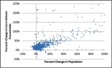
Locations that are responsible for a large number of trips, either through attraction (such as a shopping center) or generation (such as an apartment complex), are also potential indicators for transit usage, as, at least at one trip end, origins or destinations are concentrated. CTPS has compiled a listing of trip generators for all towns in the Boston metropolitan area except for Boston and Brookline. These generators, along with which ones are located within 0.5 miles of a transit stop or station, are shown in Figure 30. As shown in the figure, practically all trip generators located within the urban core lie within 0.5 miles of transit.
The neighborhoods with the greatest existing and projected population and employment densities and number of zero-vehicle households are largely located in or near downtown Boston. East Cambridge, East Somerville, and Waterfront appear among the 20 neighborhoods with the greatest projected increases in population, employment, and zero-vehicle households. Other neighborhoods such as Chelsea, Chinatown, Downtown, East Boston, and Longwood also appear on at least two of these lists. Several of these neighborhoods, such as Chinatown, Downtown, and Longwood, already have the greatest existing population and employment densities and number of zero-vehicle households, along with neighborhoods such as BU, Fenway, Harvard Square, and North Dorchester.
The Boston Region MPO travel demand model set can estimate the volume of daily trips originating from and destined for each TAZ in the study area as well as the number of origin-destination pairings between any two TAZs. The model provides existing figures for daily trips as well as projections based on assumed changes to the model inputs for prices, trip times, and land use, among others. Existing (2009) and projected (2030) trip origins, destinations, and origin-destination pairings are used in this report to chart where trips are occurring and which trips could potentially be served by transit.
Existing trip origins and destinations are shown in Figures 31 and 32, and Table 43 shows the 20 neighborhoods with the greatest number of origins and destinations. As shown in the figures and table, many neighborhoods with the greatest number of origins lie in the urban core, despite the fact that many towns outside the core are not split into multiple neighborhoods. Indeed, when looking at the total number of origins by town, Boston clearly has the greatest number, nearly five times greater than that of Cambridge, followed by Quincy, Newton, Lynn, and Somerville. This concentration of trips also characterizes destinations. The Downtown neighborhood of Boston is clearly the greatest destination.
In addition to identifying the number of all origin and destination trips for each neighborhood, it is possible to combine the two datasets and estimate the number of trips between any two neighborhoods. The most frequent existing origin-destination pairs are primarily those with the same origin and destination, that is, intra-neighborhood trips. These trips make up nearly one-third of all existing trips. Table 44 lists the top 20 origin-destination trip pairs, all of which are intra-neighborhood trips, as well as the percentage that each trip pair represents of the respective neighborhood’s total origins and destinations. For instance,
Figure 30
Trip Generators within 0.5 Miles of Transit
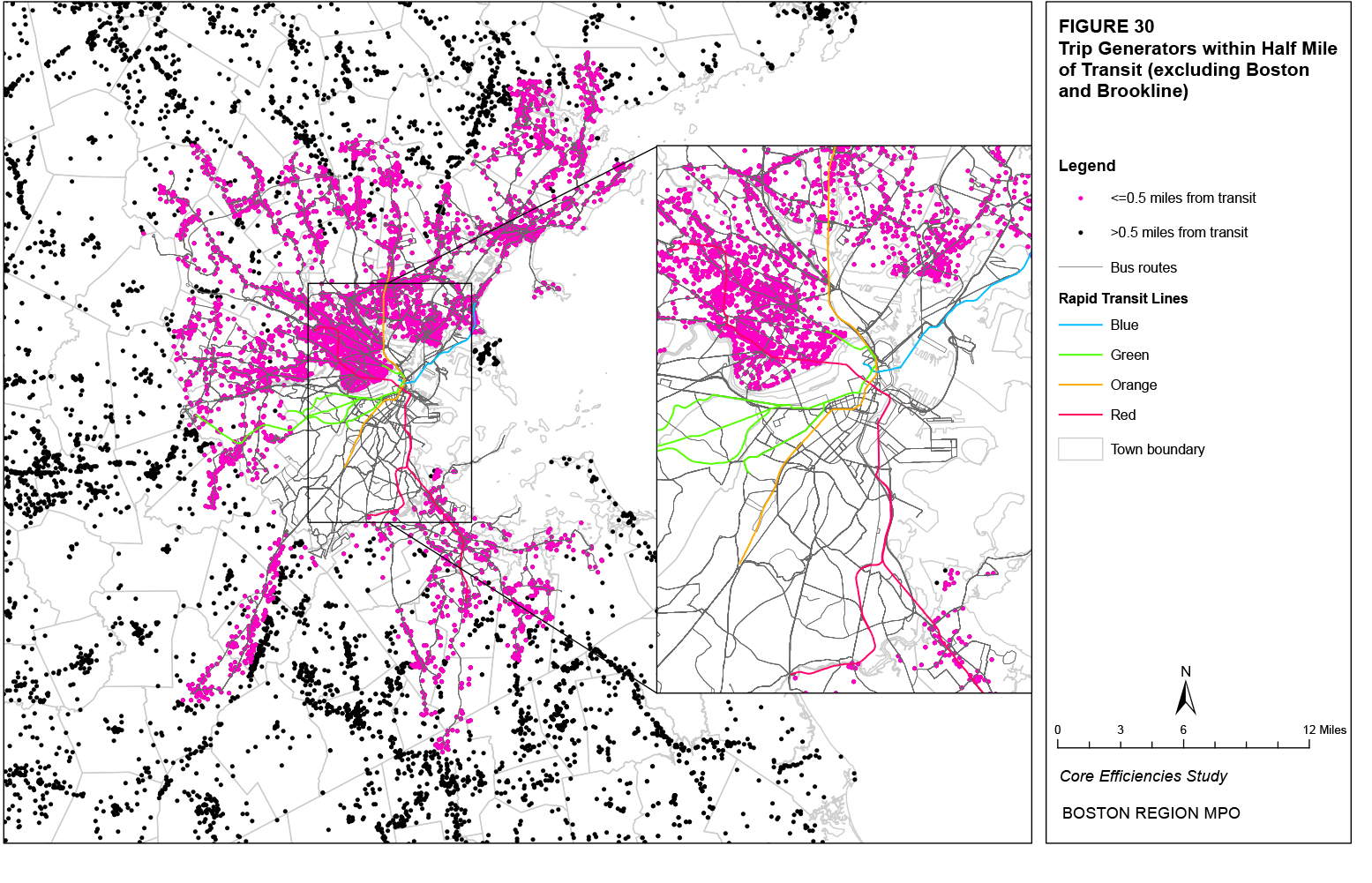
Figure 31
Existing Trip Origins
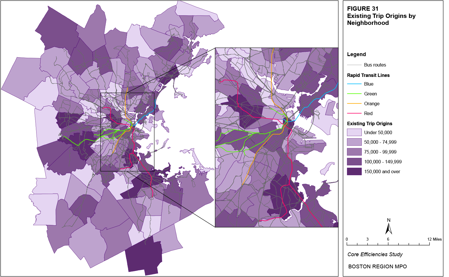
Figure 32
Existing Trip Destinations
Table 43
Existing Origin and Destination Trips by Neighborhood (Top 20)
Neighborhood |
Origins |
Neighborhood |
Destinations |
Brockton |
240,739 |
Downtown |
351,793 |
South Dorchester |
197,718 |
Back Bay |
238,553 |
South Quincy |
193,530 |
Brockton |
212,598 |
Downtown |
189,755 |
Harvard Square |
210,901 |
South Newton |
184,791 |
South Newton |
210,818 |
East Lynn |
164,879 |
South Quincy |
186,674 |
Harvard Square |
158,653 |
Chinatown |
171,087 |
South Waltham |
149,436 |
Fenway |
166,385 |
Central Square |
146,178 |
Burlington |
150,026 |
Back Bay |
145,761 |
Longwood |
149,177 |
Fenway |
139,110 |
South Waltham |
148,810 |
Chelsea |
129,573 |
Central Square |
148,675 |
North Quincy |
129,271 |
East Lynn |
146,379 |
East Boston |
126,010 |
South End |
137,137 |
South End |
125,446 |
South Dorchester |
133,362 |
North Newton |
122,748 |
East Woburn |
131,419 |
Chinatown |
115,549 |
North Newton |
120,854 |
Hyde Park |
113,836 |
Kendall/MIT |
120,120 |
Burlington |
111,708 |
South Peabody |
114,571 |
North Brookline |
110,482 |
North Braintree |
114,385 |
the largest number of origin-destination trip pairs occurs with intra-Brockton travel and these trips represent 65 percent of Brockton’s total trip origins and 73 percent of Brockton’s total trip destinations. By comparison, the second largest number of origin-destination trip pairs occurs with trips beginning and ending within the Downtown neighborhood of Boston. These trips represent 53 percent of Downtown’s total trip origins and 29 percent of Downtown’s total trip destinations. When comparing Brockton to the Downtown neighborhood, therefore, it is apparent that a much greater percentage of trips destined for Downtown are originating from different neighborhoods, while the largest percentage of Brockton origin-destination trip pairs are intra-Brockton trips.
Table 44
Existing Origin-Destination Trip Pairs by Pair (Top 20)
Number of Trips in the Origin-Destination Pair, Percent of All Trips from the Origin, and Percent of All Trips to the Destination
Neighborhood |
Number of Trips |
Percent of Trips |
||
Origin |
Destination |
From Origin* |
To Destination** |
|
Brockton |
Brockton |
156,109 |
64.8% |
73.4% |
Downtown |
Downtown |
100,314 |
52.9% |
28.5% |
East Lynn |
East Lynn |
86,899 |
52.7% |
59.4% |
South Quincy |
South Quincy |
81,324 |
42.0% |
43.6% |
Harvard Square |
Harvard Square |
75,209 |
47.4% |
35.7% |
South Waltham |
South Waltham |
70,583 |
47.2% |
47.4% |
Back Bay |
Back Bay |
67,918 |
46.6% |
28.5% |
South Newton |
South Newton |
66,458 |
36.0% |
31.5% |
Burlington |
Burlington |
57,601 |
51.6% |
38.4% |
South Dorchester |
South Dorchester |
49,159 |
24.9% |
36.9% |
Longwood |
Longwood |
48,571 |
47.5% |
32.6% |
Norwood |
Norwood |
46,435 |
46.0% |
41.2% |
Needham |
Needham |
46,276 |
47.7% |
47.2% |
North Quincy |
North Quincy |
46,155 |
35.7% |
41.2% |
Central Square |
Central Square |
42,994 |
29.4% |
28.9% |
East Boston |
East Boston |
42,877 |
34.0% |
48.7% |
Wellesley |
Wellesley |
42,392 |
50.0% |
48.9% |
South End |
South End |
41,867 |
33.4% |
30.5% |
South Peabody |
South Peabody |
41,415 |
39.4% |
36.1% |
Billerica |
Billerica |
39,949 |
46.7% |
53.6% |
* Percent of trips from origin represents the number of trips in each origin-destination pair divided by all trips from the origin ** Percent of trips to destination represents the number of trips in each origin-destination pair divided by all trips to the destination |
||||
Table 45 lists the top 20 non-intra-neighborhood origin-destination trip pairs and the percentage that each trip pair represents of the respective neighborhoods’ total origins and destinations. As shown in the table, most of the origins and destinations lie within the urban core. The most frequent existing origin-destination pair that is not an intra-neighborhood trip is Chinatown-Downtown. This pair represents 23 percent of the origin trips from the Chinatown neighborhood but only 8 percent of the destination trips to the Downtown neighborhood. The reverse trip is the second largest pair.
Table 45
Existing Non-Intra-Neighborhood Origin-Destination Trip Pairs by Pair
(Top 20)
Number of Trips in the Origin-Destination Pair, Percent of All Trips from the Origin, and Percent of All Trips to the Destination
Neighborhood |
Number of Trips |
Percent of Trips |
||
Origin |
Destination |
From Origin* |
To Destination** |
|
Chinatown |
Downtown |
26,291 |
22.8% |
7.5% |
Downtown |
Chinatown |
22,570 |
11.9% |
13.2% |
South End |
Back Bay |
19,230 |
15.3% |
8.1% |
Central Square |
Harvard Square |
18,181 |
12.4% |
8.6% |
East Lynn |
West Lynn |
16,801 |
10.2% |
22.4% |
North Quincy |
South Quincy |
16,291 |
12.6% |
8.7% |
Harvard Square |
Central Square |
15,729 |
9.9% |
10.6% |
Fenway |
Longwood |
15,577 |
11.2% |
10.4% |
West Lynn |
East Lynn |
15,539 |
16.7% |
10.6% |
South Newton |
North Newton |
15,446 |
8.4% |
12.8% |
North Newton |
South Newton |
14,918 |
12.2% |
7.1% |
Chinatown |
Back Bay |
14,283 |
12.4% |
6.0% |
Central Square |
Kendall/MIT |
13,893 |
9.5% |
11.6% |
South Quincy |
North Braintree |
13,227 |
6.8% |
11.6% |
South Waltham |
North Waltham |
12,997 |
8.7% |
13.0% |
South Dorchester |
North Dorchester |
12,966 |
6.6% |
12.0% |
North Cambridge |
Harvard Square |
12,826 |
15.5% |
6.1% |
Fenway |
Back Bay |
12,613 |
9.1% |
5.3% |
North Weymouth |
Hingham |
12,425 |
12.6% |
16.0% |
South Quincy |
North Quincy |
12,397 |
6.4% |
11.1% |
* Percent of trips from origin represents the number of trips in each origin-destination pair divided by all trips from the origin ** Percent of trips to destination represents the number of trips in each origin-destination pair divided by all trips to the destination |
||||
Tables 46 and 47 list the top 20 destination and origin neighborhoods, respectively, for each of the top 20 origin and destination neighborhoods listed in Table 43. For the top 20 origins (Table 46), Downtown is the only neighborhood listed among the top 20 destinations for each origin. Back Bay is listed among the top 20 destinations for 18 of the origins, followed by South Newton with 16, Chinatown with 15, and Fenway with 14. A total of 10 neighborhoods, all in the urban core, are listed among the top 20 destinations for at least half of the top 20 origins. For the top 20 destinations (Table 47), the distribution of origins is much greater. South Dorchester is listed among the top 20 origins for 15 of the top 20 destinations, followed by North Brookline, with 11 and East Boston, Fenway, and South Quincy with 10 each.
The percentages presented in Tables 46 and 47 give some indication as to the relative distribution of origins and destinations for each listed neighborhood. For instance, in Table 46, Downtown is listed as the 4th most frequent origin among all neighborhoods, and intra-Downtown trips represent 52.9 percent of all trips from Downtown but only 28.5 percent of trips to Downtown. This indicates that while more than 50 percent of trips originating from Downtown are headed to just one destination (Downtown), less than 30 percent of trips destined for Downtown originate from this one destination. Lower percentages are relatively consistent for trips destined for downtown neighborhoods such as Downtown, Chinatown, Back Bay, and Fenway given the larger number of these trips and the greater distribution of origins compared to neighborhoods such as Brockton, Burlington, and South Waltham.
Figures 33 and 34 present example trip flow diagrams. The flows presented in Figure 33 are for the top 20 origin neighborhoods with a destination of the Downtown neighborhood. As shown in the figure, in general, neighborhoods with a greater proximity to Downtown have greater trip flows to Downtown. There are some exceptions, however. North Dorchester has fewer trips to Downtown compared to South Dorchester and Central Square has a greater number of trips to Downtown compared to Kendall/MIT or East Cambridge. Figure 34 presents the 20 greatest non-intra-neighborhood trip origin-destination pairs shown in Table 45. As shown in the figure, the greatest origin-destination pairs are generally composed of nearby neighborhoods. For instance, the greatest trip flows originating from neighborhoods in the towns of Boston, Cambridge, Lynn, Waltham, and Newton remain within the respective town borders.
An analysis of existing modeled trips results in the appearance of some general patterns. First, the greatest percentages of trips originating from and destined to each neighborhood come from that same neighborhood. This reflects the local nature of most trip making. Second, the next greatest percentages of trips for each neighborhood typically come from neighborhoods nearby or at least within the same town. Even where trips must leave their origin neighborhood, therefore, the destination likely lies within a short distance. Finally, the neighborhoods with the greatest numbers of origins and destinations are primarily those located in the urban core. This reflects the greater population and employment density of these neighborhoods that leads to a greater number of trips.
Neighborhoods such as Back Bay, Brockton, Chinatown, Downtown, Fenway, Harvard Square, South Dorchester, and South Newton have some of the greatest numbers of existing trip origins and destinations individually as well as origin-destination trip pairs. Much of the greatest non-intra-neighborhood travel also occurs between these neighborhoods.
Figure 33
Top 20 Origin Trip Flows to Downtown Destination
Figure 34
Top 20 Non-Intra-Neighborhood Trip Origin-Destination Pairs
Table 46
Top 20 Existing Origin-Destination Trip Pairs for Top 20 Trip Origins
Number of Trips in the Origin-Destination Pair, Percent of All Trips from the Origin, and Percent of All Trips to the Destination
This table shows the neighborhoods with the top 20 number of destination trips for each of the neighborhoods with the top 20 number of origin trips. For each origin neighborhood, column 2 shows the number of trips in the origin-destination pair; column 3 shows the number of trips in each origin-destination pair divided by all trips from the origin; column 4 shows the number of trips in each origin-destination pair divided by all trips to the destination.
Because of the size or complexity of this particular table, it has not been included in this hypertext markup language (HTML) version of the report; however, it has been included in the portable document format (PDF) version. If you would like to obtain this data in a different format, please contact the Central Transportation Planning Staff (CTPS) via email at publicinfo@ctps.org.
Table 47
Top 20 Existing Origin-Destination Trip Pairs for Top 20 Trip Destinations
Number of Trips in the Origin-Destination Pair, Percent of All Trips to the Destination, and Percent of All Trips from the Origin
This table shows the neighborhoods with the top 20 number of origin trips for each of the neighborhoods with the top 20 number of destination trips. For each origin neighborhood, column 2 shows the number of trips in the origin-destination pair; column 3 shows the number of trips in each origin-destination pair divided by all trips to the destination; column 4 shows the number of trips in each origin-destination pair divided by all trips from the origin.
Because of the size or complexity of this particular table, it has not been included in this hypertext markup language (HTML) version of the report; however, it has been included in the portable document format (PDF) version. If you would like to obtain this data in a different format, please contact the Central Transportation Planning Staff (CTPS) via email at publicinfo@ctps.org.
Figure 35 shows the projected 2030 percentage change in origin trips by neighborhood across the study area and Table 48 shows the 20 neighborhoods with the greatest projected percentage and absolute changes in origin trips as well as the projected average changes across the entire study area. As shown in Figure 35, there are only a few neighborhoods that are projected to have a decrease in origin trips by 2030. An increase in origin trips between 5 and 10 percent is projected for the largest percentage of neighborhoods (40%), followed by an increase between 0 and 5 percent for 35 percent of neighborhoods. As shown in the table, neighborhoods in the urban core make up only about half of the top 20 neighborhoods with the greatest percentage increase in origin trips, although the increase in the Waterfront neighborhood, followed by East Somerville and East Cambridge, far exceeds those of other neighborhoods. However, at the town level, urban towns such as Boston, Cambridge, and Somerville have much lower percentage increases, indicating that origin-trip growth in these towns is limited to certain neighborhoods. To some extent, the large percentage increases in suburban towns are due to lower existing trip levels. When considering the projected absolute changes in origin trips, most neighborhoods in the top 20 have higher existing numbers of origin trips and lie in the urban core. The entire projected increase in origin trips across the entire study area is 7.8 percent and 701,300.
Figure 36 shows the projected 2030 percentage change in destination trips by neighborhood across the study area and Table 49 shows the 20 neighborhoods with the greatest projected percentage and absolute changes in destination trips as well as the projected average changes across the entire study area. As shown in Figure 36, there are only a few neighborhoods that are projected to have a decrease in destination trips by 2030. An increase in origin trips between 5 and 10 percent is projected for the largest percentage of neighborhoods (42%), followed by an increase between 0 and 5 percent for 31 percent of neighborhoods. As shown in the table, neighborhoods in the urban core make up only about half of the top 20 neighborhoods with the greatest percentage increase in destination trips, although the increases in the East Somerville and Waterfront neighborhoods far exceed those of other neighborhoods. However, at the town level, urban towns such as Boston, Cambridge, and Somerville have much lower percentage increases, indicating that destination-trip growth in these towns is limited to certain neighborhoods. As with origin trips, the large percentage increases in suburban towns are due in some part to lower existing trip levels. When considering the projected absolute changes in destination trips, a greater number of neighborhoods in the top 20 have higher existing numbers of origin trips and lie in the urban core. The entire projected increase in destination trips across the entire study area is 8.6 percent and 697,292.
Table 48
Projected Increases in Origin Trips by Neighborhood (Top 20)
Top 20 Percent Increases |
Top 20 Absolute Increases |
||||
Neighborhood |
% Change |
# Change |
Neighborhood |
% Change |
# Change |
Waterfront |
104.8% |
55,685 |
Waterfront |
55,685 |
104.8% |
East Somerville |
52.0% |
21,801 |
Chinatown |
25,250 |
21.9% |
East Cambridge |
40.8% |
23,523 |
East Cambridge |
23,523 |
40.8% |
Westwood |
23.9% |
11,273 |
East Somerville |
21,801 |
52.0% |
South Weymouth |
23.8% |
14,199 |
East Lynn |
20,312 |
12.3% |
Chinatown |
21.9% |
25,250 |
Downtown |
18,722 |
9.9% |
Abington |
20.8% |
7,529 |
Brockton |
17,483 |
7.3% |
Hingham |
16.7% |
11,264 |
Chelsea |
15,874 |
12.3% |
Wilmington |
16.0% |
8,115 |
South Weymouth |
14,199 |
23.8% |
Stoughton |
15.6% |
12,507 |
Fenway |
14,177 |
10.2% |
West End |
15.5% |
7,842 |
East Boston |
13,942 |
11.1% |
North Peabody |
14.8% |
8,139 |
South End |
12,762 |
10.2% |
Avon |
14.6% |
2,567 |
Stoughton |
12,507 |
15.6% |
North Cambridge |
14.2% |
11,755 |
North Cambridge |
11,755 |
14.2% |
North Allston |
14.0% |
6,996 |
South Quincy |
11,486 |
5.9% |
West Dedham |
13.9% |
3,648 |
Westwood |
11,273 |
23.9% |
Charlestown |
13.4% |
8,409 |
Hingham |
11,264 |
16.7% |
South Braintree |
13.0% |
6,327 |
Burlington |
10,626 |
9.5% |
East Lynn |
12.3% |
20,312 |
Longwood |
10,528 |
10.3% |
Chelsea |
12.3% |
15,874 |
East Woburn |
9,842 |
10.2% |
Entire Study Area |
7.8% |
701,300 |
Entire Study Area |
701,300 |
7.8% |
Figure 35
Projected Change in Origin Trips
Figure 36
Projected Change in Destination Trips
Table 49
Projected Increases in Destination Trips by Neighborhood (Top 20)
Top 20 Percent Increases |
Top 20 Absolute Increases |
||||
Neighborhood |
% Change |
# Change |
Neighborhood |
% Change |
# Change |
East Somerville |
83.0% |
34,158 |
Waterfront |
54,251 |
74.7% |
Waterfront |
74.7% |
54,251 |
East Somerville |
34,158 |
83.0% |
Westwood |
33.9% |
16,227 |
East Cambridge |
19,405 |
24.6% |
South Weymouth |
27.9% |
14,177 |
East Lynn |
18,277 |
12.5% |
East Cambridge |
24.6% |
19,405 |
Downtown |
17,209 |
4.9% |
East Revere |
22.4% |
16,587 |
East Revere |
16,587 |
22.4% |
North Peabody |
19.5% |
9,497 |
Chinatown |
16,238 |
9.5% |
North Allston |
19.1% |
12,171 |
Westwood |
16,227 |
33.9% |
Wilmington |
18.6% |
9,120 |
East Woburn |
15,942 |
12.1% |
Stoughton |
17.5% |
13,336 |
South Quincy |
15,181 |
8.1% |
Abington |
16.6% |
4,724 |
Longwood |
14,906 |
10.0% |
Charlestown |
15.5% |
9,406 |
South Weymouth |
14,177 |
27.9% |
Mission Hill |
15.0% |
5,931 |
Chelsea |
13,352 |
13.2% |
West Revere |
14.8% |
7,151 |
Stoughton |
13,336 |
17.5% |
Lynnfield |
13.9% |
4,298 |
Burlington |
13,100 |
8.7% |
Chelsea |
13.2% |
13,352 |
Fenway |
12,505 |
7.5% |
East Lynn |
12.5% |
18,277 |
North Allston |
12,171 |
19.1% |
West Dedham |
12.4% |
3,663 |
South End |
11,585 |
8.4% |
East Woburn |
12.1% |
15,942 |
North Peabody |
9,497 |
19.5% |
South Roxbury |
11.9% |
7,886 |
Needham |
9,445 |
9.6% |
Entire Study Area |
8.6% |
697,292 |
Entire Study Area |
697,292 |
8.6% |
The projected changes in trips do not dramatically affect the list of the top origin and destination neighborhoods presented in Table 43. In terms of origins, the only neighborhood projected to fall out of the top 20 is North Brookline and is replaced by East Revere. Downtown becomes the second-most-frequent origin while South Dorchester falls to the fourth-most-frequent, and Chinatown jumps from the 17th most frequent to the 13th most frequent. In terms of destinations, the Waterfront neighborhood is projected to become the 17th most frequent, replacing Kendall/MIT. Norwood is also projected to replace North Braintree as the 20th most frequent destination. Therefore, while the top origins and destinations are not projected to change dramatically, the one exception is the Waterfront neighborhood. This neighborhood is projected to increase from the 50th to the 17th most frequent destination and from the 79th to the 24th most frequent origin, due to the planned build-out of the Waterfront.
In terms of origin-destination combinations, the neighborhoods in pairs with the greatest projected increases in trips are generally those identified in Tables 44 and 45. Table 50 shows the 20 neighborhood origin-destination pairs with the greatest projected percentage and absolute changes in trips. As shown in the table, neighborhoods in the top 20 projected percentage increases in origin trips, such as Waterfront, East Somerville, Chinatown, and Charlestown, make up 12 of the origins in the top 20 origin-destination pairs. Neighborhoods in the top 20 projected percentage increases in destination trips, such as East Somerville, Waterfront, Westwood, and East Cambridge, make up 8 of the destinations in the top 20 projected percentage increases in origin-destination pairs. All but two of the greatest absolute increases in origin-destination trip pairs are intra-neighborhood trips; the exceptions are Waterfront to Downtown and Chinatown to Downtown. All but one of the neighborhoods belonging in these pairs are listed in the top 20 projected absolute increases in either or both origin and destination trips in Tables 48 and 49; the only exception is Central Square.
The top projected origin-destination trip pairs are largely consistent with the top existing pairs. All of the top pairs are intra-neighborhood trips and the top 11 pairs do not change. Wellesley and Billerica fall out of the top 20 and are replaced by Chelsea and the Fenway neighborhood. In terms of non-intra-neighborhood trips, Chinatown to Downtown and Downtown to Chinatown remain the two greatest trip pairs and the top 20 trip pairs remain generally unchanged. Trips from North Weymouth to Hingham, Central Square to Kendall/MIT, and North Cambridge to Harvard Square are replaced in the top 20 by trips from Waterfront to Downtown, Longwood to Fenway, and Spring Hill to Harvard Square.
For purposes of comparison, Tables 51 and 52 list the top 20 destination and origin neighborhoods, respectively, for each of the projected top 20 origin and destination neighborhoods. These tables correspond to Tables 46 and 47, and, as can be seen when comparing the tables for existing trips to projected trips, do not differ significantly. As with Table 46, for the top 20 origins (Table 51), Downtown is the only neighborhood listed among the top 20 destinations for each origin. All of the existing top destination neighborhoods for the top 20 origins, such as Back Bay, Chinatown, South Newton, and Fenway, remain the projected top destination neighborhoods as well. The one neighborhood that is projected to appear among the top 20 destinations for several more origins in Table 51 compared to Table 46 (11 versus 7) is the Waterfront. For the top 20 destinations (Table 52), the distribution of origins is almost the same as in Table 47. South Dorchester is listed among the top 20 origins for 15 of the top 20 destinations, followed by North Brookline with 11 and East Boston and South Quincy with 10.
Table 50
Projected Increases in Origin-Destination Pairs by Pair (Top 20)
Origin-Destination Pair |
Top 20 % Increases |
Origin-Destination Pair |
Top 20 # Increases |
||||
Origin |
Destination |
% Change |
# Change |
Origin |
Destination |
# Change |
% Change |
Chinatown |
Chestnut Hill |
928.3% |
510 |
Waterfront |
Waterfront |
22,762 |
198.4% |
Waterfront |
North Milton |
326.2% |
240 |
East Lynn |
East Lynn |
14,116 |
16.2% |
Chinatown |
North Brighton |
312.0% |
307 |
East Cambridge |
East Cambridge |
11,416 |
64.0% |
Logan Airport |
Lynnfield |
306.3% |
2 |
East Somerville |
East Somerville |
10,034 |
187.2% |
Walpole |
Swampscott |
265.6% |
11 |
Chelsea |
Chelsea |
9,972 |
25.8% |
Waterfront |
Westwood |
256.1% |
141 |
Waterfront |
Downtown |
8,279 |
86.5% |
Sharon |
Swampscott |
255.2% |
7 |
Brockton |
Brockton |
8,034 |
5.1% |
Charlestown |
East Somerville |
243.2% |
2,343 |
South Weymouth |
South Weymouth |
7,916 |
41.4% |
Brockton |
Swampscott |
231.1% |
53 |
Hingham |
Hingham |
7,866 |
24.1% |
Waterfront |
East Cambridge |
228.0% |
549 |
East Woburn |
East Woburn |
7,787 |
21.9% |
Medfield |
Swampscott |
222.0% |
4 |
East Revere |
East Revere |
7,764 |
33.9% |
Back Bay |
Westwood |
217.8% |
153 |
Stoughton |
Stoughton |
7,552 |
25.9% |
Waterfront |
Waterfront |
198.4% |
22,762 |
South Quincy |
South Quincy |
7,306 |
9.0% |
Waterfront |
Lynnfield |
196.7% |
24 |
Burlington |
Burlington |
7,118 |
12.4% |
Waterfront |
North Belmont |
196.6% |
46 |
Fenway |
Fenway |
7,094 |
18.3% |
Waterfront |
Logan Airport |
195.8% |
360 |
Central Square |
Central Square |
6,819 |
15.9% |
Burlington |
Westwood |
190.3% |
44 |
Chinatown |
Downtown |
5,962 |
22.7% |
Logan Airport |
Swampscott |
187.7% |
25 |
North Cambridge |
North Cambridge |
5,785 |
30.7% |
East Somerville |
East Somerville |
187.2% |
10,034 |
Westwood |
Westwood |
5,739 |
53.2% |
Chinatown |
Westwood |
177.4% |
79 |
Randolph |
Randolph |
5,528 |
18.3% |
The percentages presented in Tables 51 and 52 give some indication as to the relative distribution of origins and destinations for each listed neighborhood. This distribution is similar to that presented for existing trips. For instance, in Table 46, Downtown is listed as the 2nd greatest origin among all neighborhoods, and intra-Downtown trips represent 49.0 percent of all trips from Downtown but only 27.7 percent of trips to Downtown. This indicates that while just less than 50 percent of trips originating from Downtown are headed to just one destination (Downtown), less than 30 percent of trips destined for Downtown originate from this one destination. Lower percentages are relatively consistent for trips destined for downtown neighborhoods such as Downtown, Chinatown, Back Bay, and Fenway given the larger number of these trips and the greater distribution of origins compared to neighborhoods such as Brockton, Burlington, and South Waltham.
In summary, the projected changes in trips do not appear to shift the overall travel patterns of existing trips. The greatest percentages of trips originating from and destined to each neighborhood come from that same neighborhood, the next greatest percentages of trips for each neighborhood typically come from neighborhoods nearby or at least within the same town, and the neighborhoods with the greatest numbers of origins and destinations and largely the greatest percentage increases in origins and destinations are those located in the urban core. The growth in trips to and from certain individual neighborhoods does stand out, however. Table 53 presents the neighborhoods that appear in the top 20 projected absolute increases for both origins and destinations along with their associated percentage increases from Tables 48 and 49. Percentage increases that are not among the top 20 for either origins or destinations are italicized. While percentage increases are useful in identifying potential new markets for transit service between two neighborhoods, absolute increases are a more appropriate indicator, as they show the actual volume of trips that transit could potentially serve. While the use of an absolute increase may identify markets that are already served by transit, this indicator shows where additional capacity may be needed.
Table 51
Top 20 Projected Origin-Destination Trip Pairs for Top 20 Trip Origins
Number of Trips in the Origin-Destination Pair, Percent of All Trips from the Origin, and Percent of All Trips to the Destination
This table shows the neighborhoods with the top 20 projected number of destination trips for each of the neighborhoods with the top 20 projected number of origin trips. For each origin neighborhood, column 2 shows the projected number of trips in the origin-destination pair; column 3 shows the projected number of trips in each origin-destination pair divided by all projected trips from the origin; column 4 shows the projected number of trips in each origin-destination pair divided by all projected trips to the destination.
Because of the size or complexity of this particular table, it has not been included in this hypertext markup language (HTML) version of the report; however, it has been included in the portable document format (PDF) version. If you would like to obtain this data in a different format, please contact the Central Transportation Planning Staff (CTPS) via email atpublicinfo@ctps.org.
Table 52
Top 20 Projected Origin-Destination Trip Pairs for Top 20 Trip Destinations
Number of Trips in the Origin-Destination Pair, Percent of All Trips to the Destination, and Percent of All Trips from the Origin
This table shows the neighborhoods with the top 20 projected number of origin trips for each of the neighborhoods with the top 20 projected number of destination trips. For each origin neighborhood, column 2 shows the projected number of trips in the origin-destination pair; column 3 shows the projected number of trips in each origin-destination pair divided by all projected trips to the destination; column 4 shows the projected number of trips in each origin-destination pair divided by all projected trips from the origin.
Because of the size or complexity of this particular table, it has not been included in this hypertext markup language (HTML) version of the report; however, it has been included in the portable document format (PDF) version. If you would like to obtain this data in a different format, please contact the Central Transportation Planning Staff (CTPS) via email atpublicinfo@ctps.org.
Table 53
Neighborhoods with the Top 20 Projected Absolute Increases in Trips
for both Origins and Destinations
|
Absolute Increase |
Percent Increase |
||
Neighborhood |
Origin |
Destination |
Origin |
Destination |
Waterfront |
55,685 |
54,251 |
104.8% |
74.7% |
Chinatown |
25,250 |
16,238 |
21.9% |
9.5% |
East Cambridge |
23,523 |
19,405 |
40.8% |
24.6% |
East Somerville |
23,523 |
34,158 |
52.0% |
83.0% |
East Lynn |
20,312 |
18,277 |
12.3% |
12.5% |
Downtown |
18,722 |
17,209 |
9.9% |
4.9% |
Chelsea |
15,874 |
13,352 |
12.3% |
13.2% |
South Weymouth |
14,199 |
14,177 |
23.8% |
27.9% |
Fenway |
14,177 |
12,505 |
10.2% |
7.5% |
South End |
12,762 |
11,585 |
10.2% |
8.4% |
Stoughton |
12,507 |
13,336 |
15.6% |
17.5% |
South Quincy |
11,486 |
15,181 |
5.9% |
8.1% |
Westwood |
11,273 |
16,227 |
23.9% |
33.9% |
Burlington |
10,626 |
13,100 |
9.5% |
8.7% |
Longwood |
10,528 |
14,906 |
10.3% |
10.0% |
East Woburn |
9,842 |
15,942 |
10.2% |
12.1% |
Waterfront |
55,685 |
54,251 |
104.8% |
74.7% |
Chinatown |
25,250 |
16,238 |
21.9% |
9.5% |
East Cambridge |
23,523 |
19,405 |
40.8% |
24.6% |
East Somerville |
23,523 |
34,158 |
52.0% |
83.0% |
The Waterfront neighborhood clearly has the greatest projected increase in trips with absolute increases of 55,685 origins and 54,251 destinations. At the next tier of increases (absolute gains in either origins or destinations between 17,000 and 35,000), except for East Lynn, the neighborhoods of Chinatown, East Cambridge, East Somerville, and Downtown are all in the urban core. The final group of neighborhoods (with absolute gains in either origins or destinations below 17,000) is primarily composed of suburban neighborhoods.
Table 54 shows the top 20 neighborhood pairs (not including intra-neighborhood trips) in terms of the absolute and percentage increases in all trips between the two neighborhoods (origins plus destinations). Table 55 shows the top 20 neighborhood pairs (including intra-neighborhood trips) for each of the 16 neighborhoods listed in Table 53. The Waterfront is the only neighborhood that appears in the top 20 list for each neighborhood, followed by East Cambridge with 13, Back Bay and South End with 10, and Downtown, East Cambridge, and the West End with 9. The greatest absolute increase in trips is typically projected for intra-neighborhood trips, but also in four cases for nearby neighborhoods (Downtown for Chinatown, Waterfront for Downtown, Fenway for South End, and Fenway for Longwood). Figure 37 presents the 20 neighborhood pairs with the largest absolute increase in all trips between the two neighborhoods, as shown in Table 54. Figures 38 through 53 demonstrate the geographic distribution of the absolute increases shown in Table 55. Each figure clearly shows how additional trips are primarily projected to occur between neighborhoods in close proximity.
Table 54
Neighborhood Pairs (Non-Intra-Neighborhood Trips) with the Top 20 Projected Absolute and
Percentage Increases in Trips
Origin-Destination Pair |
Top 20 % Increases |
Origin-Destination Pair |
Top 20 # Increases |
||||
Origin |
Destination |
% Change |
# Change |
Origin |
Destination |
# Change |
% Change |
Chestnut Hill |
Chinatown |
400.6% |
505 |
Downtown |
Waterfront |
12,941 |
82.2% |
Sharon |
Swampscott |
173.2% |
7 |
Chinatown |
Downtown |
10,931 |
22.4% |
East Cambridge |
Waterfront |
169.7% |
877 |
Fenway |
Longwood |
6,505 |
24.1% |
East Somerville |
South Braintree |
147.8% |
135 |
Chinatown |
Waterfront |
5,503 |
82.5% |
East Somerville |
Waterfront |
147.0% |
713 |
Central Square |
Harvard Square |
5,293 |
15.6% |
East Somerville |
Westwood |
144.1% |
103 |
Chelsea |
East Boston |
4,860 |
40.3% |
Brockton |
Swampscott |
143.9% |
61 |
Davis Square |
North Cambridge |
4,566 |
39.7% |
Chinatown |
Logan Airport |
142.9% |
343 |
Fenway |
South End |
4,361 |
33.7% |
Waterfront |
Westwood |
134.3% |
266 |
East Everett |
West Everett |
4,279 |
47.4% |
Logan Airport |
Waterfront |
133.5% |
343 |
East Somerville |
Spring Hill |
4,073 |
63.2% |
East Somerville |
Randolph |
131.8% |
144 |
East Malden |
West Malden |
3,965 |
32.4% |
Kendall/MIT |
Waterfront |
126.5% |
1,436 |
Back Bay |
Chinatown |
3,880 |
14.6% |
Charlestown |
East Somerville |
126.4% |
3,672 |
North Braintree |
South Quincy |
3,676 |
16.5% |
Back Bay |
Waterfront |
122.0% |
3,177 |
Charlestown |
East Somerville |
3,672 |
126.4% |
South Boston |
Westwood |
121.8% |
208 |
Mattapan |
South Dorchester |
3,643 |
20.4% |
Waterfront |
West End |
121.5% |
1,454 |
Back Bay |
Fenway |
3,391 |
15.4% |
Swampscott |
Walpole |
120.2% |
10 |
Longwood |
Mission Hill |
3,370 |
31.0% |
Medfield |
Swampscott |
119.2% |
5 |
Back Bay |
Waterfront |
3,177 |
122.0% |
South Salem |
Westwood |
117.9% |
18 |
Chelsea |
East Everett |
3,165 |
25.6% |
South Braintree |
Waterfront |
113.5% |
453 |
East Lynn |
West Lynn |
3,110 |
9.6% |
Table 55
Top 20 Projected Absolute Increases in Trips between Neighborhoods for Neighborhoods with the Top Projected Absolute Increases
Number and Percent Change in Trips (Origins plus Destinations)
This table shows the neighborhood pairs with the top 20 projected absolute increase in trips (origins plus destinations) for each of the neighborhoods with the top 20 projected absolute increases in trips (origins plus destinations). For each neighborhood, column 2 shows the projected absolute increase in trips in the neighborhood pair; column 3 shows the projected percent increase in trips in the neighborhood pair.
Because of the size or complexity of this particular table, it has not been included in this hypertext markup language (HTML) version of the report; however, it has been included in the portable document format (PDF) version. If you would like to obtain this data in a different format, please contact the Central Transportation Planning Staff (CTPS) via email at publicinfo@ctps.org.
Finally, while this analysis is primarily focused on identifying trip increases, it is also important to note projected decreases in trips. The vast majority of neighborhoods are projected to have increases in both origins and destinations; however, four neighborhoods are projected to have decreases in both origins and destinations, two neighborhoods are projected to have decreases in origins, and five neighborhoods are projected to have decreases in destinations. These neighborhoods and their associated absolute and percentage changes are shown in Table 56.
Table 56
Neighborhoods with Projected Absolute Decreases in Trips
for either Origins or Destinations
|
Absolute Change |
Percentage Change |
||
Neighborhood |
Origin |
Destination |
Origin |
Destination |
Harvard Square |
-2,372 |
-10,874 |
-1.5% |
-5.2% |
Logan Airport |
-852 |
-2,570 |
-3.2% |
-7.6% |
Beacon Hill |
-208 |
-242 |
-0.7% |
-0.8% |
Harbor Islands |
-5 |
-31 |
-1.3% |
-4.5% |
North Newton |
-852 |
+2,446 |
-0.7% |
+2.0% |
Winter Hill |
-152 |
+942 |
-0.4% |
+3.6% |
Kendall/MIT |
+546 |
-2,594 |
+0.7% |
-2.2% |
BU |
+5,664 |
-1,033 |
+9.6% |
-1.8% |
Medford Hillside |
+69 |
-362 |
+0.2% |
-1.3% |
Wenham |
+942 |
-193 |
+7.2% |
-2.5% |
Walpole |
+1,940 |
-150 |
+3.2% |
-0.3% |
Harvard Square clearly has the greatest projected decrease in trips. The five neighborhoods with the greatest trip decreases between Harvard Square are Davis Square (-3,370 trips, a -31.8 percent change), North Cambridge (-2,088 trips, a -9.2 percent change), East Watertown (-938 trips, an -18.5 percent change), East Arlington (-934 trips, a -30.6 percent change), and Chelsea (-822 trips, a -21.5 percent change). The trip decreases to Logan Airport and Beacon Hill are much more widely distributed among neighborhoods.
Figure 37
Top 20 Projected Absolute Increases in Trips between Neighborhoods
Figure 38
Projected Absolute Change in Trips to and from Waterfront
Figure 39
Projected Absolute Change in Trips to and from Chinatown
Figure 40
Projected Absolute Change in Trips to and from East Cambridge
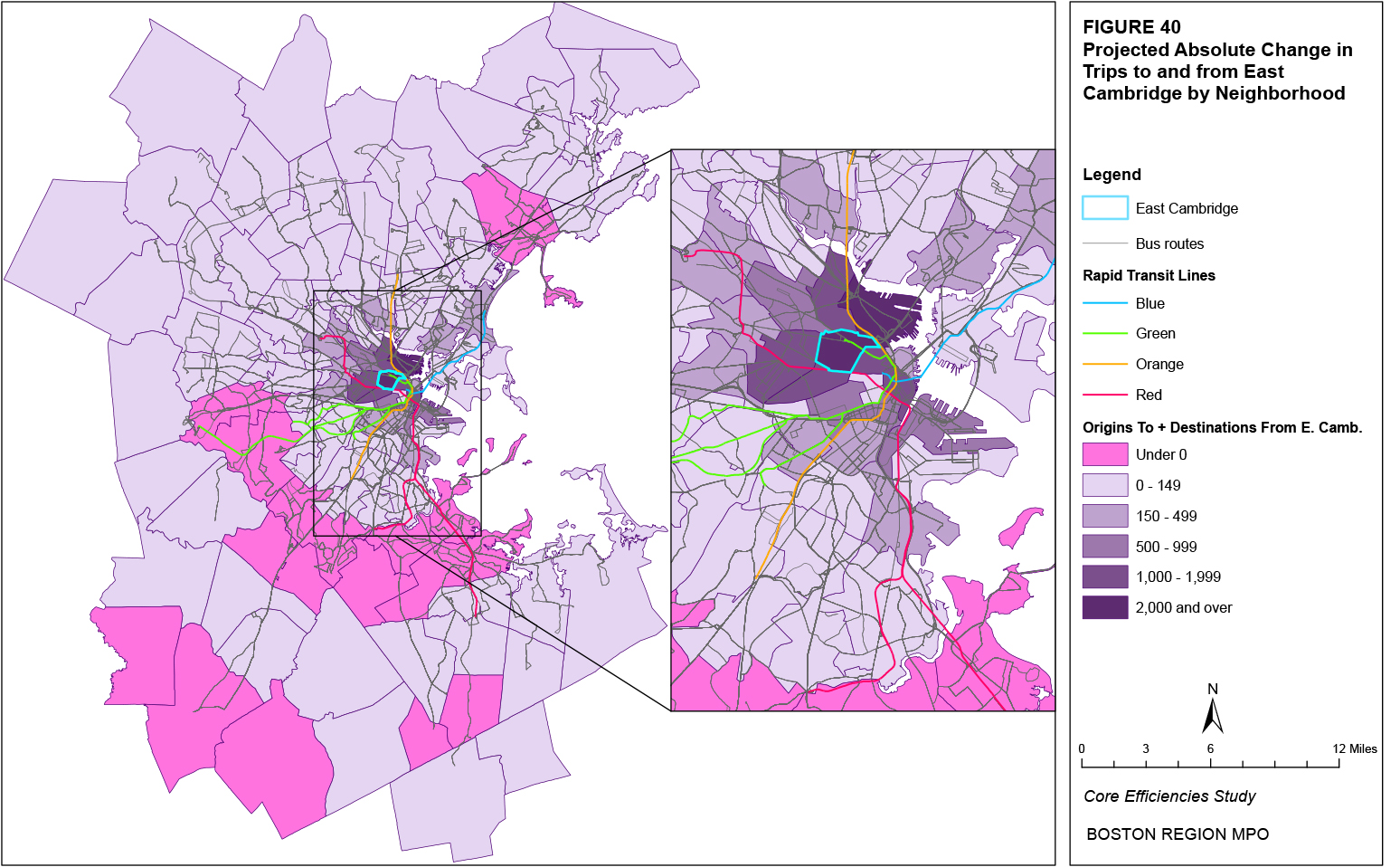
Figure 41
Projected Absolute Change in Trips to and from East Somerville
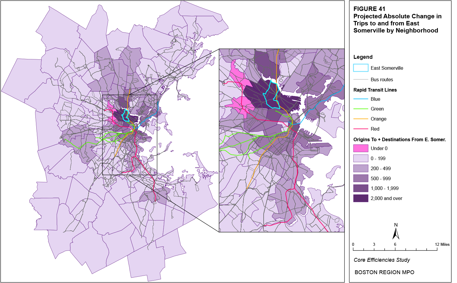
Figure 42
Projected Absolute Change in Trips to and from East Lynn
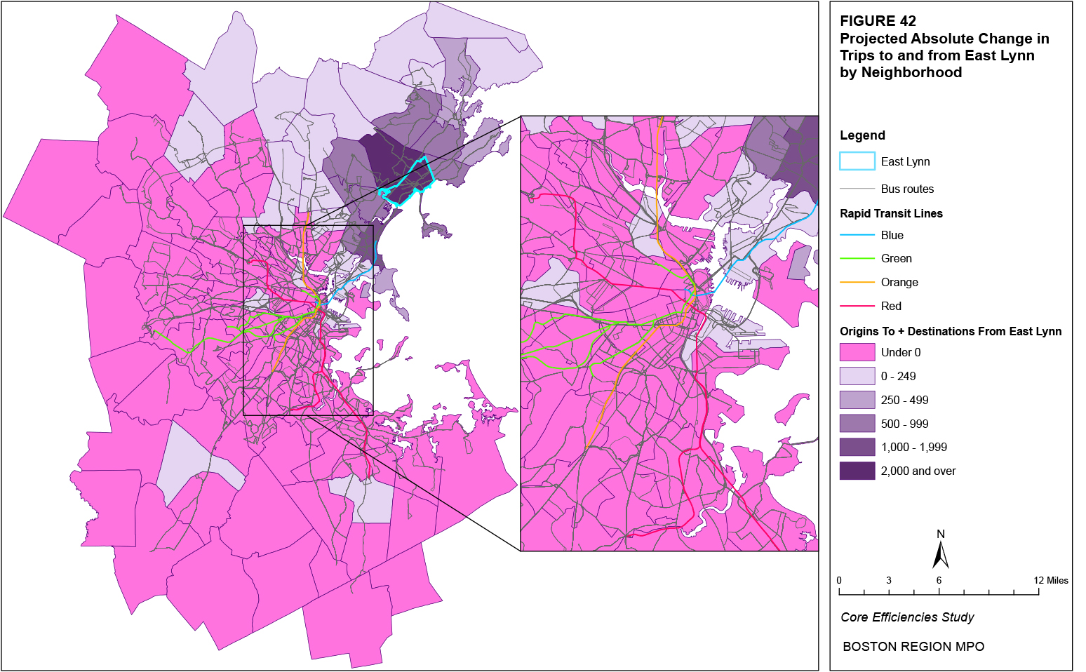
Figure 43
Projected Absolute Change in Trips to and from Downtown
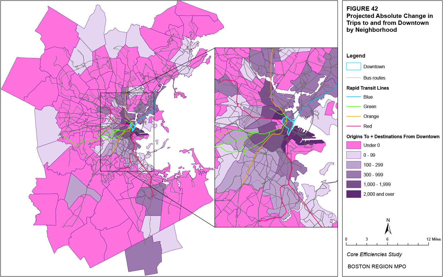
Figure 44
Projected Absolute Change in Trips to and from Chelsea
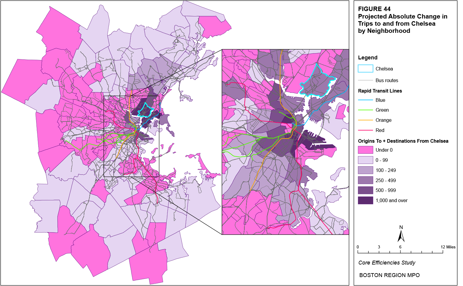
Figure 45
Projected Absolute Change in Trips to and from South Weymouth
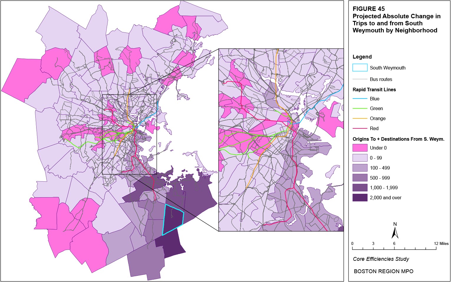
Figure 46
Projected Absolute Change in Trips to and from Fenway
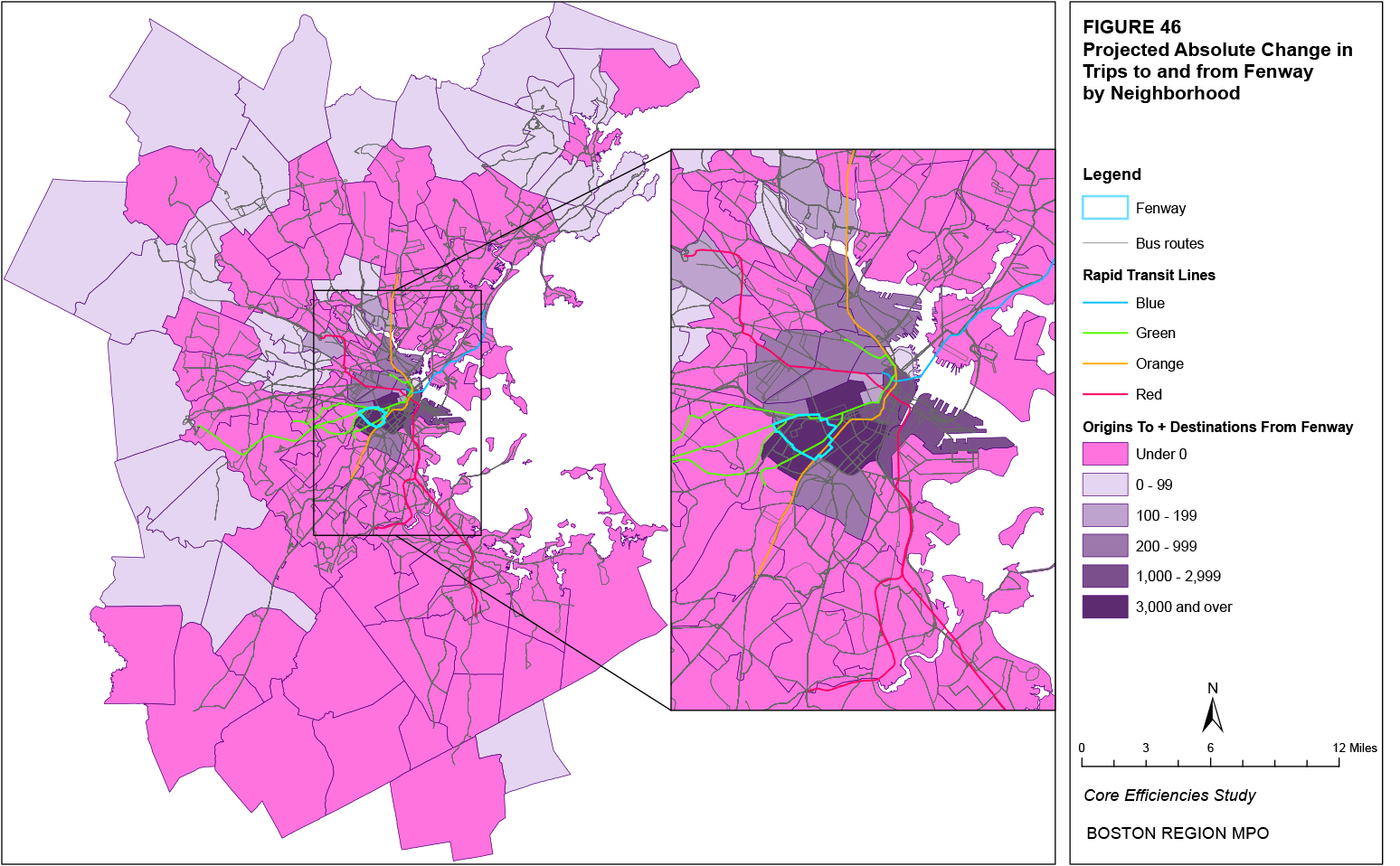
Figure 47
Projected Absolute Change in Trips to and from South End
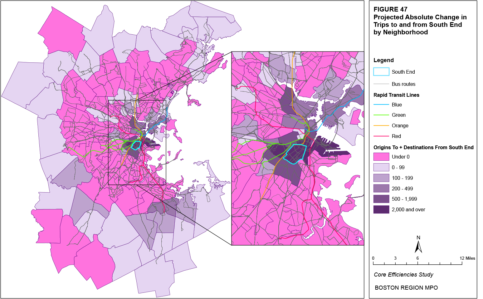
Figure 48
Projected Absolute Change in Trips to and from Stoughton
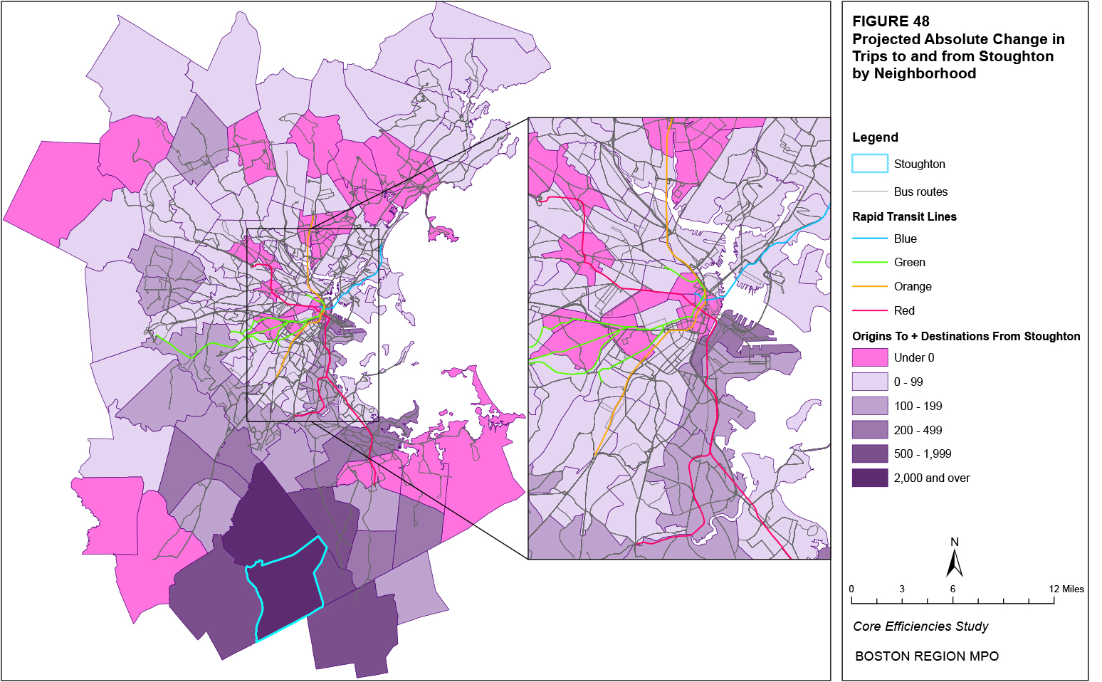
Figure 49
Projected Absolute Change in Trips to and from South Quincy
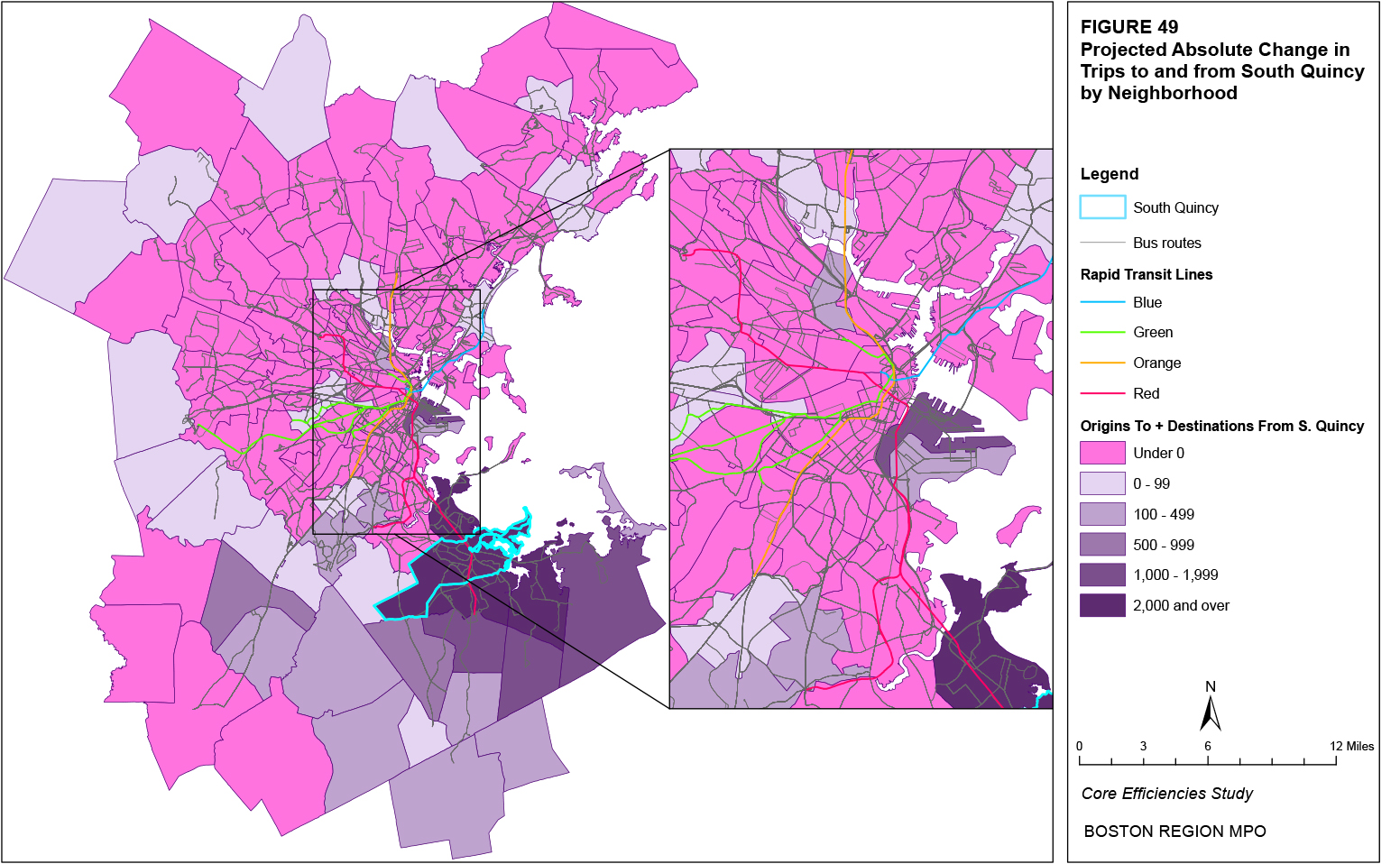
Figure 50
Projected Absolute Change in Trips to and from Westwood
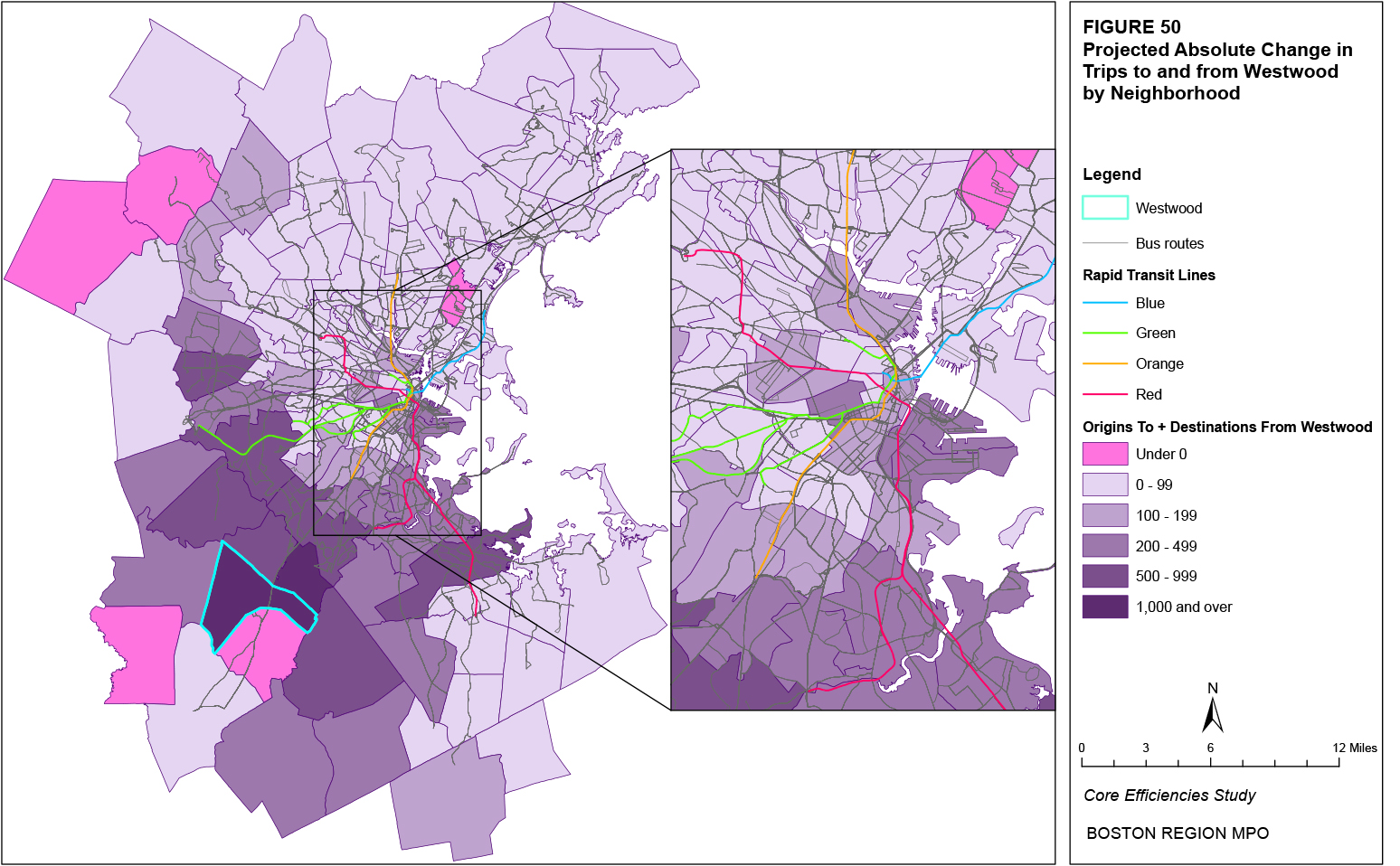
Figure 51
Projected Absolute Change in Trips to and from Burlington
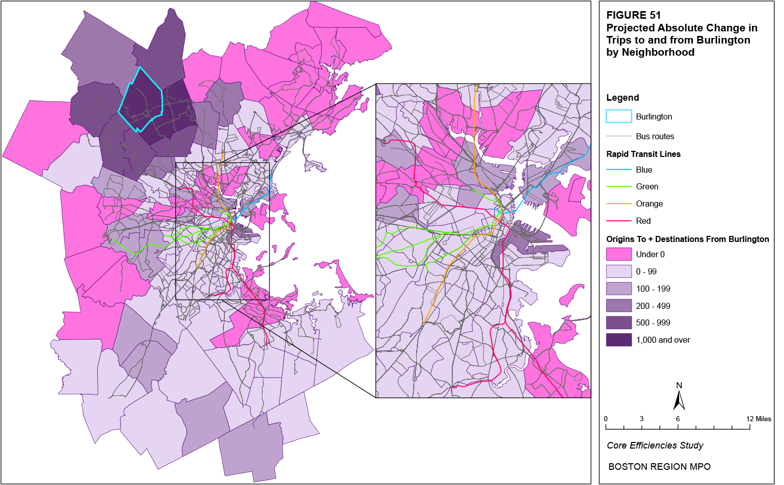
Figure 52
Projected Absolute Change in Trips to and from Longwood
Figure 53
Projected Absolute Change in Trips to and from East Woburn
While the previous section of this report considered projected changes in the number of trips between neighborhoods, this section analyzes the existing characteristics of the level of transit service for these trips. The first characteristic considered is the frequency of vehicles (MBTA directly-operated bus, rapid transit, and commuter rail) serving each neighborhood and transit stop or station. Other transit trip characteristics that are considered are the transit fare, the walk time to transit from the origin and from transit to the destination, the in-vehicle transit travel time, the initial waiting time, the transfer waiting time, and the number of transfers. Each characteristic is taken from inputs to the Boston Region MPO travel demand model set. Finally, all of these characteristics are combined into a relative weighted cost index. These inputs are used to model the mode and path of each trip between two TAZs. The following sections will determine neighborhoods and neighborhood pairs where the existing characteristics of transit travel discourage transit as a mode choice.
The frequency of transit service (vehicles per hour) on a route or line provides some indication as to the level of service. Figure 54 shows the hourly frequency of MBTA bus service by neighborhood and stop in the AM Peak period. Table 57 shows the top 20 neighborhoods and Table 58 shows the top 20 bus stops in terms of service frequency along with the MBTA bus routes that serve the respective neighborhood and stop. As shown by the figure and tables, there appears to be a general correlation between neighborhoods and bus stops with greater bus frequencies. These neighborhoods and stops are primarily located in the urban core but also in areas outside the core such as East Watertown and South Quincy. Most of the high-frequency bus stops are located either at rapid transit stations, express bus depots, or between Dudley and Ruggles Stations along Malcolm X Boulevard.
Figure 55 shows the hourly frequency of MBTA rapid transit service by neighborhood and station in the AM Peak period. Table 59 shows the top 20 neighborhoods in terms of service frequency along with the rapid transit stations that serve each respective neighborhood, and Table 60 shows the service frequency of all rapid transit stations (grouped by line when the service frequency at the corresponding stations is the same) and the rapid transit lines that service each respective station. As shown by the figure and tables, the highest rapid transit frequencies occur where multiple lines serve the same neighborhood or station. For instance, the Downtown and Beacon Hill neighborhoods contain the four transfer stations for the four subway lines while the Back Bay neighborhood contains three Green Line subway stations served by multiple Green Line branches. Of the neighborhoods or rapid transit stations that are served by only one line, the Blue Line has the highest hourly frequency.
Table 57
Neighborhoods by Existing AM Peak Bus Frequency (Vehicles per Hour) (Top 20)
Neighborhood |
Frequency |
Routes Serving Neighborhood |
Downtown |
270.1 |
4, 11, 92, 93, 115, 352, 354, 424, 426, 428, 441, 442, 448, 449, 450, 455, 459, 500, 501, 504, 505, 553, 554, 556, 558, Silver Line-Waterfront, Silver Line-Washington |
North Roxbury |
261.6 |
1, 8, 10, 14, 15, 19, 22, 23, 25, 28, 41, 42, 43, 44, 45, 47, 66, CT1, Silver Line-Washington |
Fenway |
260.6 |
1, 8, 15, 19, 22, 23, 25, 28, 39, 43, 44, 45, 47, 55, 60, 65, CT1, CT2 |
Roslindale |
178.5 |
14, 21, 30, 31, 32, 34, 35, 36, 37, 38, 39, 40, 42, 50, 51 |
South End |
173.8 |
1, 8, 9, 10, 11, 19, 39, 43, 47, CT1, CT2 |
South Dorchester |
161.2 |
17, 18, 19, 21, 22, 23, 26, 27, 28, 29, 45, 201, 215, 240 |
Chinatown |
155.5 |
9, 11, 43, 55, 275, 500, 501, 504, 505, 553, 554, 556, 558, Silver Line-Washington |
North Allston |
155.1 |
64, 66, 70, 86, 500, 501, 502, 503, 504, 505, 553, 554, 556, 558 |
East Watertown |
154.5 |
52, 57, 59, 70, 71, 73, 502, 504 |
South Roxbury |
153.9 |
14, 19, 22, 23, 25, 28, 29, 42, 44, 45, 48 |
Harvard Square |
148.0 |
1, 66, 68, 69, 71, 72, 73, 74, 75, 77, 78, 86, 96 |
North Newton |
145.1 |
52, 57, 59, 501, 502, 503, 504, 505, 553, 554, 556, 558 |
Waterfront |
136.6 |
4, 9, 11, 47, 448, 449, 459, Silver Line-Waterfront |
Mattapan |
135.7 |
14, 21, 24, 26, 27, 28, 29, 30, 31, 33, 240, 245 |
South Quincy |
130.0 |
210, 211, 212, 214, 215, 216, 220, 222, 225, 230, 238, 245 |
Back Bay |
124.0 |
1, 9, 10, 39, 43, 55, 502, 503, CT1 |
Central Square |
105.2 |
1, 47, 64, 68, 69, 70, 83, 85, 91, CT1, CT2 |
Longwood |
104.6 |
8, 19, 39, 47, 60, 65, 66, CT2 |
Charlestown |
101.6 |
86, 89, 90, 91, 92, 93, 95, 101, 104, 105, 109, CT2 |
Figure 54
Existing Bus Frequency by Neighborhood and Stop
Figure 55
Existing Rapid Transit Frequency by Neighborhood and Stop
Table 58
MBTA Bus Stops by Existing AM Peak Bus Frequency (Vehicles per Hour) (Top 20)
Stop Description |
Frequency |
Routes Serving Stop |
Dudley Station @ Ruggles Side |
151.9 |
14, 15, 19, 23, 28, 41, 42, 44, 45, 66 |
Ashmont Station |
97.1 |
18, 21, 22, 23, 26, 27, 215, 217, 240 |
Ruggles Station |
92.8 |
8, 15, 19, 22, 23, 28, 44, 45, 47, CT2 |
Sullivan Station |
87.0 |
86, 89, 90, 91, 92, 93, 95, 101, 104, 105, 109, CT2 |
Washington St @ Beacon St, Newton |
82.5 |
52, 57, 502, 504, 553, 554, 555, 556, 558 |
400 Centre St, Newton |
80.5 |
52, 57, 502, 504, 553, 554, 555, 556, 558 |
Watertown Yard |
79.3 |
52, 57, 59, 502, 504 |
Forest Hills Station Upper Busway |
76.4 |
30, 34, 35, 36, 37, 38, 40, 50, 51 |
Forest Hills Station Lower Busway |
72.6 |
16, 21, 31, 32, 42 |
Mattapan Station |
71.9 |
24, 27, 28, 29, 30, 31, 33, 245 |
Federal St @ Franklin St, Boston |
70.8 |
500, 501, 504, 505, 553, 554, 555, 556, 558 |
Dudley Station @ Harvard Side |
70.7 |
1, 8, 10, 47, Silver Line-Washington |
St. James Ave @ Dartmouth St, Boston |
67.3 |
9, 10, 39, 55, 502, 503, 504, 555 |
Malcolm X Blvd @ Shawmut Ave, Boston |
64.9 |
14, 15, 19, 23, 25, 28, 41, 42, 44, 45, 66 |
Tremont St Opp. Prentiss St, Boston |
60.5 |
15, 19, 22, 23, 25, 28, 29, 42, 44, 45 |
Malcolm X Blvd Opp. Madison Park School, Boston |
60.5 |
10, 15, 19, 23, 25, 28, 42, 44, 45, 66 |
Malcolm X Blvd @ Madison Park HS, Boston |
60.5 |
15, 19, 22, 23, 25, 28, 42, 44, 45, 66 |
Malcolm X Blvd @ O'Bryant HS, Boston |
60.5 |
15, 19, 23, 25, 28, 42, 44, 45, 66 |
Malcolm X Blvd @ King St, Boston |
60.5 |
15, 19, 23, 25, 28, 42, 44, 45, 66 |
Table 59
Neighborhoods by Existing AM Peak Rapid Transit Frequency
(Vehicles per Hour) (Top 20)
Neighborhood |
Frequency |
Stations Serving Neighborhood |
Downtown |
183.3 |
Aquarium, Bowdoin, Downtown Crossing, Government Center, South Station, State |
Beacon Hill |
122.3 |
Boylston, Park Street |
West End |
104.7 |
Charles, Haymarket, North Station, Science Park |
Back Bay |
92.3 |
Arlington, Copley, Prudential |
Fenway |
90.7 |
Fenway, Hynes Convention Center/ICA, Museum of Fine Arts, Northeastern, Symphony |
BU |
68.4 |
Blandford Street, BU Central, BU East, BU West, Kenmore, St. Paul St (B) |
East Cambridge |
48.0 |
Lechmere |
North Brookline |
44.0 |
Brandon Hall, Coolidge Corner, Dean Rd, Englewood Ave, Fairbanks St, Hawes St, Kent St, Longwood Ave, St. Mary's St, St. Paul St (C), Summit Ave, Tappan St, Washington Sq. |
South Brighton |
44.0 |
Allston St, Boston College, Chestnut Hill Ave, Chiswick Rd, Cleveland Circle, Mount Hood Rd, South St, Warren St, Washington St |
South Dorchester |
40.0 |
Ashmont, Butler, Cedar Grove, Fields Corner, Shawmut |
East Boston |
34.3 |
Airport, Maverick, Orient Heights, Wood Island |
East Revere |
34.3 |
Beachmont, Suffolk Downs, Revere Beach, Wonderland |
Central Square |
30.0 |
Central |
Davis Square |
30.0 |
Davis |
Harvard Square |
30.0 |
Harvard |
Kendall/MIT |
30.0 |
Kendall/MIT |
North Cambridge |
30.0 |
Alewife, Porter |
Table 60
Rapid Transit Stations by Existing AM Peak Rapid Transit Frequency (Vehicles per Hour)
Station Description |
Frequency |
Lines Serving Station |
Government Center |
63.3 |
Blue, Green |
Park Street |
61.2 |
Green, Red |
Arlington-Boylston-Copley |
46.2 |
Green |
Hynes Convention Center/ICA |
33.3 |
Green |
State |
30.5 |
Blue, Orange |
Downtown Crossing |
28.3 |
Orange, Red |
Lechmere & Science Park |
24.0 |
Green |
Kenmore |
22.2 |
Green |
Blue Line Stations |
17.1 |
Blue |
Red Line Stations |
15.0 |
Red |
Orange Line Stations |
13.3 |
Orange |
Green Line B, D, & E Surface |
12.0 |
Green |
Mattapan Line Stations |
12.0 |
Mattapan |
Green Line C Surface |
10.0 |
Green |
Red Line Ashmont/Braintree |
8.0 |
Red |
Government Center |
63.3 |
Blue, Green |
Park Street |
61.2 |
Green, Red |
Arlington-Boylston-Copley |
46.2 |
Green |
Hynes Convention Center/ICA |
33.3 |
Green |
Figure 56 shows the hourly frequency of MBTA commuter rail service by neighborhood and station in the AM Peak period. Table 61 shows the top 18 neighborhoods in terms of service frequency along with the stations that serve each respective neighborhood, and Table 62 shows the service frequency of the top 19 commuter rail stations and the lines that serve each respective station. As shown by the figure and tables, the highest commuter rail frequencies occur at the stations served by multiple lines and the neighborhoods served by these stations. South Station and North Station, as the two terminus stations for all south side and north side lines, respectively, and Back Bay, which is served by all south side lines except Fairmount and the Old Colony Lines, have the highest frequencies. Of the neighborhoods or commuter rail stations that are served by only one line, the Newburyport/Rockport Line has the highest hourly frequency.
In summary, neighborhoods and stops/stations with greater frequencies of service are typically those that serve multiple transit routes or lines, such as the Downtown neighborhood, which is served by all four rapid transit lines, or Dudley Station, which is served by several bus routes.
Figure 56
Existing Commuter Rail Frequency by Neighborhood and Stop
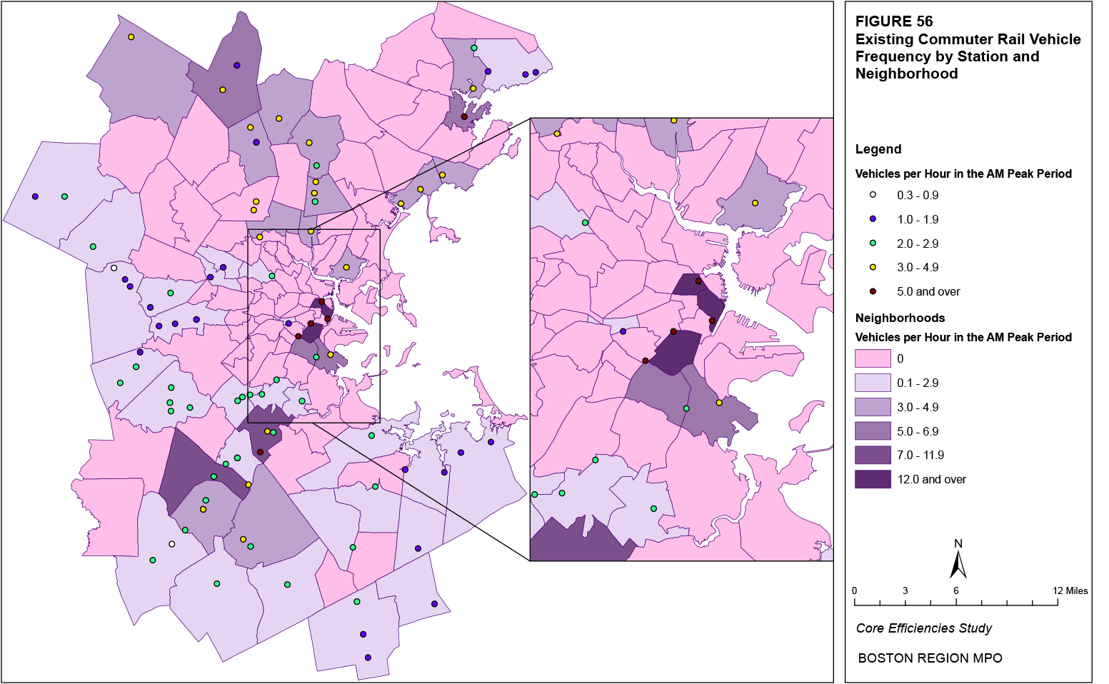
Table 61
Neighborhoods by Existing AM Peak Commuter Rail Frequency
(Vehicles per Hour) (Top 18)
Neighborhood |
Frequency |
Stations Serving Neighborhood |
Downtown |
23.3 |
South Station |
West End |
18.0 |
North Station |
South End |
14.0 |
Back Bay |
Hyde Park |
8.0 |
Fairmount, Hyde Park, Readville |
Westwood |
7.0 |
Islington, Route 128 |
North Dorchester |
5.7 |
JFK-UMass, Uphams Corner |
Wilmington |
5.3 |
North Wilmington, Wilmington |
North Roxbury |
5.0 |
Ruggles |
North Salem |
5.0 |
Salem |
Chelsea |
4.7 |
Chelsea |
West Beverly |
4.7 |
Beverly, North Beverly |
East Woburn |
4.7 |
Anderson/Woburn, Mishawum |
Canton |
4.0 |
Canton Center, Canton Junction |
East Lynn |
4.0 |
Lynn/Central Square, River Works |
Swampscott |
4.0 |
Swampscott |
North Medford |
3.7 |
West Medford |
Reading |
3.3 |
Reading |
Table 62
Commuter Rail Stations by Existing AM Peak Commuter Rail Frequency (Vehicles per Hour) (Top 19)
Stop Description |
Frequency |
Lines Serving Station |
South Station |
23.3 |
South Side Lines |
North Station |
18.0 |
North Side Lines |
Back Bay |
14.0 |
South Side Lines except Fairmount and Old Colony |
Readville |
5.3 |
Forge Park/I-495, Providence/Stoughton |
Ruggles |
5.0 |
Forge Park/I-495, Needham, Providence/Stoughton |
Salem |
5.0 |
Newburyport/Rockport |
Chelsea |
4.7 |
Newburyport/Rockport |
Beverly |
4.7 |
Newburyport/Rockport |
Route 128 |
4.7 |
Providence/Stoughton |
Anderson/Woburn |
4.7 |
Lowell |
Canton Junction |
4.0 |
Providence/Stoughton |
Lynn/Central Square |
4.0 |
Newburyport/Rockport |
Swampscott |
4.0 |
Newburyport/Rockport |
Winchester Center |
4.0 |
Lowell |
West Medford |
3.7 |
Lowell |
Wedgemere |
3.7 |
Lowell |
Reading |
3.3 |
Haverhill |
River Works |
3.3 |
Newburyport/Rockport |
Malden Center |
3.3 |
Haverhill |
Table 63 shows the existing frequencies of the three transit modes (MBTA bus, rapid transit, and commuter rail) for the 16 neighborhoods with the top projected absolute increases in trips (Table 53). The bottom three rows of the table show the average, maximum, and minimum frequencies for each mode across all neighborhoods served by the respective mode. The second column under each mode shows the ranking percentile of each frequency for that mode (the percentage of all neighborhood frequencies that the individual neighborhood’s frequency exceeds). As shown in the table, only three neighborhoods (Downtown, South End, and South Quincy) are served by all three transit modes. Downtown has the greatest frequency for each transit mode, placing it above 100 percent of all other neighborhood frequencies for each transit mode. Lower rapid transit frequencies (in the bottom 40 percent) typically have greater bus frequencies (in the top 20 percent). Note how, for each mode, the average for all neighborhoods lies in the top half of percentiles (64 percent for buses, 80 percent for rapid transit, and 71 percent for commuter rail) of all frequencies, indicating a greater number of neighborhoods with frequencies below the average and fewer neighborhoods with frequencies much greater than the average.
Table 63
AM Peak Transit Frequencies (Vehicle per Hour) and Ranking Percentiles* for Neighborhoods with the Top Projected Absolute Increases in Trips
|
MBTA Bus |
Rapid Transit |
Commuter Rail |
|||
Neighborhood |
Frequency |
Ranking Percentile |
Frequency |
Ranking Percentile |
Frequency |
Ranking Percentile |
Waterfront |
136.6 |
89% |
30.0 |
54% |
- |
- |
Chinatown |
155.5 |
94% |
26.7 |
32% |
- |
- |
East Cambridge |
42.5 |
47% |
48.0 |
85% |
- |
- |
East Somerville |
77.0 |
72% |
- |
- |
- |
- |
East Lynn |
60.0 |
63% |
- |
- |
4.0 |
71% |
Downtown |
270.1 |
100% |
183.3 |
100% |
23.3 |
100% |
Chelsea |
51.4 |
51% |
- |
- |
4.7 |
80% |
South Weymouth |
- |
- |
- |
- |
1.7 |
6% |
Fenway |
260.6 |
98% |
90.7 |
90% |
- |
- |
South End |
173.8 |
96% |
26.7 |
32% |
14.0 |
96% |
Stoughton |
- |
- |
- |
- |
2.3 |
29% |
South Quincy |
130.0 |
87% |
16.0 |
2% |
2.3 |
33% |
Westwood |
24.0 |
39% |
- |
- |
7.0 |
92% |
Burlington |
12.0 |
19% |
- |
- |
- |
- |
Longwood |
104.6 |
84% |
24.0 |
10% |
- |
- |
East Woburn |
8.0 |
12% |
- |
- |
4.7 |
78% |
All Neighborhoods |
|
|
|
|
|
|
Average |
61.3 |
64% |
40.2 |
80% |
4.0 |
71% |
Maximum |
270.1 |
100% |
183.3 |
100% |
23.3 |
100% |
Minimum |
2.0 |
0% |
16.0 |
0% |
1.3 |
0% |
*The ranking percentile represents the percentage of all neighborhood frequencies that the individual neighborhood’s frequency exceeds. |
||||||
Transit fares are modeled by the Boston Region MPO travel demand model set as one of the “costs” incurred by a rider when taking a transit trip. Higher costs reduce the estimated number of trips. An average fare represents a trip cost (measured in terms of the transit fare) of all trips averaged over all riders, including both single-ride and pass trips. The average transit fare for each neighborhood equals the average of the respective neighborhood’s transit fares between each of the other neighborhoods weighted by the number of existing trips between each neighborhood pair. For example, the average transit fare from Fenway to Longwood is $0.65 while the average transit fare from Fenway to Downtown is $1.03, and the number of existing trips from Fenway to the two destinations is 15,577 and 4,297, respectively. The weighted average fare for origin trips from Fenway of these two neighborhoods pairs would therefore be $0.73. The weighted average fare for origin trips from Fenway for all neighborhood pairs is $0.60.
Figure 57 shows the distribution of existing average transit fares in the AM Peak time period for all trips with an origin in the respective neighborhood. Figure 58 does the same for destination neighborhoods. As seen in the figures, in terms of origins, the neighborhoods with the lowest average fares are primarily located in the urban core: Downtown, Longwood, Harvard Square, etc. Destination neighborhoods with the lowest category of average fares are fewer and are more widely distributed. Of the neighborhoods in the urban core, the Waterfront stands out as having a slightly greater average fare than its surrounding neighborhoods. While neighborhoods without rapid transit service might be expected to have the lowest average transit fares (such as areas of Roxbury, Dorchester, Somerville, and Chelsea), this does not appear to be the case, indicating that a significant number of these transit riders are likely transferring to rapid transit from buses, and thus paying the rapid transit fare. The lowest average transit fares are more likely caused by a greater percentage of riders using a pass, which typically has a much lower per-ride cost than a single-ride fare. The neighborhoods with the greatest average transit fares are primarily located outside of the urban core and appear to have some correlation with commuter rail service in the neighborhood or nearby.
Table 64 shows the existing average transit fares for each of the top 20 origin and destination neighborhoods in terms of their 2030 projected increases in origin and destination trips, respectively (Tables 48 and 49). A majority of origin neighborhoods have an average fare below the average for all neighborhoods (the neighborhood average of $0.91 is greater than 66 percent of other neighborhoods’ average fares), as do a greater number of neighborhoods in the table. Most of these neighborhoods are within the urban core. The neighborhoods in the table with the greatest average fares within the urban core are East Boston, the Waterfront, East Somerville, and Chelsea. For destination neighborhoods, most neighborhoods in the table also have an average fare below the average for all neighborhoods. Within the urban core, only the Waterfront and East Somerville neighborhoods have average fares greater than the average for all neighborhoods.
Figure 57
Existing Average AM Peak Transit Fares for Origin Neighborhoods
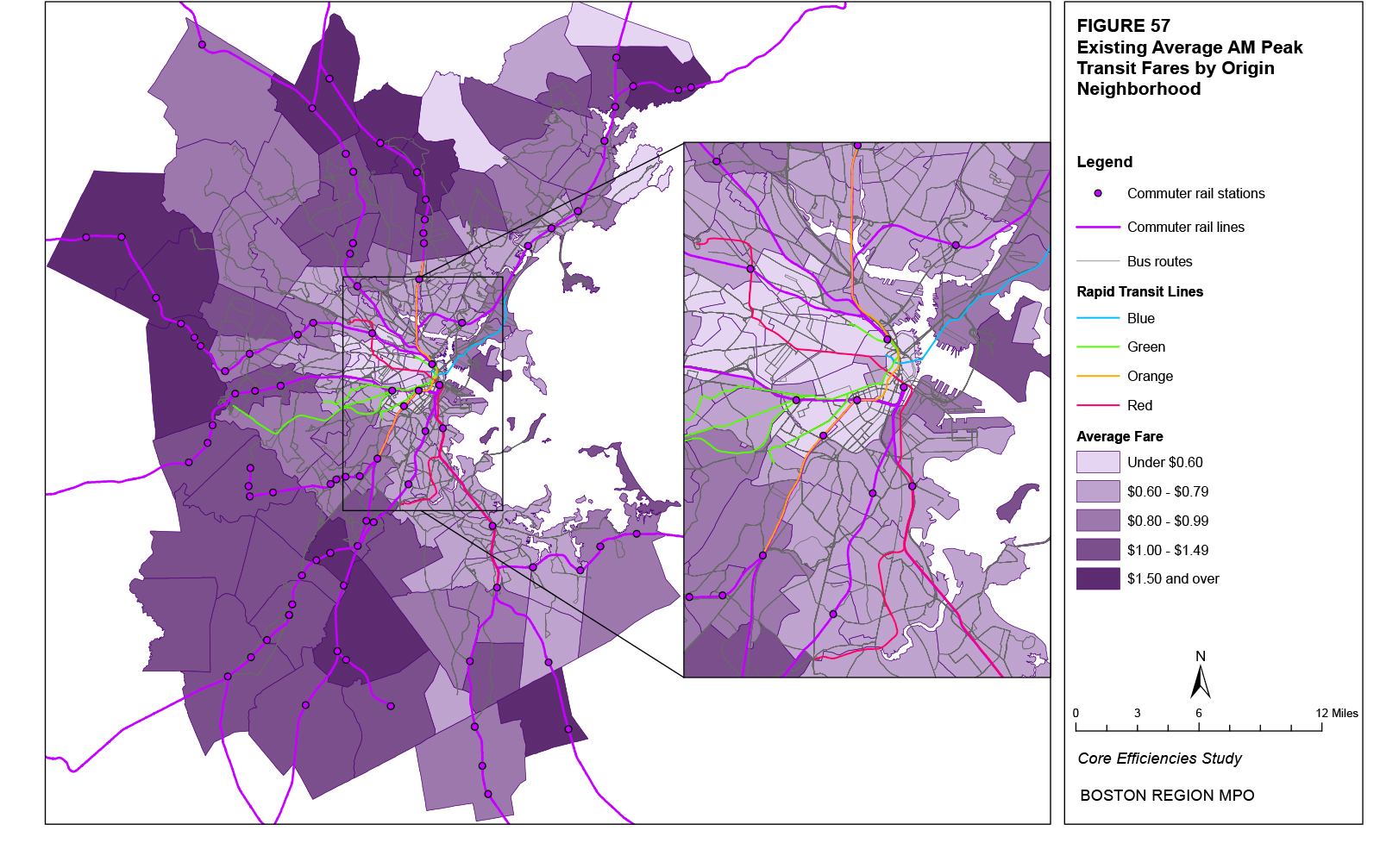
Figure 58
Existing Average AM Peak Transit Fares for Destination Neighborhoods
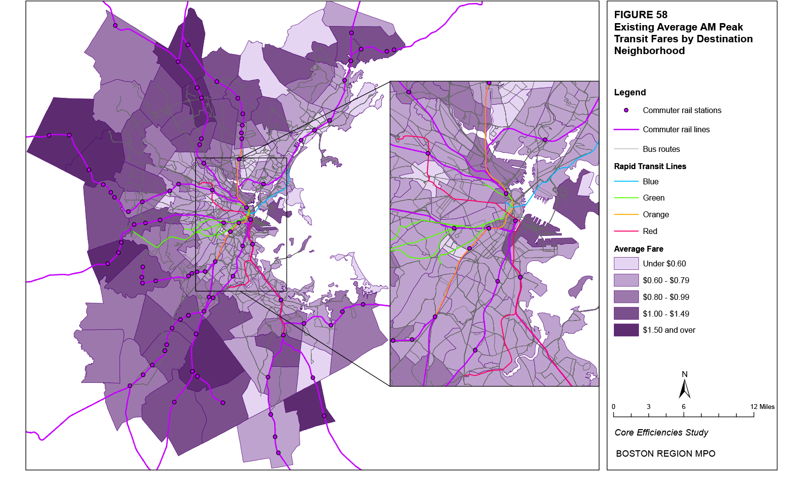
Table 64
Average AM Peak Transit Fares and Ranking Percentiles* for Origin and Destination Neighborhoods with the Top 20 Projected Absolute Increases in Origins and Destinations
Origin Neighborhood |
Average Fare |
Ranking Percentile |
Destination Neighborhood |
Average Fare |
Ranking Percentile |
Waterfront |
$0.82 |
52% |
Waterfront |
$1.11 |
83% |
Chinatown |
$0.52 |
5% |
East Somerville |
$0.90 |
65% |
East Cambridge |
$0.56 |
10% |
East Cambridge |
$0.79 |
52% |
East Somerville |
$0.78 |
45% |
East Lynn |
$0.55 |
4% |
East Lynn |
$0.64 |
19% |
Downtown |
$0.79 |
51% |
Downtown |
$0.36 |
1% |
East Revere |
$0.66 |
21% |
Brockton |
$0.91 |
65% |
Chinatown |
$0.85 |
58% |
Chelsea |
$0.76 |
43% |
Westwood |
$1.22 |
87% |
South Weymouth |
$0.62 |
17% |
East Woburn |
$1.98 |
98% |
Fenway |
$0.60 |
14% |
South Quincy |
$0.74 |
41% |
East Boston |
$0.84 |
56% |
Longwood |
$0.58 |
9% |
South End |
$0.45 |
4% |
South Weymouth |
$0.51 |
2% |
Stoughton |
$1.29 |
86% |
Chelsea |
$0.71 |
29% |
North Cambridge |
$0.69 |
26% |
Stoughton |
$1.07 |
80% |
South Quincy |
$0.72 |
35% |
Burlington |
$1.01 |
77% |
Westwood |
$1.10 |
75% |
Fenway |
$0.71 |
33% |
Hingham |
$0.88 |
62% |
North Allston |
$0.77 |
47% |
Burlington |
$0.82 |
52% |
South End |
$0.70 |
27% |
Longwood |
$0.40 |
2% |
North Peabody |
$1.30 |
90% |
East Woburn |
$1.35 |
89% |
Needham |
$1.15 |
84% |
All Neighborhoods |
All Neighborhoods |
||||
Average |
$0.91 |
66% |
Average |
$0.88 |
64% |
Maximum |
$2.31 |
100% |
Maximum |
$2.47 |
100% |
Minimum |
$0.18 |
0% |
Minimum |
$0.16 |
0% |
*The ranking percentile represents the percentage of all neighborhood average fares that the individual neighborhood’s average fare exceeds. |
|||||
Table 65 shows the average fares for the top 20 neighborhood pairs in terms of the projected absolute increase in all trips (origins plus destinations) for each of the 16 neighborhoods with the top projected absolute increases in trips (Table 55). Neighborhoods that are closer to each other typically have lower average fares. In addition, for each neighborhood, for most of the pairs with the greatest projected increases in trips (appearing at the top of each list), the average fares lie within the bottom 10 percent of the average fares between all neighborhood pairs. For example, for the Waterfront neighborhood, the second largest projected increase in trips is between the Waterfront and Downtown. This neighborhood pair has an average fare (for trips from the Waterfront to Downtown and from Downtown to the Waterfront) of $0.47. This average fare exceeds only four percent of all average fares between the Waterfront and all other neighborhoods. Within the urban core, which is where most of the projected increase in trips is located, neighborhoods identified in Table 64 with greater average fares generally also have greater average fares in Table 65. Average fares for neighborhood pairs involving the Waterfront, East Boston, and East Somerville on average exceed $1.00.
The walk time between a rider’s origin or destination and where they board or alight transit, respectively, and the walk time between two transfer points is modeled by the Boston Region MPO travel demand model set as one of the “costs” incurred by a rider when taking a transit trip. Higher costs reduce the estimated number of trips. An average walk time represents the trip cost (measured in terms of the walk time) of all trips averaged over all riders. The average walk time for each neighborhood equals the average of the respective neighborhood’s access plus egress walk times to and from transit for trips between all other neighborhoods weighted by the number of existing trips between each neighborhood pair. For example, the average walk time for transit trips from Fenway to Longwood is 1.67 minutes while the average walk time for transit trips from Fenway to Downtown is 1.90 minutes, and the number of existing trips from Fenway to the two destinations is 15,577 and 4,297, respectively. The weighted average walk time for origin trips from Fenway of these two neighborhoods pairs would therefore be 1.72 minutes. The weighted average walk time for origin trips from Fenway for all neighborhood pairs is 1.55 minutes.
Figure 59 shows the distribution of existing average walk times for transit in the AM Peak time period for all trips with an origin in the respective neighborhood. Figure 60 does the same for destination neighborhoods. As seen in the figures, in terms of origins, the lowest average walk times are primarily located in the urban core in neighborhoods served by rapid transit: the downtown and Back Bay neighborhoods, where multiple lines are located in close proximity to each other, and Cambridge neighborhoods along the Red Line. Destination neighborhoods with the lowest average walk times are generally located in the same neighborhoods as for origins, but average walk times appear to be slightly less in some destination neighborhoods compared to origin neighborhoods, particularly in areas of Dorchester, Roxbury, and Roslindale. Of the neighborhoods in the urban core, the destinations of the Waterfront and East Somerville stand out as having slightly greater average walk times than their surrounding neighborhoods. Lower average walk times appear to be generally correlated with the presence of rapid transit service, while neighborhoods with only bus service have slightly greater average walk times. The neighborhoods with the greatest average walk times are primarily located outside of the urban core and are served by buses.
Table 65
Average AM Peak Transit Fares between Neighborhoods and Ranking Percentiles (Rank %)* by Neighborhood
for Neighborhoods with the Top Projected Absolute Increases in Trips
This table shows the neighborhood pairs with the top 20 projected absolute increase in trips (origins plus destinations) for each of the neighborhoods with the top 20 projected absolute increases in trips (origins plus destinations). For each neighborhood, column 2 shows the existing average fare for the neighborhood pair and column 3 shows percentage of all average fares between neighborhood pairs that the average fare of the individual neighborhood pair exceeds.
Because of the size or complexity of this particular table, it has not been included in this hypertext markup language (HTML) version of the report; however, it has been included in the portable document format (PDF) version. If you would like to obtain this data in a different format, please contact the Central Transportation Planning Staff (CTPS) via email at publicinfo@ctps.org.
Figure 59
Existing Average AM Peak Walk Times for Origin Neighborhoods
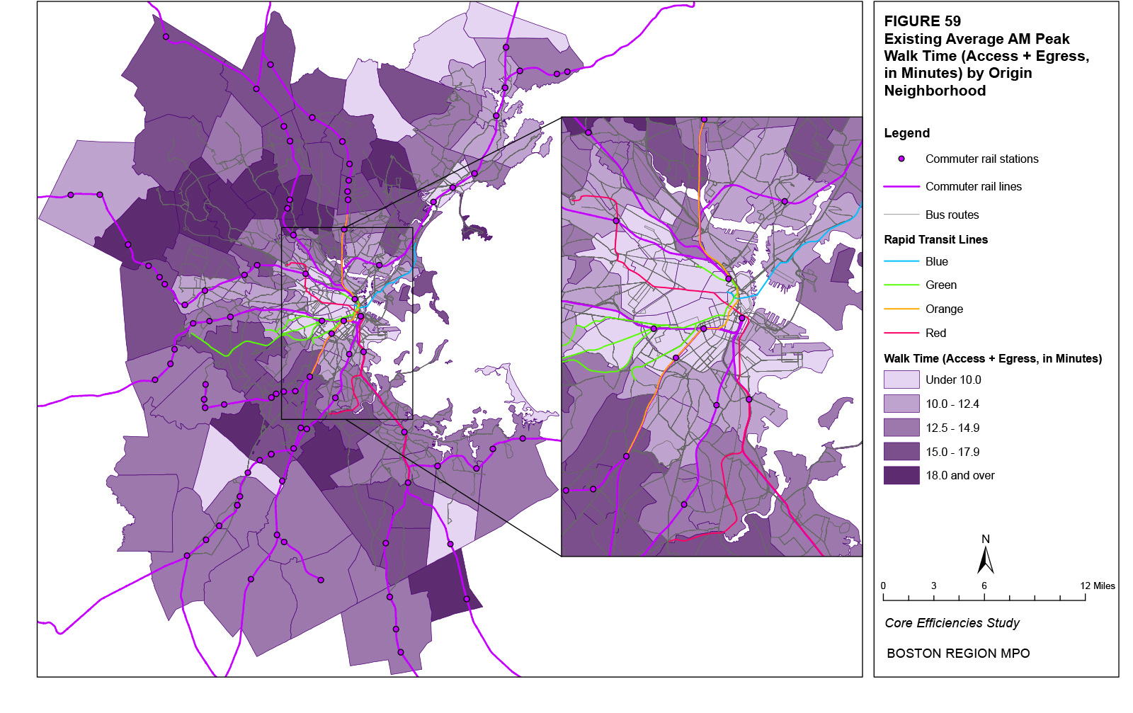
Figure 60
Existing Average AM Peak Walk Times for Destination Neighborhoods
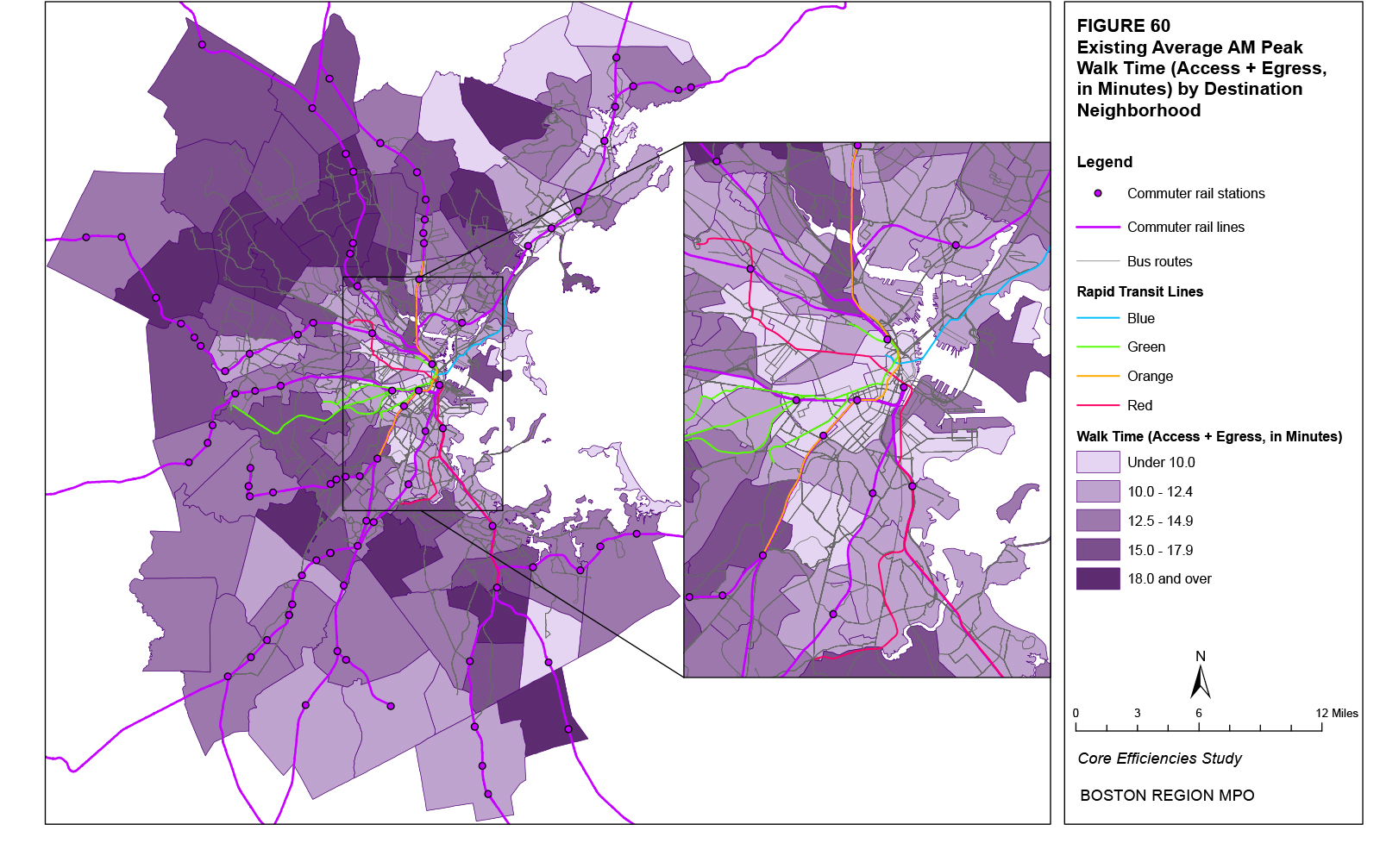
Table 66 shows the existing average access, egress, and transfer walk times for each of the 20 origin and destination neighborhoods with the highest projected increases in origin and destination trips, respectively (Tables 48 and 49). A greater number of the origin neighborhoods in the table have an average walk time below the average for all neighborhoods (12.92 minutes). Most of these neighborhoods are within the urban core. East Somerville is the only origin neighborhood in the table within the urban core that has an average walk time greater than the average for all origin neighborhoods. Other origin urban-core neighborhoods in the table that have relatively long average walk times are East Boston, Chelsea, North Cambridge, and the Waterfront. A greater number of destination neighborhoods in the table also have an average walk time below the average for all destination neighborhoods (13.01 minutes). Within the urban core, only the Waterfront and East Somerville destination neighborhoods have average walk times that are greater than the average for all destination neighborhoods.
Using the 16 neighborhoods with the highest projected absolute increases in trips (shown in Table 55), Table 67 shows the average access, egress, and transfer walk times for the 20 neighborhood pairs with the highest projected absolute increase in all trips (origins plus destinations). Neighborhoods that are closer to each other typically have shorter average walk times. In addition, for each neighborhood in the urban core, most of the neighborhood pairs with the largest projected increases in trips (appearing at the top of each list) have average walk times that lie within the bottom 10 percent of the average walk times for trips between all neighborhood pairs. For example, for the Waterfront neighborhood, the second largest projected increase in trips is between the Waterfront and Downtown. This neighborhood pair has an average walk time (for trips from the Waterfront to Downtown and from Downtown to the Waterfront) of 4.39 minutes. This average walk time exceeds only two percent of all average walk times between the Waterfront and all other neighborhoods. Within the urban core, which is where most of the projected increase in trips is located, neighborhoods identified in Table 66 with longer average walk times generally also have longer average walk times in Table 67. Average walk times for trips between neighborhood pairs involving Chelsea, East Cambridge, East Somerville, and the Waterfront, exceed 18 minutes.
Table 66
Average AM Peak Walk Times and Ranking Percentiles* for Origin and Destination Neighborhoods with the Top 20 Projected Absolute Increases in Origins and Destinations
Origin Neighborhood |
Average Walk Time |
Ranking Percentile |
Destination Neighborhood |
Average Walk Time |
Ranking Percentile |
Waterfront |
10.27 |
21% |
Waterfront |
13.80 |
60% |
Chinatown |
5.32 |
5% |
East Somerville |
15.03 |
72% |
East Cambridge |
7.35 |
11% |
East Cambridge |
10.12 |
18% |
East Somerville |
13.09 |
48% |
East Lynn |
7.71 |
4% |
East Lynn |
8.52 |
15% |
Downtown |
8.40 |
9% |
Downtown |
3.53 |
2% |
East Revere |
12.78 |
52% |
Brockton |
12.56 |
41% |
Chinatown |
8.38 |
8% |
Chelsea |
11.64 |
30% |
Westwood |
10.87 |
26% |
South Weymouth |
8.13 |
13% |
East Woburn |
18.36 |
92% |
Fenway |
7.62 |
12% |
South Quincy |
12.76 |
50% |
East Boston |
11.83 |
33% |
Longwood |
7.18 |
3% |
South End |
5.89 |
6% |
South Weymouth |
7.10 |
2% |
Stoughton |
13.45 |
52% |
Chelsea |
10.69 |
25% |
North Cambridge |
11.21 |
27% |
Stoughton |
12.35 |
43% |
South Quincy |
12.69 |
43% |
Burlington |
15.90 |
76% |
Westwood |
8.84 |
17% |
Fenway |
9.29 |
13% |
Hingham |
14.41 |
63% |
North Allston |
12.52 |
47% |
Burlington |
14.07 |
60% |
South End |
8.55 |
10% |
Longwood |
5.13 |
3% |
North Peabody |
18.16 |
90% |
East Woburn |
15.71 |
77% |
Needham |
13.78 |
59% |
All Neighborhoods |
All Neighborhoods |
||||
Average |
12.92 |
44% |
Average |
13.01 |
52% |
Maximum |
22.48 |
100% |
Maximum |
22.48 |
100% |
Minimum |
2.53 |
0% |
Minimum |
1.18 |
0% |
*The ranking percentile represents the percentage of all neighborhood average walk times that the individual neighborhood’s average walk time exceeds. |
|||||
Table 67
Average AM Peak Walk Time for Transit Trips between Neighborhoods and Ranking Percentiles (Rank %)* by Neighborhood
for Neighborhoods with the Top Projected Absolute Increases in Trips
This table shows the neighborhood pairs with the top 20 projected absolute increase in trips (origins plus destinations) for each of the neighborhoods with the top 20 projected absolute increases in trips (origins plus destinations). For each neighborhood, column 2 shows the existing average walk time for the neighborhood pair and column 3 shows percentage of all average walk times between neighborhood pairs that the average walk time of the individual neighborhood pair exceeds.
Because of the size or complexity of this particular table, it has not been included in this hypertext markup language (HTML) version of the report; however, it has been included in the portable document format (PDF) version. If you would like to obtain this data in a different format, please contact the Central Transportation Planning Staff (CTPS) via email at publicinfo@ctps.org.
The in-vehicle travel time (that is, the time that elapses between when the rider boards and alights the transit vehicle) is modeled by the Boston Region MPO travel demand model set as one of the “costs” incurred by a rider when taking a transit trip. Higher costs reduce the estimated number of trips. An average travel time represents the trip cost (measured in terms of in-vehicle travel time) of all trips averaged over all riders. The average travel time for each neighborhood equals the average of the respective neighborhood’s travel time between all other neighborhoods weighted by the number of existing trips between each neighborhood pair. For example, the average in-vehicle travel time for transit trips from Fenway to Longwood is 2.38 minutes while the average travel time from Fenway to Downtown is 9.41 minutes, and the number of existing trips from Fenway to the two destinations is 15,577 and 4,297, respectively. The weighted average in-vehicle travel time for origin trips from Fenway of these two neighborhoods pairs would therefore be 3.90 minutes. The weighted average in-vehicle travel time for origin trips from Fenway for all neighborhood pairs is 6.41 minutes.
Figure 61 shows the distribution of existing average in-vehicle travel times on transit in the AM Peak time period for all trips with an origin in the respective neighborhood. Figure 62 does the same for destination neighborhoods. As seen in the figures, in terms of origins, the lowest average travel times are primarily located in the urban core in neighborhoods served by rapid transit: the Downtown and Back Bay neighborhoods, where multiple lines are located in close proximity to each other, and Cambridge neighborhoods along the Red Line. Destination neighborhoods with the lowest category of average travel times are generally located in the same neighborhoods, but average travel times do appear to be slightly less in other destination neighborhoods, particularly in areas of Dorchester and Roxbury. This likely reflects the pattern of AM peak trips destined primarily for downtown locations. While large numbers of origins in Dorchester and Roxbury increase crowding and increase travel times, fewer destinations facilitate faster transit trips. During the AM Peak travel period, in which most trips are destined for downtown Boston, lower in-vehicle travel times appear to be correlated both with the distance from the downtown as well as the type of transit mode serving the neighborhood. While neighborhoods outside the urban core generally have greater average in-vehicle travel times, neighborhoods served by commuter rail generally have lower average travel times compared to neighborhoods served only by buses.
Figure 61
Existing Average AM Peak In-Vehicle Travel Times for Origin Neighborhoods
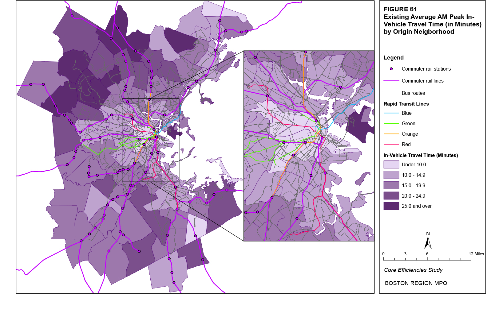
Table 68 shows the existing average in-vehicle transit travel times for each of the top 20 origin and destination neighborhoods in terms of their projected increases in origin and destination trips, respectively (Tables 48 and 49). A majority of origin neighborhoods have an average travel time below the average for all neighborhoods (the neighborhood average of 15.40 minutes is greater than 55 percent of other neighborhoods’ average travel times), as do a greater number of neighborhoods in the table. Most of these neighborhoods are within the urban core. The neighborhoods in the table with the greatest average in-vehicle travel times within the urban core are Chelsea, East Somerville, and East Boston. For destination neighborhoods, most neighborhoods in the table also have an average walk time below the average for all neighborhoods. Within the urban core, only the Waterfront has an average travel time greater than the average for all neighborhoods. Other destination neighborhoods with larger average travel times are North Allston and East Somerville.
Table 68
Average AM Peak In-Vehicle Travel Times and Ranking Percentiles* for Origin and Destination Neighborhoods with the Top 20 Projected Absolute Increases in Origins and Destinations
Origin Neighborhood |
Average Travel Time |
Ranking Percentile |
Destination Neighborhood |
Average Travel Time |
Ranking Percentile |
Waterfront |
1.47 |
10% |
Waterfront |
3.07 |
44% |
Chinatown |
1.00 |
2% |
East Somerville |
3.17 |
45% |
East Cambridge |
1.29 |
6% |
East Cambridge |
2.39 |
20% |
East Somerville |
2.45 |
30% |
East Lynn |
2.51 |
21% |
East Lynn |
2.39 |
29% |
Downtown |
2.12 |
6% |
Downtown |
0.73 |
0% |
East Revere |
3.29 |
48% |
Brockton |
3.99 |
67% |
Chinatown |
2.13 |
9% |
Chelsea |
2.27 |
24% |
Westwood |
3.33 |
49% |
South Weymouth |
2.81 |
39% |
East Woburn |
5.87 |
92% |
Fenway |
1.55 |
12% |
South Quincy |
3.29 |
48% |
East Boston |
1.56 |
13% |
Longwood |
1.77 |
2% |
South End |
1.34 |
9% |
South Weymouth |
2.18 |
10% |
Stoughton |
8.16 |
97% |
Chelsea |
2.56 |
24% |
North Cambridge |
2.22 |
21% |
Stoughton |
4.83 |
80% |
South Quincy |
2.96 |
45% |
Burlington |
5.38 |
87% |
Westwood |
2.95 |
44% |
Fenway |
2.00 |
4% |
Hingham |
3.66 |
60% |
North Allston |
2.93 |
38% |
Burlington |
4.64 |
75% |
South End |
2.22 |
13% |
Longwood |
1.24 |
6% |
North Peabody |
5.35 |
86% |
East Woburn |
6.90 |
90% |
Needham |
3.81 |
63% |
All Neighborhoods |
All Neighborhoods |
||||
Average |
3.66 |
60% |
Average |
3.61 |
59% |
Maximum |
9.02 |
100% |
Maximum |
9.03 |
100% |
Minimum |
0.73 |
0% |
Minimum |
0.24 |
0% |
*The ranking percentile represents the percentage of all neighborhood average in-vehicle travel times that the individual neighborhood’s average in-vehicle travel time exceeds. |
|||||
Figure 62
Existing Average AM Peak In-Vehicle Travel Times for Destination Neighborhoods
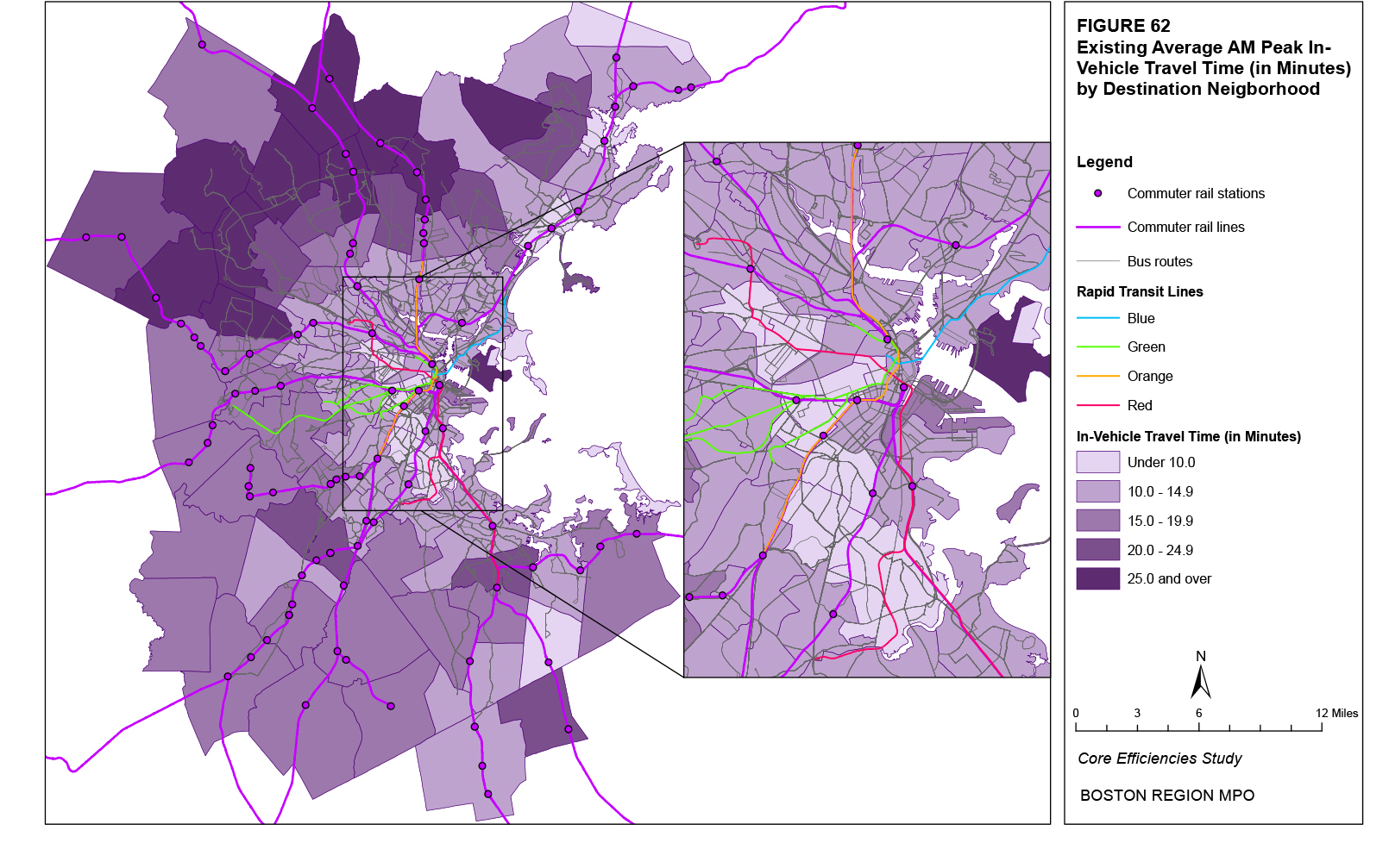
Table 69 shows the average in-vehicle transit travel times for the top 20 neighborhood pairs in terms of the projected absolute increase in all trips (origins plus destinations) for each of the 16 neighborhoods with the top projected absolute increases in trips (Table 55). Neighborhoods that are closer to each other typically have lower average travel times. In addition, for each neighborhood, for most of the pairs with the greatest projected increases in trips (appearing at the top of each list), the average travel times lie within the bottom 10 percent of the average travel times for trips between all neighborhood pairs. For example, for the Waterfront neighborhood, the second largest projected increase in trips is between the Waterfront and Downtown. This neighborhood pair has an average travel time (for trips from the Waterfront to Downtown and from Downtown to the Waterfront) of 1.66 minutes. This average travel time exceeds only one percent of all average travel times between the Waterfront and all other neighborhoods. Within the urban core, which is where most of the projected increase in trips is located, neighborhoods identified in Table 68 with greater average travel times generally also have greater average travel times in Table 69. Average walk times for trips between neighborhood pairs involving the Waterfront, East Somerville, North Dorchester, and Charlestown on average exceed 15 minutes.
The initial waiting time where the rider boards the transit vehicle is modeled by the Boston Region MPO travel demand model set as one of the “costs” incurred by a rider when taking a transit trip. Higher costs reduce the estimated number of trips. An average initial waiting time represents the trip cost (measured in terms of the initial waiting time) of all trips averaged over all riders. The average initial waiting time for each neighborhood equals the average of the respective neighborhood’s initial waiting time for transit trips between all other neighborhoods weighted by the number of existing trips between each neighborhood pair. For example, the average initial waiting time for transit trips from Fenway to Longwood is 2.38 minutes while the average initial waiting time from Fenway to Downtown is 9.41 minutes, and the number of existing trips from Fenway to the two destinations is 15,577 and 4,297, respectively. The weighted average initial waiting time for origin trips from Fenway of these two neighborhoods pairs would therefore be 3.90 minutes. The weighted average initial waiting time for origin trips from Fenway for all neighborhood pairs is 6.41 minutes.
Figure 63 shows the distribution of existing average initial waiting times on transit in the AM Peak time period for all trips with an origin in the respective neighborhood. Figure 64 does the same for destination neighborhoods. As seen in the figures, in terms of origins, the lowest average initial waiting times are primarily located in the urban core in neighborhoods served by rapid transit: the Downtown and Back Bay neighborhoods, where multiple lines are located in close proximity to each other, and Cambridge neighborhoods along the Red Line. Destination neighborhoods with the lowest category of average initial waiting times are generally located in the same neighborhoods, but average initial waiting times do appear to be slightly less in other destination neighborhoods, particularly in areas of Dorchester and Roxbury. Lower average initial waiting times do appear to be generally correlated with the distance of the neighborhood from downtown Boston. The neighborhoods with the greatest average initial waiting times are primarily located in the northern suburbs of Boston.
Table 70 shows the existing average initial transit waiting times for each of the top 20 origin and destination neighborhoods in terms of their projected increases in origin and destination trips, respectively (Tables 48 and 49). A majority of origin neighborhoods have an average initial waiting time below the average for all neighborhoods (the neighborhood average of 3.66 minutes is greater than 60 percent of other neighborhoods’ average travel times), as do a greater number of neighborhoods in the table. Most of these neighborhoods are within the urban core. The neighborhoods in the table with the greatest average initial waiting times within the urban core are East Somerville, Chelsea, and North Cambridge. For destination neighborhoods, most neighborhoods in the table also have an average initial waiting time below the average for all neighborhoods. Within the urban core, destination neighborhoods with the largest average initial waiting times are East Revere, East Somerville, and the Waterfront.
Table 69
Average AM Peak In-Vehicle Travel Time for Transit Trips between Neighborhoods and Ranking Percentiles (Rank %)* by Neighborhood
for Neighborhoods with the Top Projected Absolute Increases in Trips
This table shows the neighborhood pairs with the top 20 projected absolute increase in trips (origins plus destinations) for each of the neighborhoods with the top 20 projected absolute increases in trips (origins plus destinations). For each neighborhood, column 2 shows the existing average in-vehicle travel time for the neighborhood pair and column 3 shows percentage of all average travel times between neighborhood pairs that the average travel time of the individual neighborhood pair exceeds.
Because of the size or complexity of this particular table, it has not been included in this hypertext markup language (HTML) version of the report; however, it has been included in the portable document format (PDF) version. If you would like to obtain this data in a different format, please contact the Central Transportation Planning Staff (CTPS) via email at publicinfo@ctps.org.
Figure 63
Existing Average AM Peak Initial Waiting Times for Origin Neighborhoods
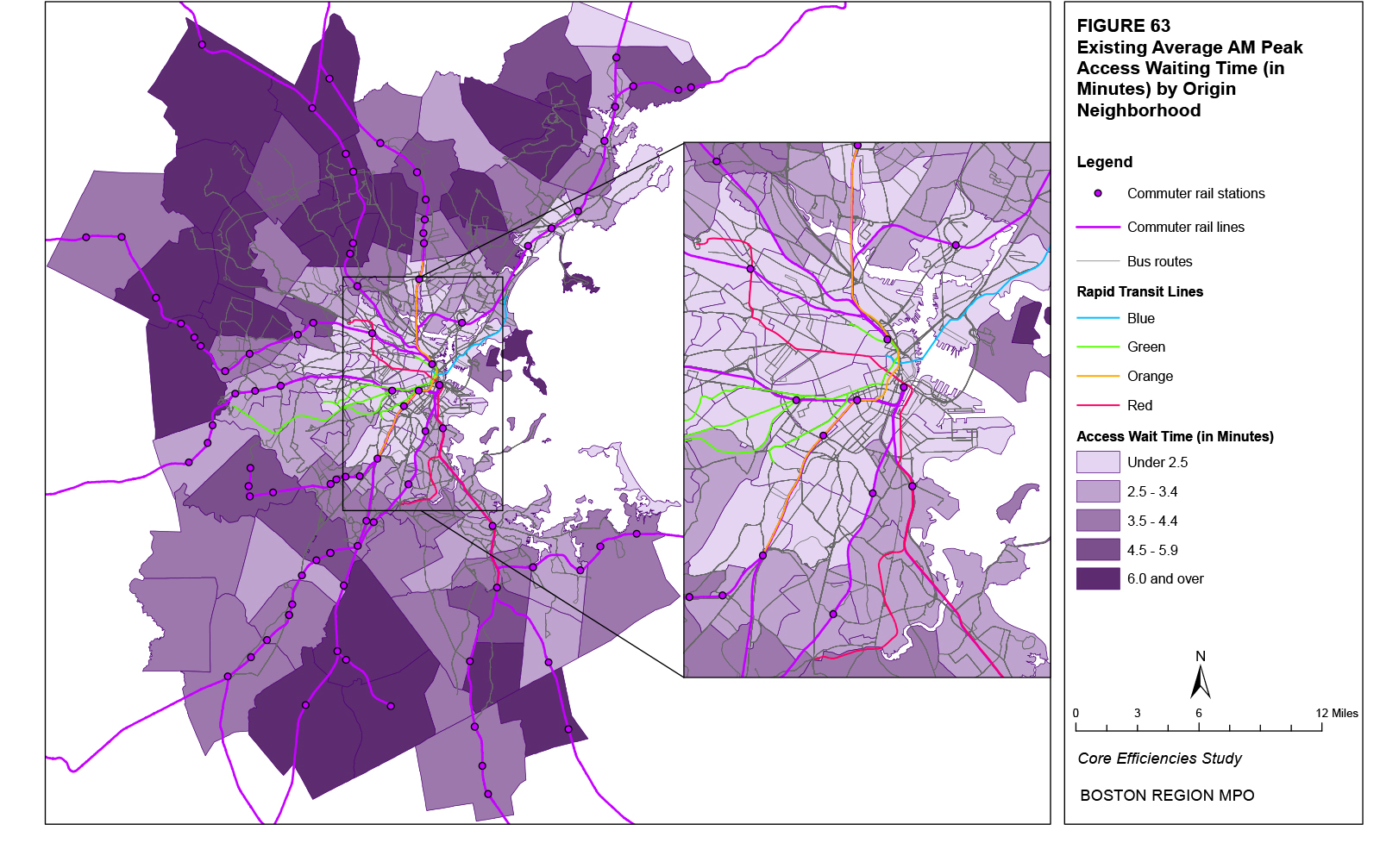
Figure 64
Existing Average AM Peak Initial Waiting Times for Destination Neighborhoods
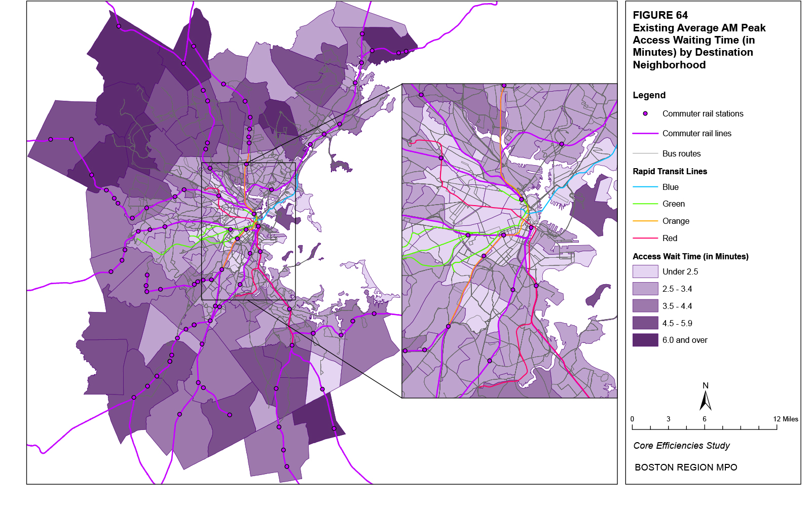
Table 70
Average AM Peak Initial Waiting Times and Ranking Percentiles* for Origin and Destination Neighborhoods with the Top 20 Projected Absolute Increases in Origins and Destinations
Origin Neighborhood |
Average Wait Time |
Ranking Percentile |
Destination Neighborhood |
Average Wait Time |
Ranking Percentile |
Waterfront |
9.94 |
15% |
Waterfront |
15.69 |
64% |
Chinatown |
4.50 |
2% |
East Somerville |
14.58 |
58% |
East Cambridge |
7.29 |
11% |
East Cambridge |
11.48 |
31% |
East Somerville |
12.24 |
28% |
East Lynn |
7.44 |
3% |
East Lynn |
10.79 |
18% |
Downtown |
10.39 |
17% |
Downtown |
3.14 |
0% |
East Revere |
12.58 |
46% |
Brockton |
12.59 |
33% |
Chinatown |
10.02 |
13% |
Chelsea |
13.70 |
40% |
Westwood |
14.69 |
60% |
South Weymouth |
8.89 |
13% |
East Woburn |
26.74 |
94% |
Fenway |
6.41 |
8% |
South Quincy |
13.29 |
49% |
East Boston |
11.91 |
26% |
Longwood |
7.94 |
4% |
South End |
6.01 |
7% |
South Weymouth |
6.17 |
2% |
Stoughton |
21.36 |
85% |
Chelsea |
10.17 |
15% |
North Cambridge |
11.72 |
25% |
Stoughton |
17.08 |
72% |
South Quincy |
14.50 |
45% |
Burlington |
25.55 |
91% |
Westwood |
12.06 |
27% |
Fenway |
8.92 |
6% |
Hingham |
22.57 |
88% |
North Allston |
14.63 |
59% |
Burlington |
21.61 |
86% |
South End |
10.12 |
14% |
Longwood |
4.81 |
5% |
North Peabody |
39.50 |
99% |
East Woburn |
24.84 |
91% |
Needham |
19.24 |
79% |
All Neighborhoods |
All Neighborhoods |
||||
Average |
15.40 |
55% |
Average |
15.11 |
62% |
Maximum |
36.92 |
100% |
Maximum |
39.50 |
100% |
Minimum |
3.14 |
0% |
Minimum |
2.86 |
0% |
*The ranking percentile represents the percentage of all neighborhood average initial waiting times that the individual neighborhood’s average initial waiting time exceeds. |
|||||
Table 71 shows the average initial transit waiting times for the top 20 neighborhood pairs in terms of the projected absolute increase in all trips (origins plus destinations) for each of the 16 neighborhoods with the top projected absolute increases in trips (Table 55). Neighborhoods that are closer to each other typically have lower average initial waiting times. In addition, for each neighborhood lying in the urban core, for most of the pairs with the greatest projected increases in trips (appearing at the top of each list), the average initial waiting times lie within the bottom 10 percent of the average travel times for trips between all neighborhood pairs. For example, for the Waterfront neighborhood, the second largest projected increase in trips is between the Waterfront and Downtown. This neighborhood pair has an average initial waiting time (for trips from the Waterfront to Downtown and from Downtown to the Waterfront) of 0.73 minutes. This average initial waiting time exceeds only one percent of all average initial waiting times for trips between the Waterfront and all other neighborhoods. Within the urban core, which is where most of the projected increase in trips is located, neighborhoods identified in Table 70 with greater average initial waiting times generally also have greater average initial waiting times in Table 71. Average initial waiting times for trips between neighborhood pairs involving North Dorchester, North Cambridge, South Boston, and Waterfront on average exceed 3 minutes.
The number of transfers a rider takes between where they board and alight transit is modeled by the Boston Region MPO travel demand model set as one of the “costs” incurred by a rider when taking a transit trip. Higher costs reduce the estimated number of trips. An average transfer rate represents the trip cost (measured in terms of the number of transfers) of all trips averaged over all riders. The average transfer rate for each neighborhood equals the average of the respective neighborhood’s number of transfers for transit trips between all other neighborhoods weighted by the number of existing trips between each neighborhood pair. A transfer rate of 1.0 indicates one transfer per trip. Transfer rates below 1.0 indicate that, on average, some trips require transfers and some trips do not. Transfer rates above 1.0 indicate that, on average, each trip has at least one transfer and some trips have more than one transfer. For example, the average transfer rate for transit trips from Fenway to Longwood is 0.01 transfers per trip while the average travel time from Fenway to Downtown is 0.09 transfers per trip, and the number of existing trips from Fenway to the two destinations is 15,577 and 4,297, respectively. The weighted average transfer rate for origin trips from Fenway of these two neighborhoods pairs would therefore be 0.03 transfers per trip. The weighted average transfer rate for origin trips from Fenway for all neighborhood pairs is 0.20 transfers per trip.
Figure 65 shows the distribution of existing average transfer rates on transit in the AM Peak time period for all trips with an origin in the respective neighborhood. Figure 66 does the same for destination neighborhoods. As seen in the figures, in terms of origins, the lowest transfer rates are primarily located in the urban core in neighborhoods served by rapid transit: the downtown and Back Bay neighborhoods, where multiple lines are located in close proximity to each other, and Cambridge neighborhoods along the Red Line. Destination neighborhoods with the lowest category of average transfer rates are limited to two locations with a significant number of destinations: downtown Boston (neighborhoods of Downtown, Chinatown, and Beacon Hill) and Harvard Square. For these destinations, trips are likely destined for locations within walking distance of rapid transit stations. Riders can take any one of the four rapid transit lines to access downtown Boston and most riders using the Red Line or riding a bus to access Harvard Square appear to start their trip on the same vehicle. Outside the urban core, the greater transfer rates in the northern suburbs compared to the south likely reflect the smaller percentage of North Side commuter rail riders who can walk to their final destination from North Station compared to South Side commuter rail riders at South Station, and must transfer to rapid transit.
Table 71
Average AM Peak Initial Waiting Time for Transit Trips between Neighborhoods and Ranking Percentiles (Rank %)* by Neighborhood
for Neighborhoods with the Top Projected Absolute Increases in Trips
This table shows the neighborhood pairs with the top 20 projected absolute increase in trips (origins plus destinations) for each of the neighborhoods with the top 20 projected absolute increases in trips (origins plus destinations). For each neighborhood, column 2 shows the existing average initial waiting time for the neighborhood pair and column 3 shows percentage of all average initial waiting times between neighborhood pairs that the average initial waiting time of the individual neighborhood pair exceeds.
Because of the size or complexity of this particular table, it has not been included in this hypertext markup language (HTML) version of the report; however, it has been included in the portable document format (PDF) version. If you would like to obtain this data in a different format, please contact the Central Transportation Planning Staff (CTPS) via email at publicinfo@ctps.org.
Figure 65
Existing Average AM Peak Number of Transfers for Origin Neighborhoods
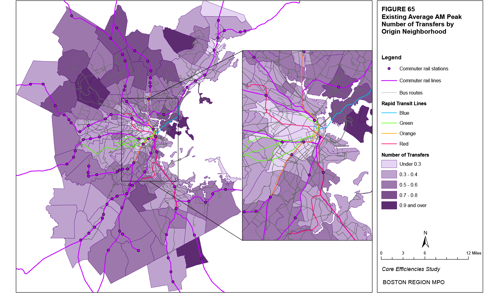
Figure 66
Existing Average AM Peak Number of Transfers for Destination Neighborhoods
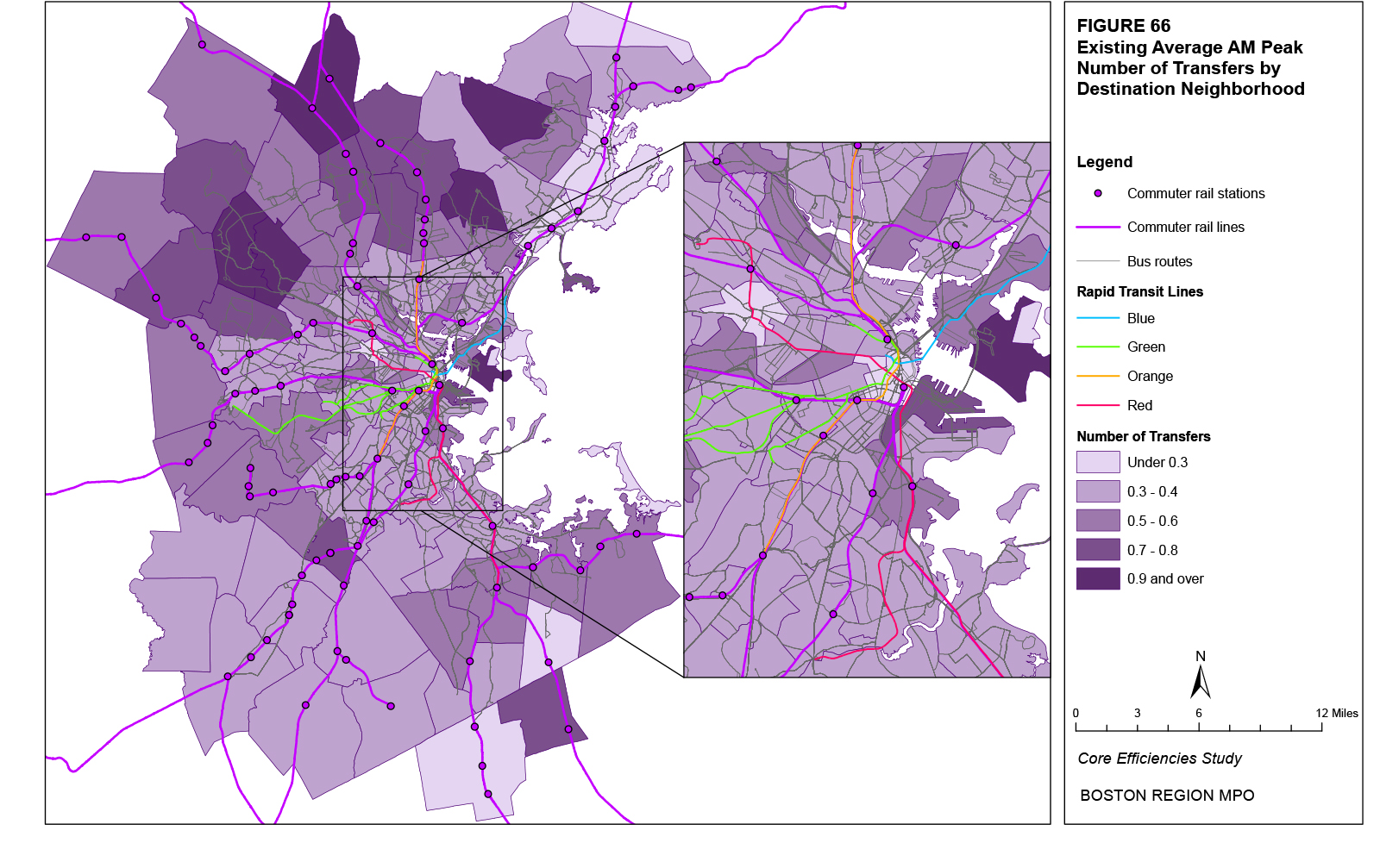
Table 72 shows the existing average initial transit transfer rates for each of the top 20 origin and destination neighborhoods in terms of their projected increases in origin and destination trips, respectively (Tables 48 and 49). A slight majority of origin neighborhoods have an average transfer rate below the average for all neighborhoods (the neighborhood average of 0.50 transfers per trip is greater than 52 percent of other neighborhoods’ average transfer rates), as do a greater number of neighborhoods in the table. Most of these neighborhoods are within the urban core. East Boston and Chelsea are the only origin neighborhoods in the table within the urban core with average transfer rates greater than the average for all neighborhoods. For destination neighborhoods, most neighborhoods in the table also have an average transfer rate below the average for all neighborhoods. Within the urban core, only the Waterfront and North Allston neighborhoods have average transfer rates greater than the average for all neighborhoods.
Origin Neighborhood |
Average Transfers |
Ranking Percentile |
Destination Neighborhood |
Average Transfers |
Ranking Percentile |
Waterfront |
0.42 |
35% |
Waterfront |
0.73 |
87% |
Chinatown |
0.10 |
2% |
East Somerville |
0.48 |
58% |
East Cambridge |
0.25 |
12% |
East Cambridge |
0.41 |
42% |
East Somerville |
0.39 |
30% |
East Lynn |
0.17 |
2% |
East Lynn |
0.27 |
13% |
Downtown |
0.20 |
3% |
Downtown |
0.05 |
0% |
East Revere |
0.37 |
28% |
Brockton |
0.31 |
18% |
Chinatown |
0.28 |
8% |
Chelsea |
0.70 |
86% |
Westwood |
0.49 |
60% |
South Weymouth |
0.42 |
36% |
East Woburn |
0.83 |
92% |
Fenway |
0.20 |
8% |
South Quincy |
0.40 |
38% |
East Boston |
0.71 |
87% |
Longwood |
0.31 |
11% |
South End |
0.22 |
9% |
South Weymouth |
0.27 |
6% |
Stoughton |
0.56 |
66% |
Chelsea |
0.44 |
45% |
North Cambridge |
0.31 |
17% |
Stoughton |
0.45 |
51% |
South Quincy |
0.49 |
50% |
Burlington |
0.66 |
85% |
Westwood |
0.33 |
21% |
Fenway |
0.31 |
13% |
Hingham |
0.61 |
74% |
North Allston |
0.53 |
67% |
Burlington |
0.61 |
75% |
South End |
0.44 |
46% |
Longwood |
0.18 |
6% |
North Peabody |
1.07 |
98% |
East Woburn |
0.78 |
90% |
Needham |
0.56 |
71% |
All Neighborhoods |
All Neighborhoods |
||||
Average |
0.50 |
52% |
Average |
0.49 |
61% |
Maximum |
1.31 |
100% |
Maximum |
1.28 |
100% |
Minimum |
0.05 |
0% |
Minimum |
0.12 |
0% |
*The ranking percentile represents the percentage of all neighborhood average transfer rates that the individual neighborhood’s average transfer rate exceeds. |
|||||
Table 73 shows the average transit transfer rates for the top 20 neighborhood pairs in terms of the projected absolute increase in all trips (origins plus destinations) for each of the 16 neighborhoods with the top projected absolute increases in trips (Table 55). Neighborhoods that are closer to each other typically have lower average transfer rates. In addition, for each neighborhood lying in the urban core, for most of the pairs with the greatest projected increases in trips (appearing at the top of each list), the average transfer rates lie within the bottom 10 percent of the average transfer rates for trips between all neighborhood pairs. For example, for the Waterfront neighborhood, the second largest projected increase in trips is between the Waterfront and Downtown. This neighborhood pair has an average transfer rate (for trips from the Waterfront to Downtown and from Downtown to the Waterfront) of 0.60 transfers per trip. This average transfer rate exceeds only one percent of all average transfer rates for trips between the Waterfront and all other neighborhoods. Within the urban core, which is where most of the projected increase in trips is located, neighborhoods identified in Table 72 with greater average transfer rates generally also have greater average transfer rates in Table 73. Average transfer rates for trips between neighborhood pairs involving Chelsea, the Waterfront, East Boston, and East Somerville on average exceed a transfer rate of 0.70 transfers per trip.
Table 73
Average AM Peak Transfer Rates for Transit Trips between Neighborhoods and Ranking Percentiles (Rank %)* by Neighborhood
for Neighborhoods with the Top Projected Absolute Increases in Trips
This table shows the neighborhood pairs with the top 20 projected absolute increase in trips (origins plus destinations) for each of the neighborhoods with the top 20 projected absolute increases in trips (origins plus destinations). For each neighborhood, column 2 shows the existing average transfer rate for the neighborhood pair and column 3 shows percentage of all average transfer rates between neighborhood pairs that the average transfer rate of the individual neighborhood pair exceeds.
Because of the size or complexity of this particular table, it has not been included in this hypertext markup language (HTML) version of the report; however, it has been included in the portable document format (PDF) version. If you would like to obtain this data in a different format, please contact the Central Transportation Planning Staff (CTPS) via email at publicinfo@ctps.org.
The transfer waiting time where the rider transfers between two transit vehicles is modeled by the Boston Region MPO travel demand model set as one of the “costs” incurred by a rider when taking a transit trip. Higher costs reduce the estimated number of trips. An average transfer waiting time represents the trip cost (measured in terms of the transfer waiting time) of all trips averaged over all riders. This time is averaged over all trips, regardless of whether or not a transfer occurs. Therefore, trips without transfers would have a transfer waiting time of zero minutes. The average transfer waiting time for each neighborhood equals the average of the respective neighborhood’s transfer waiting time for transit trips between all other neighborhoods weighted by the number of existing trips between each neighborhood pair. For example, the average transfer waiting time for transit trips from Fenway to Longwood is 0.04 minutes while the average transfer waiting time from Fenway to Downtown is 0.19 minutes, and the number of existing trips from Fenway to the two destinations is 15,577 and 4,297, respectively. The weighted average transfer waiting time for origin trips from Fenway of these two neighborhoods pairs would therefore be 0.07 minutes. The weighted average transfer waiting time for origin trips from Fenway for all neighborhood pairs is 0.71 minutes.
Figure 67 shows the distribution of existing average transfer waiting times on transit in the AM Peak time period for all trips with an origin in the respective neighborhood. Figure 68 does the same for destination neighborhoods. As seen in the figures, in terms of origins, the lowest average transfer waiting times characterize almost the entire urban core in neighborhoods served by rapid transit. Destination neighborhoods with the lowest category of average transfer waiting times are generally located in the same neighborhoods. Lower average transfer waiting times do appear to be generally correlated with the distance of the neighborhood from downtown Boston. The neighborhoods with the greatest average initial waiting times are primarily located in the northern suburbs of Boston. Similar to the average transfer rate, the greater average transfer times in the northern suburbs compared to the south likely reflect the smaller percentage of North Side commuter rail riders who can walk to their final destination from North Station compared to South Side commuter rail riders at South Station, and must transfer to rapid transit.
Table 74 shows the existing average transit transfer waiting times for each of the top 20 origin and destination neighborhoods in terms of their projected increases in origin and destination trips, respectively (Tables 48 and 49). A majority of origin neighborhoods have an average transfer waiting time below the average for all neighborhoods (the neighborhood average of 2.75 minutes is greater than 60 percent of other neighborhoods’ average travel times), as do a greater number of neighborhoods in the table. Most of these neighborhoods are within the urban core. The neighborhoods in the table with the greatest average transfer waiting times within the urban core are Chelsea, East Boston, and East Somerville. For destination neighborhoods, most neighborhoods also have an average transfer waiting time below the average for all neighborhoods. Within the urban core, destination neighborhoods in the table with the largest average transfer waiting times are North Allston, Waterfront, and Chelsea.
Origin Neighborhood |
Average Wait Time |
Ranking Percentile |
Destination Neighborhood |
Average Wait Time |
Ranking Percentile |
Waterfront |
1.59 |
21% |
Waterfront |
1.66 |
39% |
Chinatown |
0.42 |
2% |
East Somerville |
1.42 |
29% |
East Cambridge |
1.07 |
11% |
East Cambridge |
1.09 |
14% |
East Somerville |
1.78 |
25% |
East Lynn |
1.04 |
13% |
East Lynn |
1.32 |
16% |
Downtown |
0.54 |
2% |
Downtown |
0.26 |
0% |
East Revere |
1.03 |
12% |
Brockton |
2.48 |
51% |
Chinatown |
0.61 |
2% |
Chelsea |
2.36 |
47% |
Westwood |
3.75 |
73% |
South Weymouth |
2.67 |
56% |
East Woburn |
6.46 |
91% |
Fenway |
0.71 |
6% |
South Quincy |
1.86 |
45% |
East Boston |
2.18 |
39% |
Longwood |
0.75 |
6% |
South End |
0.74 |
7% |
South Weymouth |
4.47 |
82% |
Stoughton |
4.10 |
83% |
Chelsea |
1.56 |
33% |
North Cambridge |
1.36 |
17% |
Stoughton |
3.88 |
75% |
South Quincy |
2.45 |
50% |
Burlington |
3.57 |
69% |
Westwood |
1.99 |
34% |
Fenway |
0.71 |
5% |
Hingham |
4.08 |
83% |
North Allston |
1.75 |
42% |
Burlington |
4.19 |
84% |
South End |
1.27 |
24% |
Longwood |
0.65 |
6% |
North Peabody |
11.26 |
98% |
East Woburn |
5.43 |
94% |
Needham |
4.00 |
78% |
All Neighborhoods |
All Neighborhoods |
||||
Average |
2.75 |
60% |
Average |
2.94 |
63% |
Maximum |
8.59 |
100% |
Maximum |
15.50 |
100% |
Minimum |
0.26 |
0% |
Minimum |
0.27 |
0% |
*The ranking percentile represents the percentage of all neighborhood average transfer waiting times that the individual neighborhood’s average transfer waiting time exceeds. |
|||||
Figure 67
Existing Average AM Peak Transfer Waiting Times for Origin Neighborhoods
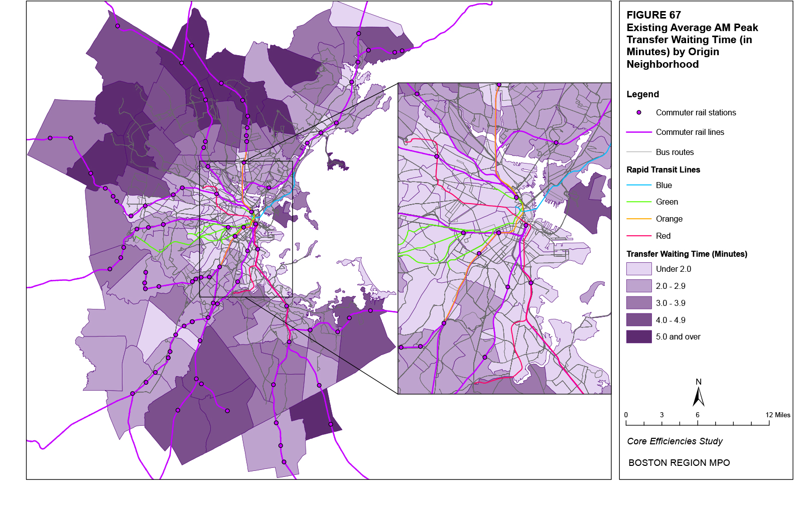
Figure 68
Existing Average AM Peak Transfer Waiting Times for Destination Neighborhoods
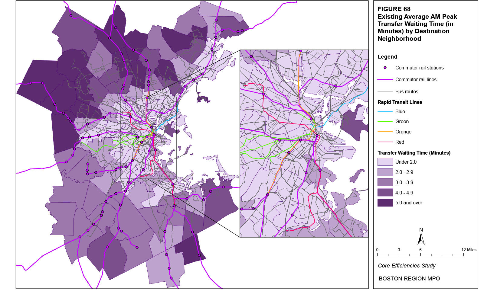
Table 75 shows the average transfer waiting times for the top 20 neighborhood pairs in terms of the projected absolute increase in all trips (origins plus destinations) for each of the 16 neighborhoods with the top projected absolute increases in trips (Table 55). Neighborhoods that are closer to each other typically have lower average transfer waiting times. In addition, for each neighborhood lying in the urban core, for most of the pairs with the greatest projected increases in trips (appearing at the top of each list), the average transfer waiting times lie within the bottom 10 percent of the average transfer waiting times for trips between all neighborhood pairs. For example, for the Waterfront neighborhood, the second largest projected increase in trips is between the Waterfront and Downtown. This neighborhood pair has an average transfer waiting time (for trips from the Waterfront to Downtown and from Downtown to the Waterfront) of 0.11 minutes. This average transfer waiting time exceeds only one percent of all average transfer waiting times for trips between the Waterfront and all other neighborhoods. Within the urban core, which is where most of the projected increase in trips is located, neighborhoods identified in Table 74 with greater average travel times generally also have greater average travel times in Table 75. Average transfer waiting times for trips between neighborhood pairs involving North Allston, South Boston, and North Dorchester on average exceed 3.5 minutes.
The various transit costs modeled by the Boston Region MPO travel demand model set (transit fare, walk time, in-vehicle travel time, initial waiting time, number of transfers, and transfer waiting time) are combined by the model to represent a “cost” incurred by a rider when taking a transit trip. This is the only cost that is used by the model to estimate the trip mode and path. Higher costs reduce the estimated number of trips. Unlike its various components, the total transit cost does not have any real-world relevance in terms of its absolute values. Rather, it equals a weighted sum of the various costs converted into time-based values. The transit fare is divided by the model’s value of time ($18.92 per hour) to obtain a time-based cost that is equivalent to the other modeled costs. The number of transfers is multiplied by a “transfer penalty” of 2.5 minutes per transfer. In addition, every bus boarding is given a 7.0 minute “bus boarding penalty” that increases the relative cost for bus trips (reflecting, in essence, how the various waiting and traveling costs on buses are perceived as more costly than those on other modes). In terms of the weights used by the model, the costs associated with walking or waiting (walk time, initial waiting time, and transfer waiting time) are valued at twice the other costs. The formula for calculating the total transit cost would therefore equal the following:
Total Transit Cost = ( Transit Fare / $18.92 ) + ( 2 × Walk Time ) +
In-Vehicle Travel Time + ( 2 × Initial Waiting Time ) +
( 2.5 × Number of Transfers) + ( 2 × Transfer Waiting Time ) +
( 7.0 × Number of Bus Boardings )
Since the total transit cost does not represent any real value, the figures presented in this analysis represent the ratio of each individual neighborhood pair’s total transit cost to the average total transit cost for all neighborhood pairs. In this way, the total transit cost index indicates not just the relative size of one neighborhood pair’s total transit cost to another’s, but also the relative size compared to the average of all neighborhood pairs. Ratios above 1.0 represent total transit costs greater than the average; ratios below 1.0 represent total transit costs less than the average.
The average total transit cost index for each neighborhood equals the average of the respective neighborhood’s cost index for transit trips between all other neighborhoods weighted by the number of existing trips between each neighborhood pair. For example, the average cost index for transit trips from Fenway to Longwood is 0.19 minutes while the average transfer waiting time from Fenway to Downtown is 0.34, and the number of existing trips from Fenway to the two destinations is 15,577 and 4,297, respectively. The weighted average cost index for origin trips from Fenway of these two neighborhoods pairs would therefore be 0.22. The weighted average cost index for origin trips from Fenway for all neighborhood pairs is 0.51.
Figure 69 shows the distribution of the index of existing average total costs on transit in the AM Peak time period for all trips with an origin in the respective neighborhood. Figure 70 does the same for destination neighborhoods. As the total transit cost represents the combination of the various individual transit costs, the patterns shown in Figures 57 through 68 are reflected in Figures 69 and 70. In terms of origins, the lowest category of average costs characterizes almost the entire urban core in neighborhoods served by rapid transit. Destination neighborhoods with the lowest category of average costs are generally located in the same neighborhoods. Lower average costs do appear to be generally correlated with the distance of the neighborhood from downtown Boston. The neighborhoods with the greatest average costs are primarily located in the northern suburbs of Boston. As with some of the individual transit costs, the smaller percentage of North Side commuter rail riders who can walk to their final destination from North Station compared to South Side commuter rail riders at South Station likely drives this cost difference.
Table 75
Average AM Peak Transfer Waiting Time for Transit Trips between Neighborhoods and Ranking Percentiles (Rank %)* by Neighborhood
for Neighborhoods with the Top Projected Absolute Increases in Trips
This table shows the neighborhood pairs with the top 20 projected absolute increase in trips (origins plus destinations) for each of the neighborhoods with the top 20 projected absolute increases in trips (origins plus destinations). For each neighborhood, column 2 shows the existing average transfer waiting time for the neighborhood pair and column 3 shows percentage of all average transfer waiting times between neighborhood pairs that the average transfer waiting time of the individual neighborhood pair exceeds.
Because of the size or complexity of this particular table, it has not been included in this hypertext markup language (HTML) version of the report; however, it has been included in the portable document format (PDF) version. If you would like to obtain this data in a different format, please contact the Central Transportation Planning Staff (CTPS) via email at publicinfo@ctps.org.
Figure 69
Existing Average AM Peak Total Transit Costs for Origin Neighborhoods
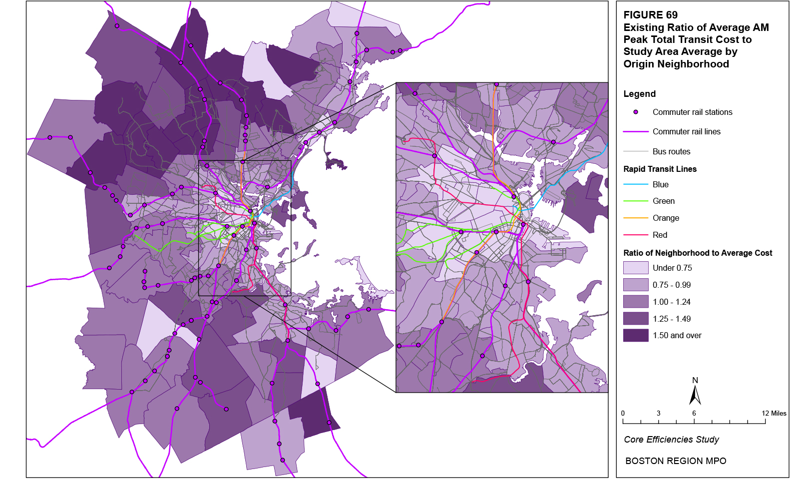
Figure 70
Existing Average AM Peak Total Transit Costs for Destination Neighborhoods
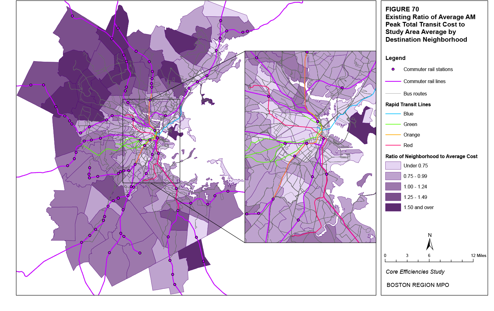
Table 76 shows the index of existing total transit costs averaged for each of the top 20 origin and destination neighborhoods in terms of their projected increases in origin and destination trips, respectively (Tables 48 and 49). Most of these neighborhoods are within the urban core. The origin neighborhoods in the table within the urban core with the greatest average cost indices are Chelsea, East Somerville, and East Boston. For destination neighborhoods in the table within the urban core, East Somerville, the Waterfront, and North Allston have the greatest average cost indices.
Origin Neighborhood |
Average Total Cost |
Ranking Percentile |
Destination Neighborhood |
Average Total Cost |
Ranking Percentile |
Waterfront |
0.69 |
17% |
Waterfront |
0.99 |
56% |
Chinatown |
0.34 |
2% |
East Somerville |
1.02 |
57% |
East Cambridge |
0.50 |
10% |
East Cambridge |
0.72 |
17% |
East Somerville |
0.89 |
35% |
East Lynn |
0.57 |
3% |
East Lynn |
0.67 |
14% |
Downtown |
0.61 |
7% |
Downtown |
0.23 |
1% |
East Revere |
0.88 |
40% |
Brockton |
0.94 |
41% |
Chinatown |
0.62 |
8% |
Chelsea |
0.91 |
37% |
Westwood |
0.95 |
48% |
South Weymouth |
0.67 |
15% |
East Woburn |
1.67 |
94% |
Fenway |
0.51 |
10% |
South Quincy |
0.92 |
46% |
East Boston |
0.81 |
25% |
Longwood |
0.55 |
2% |
South End |
0.42 |
8% |
South Weymouth |
0.61 |
6% |
Stoughton |
1.34 |
82% |
Chelsea |
0.78 |
24% |
North Cambridge |
0.78 |
24% |
Stoughton |
1.10 |
63% |
South Quincy |
0.95 |
44% |
Burlington |
1.42 |
87% |
Westwood |
0.74 |
20% |
Fenway |
0.64 |
10% |
Hingham |
1.24 |
75% |
North Allston |
0.97 |
55% |
Burlington |
1.27 |
77% |
South End |
0.66 |
11% |
Longwood |
0.38 |
5% |
North Peabody |
2.01 |
98% |
East Woburn |
1.52 |
90% |
Needham |
1.17 |
71% |
All Neighborhoods |
All Neighborhoods |
||||
Average |
1.02 |
52% |
Average |
1.02 |
58% |
Maximum |
1.91 |
100% |
Maximum |
2.12 |
100% |
Minimum |
0.23 |
0% |
Minimum |
0.17 |
0% |
*The ranking percentile represents the percentage of all neighborhood average costs that the individual neighborhood’s average cost exceeds. |
|||||
Table 77 shows the index of total transit costs averaged for the top 20 neighborhood pairs in terms of the projected absolute increase in all trips (origins plus destinations) for each of the 16 neighborhoods with the top projected absolute increases in trips (Table 55). As the total transit cost represents the combination of the various individual transit costs, the patterns shown in previous tables are reflected in Table 77. Neighborhoods that are closer to each other typically have lower average costs. In addition, for each neighborhood lying in the urban core, for most of the pairs with the greatest projected increases in trips (appearing at the top of each list), the average costs lie within the bottom 10 percent of the average costs for trips between all neighborhood pairs. For example, for the Waterfront neighborhood, the second largest projected increase in trips is between the Waterfront and Downtown. This neighborhood pair has an average cost index (for trips from the Waterfront to Downtown and from Downtown to the Waterfront) of 0.06. This average cost exceeds only one percent of all average costs for trips between the Waterfront and all other neighborhoods. Within the urban core, which is where most of the projected increase in trips is located, neighborhoods identified in Table 76 with greater average costs generally also have greater average costs in Table 77. The indices of the average cost for trips between neighborhood pairs involving North Allston, Chelsea, the Waterfront, East Boston, and East Somerville on average exceed 0.70.
Two factors generally appear to affect the transit costs of and between various neighborhoods. The first is the physical distance between neighborhoods. Smaller distances between origin and destination neighborhoods are associated with smaller transit costs. This is due to the trip likely taking the lower-priced bus mode, having a shorter in-vehicle travel time, and requiring fewer transfers. The second factor is the neighborhood location. Neighborhoods located in the urban core typically have a greater number of transit options resulting in a greater transit service frequency, fewer transfers, a smaller initial waiting time, and smaller access, egress, and transfer walk times. However, certain neighborhoods in the urban core, such as Chelsea, East Somerville, North Allston, and the Waterfront, have transit costs that are greater than those of their surrounding neighborhoods.
Table 77
Average AM Peak Total Cost Index for Transit Trips between Neighborhoods and Ranking Percentiles (Rank %)* by Neighborhood
for Neighborhoods with the Top Projected Absolute Increases in Trips
This table shows the neighborhood pairs with the top 20 projected absolute increase in trips (origins plus destinations) for each of the neighborhoods with the top 20 projected absolute increases in trips (origins plus destinations). For each neighborhood, column 2 shows the existing average total transit cost index for the neighborhood pair and column 3 shows percentage of all average total transit cost indices between neighborhood pairs that the average total transit cost index of the individual neighborhood pair exceeds.
Because of the size or complexity of this particular table, it has not been included in this hypertext markup language (HTML) version of the report; however, it has been included in the portable document format (PDF) version. If you would like to obtain this data in a different format, please contact the Central Transportation Planning Staff (CTPS) via email at publicinfo@ctps.org.
The previous three sections presented transit ridership trends by route, the modeled number of all trips between neighborhoods, and the existing costs of transit trips between neighborhoods. This section combines various aspects of the previous three. It analyzes all trips between neighborhoods that are served by each transit route and the cost of transit trips between those neighborhoods.
The traditional four-step transportation demand model begins with the generation of trips in terms of the number of origins and destinations by transportation analysis zone (TAZ) and follows with the distribution of each TAZ’s trip origins with matching destinations by TAZ. The subsequent steps specify the choice of the model of travel and the assumed trip path using that mode (referred to as the route assignment). Data from the Boston Region MPO travel demand model set was taken following the completion of the second step (after trip distribution and before mode choice) in order to analyze travel demand before the application of the realities of the actual transportation system. This section now analyzes existing and projected trip origins and destinations considering the constraints of the current transit system.
There are two general types of constraints placed on transit that are assumed in this analysis. The first is the physical service area of each transit route, or the assumed maximum distance that potential passengers would consider walking to access transit. The second constraint is the transit costs described in the previous section. These include transit fares, walk times, in-vehicle travel times, waiting times, and the number of transfers. These costs are combined by the regional travel demand model set into a relative weighted cost index. Service areas are defined according to TAZ boundaries. The cost index represents a neighborhood-to-neighborhood trip cost of transit travel.
Using these inputs, this section will answer several sets of questions. The first question concerns what percentage of trip origins from areas served by each transit route has a destination in areas served by the same route; phrased another way, the question asks what percentage of riders whose origin is in each route’s service area also has a destination within the route’s service area. Correspondingly, the same question can be phrased in the opposite way, asking what percentage of trip destinations to areas served by each transit route has an origin in areas served by the same route; phrased another way, the question asks what percentage of riders whose destination is in each route’s service area also has an origin within the route’s service area. The answers to these questions indicate the extent to which each route serves both the origins and destinations of riders, permitting a one-seat ride and reducing the need for transfers.
A second set of questions concerns the extent to which various neighborhoods are served by each transit route. For trips with a destination served by each transit route, the question asks what the top origin neighborhoods are and what percentage of trips from these neighborhoods has destinations that are served by the route. For trips with an origin served by each transit route, the question asks what the top destination neighborhoods are and what percentage of trips to these neighborhoods has origins that are served by the route. The answers to these questions indicate the top neighborhoods served by each route as well as the extent to which each route serves both the origins and destinations in trips to and from these top neighborhoods, permitting a one-seat ride and reducing the need for transfers.
Finally, a third set of questions concerns the cost of transit trips. For trips with a destination served by each transit route, the question asks what the transit cost (averaged across all destination neighborhoods in the route’s service area) is for trips from the top origin neighborhoods. For trips with an origin served by each transit route, the question asks what the transit cost (averaged across all origin neighborhoods in the route’s service area) is for trips to the top destination neighborhoods. Transit costs are generally lower between neighborhoods served directly by one route and greater when transfers are required. The answers to these questions therefore show the relative costs of various neighborhood-to-neighborhood transit trips.
A service area for each transit route was calculated using the TAZ geographical boundaries. An entire TAZ was designated as belonging to a particular route’s service area if its centroid (the geometric center of the TAZ) lay within one-half mile of the rail station (a point) or bus route (a line). This difference in modal service areas was based on the fact that bus stops are generally spaced at less than 0.15 miles while rapid transit stations generally have a much greater spacing. The exception to this rule is express buses. For express bus routes, only the TAZs that served the parts of the bus line with stops were selected. For each transit route, the trips between the TAZs served by the route and all other TAZs were summed and categorized based on neighborhood boundaries. This summary was for origins (for trips with destinations in the route’s service area) and destinations (for trips with origins in the route’s service area). Thus, while the results of the analysis are presented according to neighborhood definitions, note that the trips accorded to some neighborhoods are only for the TAZs that lie within the route’s service area.
As an example, consider three routes on three different modes: the Red Line for the rail rapid transit system, Route 39 for the local bus network, and Route 424 for the express bus network. The Red Line’s service area was defined as all TAZs with a centroid lying within one-half mile of any Red Line station. Route 39’s service area was defined as all TAZs with a centroid lying within one-half mile of the streets served by the route. Route 424’s service area was defined as all TAZs with a centroid lying within one-half mile of the streets with bus stops served by the route. This methodology results in different modal patterns of TAZ selection for inclusion in the various service areas. For instance, for the Red Line and other rail rapid transit lines, the selected TAZs are generally grouped around the rapid transit stations while, for Route 39 and other local bus routes, TAZs are selected along the entire route since bus stops are spaced at relatively small distances throughout the route. For express bus routes, TAZs are only selected around the bus stops served by the route, which generally omits the TAZs around the express portion of the route; for Route 424, the three general locations with bus stops are downtown Lynn, Wonderland Station, and downtown Boston.
Figure 71 shows the TAZs that were selected for the service area of the Red Line, Route 39, and Route 424. The application of the selection rule (TAZs with a centroid lying within a one-half-mile buffer) results in the omission of some TAZs that may have a significant portion of their area within this buffer, but not their TAZ centroid. For instance, the greater size of some TAZs in Quincy and Braintree results in their centroids lying beyond the one-half-mile buffer of the Red Line Stations, despite the fact that a portion of those TAZs lies very close to the stations. In addition, some larger TAZs have boundaries that extend well beyond the one-half-mile buffer, but because their centroid is located within this buffer, the entire TAZ is included in the service area. While it would be possible to split TAZs at the one-half-mile-buffer line and allocate the TAZ’s total trip origins and destinations based on the amount of the TAZ’s physical area inside and outside the buffer, the actual number of selected TAZs and trips would be unlikely to change significantly. Therefore, the simplistic selection rule was used to create each route’s service area.
After the TAZs belonging to the service area of each transit route were defined, a database with the TAZ-to-TAZ trip flows for all TAZs in the study area was used to summarize these flows by service area. For instance, for all trips originating from the Red Line service area, the corresponding trip destinations by TAZ were selected. The destination TAZs were then summarized according to their neighborhood definitions. The resulting table listed the number of trips origins from the Red Line service area with trip destinations summed by neighborhood. This permitted responses to the first set of questions listed above concerning the extent to which each route serves both the origins and destinations of riders.
This analysis was performed for both existing trips and the projected 2030 change in trips. Several analyses are possible given these two trip universes as well as the definition of the origin and destination. Taking the Red Line as an example, for all existing trips with origins within the Red Line service area, 56 percent of these trips have destinations also served by the Red Line. Correspondingly, for all existing trips with destinations served by the Red Line, 41 percent have origins also served by the Red Line. When looking at the projected change in trips, 52 percent of trips with origins served by the Red Line also have destinations served by the Red Line, and 61 percent of trips with destinations served by the Red Line also have origins served by the Red Line.
Figure 71
Example TAZ Service Areas
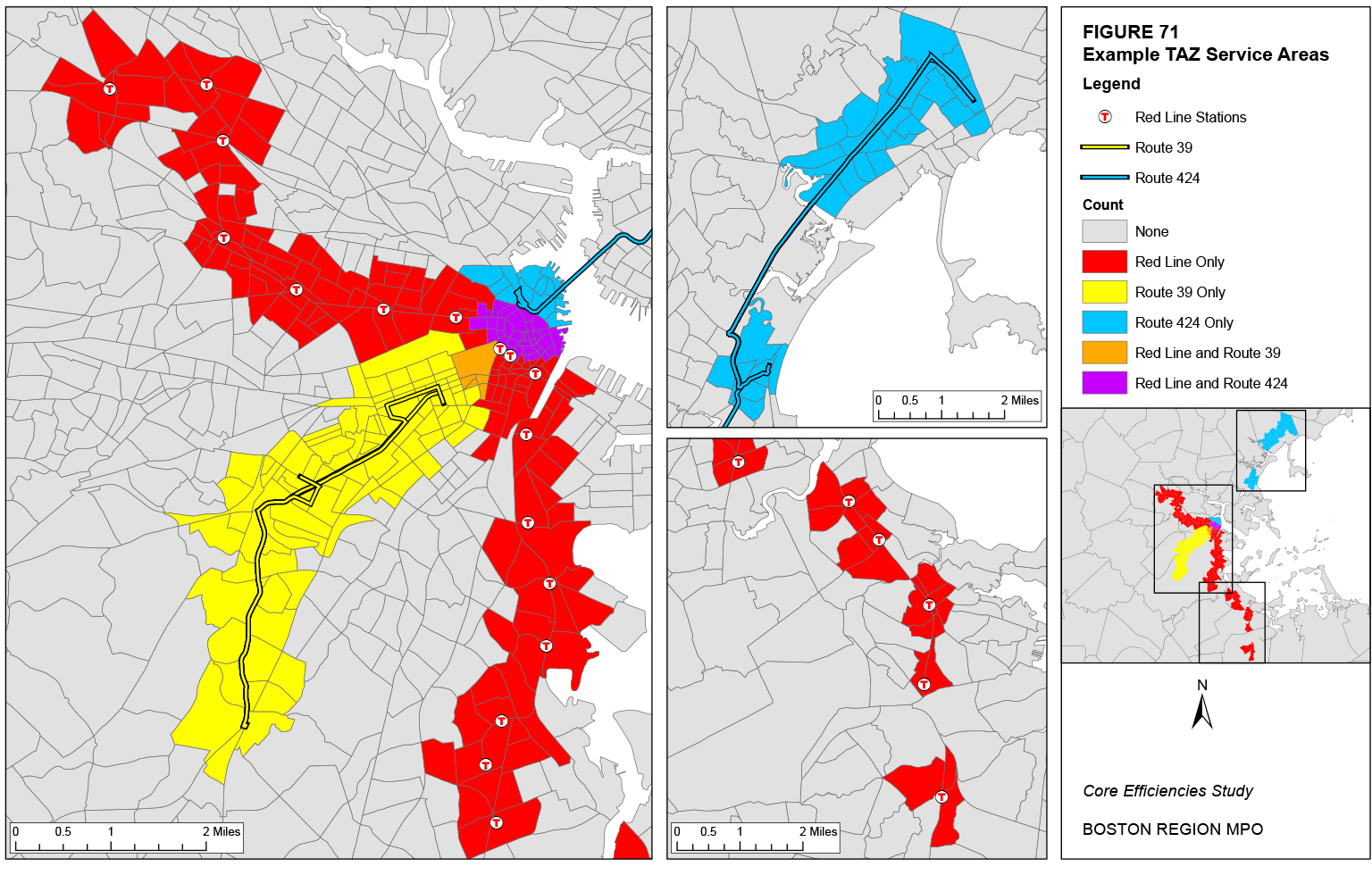
For all trips with origins served by the Red Line, the 10 greatest destination neighborhoods in terms of existing trips are Downtown, Harvard Square, Chinatown, Central Square, Kendall/MIT, South Quincy, Back Bay, South Dorchester, North Quincy, and North Cambridge. Only the Back Bay neighborhood does not lie within the Red Line service area. Correspondingly, the percentage of trips destined for each of these neighborhoods that originate from areas served by the Red Line ranges between 17 percent for Back Bay to 49 percent for Harvard Square. Therefore, a much greater percentage of trips destined for Harvard Square than Back Bay are originating from the Red Line service area. Regarding the cost of transit trips between the Red Line service area (weighted across all neighborhoods in this service area) and the top ten destination neighborhoods (in terms of existing trips), the most expensive neighborhood is Back Bay, with a relative cost index of 0.31. For trips not originating from the Red Line service area, the greatest relative cost index of transit trips to the ten destination neighborhoods is 1.21 to North Cambridge.
For all trips with destinations served by the Red Line, the ten greatest origin neighborhoods in terms of existing trips are Downtown, Harvard Square, Central Square, Chinatown, South Dorchester, South Quincy, North Quincy, Kendall/MIT, North Cambridge, and North Dorchester. All of these neighborhoods are served by the Red Line. Correspondingly, the percentage of trips originating from each of these neighborhoods that are destined for areas served by the Red Line ranges between 29 percent for South Dorchester to 76 percent for Downtown. Therefore, a much greater percentage of trips originating from Downtown than South Dorchester are destined for the Red Line service area. In addition, it is apparent that, for existing trips to the top 10 origin and destination neighborhoods, trips destined for the Red Line service area make up a greater percentage of trips originating from various neighborhoods than do trips originating from the Red Line service area of trips destined for various neighborhoods. Regarding the cost of transit trips between the top ten origin neighborhoods (in terms of existing trips) and the Red Line service area (weighted across all neighborhoods in this service area), the most expensive neighborhoods are South Dorchester and South Quincy, both with a relative cost index of 0.33. For trips not destined for the Red Line service area, the greatest relative cost index of transit trips from the ten origin neighborhoods is 1.26 from North Quincy.
The same analysis is performed for the projected change in trips. For all trips with origins served by the Red Line, the ten greatest destination neighborhoods in terms of the absolute projected change in trips are the Waterfront, Downtown, Chinatown, South Quincy, East Cambridge, Central Square, Back Bay, North Cambridge, South Dorchester, and West End. Only the Back Bay neighborhood does not lie within the Red Line service area. Correspondingly, the percentage of the projected change in trips destined for each of these neighborhoods that originate from areas served by the Red Line ranges between 35 percent for East Cambridge to 88 percent for Central Square. Therefore, a much greater percentage of trips destined for Central Square than East Cambridge are originating from the Red Line service area. Regarding the cost of transit trips between the Red Line service area (weighted across all neighborhoods in this service area) and the top ten destination neighborhoods (in terms of the projected change in trips), the most expensive neighborhood is Back Bay, with a relative cost index of 0.31 For trips not originating from the Red Line service area, the greatest relative cost index of transit trips to the ten destination neighborhoods is 1.38 to the Waterfront.
For all trips with destinations served by the Red Line, the ten greatest origin neighborhoods in terms of the absolute projected change in trips are the Waterfront, Chinatown, Downtown, East Cambridge, South Quincy, North Cambridge, Central Square, South Dorchester, West End, and North Braintree. All of these neighborhoods are served by the Red Line. Correspondingly, the percentage of the projected change in trips originating from each of these neighborhoods that are destined for areas served by the Red Line ranges between 37 percent for East Cambridge to 100 percent for South Dorchester.23 Therefore, a much greater percentage of trips originating from South Dorchester than East Cambridge are destined for the Red Line service area. In addition, it is apparent that, for the projected change in trips to the top 10 origin and destination neighborhoods, additional trips destined for the Red Line service area are projected to make up a slightly greater percentage of trips originating from various neighborhoods than do trips originating from the Red Line service area of trips destined for various neighborhoods. Regarding the cost of transit trips between the top ten origin neighborhoods (in terms of the projected change in trips) and the Red Line service area (weighted across all neighborhoods in this service area), the most expensive neighborhood is North Braintree, with a relative cost index of 0.40. For trips not destined for the Red Line service area, the greatest relative cost index of transit trips from the ten origin neighborhoods is 1.25 from North Cambridge.
Table 78 presents, for each transit route:
Table 79 presents, for each transit route’s existing trips and projected change in trips:
Table 80 presents, for each transit route’s existing trips:
Table 81 presents, for each transit route’s existing trips:
Tables 82 and 83 present the same data for each route’s projected change in trips.
Table 78 shows the 2030 projected ridership percentage change for each transit route as well as the projected percentage changes in the number of origins and destinations associated with the service area of each transit route. While the route and service-area projections are not directly comparable, given that the route projections use transit trips and the service-area projections use all trips, a correlation should exist, given that transit trips are a subset of all trips.
According to Table 78, the greatest projected percentage increases in transit trips are generally grouped into those routes serving Waterfront (Routes 4, 5, 7, 171, and 741-746/Silver Line Waterfront), Downtown (local routes such as Routes 4, 7, and 43 and express routes such as Routes 355 and 468), and East Cambridge (Route 68). In terms of origin trips, the routes with the greatest projected percentage increases have service areas in Waterfront (Routes 4, 7, 11, 171, and 741-746/Silver Line Waterfront), Malden and Everett (Routes 97, 99, 104, 105, and 109), and Downtown with express service from Marblehead and Salem (Routes 448, 449, and 459) and Watertown and Waltham (Routes 500, 504, and 505). In terms of destination trips, the routes with the greatest projected percentage increases have service areas in Waterfront (Routes 7, 11, 171, and 741-746/Silver Line Waterfront), East Somerville (Routes 89, 90, and 95), Malden and Everett (Routes 97, 99, 101, 104, 105, and 109), and East Boston (Routes 114, 116, 119, and 171).
Table 79 shows the percentages of origins and destinations served by each transit route for both existing trips and the 2030 projected change in trips. For existing trips, the routes with the 20 greatest percentages of origins served by the route that also have destinations served by the route can be grouped into the following categories:
For existing trips, the routes with the 20 greatest percentages of destinations served by the route that also have origins served by the route can be grouped into the following categories:
For the projected change in trips, the routes with the 20 greatest percentages of origins served by the route that also have destinations served by the route can be grouped into the following categories:
For the projected change in trips, the routes with the 20 greatest percentages of destinations served by the route that also have origins served by the route can be grouped into the following categories:
This table shows, for each transit route (column 1), the projected percent change in transit route ridership (column 2), the projected percent change in all trips originating from that route’s service area (column 3), and the projected percent change in all trips destined for that route’s service area (column 4).
Because of the size or complexity of this particular table, it has not been included in this hypertext markup language (HTML) version of the report; however, it has been included in the portable document format (PDF) version. If you would like to obtain this data in a different format, please contact the Central Transportation Planning Staff (CTPS) via email at publicinfo@ctps.org.
Table 79
Percentages of Origins and Destinations Served by Each Transit Route
Existing Trips and Projected Change in Trips
Percentage of trips with an origin served by the route that also have a destination served by the route (Orig.-Dest.)
Percentage of trips with a destination served by the route that also have an origin served by the route (Dest.-Orig.)
This table shows, for each transit route (column 1), the percentage of existing trips with an origin served by the route that also have a destination served by the route (column 2), the percentage of existing trips with a destination served by the route that also have an origin served by the route (column 3), the percentage of the projected change in trips with an origin served by the route that also have a destination served by the route (column 4), the percentage of the projected change in trips with a destination served by the route that also have an origin served by the route (column 5).
Because of the size or complexity of this particular table, it has not been included in this hypertext markup language (HTML) version of the report; however, it has been included in the portable document format (PDF) version. If you would like to obtain this data in a different format, please contact the Central Transportation Planning Staff (CTPS) via email at publicinfo@ctps.org.
This table shows, for rail rapid transit lines and bus routes 1−7, the ten greatest destination neighborhoods (column 1) as measured by the number of trips to the destination neighborhoods that have an origin in the route’s service area (column 2). Column 3 shows the percentage of trips to the ten greatest destination neighborhoods that have an origin in the route’s service area. Column 4 shows the relative cost index of trips to the ten greatest destination neighborhoods that have an origin in the route’s service area. Column 5 shows the number of trips to the ten greatest destination neighborhoods that do not have an origin in the route’s service area. Column 6 shows the percentage of trips to the ten greatest destination neighborhoods that do not have an origin in the route’s service area. Column 7 shows the relative cost index of trips to the ten greatest destination neighborhoods that do not have an origin in the route’s service area.Because of the size or complexity of this particular table, it has not been included in this hypertext markup language (HTML) version of the report; however, it has been included in the portable document format (PDF) version. If you would like to obtain this data in a different format, please contact the Central Transportation Planning Staff (CTPS) via email at publicinfo@ctps.org.
Table 81 shows the ten greatest origin neighborhoods for all existing trips with a destination in the service area of each transit route. The table also shows the number of these trips, the number of trips originating from the neighborhood that do not have a destination in the transit route’s service area, the associated percentages of trips originating from each neighborhood that do and do not have a destination in the transit route’s service area, and the associated relative cost index of transit trips originating from each neighborhood that do and do not have a destination in the transit route’s service area. Of the 174 analyzed transit routes, the greatest number (68 or 39%) list South Dorchester as one of their 10 greatest origin neighborhoods for trips that are destined for each route’s service area. This is followed by South End, Chinatown, and Back Bay. The 20 greatest origin neighborhoods, in terms of their inclusion in the top-10 list for each transit route, are listed in Table 85, along with the number and percentage of times each neighborhood was listed, and the percentage of routes for which the neighborhood lies in the routes’ service area. Chelsea lies in the service area of the greatest percentage of routes (71%) that list it as one of the 10 greatest origin neighborhoods, followed by East Boston (68%) and North Quincy (67%). Downtown lies in the service area of the smallest percentage of these routes (6%), followed by Longwood (7%) and North Roxbury (18%). Several neighborhoods do not lie in the service area of any of the routes that list them as one of their top 10 origins for their service-area destinations. These include Mission Hill, Beacon Hill, BU, North Newton, and North Allston.
This table shows, for rail rapid transit lines and bus routes 1−7, the ten greatest origin neighborhoods (column 1) as measured by the number of trips from the origin neighborhoods that have a destination in the route’s service area (column 2). Column 3 shows the percentage of trips to the ten greatest origin neighborhoods that have a destination in the route’s service area. Column 4 shows the relative cost index of trips from the ten greatest origin neighborhoods that have a destination in the route’s service area. Column 5 shows the number of trips from the ten greatest origin neighborhoods that do not have a destination in the route’s service area. Column 6 shows the percentage of trips to the ten greatest origin neighborhoods that do not have a destination in the route’s service area. Column 7 shows the relative cost index of trips from the ten greatest origin neighborhoods that do not have a destination in the route’s service area.
Because of the size or complexity of this particular table, it has not been included in this hypertext markup language (HTML) version of the report; however, it has been included in the portable document format (PDF) version. If you would like to obtain this data in a different format, please contact the Central Transportation Planning Staff (CTPS) via email at publicinfo@ctps.org.
Table 82 shows the ten greatest destination neighborhoods for the projected change in all trips with an origin in the service area of each transit route. The table also shows the number of these trips, the number of trips destined for the neighborhood that do not have an origin in the transit route’s service area, the associated percentages of trips destined for each neighborhood that do and do not have an origin in the transit route’s service area, and the associated relative cost index of transit trips destined for each neighborhood that do and do not have an origin in the transit route’s service area. Of the 174 analyzed transit routes, the greatest number (161 or 93%) list the Waterfront as one of their 10 greatest destination neighborhoods for trips that originate from each route’s service area. This is followed by East Somerville, Downtown, and Chinatown. The 20 greatest destination neighborhoods, in terms of their inclusion in the top-10 list for each transit route, are listed in Table 86, along with the number and percentage of times each neighborhood was listed, and the percentage of routes for which the neighborhood lies in the routes’ service area. Westwood lies in the service area of the greatest percentage of routes (100%) that list it as one of the 10 greatest destination neighborhoods, followed by the Waterfront (82%) and East Somerville (79%). Mission Hill lies in the service area of the smallest percentage of these routes (0%), followed by North Roxbury (16%) and South Dorchester (19%). Several other neighborhoods do not lie in the service area of any of the routes that list them as one of their top 10 destinations for their service-area origins. These include North End, Jamaica Plain, West Malden, East Arlington, and South Brighton.
This table shows, for rail rapid transit lines and bus routes 1−7, the ten greatest destination neighborhoods (column 1) as measured by the projected change in the number of trips to the destination neighborhoods that have an origin in the route’s service area (column 2). Column 3 shows the percentage of the projected change in trips to the ten greatest destination neighborhoods that have an origin in the route’s service area. Column 4 shows the relative cost index of the projected change in trips to the ten greatest destination neighborhoods that have an origin in the route’s service area. Column 5 shows the projected change in the number of trips to the ten greatest destination neighborhoods that do not have an origin in the route’s service area. Column 6 shows the percentage of the projected change in trips to the ten greatest destination neighborhoods that do not have an origin in the route’s service area. Column 7 shows the relative cost index of the projected change in trips to the ten greatest destination neighborhoods that do not have an origin in the route’s service area.Because of the size or complexity of this particular table, it has not been included in this hypertext markup language (HTML) version of the report; however, it has been included in the portable document format (PDF) version. If you would like to obtain this data in a different format, please contact the Central Transportation Planning Staff (CTPS) via email at publicinfo@ctps.org.
Table 83 shows the ten greatest origin neighborhoods for the projected change in all trips with a destination in the service area of each transit route. The table also shows the number of these trips, the number of trips originating from the neighborhood that do not have a destination in the transit route’s service area, the associated percentages of trips originating from each neighborhood that do and do not have a destination in the transit route’s service area, and the associated relative cost index of transit trips originating from each neighborhood that do and do not have a destination in the transit route’s service area. Of the 174 analyzed transit routes, the greatest number (122 or 70%) list the Waterfront as one of their 10 greatest origin neighborhoods for trips that are destined for each route’s service area. This is followed by Chinatown, East Cambridge, and East Somerville. The 20 greatest origin neighborhoods, in terms of their inclusion in the top-10 list for each transit route, are listed in Table 87, along with the number and percentage of times each neighborhood was listed, and the percentage of routes for which the neighborhood lies in the routes’ service area. Brockton lies in the service area of the greatest percentage of routes (97%) that list it as one of the 10 greatest origin neighborhoods, followed by East Cambridge (83%) and Chelsea (76%). North Roxbury lies in the service area of the smallest percentage of these routes (0%), followed by Longwood (10%) and South Dorchester (12%). Several other neighborhoods do not lie in the service area of any of the routes that list them as one of their top 10 origins for their service-area destinations. These include Mission Hill, North End, East Malden, Jamaica Plain, and East Arlington.
This table shows, for rail rapid transit lines and bus routes 1−7, the ten greatest origin neighborhoods (column 1) as measured by the projected change in the number of trips from the origin neighborhoods that have a destination in the route’s service area (column 2). Column 3 shows the percentage of the projected change in trips to the ten greatest origin neighborhoods that have a destination in the route’s service area. Column 4 shows the relative cost index of the projected change in trips from the ten greatest origin neighborhoods that have a destination in the route’s service area. Column 5 shows the projected change in the number of trips from the ten greatest origin neighborhoods that do not have a destination in the route’s service area. Column 6 shows the percentage of the projected change in trips to the ten greatest origin neighborhoods that do not have a destination in the route’s service area. Column 7 shows the relative cost index of the projected change in trips from the ten greatest origin neighborhoods that do not have a destination in the route’s service area.Because of the size or complexity of this particular table, it has not been included in this hypertext markup language (HTML) version of the report; however, it has been included in the portable document format (PDF) version. If you would like to obtain this data in a different format, please contact the Central Transportation Planning Staff (CTPS) via email at publicinfo@ctps.org.
|
Count of Routes Listing the Neighborhood |
Percent of Routes |
|
Destination Neighborhood |
Listing the Neighborhood |
Serving the Neighborhood |
|
Downtown |
137 |
79% |
66% |
Back Bay |
90 |
52% |
73% |
Chinatown |
62 |
36% |
34% |
South End |
53 |
30% |
36% |
Fenway |
48 |
28% |
27% |
South Dorchester |
46 |
26% |
41% |
West End |
43 |
25% |
40% |
Harvard Square |
41 |
24% |
54% |
Longwood |
38 |
22% |
21% |
South Newton |
37 |
21% |
78% |
North End |
33 |
19% |
36% |
Kendall/MIT |
29 |
17% |
62% |
North Dorchester |
29 |
17% |
59% |
South Quincy |
29 |
17% |
34% |
South Roxbury |
29 |
17% |
34% |
Central Square |
28 |
16% |
36% |
North Cambridge |
28 |
16% |
29% |
Waterfront |
28 |
16% |
32% |
Spring Hill |
27 |
16% |
41% |
East Revere |
24 |
14% |
25% |
|
Count of Routes Listing the Neighborhood |
Percent of Routes |
|
Origin Neighborhood |
Listing the Neighborhood |
Serving the Neighborhood |
|
South Dorchester |
68 |
39% |
60% |
South End |
57 |
33% |
42% |
Chinatown |
52 |
30% |
21% |
Back Bay |
48 |
28% |
50% |
Downtown |
48 |
28% |
6% |
Fenway |
46 |
26% |
24% |
South Roxbury |
41 |
24% |
51% |
Mattapan |
39 |
22% |
46% |
North Roxbury |
39 |
22% |
18% |
North End |
37 |
21% |
41% |
East Revere |
36 |
21% |
47% |
Harvard Square |
32 |
18% |
41% |
West End |
32 |
18% |
28% |
East Boston |
31 |
18% |
68% |
Longwood |
30 |
17% |
7% |
North Dorchester |
30 |
17% |
60% |
Davis Square |
29 |
17% |
62% |
South Quincy |
29 |
17% |
34% |
Chelsea |
28 |
16% |
71% |
Central Square |
27 |
16% |
33% |
|
Count of Routes Listing the Neighborhood |
Percent of Routes |
|
Destination Neighborhood |
Listing the Neighborhood |
Serving the Neighborhood |
|
Waterfront |
161 |
93% |
82% |
East Somerville |
97 |
56% |
79% |
Downtown |
77 |
44% |
56% |
Chinatown |
63 |
36% |
35% |
South End |
56 |
32% |
39% |
Fenway |
55 |
32% |
36% |
West End |
49 |
28% |
43% |
Back Bay |
43 |
25% |
56% |
Longwood |
41 |
24% |
29% |
North Roxbury |
37 |
21% |
16% |
Westwood |
34 |
20% |
100% |
Mattapan |
33 |
19% |
36% |
North Allston |
27 |
16% |
33% |
East Cambridge |
26 |
15% |
54% |
Mission Hill |
26 |
15% |
0% |
South Dorchester |
26 |
15% |
19% |
South Roxbury |
26 |
15% |
27% |
East Revere |
25 |
14% |
24% |
North Quincy |
24 |
14% |
67% |
Spring Hill |
24 |
14% |
33% |
|
Count of Routes Listing the Neighborhood |
Percent of Routes |
|
Origin Neighborhood |
Listing the Neighborhood |
Serving the Neighborhood |
|
Waterfront |
122 |
70% |
76% |
Chinatown |
74 |
43% |
45% |
East Cambridge |
69 |
40% |
83% |
East Somerville |
64 |
37% |
69% |
Downtown |
60 |
34% |
38% |
South End |
59 |
34% |
39% |
Fenway |
55 |
32% |
38% |
West End |
50 |
29% |
44% |
Back Bay |
37 |
21% |
38% |
Chelsea |
34 |
20% |
76% |
Mattapan |
33 |
19% |
36% |
Longwood |
31 |
18% |
10% |
Brockton |
29 |
17% |
97% |
East Boston |
28 |
16% |
64% |
Spring Hill |
27 |
16% |
37% |
North Roxbury |
26 |
15% |
0% |
South Dorchester |
26 |
15% |
12% |
West Revere |
26 |
15% |
58% |
South Quincy |
25 |
14% |
24% |
Charlestown |
24 |
14% |
29% |
The analysis of this section largely reinforces the conclusions of previous sections. Most existing trips have origins and destinations that are mainly served by routes with the greatest ridership totals. These transit routes typically serve downtown Boston or other neighborhoods that attract a large number of trips. Population and employment densities are typically greater in these neighborhoods, as are the number of zero-vehicle households. Transit costs are also generally lower for existing trips to and from these neighborhoods. Finally, the largest number of existing trips occurs within neighborhoods or between neighborhoods that are nearby or within the same town. These neighborhoods include Chinatown, Downtown, Fenway, and Harvard Square.
In terms of the projected 2030 change in trips, there are several neighborhoods that appear consistently throughout this section when identifying transit routes that have greater projected increases in trips to and from their service areas, greater numbers of projected origins and destinations, and greater costs for transit trips. The two neighborhoods that stand out are the Waterfront and East Somerville. Neighborhoods such as Chinatown, Downtown, East Boston, East Cambridge, Fenway, Longwood, and North Roxbury are also noticeable for their projected trip increases. Therefore, while the existing transit system appears to adequately serve existing travel patterns, increases in the number of trips to neighborhoods that currently have higher transit costs indicate that potential changes may be advisable.
This chapter presents several potential concepts for modifying and/or redesigning MBTA service delivery. In the two previous chapters, the measurement of service-delivery standards and the existing and forecasted trip patterns of the study area were analyzed. This chapter will apply the same analysis to the presented service concepts as well as an evaluation of the concepts under various financial-constraint scenarios.
There are several general patterns for service structure. Each pattern’s application to real-world settings is, by necessity, largely dependent on existing characteristics. However, from a purely theoretical perspective, a discussion of the different patterns and their associated positives and negatives is useful before considering potential real-world application and limitations.
A grid transit pattern provides a consistent level of service across a defined service area. Routes have the same frequencies and are spaced at a consistent distance, with no overlap except where routes cross and transfers are possible. Figure 72 provides an example of this service pattern.
Figure 72
Theoretical Concept of a Grid Transit Pattern
|
|
|
|
|
|
|
|
|
|
|
|
|
|
|
|
|
|
|
|
Advantages of the grid transit pattern include a relatively higher level of service coverage (with the absolute coverage depending on the size of the individual grid boxes) and, consequently, a reduced probability of crowding occurring on any individual route, as ridership is diffused across the grid. However, since locations with greater demand for transit, such as the central business district, schools, or shopping centers, are generally not dispersed, this ridership dispersion across the grid means that fewer riders will be able to travel directly between their origin and destination with a one-seat ride. The extent to which riders would need to transfer between routes would likely increase, resulting in greater transit travel times.
A hub-and-spoke transit pattern provides different levels of local and non-local service across a defined service area. These differences occur primarily in terms of service frequency and coverage. The local service funnels riders to a central hub along various spokes that connect to the hub. The non-local service then provides connections between different hubs, where all routes meet and transfers are possible. This service also typically offers greater frequency and capacity, given the greater expected numbers of riders. Figure 73 provides an example of this service pattern in which the bold line represents the non-local service that connects the hubs, which are each served by multiple spokes representing the local services.
Figure 73
Theoretical Concept of a Hub-and-Spoke Transit Pattern

Advantages of the hub-and-spoke transit pattern include a reduction in the total number of route miles, as most routes are shorter-distance local “spokes” serving only the regional “hub,” which, along with other hubs, is only served by a few long-distance non-local routes. However, the reduction in total route miles comes at the expense of coverage. Riders must walk greater distances to access transit (represented by the distance between spokes) as the distance from the hub increases. One option to reduce this walking distance would be to provide circumferential connections between the spokes at these greater distances from the hub. Another potential advantage can be realized if all local and non-local routes are scheduled to arrive at the hub at the same time. These so-called “pulse” transfers reduce the transfer waiting time. On the other hand, delays resulting from the failure to meet the schedule at any individual hub can reverberate across the entire transit network, owing to the inter-connected nature of the hub-and-spoke pattern.
A trunk transit pattern provides different levels of feeder and trunk service across a defined service area. Like the hub-and-spoke pattern, these differences occur primarily in terms of service frequency and coverage. Multiple feeder routes funnel riders to a central meeting point, where all routes converge and operate along a shared, trunk segment before splitting into their individual routes once again. Transfers between individual routes are possible anywhere along the trunk segment. Given its greater number of routes, the trunk portion of any route offers greater frequency and capacity. Figure 74 provides an example of this service pattern in which the patterned box represents the trunk service.
Figure 74
Theoretical Concept of a Trunk Transit Pattern

The major advantage of the trunk transit pattern is the use of multiple feeder routes to create a trunk segment of every route with a higher level of transit service. The greater frequencies and capacities of the trunk segment come at the expense of reduced transit service coverage elsewhere. However, the service benefits, including the ability of riders to transfer among multiple routes anywhere along the trunk segment, may outweigh the reduction in coverage. Feeder routes face the same challenge as spoke routes do in the hub-and-spoke pattern: as the distance from the trunk segment increases, so does the distance that riders are required to walk to access the feeder service. In addition, some amount of route schedule-coordination is desirable to ensure consistent vehicle spacing in the trunk segment; however, unlike the hub-and-spoke pattern, delays on one route will not dramatically affect the entire network, as each route operates relatively independently.
No general transit pattern can be applied directly to a real-world situation. Geography, street network, land use/development, cost, and trip patterns, among other characteristics, will inevitably dictate the actual layout of transit service. However, each of the three patterns discussed above – grid, hub and spoke (with or without circumferential connections), and trunk – offer potential elements for guiding service structure. A grid pattern prioritizes universal coverage while the hub-and-spoke pattern sacrifices some coverage for greater potential efficiency in service delivery. Finally, the trunk pattern also trades coverage in certain areas for improved transit service in others.
The existing structure of MBTA service uses a combination of elements from the three general service patterns. While there is no strict application of the grid pattern, per se, the South End has a bus route running on almost every major street in both the north-south and east-west directions. Several North Shore routes join at various hubs at the Salem and Lynn commuter rail stations and at Wonderland Station on the Blue Line. Melnea Cass Boulevard between Ruggles and Dudley Stations and Warren Street south of Dudley Station act as the trunk portion of several routes that feed into these stations.
In its entirety, the core MBTA system largely functions as a general hub-and-spoke/trunk transit network in which rapid transit stations are radial hubs and bus routes are the spokes feeding into trunk corridors around rapid transit stations. Indeed, most bus routes serve one or more rapid transit or commuter rail stations. Riders typically use local bus routes to travel to the rapid transit station closest to their neighborhood, from which they take rapid transit to their destination, typically in the urban core. There are obviously many exceptions to this general trip pattern depending on where riders live and work and where various services operate. For instance, express buses from Waltham provide service directly to downtown Boston. While bus and commuter rail schedules are sometimes coordinated in order to facilitate a smooth transfer between the modes at certain commuter rail stations, rapid transit service operates at a high enough frequency such that no such schedule coordination with buses is needed.
Any potential adjustment or change to existing MBTA service must assume the continuation of the current rapid transit and commuter rail networks. The nature of these rail networks, with track and stations being largely immobile, means that the radial structure of the rail system is unlikely to change without a large capital expenditure. However, most bus routes can be re-routed with relatively little expense. Bus stop amenities, such as signs or shelters, can be relocated, maps can be changed, and on-street parking spaces can shift. As a result, most of the concepts developed for this report focus on changes to the bus network and little to no change in the rapid transit or commuter rail networks.
The following sections describe these concepts, and subsequent sections present an evaluation of each.
The one potential change to the rail network that is considered in this report is the extension of the rapid transit network beyond its existing terminus stations. The following potential extensions of the rapid transit network, included in the 2009 Program for Mass Transportation (PMT), are included in this rail-extension concept:
Figure 75 shows the physical location of these proposed rail rapid transit extensions. Of these various proposals, only Assembly Square Station on the Orange Line, the Green Line extension from Lechmere Station, and improvements and additional stations on the Fairmount Commuter Rail Line are currently scheduled for construction, and construction on the Green Line in Medford is only planned as far as College Avenue Station. The other projects have been proposed as part of the most recent and past PMTs, but no current plan for their construction is underway.
Extensions of the rail rapid transit network would not dramatically change the basic structure of the existing transit system. Some bus routes, such as Route 79 out of Alewife Station or Route 32 out of Forest Hills Station, that mirror the proposed extensions could likely be eliminated or modified. Some of the proposed stations, such as Lynn Station on the Blue Line and Union Square Station on the Green Line, would likely act as new hubs for bus routes, reducing bus trips to existing hubs. However, the use of buses as spokes, feeding trips to the rapid transit network, would not change. If anything, extensions of the rail rapid transit lines would expand this trip pattern.
This concept would balance a reduction in local bus coverage with an improvement in frequency and capacity on more heavily-used bus routes. The routes chosen for such improvements would receive various bus rapid transit (BRT) improvement measures, including dedicated rights of way, fare-collection equipment permitting pre-paid boarding, and transit signal priority, as well as frequencies that equal or exceed those of the rail rapid transit lines. As a trade-off for these bus improvements on some routes, other bus routes would be eliminated. Neighborhoods not receiving BRT service would maintain their local bus service at the existing frequencies.
Figure 76 presents an example of how this concept could potentially be realized. The routes selected for BRT improvements include all Key Bus Routes (Routes 1, 15, 22, 23, 28, 32, 39, 57, 66, 71, 73, 77, 111, 116, 117, and the various branches of the Silver Line) as well as other major routes, with the goal of maintaining a relatively equal spacing between the BRT corridors and maintaining service along heavily-traveled corridors. All local routes within the service areas of these selected BRT routes would be eliminated. All other local routes outside the service areas of these selected BRT routes would be maintained. These local routes would operate at existing frequencies.
The figure shows changes in bus service by road segment. All maintained local routes that share a routing with a BRT route would use the BRT facilities along this route segment, stopping at only the BRT facilities, but return to local service in non-BRT segments. Eliminated bus service is only shown where no BRT or local service would operate. For example, even though Route 44 (Jackson Square Station – Ruggles Station) service would be eliminated along Humboldt Avenue, BRT service would remain on the route’s other existing segments. Similarly, the elimination of Route 80 (Arlington Center – Lechmere Station) is only shown along Medford Street in Arlington and not along Boston Avenue in Medford where Route 94 (Medford Square – Davis Square) is maintained.
Figure 75
Rail Extension Concept
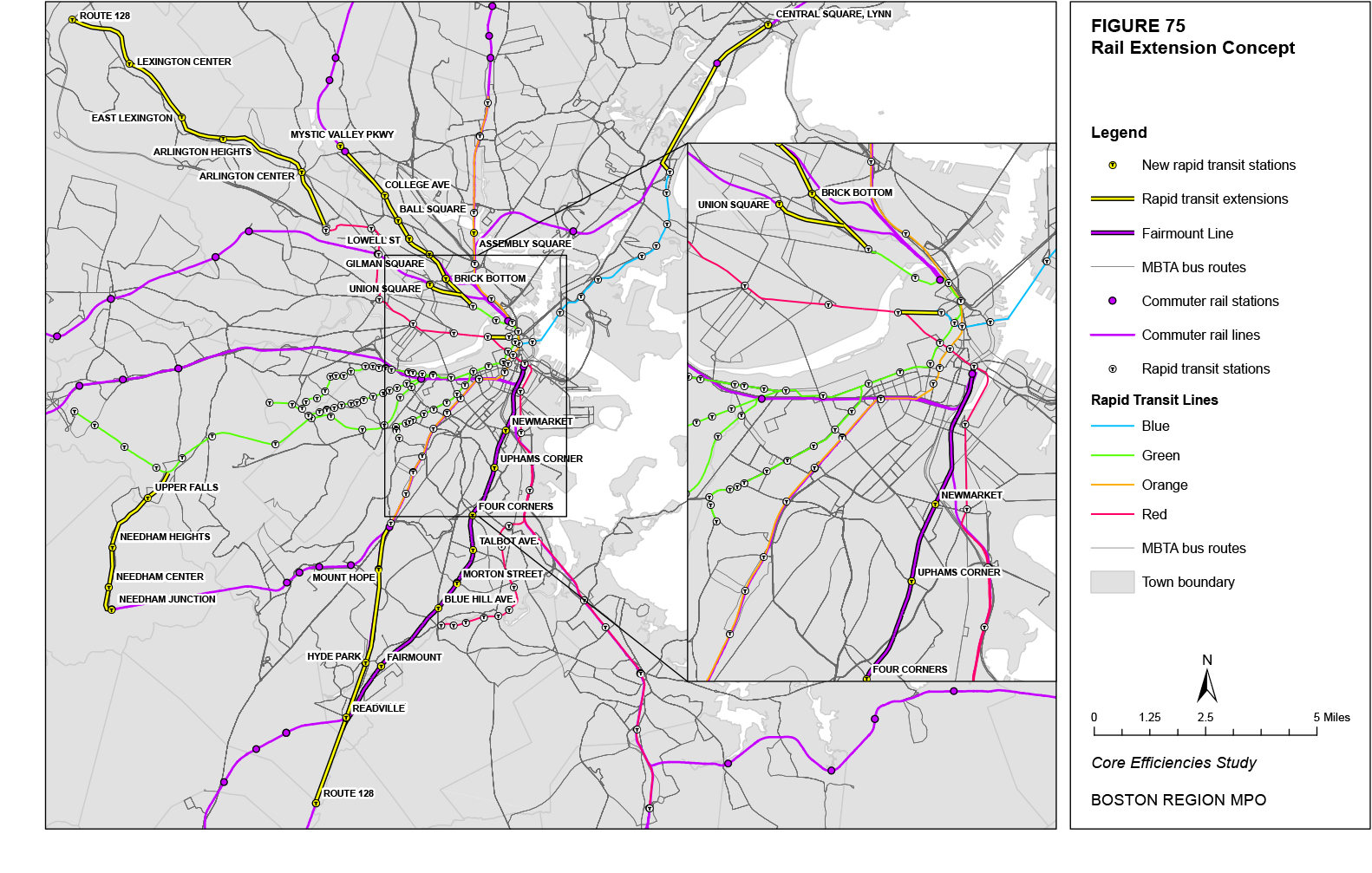
Figure 76
BRT Corridor Concept
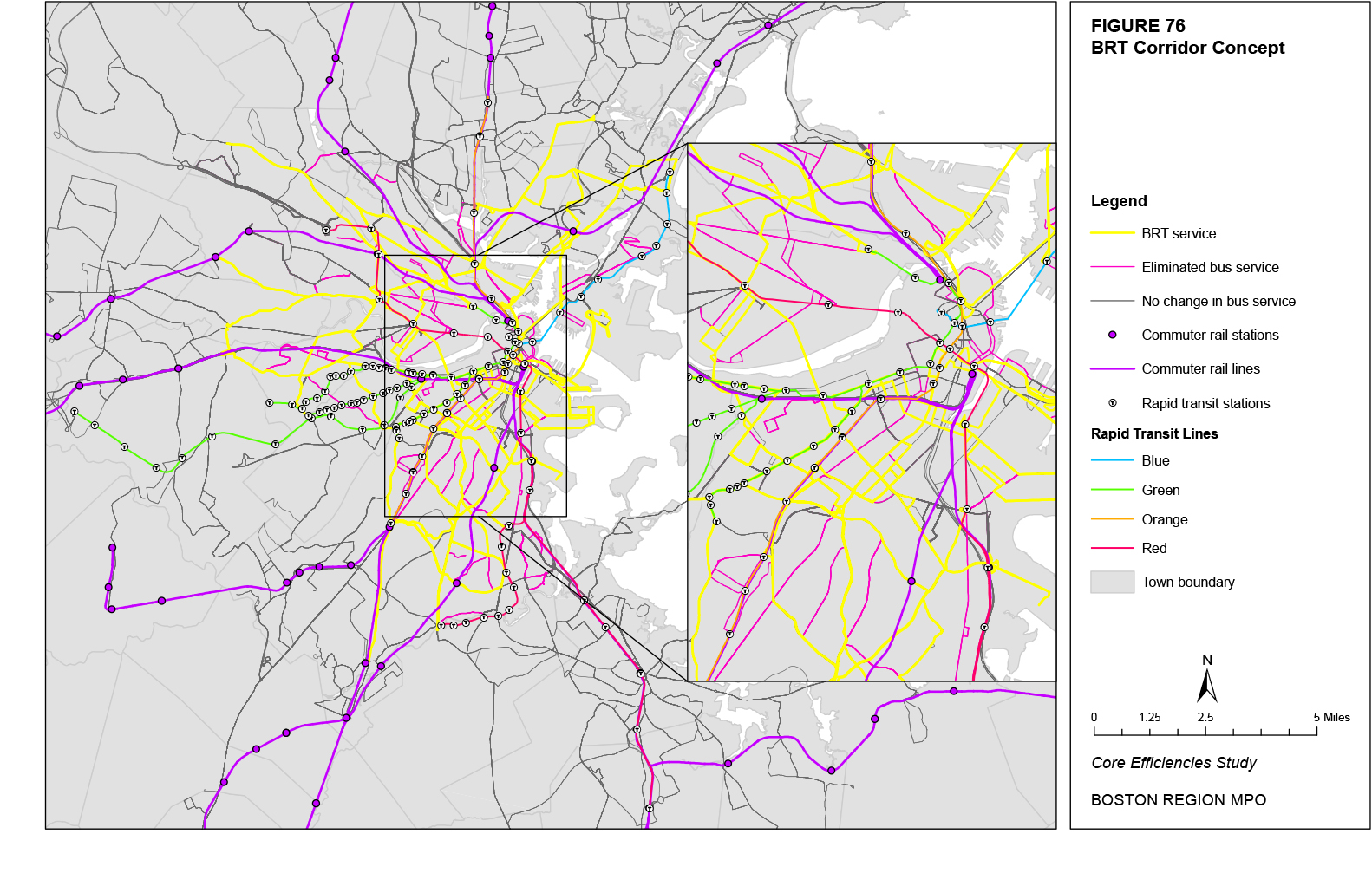
This concept would add limited-stop service during the AM- and PM-peak-weekday time periods on longer and more heavily-used bus routes. Stops would be at major boarding and alighting points, such as rapid transit stations, bus transfer opportunities, and major trip attractors. The goal would be to have sufficient spacing between stops (with a minimum average of approximately one-half mile) such that greater than 50 percent of route boardings and alightings would be served by the limited-stop service. Obviously, not all of these riders would actually be served by the limited-stop service, as one end of the trip could be at a local stop. However, those riders whose boarding and alighting are both served by the limited-stop service would receive a significant savings in their average trip time. The introduction of limited-stop service would be balanced with a decrease in the trip frequency for the route’s local variation. Routes not receiving limited-stop service would maintain their local bus service at the existing frequencies.
Figures 77 and 78 present an example of how this concept could potentially be realized. The routes selected for limited-stop service include all Key Bus Routes (Routes 1, 15, 22, 23, 28, 32, 39, 57, 66, 71, 73, 77, 111, 116, 117, and the various branches of the Silver Line) as well as additional routes that travel longer distances and have a minimum of 4,000 daily trips (Routes 16, 34, 70, 86, and 101). Figure 77 shows the locations of the stops selected for limited-stop service in the inbound direction while Figure 78 does the same in the outbound direction.
As an example, the operation of limited-stop service on Route 28 is estimated to be feasible with 30-minute headways and an increase in the headway of local Route 28 service from 6-7 minutes and 8 minutes in the AM- and PM-peak-weekday time periods, respectively, to 9-10 minutes and 12-13 minutes. Two vehicles would be required for limited-stop Route 28 service in the AM-peak-weekday time period, and three vehicles would be required in the PM-peak-weekday time period. The existing vehicle requirement for Route 28 local service for both peak-weekday time periods would decrease from 13 to 11 vehicles in the AM peak and 10 vehicles in the PM peak. The limited-stop Route 28 service is estimated to have a savings in total route running time of over 30 percent.
This concept would reinforce the radial nature of the rail network by using buses primarily to shuttle passengers to the rail system or to points between rail lines. In neighborhoods without access to rail stations, BRT routes, with frequencies similar to those of other rapid transit lines and bus improvement measures to prioritize bus travel, would provide radial access to downtown Boston. Other BRT routes would operate on the major circumferential corridors, typically linking multiple radial routes but also serving non-radial trips that are entirely circumferential. Non-BRT bus routes would also operate as circumferential routes between radial lines. While the alignment of some local routes would not change from the current local bus network (particularly those outside the rapid transit service area), other local routes between the radial lines would be much shorter in terms of both distance and running times than they currently are. These routes would primarily serve a specific neighborhood, shuttling trips from that neighborhood to the nearest rapid transit lines. The shorter running times of these routes would also permit an increase in their service frequencies.
Figure 79 presents an example of how this concept could potentially be realized. Note that the Green Line extension to College Avenue, the new Assembly Square Station on the Orange Line, and the improvements to the Fairmount Line are assumed. Other new radial corridors that would be realized with BRT service are Routes 32, 34, 39, 57, 70, 73, 77, 109 (with an extension to Haymarket Station), 111, 220, 240, 455, and an extension of the Silver Line-Washington Street along Blue Hill Avenue to Mattapan Station and along Washington Street and Talbot Avenue to Ashmont Station. Circumferential routes that would be converted into BRT services are Routes 1, 9, 15, 16, 21, 22, 31, 47, 66, 86, 110, and 215. In addition, Route 101 could be converted into a circumferential route between Malden Station and Davis Station by rerouting Route 101 onto College Avenue from Main Street. Other existing routes would only be maintained if they provide service to an area not well served by the rapid transit routes. Some of these existing routes would be shortened. The total number of bus routes under this example concept would be reduced from the 166 existing (include the Silver Line-Washington Street and Silver Line-Waterfront) to 26 BRT routes and 82 neighborhood bus routes.
Figure 77
Limited-Stop Corridor Concept: Inbound Stops
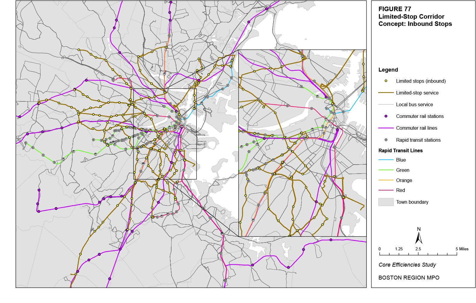
Figure 78
Limited-Stop Corridor Concept: Outbound Stops
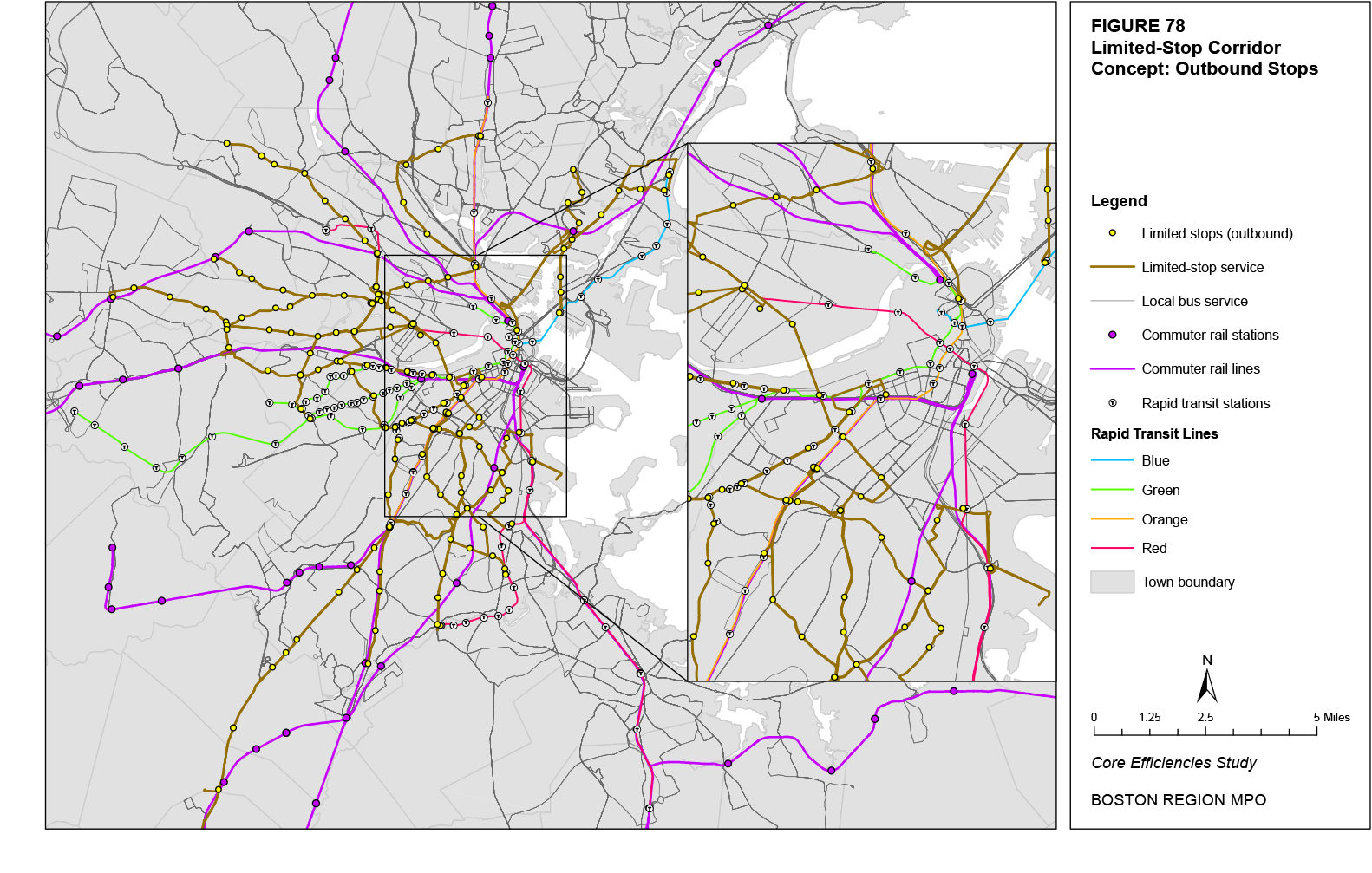
Figure 79
Radial, Circumferential, and Neighborhood Concept
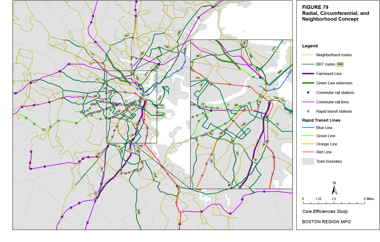
The four concepts presented in this section offer several different visions for how MBTA service could be potentially structured in the future. The rail extension concept essentially maintains the existing service structure with extensions of the radial rail network while using buses as primarily feeder routes or to serve circumferential trips. The BRT corridor concept replaces local bus service in the urban core with a reduced number of high-frequency, BRT-level services, while local bus service outside the core would remain the same. The limited-stop corridor concept replaces local bus service with a combination of local and limited-stop service during the peak travel periods along Key Bus Routes and other major routes that travel a longer distance. The final concept presents an entirely revised bus network, with new BRT routes along major radial and circumferential corridors and other bus routes linking local neighborhoods to these corridors and the rail lines.
The second chapter in this study reviewed the various service standards used by the MBTA and other peer transit agencies. The following section analyzes the possible implications for these service standards of each of the defined potential service concepts: rail extensions; BRT corridors; limited-stop corridors; and radial, circumferential, and neighborhood services (referred to henceforth as “neighborhood services”). Given that the MBTA’s existing performance according to these standards has already been reviewed, this analysis will focus on the potential changes to this performance that can be linked to the specific service concept. These concepts are grouped by their general theme category: service structure, service provision, service efficiency, and physical infrastructure.
The coverage standard measures the walking distance to the nearest transit service. The MBTA currently uses a minimum standard of 0.25 miles for areas with a minimum population density of 5,000 persons per square mile. Within the 65 municipalities of the MBTA’s bus and rapid transit service area, 80 percent of street-miles that lie within census tracts with a population density of 5,000 or greater are within a quarter-mile of transit service. For all bus and rapid transit services, 158 square miles fall within the quarter-mile coverage standard.
The rail extension concept would add coverage compared to the existing transit network, as it only involves additions to the rail network. Figure 80 shows the coverage of the existing transit network and the additional coverage that would be provided by adding to the rail network. This concept would increase the square miles of bus and rapid transit service coverage by 2.4 percent. Within census tracts with a population density of 5,000 or greater, square miles of service coverage would increase by 3.0 percent.
The BRT corridor concept would reduce coverage compared to the existing transit network, as the provision of BRT services within the urban core would be offset by the reduction in local bus routes. Figure 81 shows the quarter-mile coverage of the BRT corridor concept and the reduced coverage compared to the existing transit network that would be caused by the elimination of non-BRT local bus routes in the urban core. This concept would decrease the square miles of service coverage for the entire bus and rapid transit system by 1.7 percent. Within census tracts with a population density of 5,000 or greater, the square miles of service coverage would decrease by 57.9 percent.
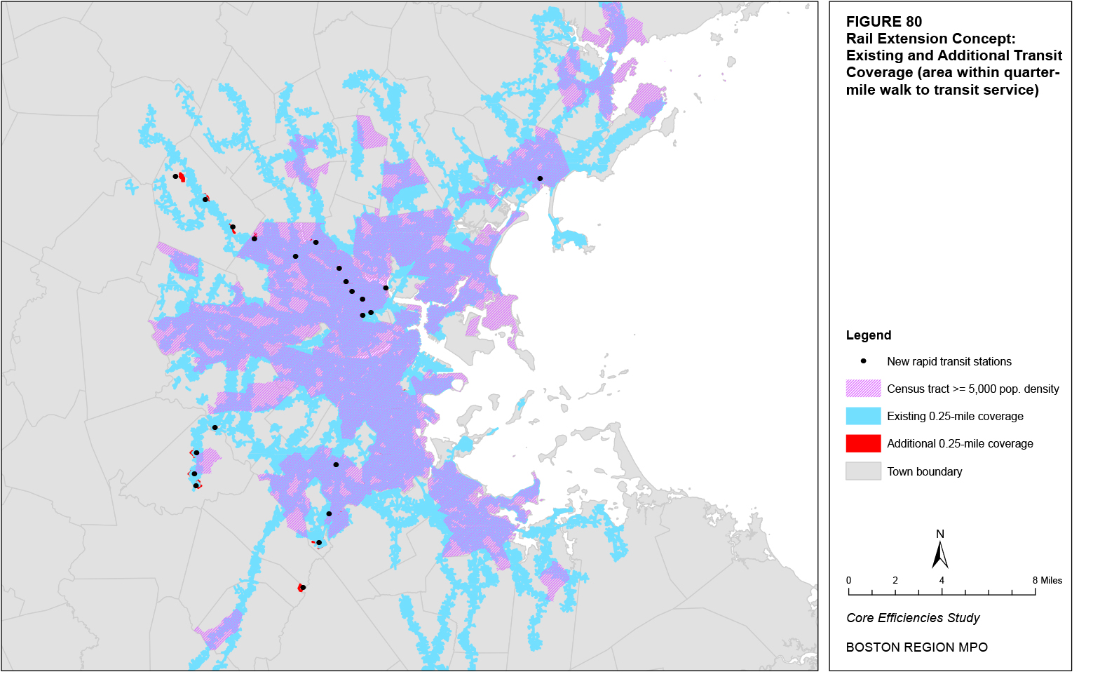
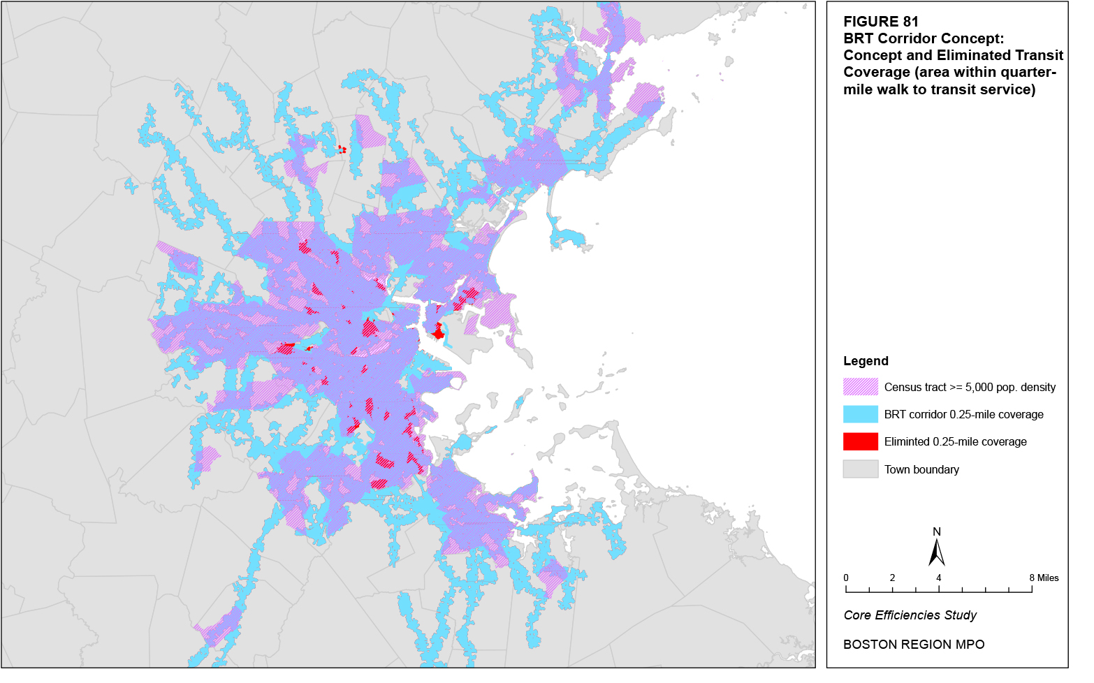
The limited-stop corridor concept would not change the coverage of the existing transit network, as no new routes would be added nor would any routes be eliminated. According to the standards by which the stops for the limited-stop routes were selected, all limited-stop routes have stops that serve at least 50 percent of the boardings and alightings for that route. Table 88 presents the percentage of boardings plus alightings that the stops of each limited-stop route serve. Routes with a greater concentration of boardings and alightings at specific stops, such as Route 111 where 81 percent of boardings plus alightings are at Haymarket Station, have greater percentages.
Table 88
Limited-Stop Corridor Concept: Percentage of Boardings plus Alightings Served by Stops
|
Percent of Boardings + Alightings Served |
|
Bus Route |
Inbound |
Outbound |
1: Harvard Sq. - Dudley Sta. via Mass. Ave. |
65% |
62% |
15: Kane Sq. - Ruggles Sta. |
56% |
62% |
16: Forest Hills Sta. - UMass |
64% |
70% |
22: Ashmont Sta. - Ruggles Sta. via Talbot Ave. |
61% |
64% |
23: Ashmont Sta. - Ruggles Sta. via Washington St. |
60% |
62% |
28: Mattapan Sta. - Ruggles Sta. |
60% |
59% |
32: Wolcott Sq. or Cleary Sq. - Forest Hills Sta. |
72% |
67% |
34: Dedham Line - Forest Hills Sta. |
35% |
65% |
39: Forest Hills Sta. - Back Bay Sta. |
55% |
51% |
57: Watertown Yard - Kenmore Sta. |
52% |
49% |
66: Harvard Sq. - Dudley Sta. via Brookline |
57% |
60% |
70: Cedarwood - Central Sq. Cambridge |
55% |
60% |
71: Watertown Sq. - Harvard Sta. |
69% |
65% |
86: Sullivan Sta. - Cleveland Circle |
66% |
64% |
101: Malden Sta. - Sullivan Sta. via Medford Sq. |
52% |
54% |
111: Woodlawn or Bway. & Park - Haymarket Sta. |
73% |
73% |
116: Wonderland Sta. - Maverick Sta. via Revere |
56% |
60% |
The neighborhood services concept would reduce coverage compared to the existing transit network in some areas where local bus routes are eliminated, but it would also add coverage in some areas that are not currently served by transit. Figure 82 shows the quarter-mile coverage of the neighborhood services concept and the eliminated coverage compared to the existing transit network. Overall, this concept would decrease the square miles of coverage for the entire bus and rapid transit network by 4.1 percent. The percentage decrease in the existing service coverage is actually 9.2 percent; however, an additional 8.8 square miles of new coverage would be provided to some areas that are not currently served by transit. Within census tracts with a population density of 5,000 or greater, the square miles of service coverage would decrease by 5.8 percent. This overall decrease would be made up of a 9.2 percent decrease in the existing service coverage, offset by an additional 3.3 square miles of new coverage.
The proposed concepts would offer significantly different levels of coverage. The rail extension concept would only provide limited additional coverage, as several proposed stations are located in suburban areas that have limited walking access, and other stations are located in more urban areas that are already served by bus routes, such that the rail extensions there would provide no additional coverage. The BRT corridor concept proposes the greatest reduction in coverage, largely in the urban core where most proposed BRT routes would be located. This is caused by the elimination of local bus service in the BRT corridor concept. The limited-stop corridor concept would not change systemwide coverage as no routes would be added or eliminated. Finally, the neighborhood services concept has a slightly reduced coverage level compared to the existing system; however, it does add coverage to some areas that are not currently served by transit. This additional coverage would be provided by new neighborhood-based local routes while the reduced coverage would come from the elimination and rerouting of several local bus routes where BRT service would be provided. Under this concept, the primary role of local bus routes would be to serve as feeders to the major radial and circumferential rapid transit corridors.
The MBTA does not currently have a stop-spacing standard, but a majority of distances between stops fall between 0.05 miles and 0.15 miles.
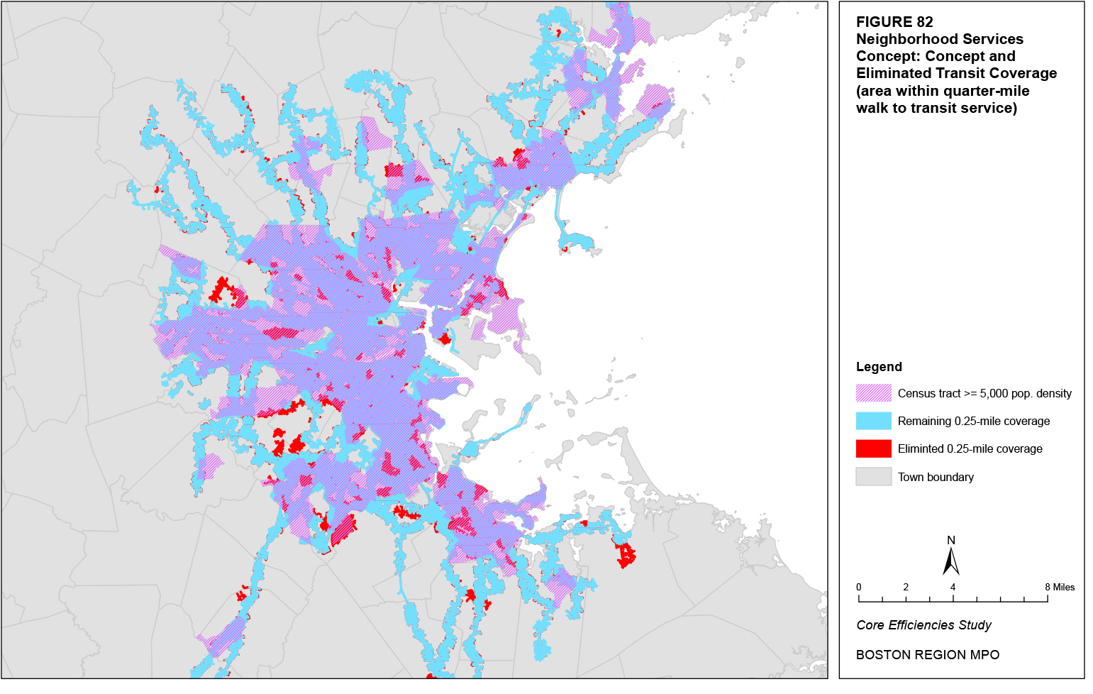
The approximate distances between new rapid transit stations in the rail extension concept are presented in Table 89. Most of the new stations are separated by distances greater than one mile. The addition of Assembly Square Station on the Orange Line reduces the line’s average station distance. The Green Line E Branch extension from Lechmere to Mystic Valley Parkway has the smallest spacing between stations of any rail extension. The rail extensions would increase the average station spacing for all of the lines in the current rail rapid transit system. Station spacing for each line is currently below one mile.
|
Stations |
|
Average Station Distance (mi.) |
|
Rail Line |
From |
To |
Distance btwn. Stations (mi.) |
|
Blue |
Wonderland |
Central Square, Lynn |
4.252 |
|
Red |
Alewife |
Arlington Center |
1.419 |
|
|
Arlington Center |
Arlington Heights |
2.042 |
|
|
Arlington Heights |
East Lexington |
1.150 |
|
|
East Lexington |
Lexington Center |
1.716 |
|
|
Lexington Center |
Route 128 |
1.843 |
|
|
Alewife |
Route 128 |
8.170 |
1.634 |
Green D Branch |
Newton Highlands |
Upper Falls |
1.213 |
|
|
Upper Falls |
Needham Heights |
1.435 |
|
|
Needham Heights |
Needham Center |
0.908 |
|
|
Needham Center |
Needham Junction |
0.607 |
|
|
Newton Highlands |
Needham Junction |
4.163 |
1.041 |
Orange |
Forest Hills |
Mount Hope |
1.831 |
|
|
Mount Hope |
Hyde Park |
2.151 |
|
|
Hyde Park |
Readville |
1.286 |
|
|
Readville |
Route 128 |
2.054 |
|
|
Forest Hills |
Route 128 |
7.322 |
1.831 |
Orange |
Sullivan Square |
Assembly Square |
0.687 |
|
|
Assembly Square |
Wellington |
0.457 |
|
|
Sullivan Square |
Wellington |
1.144 |
0.572 |
Red-Blue Connector |
Bowdoin |
Charles/MGH |
0.475 |
|
Green E Branch |
Lechmere |
Brick Bottom |
0.857 |
|
|
Brick Bottom |
Gilman Square |
0.677 |
|
|
Gilman Square |
Lowell Street |
0.592 |
|
|
Lowell Street |
Ball Square |
0.484 |
|
|
Ball Square |
College Avenue |
0.630 |
|
|
College Avenue |
Mystic Valley Parkway |
1.490 |
|
|
Lechmere |
Mystic Valley Parkway |
4.730 |
0.788 |
|
Lechmere |
Union Square |
1.136 |
|
Fairmount Line |
South Station |
Newmarket |
1.595 |
|
|
Newmarket |
Uphams Corner |
0.893 |
|
|
Uphams Corner |
Four Corners |
1.194 |
|
|
Four Corners |
Talbot Avenue |
0.779 |
|
|
Talbot Avenue |
Morton Street |
0.855 |
|
|
Morton Street |
Blue Hill Avenue |
0.699 |
|
|
Blue Hill Avenue |
Fairmount |
1.841 |
|
|
Fairmount |
Readville |
1.408 |
|
|
South Station |
Readville |
9.264 |
1.158 |
The implementation of BRT service is often accompanied by an increase in the average distance between stops. Table 90 presents the existing average inbound and outbound stop spacing for the 34 routes selected under the BRT corridor concept for BRT service. As seen in the table, all routes except for the two Silver Line Waterfront branches, Route 31 in the inbound direction, and the Silver Line Washington Street in the outbound direction have an average stop spacing below 0.20 miles, and 65 percent and 74 percent of routes in the inbound and outbound directions, respectively, have an average stop spacing below 0.16 miles. The revised stop spacing for most BRT routes would likely mirror that of the Silver Line Washington Street, with an average stop spacing between 0.20 and 0.25 miles.
Limited-stop service would operate at an average stop-spacing distance greater than that under the BRT corridor concept. Note that, under the limited-stop corridor concept, all routes with limited-stop service would also have local service. Table 91 presents the existing average stop-spacing distance for the local service by direction as well as the potential average stop spacing for limited-stop service by direction. The average stop-spacing distance of local routes in both directions is approximately 0.15 miles while the average potential stop-spacing distance of the limited-stop routes is 0.68 miles in the inbound direction and 0.66 miles in the outbound direction.
As with the BRT corridor concept, the neighborhood services concept would also increase the average distance between stops on routes selected for BRT service, largely to within the range of 0.20 to 0.25 miles. Neighborhood routes would maintain a maximum distance between stops of 0.20 miles, but most stop distances would fall within the range of 0.05 to 0.15 miles.
Table 90
BRT Corridor Concept: Existing Stop Spacing for Selected BRT Routes
|
Average Stop Spacing (mi.) |
|
Bus Route |
Inbound |
Outbound |
1: Harvard Sq. - Dudley Sta. via Mass. Ave. |
0.148 |
0.138 |
7: City Point - Otis & Summer Sts. |
0.182 |
0.163 |
8: Harbor Point/UMass - Kenmore Sta. |
0.168 |
0.173 |
9: City Point - Copley Sq. via Broadway Sta. |
0.153 |
0.137 |
11: City Point - Downtown |
0.133 |
0.130 |
15: Kane Sq. - Ruggles Sta. |
0.109 |
0.131 |
16: Forest Hills Sta. - UMass |
0.188 |
0.192 |
21: Ashmont Sta. - Forest Hills Sta. |
0.186 |
0.169 |
22: Ashmont Sta. - Ruggles Sta. via Talbot Ave. |
0.178 |
0.158 |
23: Ashmont Sta. - Ruggles Sta. via Washington St. |
0.142 |
0.134 |
28: Mattapan Sta. - Ruggles Sta. |
0.146 |
0.137 |
31: Mattapan Sta. - Forest Hills Sta. |
0.233 |
0.157 |
32: Wolcott Sq. or Cleary Sq. - Forest Hills Sta. |
0.155 |
0.149 |
39: Forest Hills Sta. - Back Bay Sta. |
0.156 |
0.160 |
47: Central Sq. Cambridge - Broadway Sta. |
0.158 |
0.166 |
57: Watertown Yard - Kenmore Sta. |
0.133 |
0.130 |
66: Harvard Sq. - Dudley Sta. via Brookline |
0.147 |
0.155 |
71: Watertown Sq. - Harvard Sta. |
0.156 |
0.138 |
73: Waverley Sq. - Harvard Sta. |
0.144 |
0.149 |
77: Arlington Heights - Harvard Sta. |
0.153 |
0.144 |
86: Sullivan Sta. - Cleveland Circle |
0.152 |
0.143 |
87: Clarendon Hill - Lechmere Sta. via Somerville Ave. |
0.154 |
0.135 |
88: Clarendon Hill - Lechmere Sta. via Highland Ave. |
0.153 |
0.136 |
89: Clarendon Hill - Sullivan Sta. |
0.126 |
0.114 |
91: Sullivan Sta. - Central Sq. Cambridge |
0.138 |
0.137 |
93: Sullivan Sta. - Downtown via Bunker Hill |
0.157 |
0.138 |
109: Linden Sq. - Sullivan Sta. |
0.166 |
0.153 |
110: Wonderland Sta. - Wellington Sta. |
0.160 |
0.148 |
111: Woodlawn or Bway. & Park - Haymarket Sta. |
0.176 |
0.132 |
116: Wonderland Sta. - Maverick Sta. via Revere |
0.126 |
0.113 |
117: Wonderland Sta. - Maverick Sta. via Beach |
0.130 |
0.124 |
741 Silver Line 1: Logan Airport - South Sta. |
0.451 |
0.629 |
742 Silver Line 2: Boston Marine Industrial Park - South Sta. |
0.302 |
0.344 |
749 Silver Line 5: Dudley Sta. - Downtown |
0.189 |
0.219 |
Table 91
Limited-Stop Corridor Concept:
Stop Spacing for Local and Limited-Stop Routes
|
Average Stop Spacing (mi.) |
|||
|
Inbound |
Outbound |
||
Bus Route |
Local |
Limited |
Local |
Limited |
1: Harvard Sq. - Dudley Sta. via Mass. Ave. |
0.148 |
0.560 |
0.138 |
0.551 |
15: Kane Sq. - Ruggles Sta. |
0.109 |
0.607 |
0.131 |
0.634 |
16: Forest Hills Sta. - UMass |
0.177 |
0.809 |
0.213 |
0.791 |
22: Ashmont Sta. - Ruggles Sta. via Talbot Ave. |
0.178 |
0.587 |
0.158 |
0.536 |
23: Ashmont Sta. - Ruggles Sta. via Washington St. |
0.142 |
0.582 |
0.134 |
0.568 |
28: Mattapan Sta. - Ruggles Sta. |
0.146 |
0.530 |
0.137 |
0.601 |
32: Wolcott Sq. or Cleary Sq. - Forest Hills Sta. |
0.155 |
0.650 |
0.149 |
0.656 |
34: Dedham Line - Forest Hills Sta. |
0.162 |
1.133 |
0.166 |
1.118 |
39: Forest Hills Sta. - Back Bay Sta. |
0.156 |
0.554 |
0.160 |
0.580 |
57: Watertown Yard - Kenmore Sta. |
0.133 |
0.650 |
0.130 |
0.548 |
66: Harvard Sq. - Dudley Sta. via Brookline |
0.147 |
0.616 |
0.155 |
0.618 |
70: Cedarwood - Central Sq. Cambridge |
0.186 |
0.777 |
0.171 |
0.777 |
71: Watertown Sq. - Harvard Sta. |
0.156 |
0.581 |
0.138 |
0.573 |
86: Sullivan Sta. - Cleveland Circle |
0.148 |
0.605 |
0.143 |
0.612 |
101: Malden Sta. - Sullivan Sta. via Medford Sq. |
0.124 |
1.065 |
0.131 |
0.941 |
111: Woodlawn or Bway. & Park - Haymarket Sta. |
0.176 |
0.579 |
0.132 |
0.548 |
116: Wonderland Sta. - Maverick Sta. via Revere |
0.126 |
0.695 |
0.113 |
0.676 |
117: Wonderland Sta. - Maverick Sta. via Beach |
0.130 |
0.619 |
0.124 |
0.573 |
All of the potential service concepts offer a greater average stop-spacing distance compared to the existing system. The rail extension concept proposes greater distances between stations than the existing station spacing on the same line. All proposed BRT routes, either in the BRT corridor concept or the neighborhood services concept, have a greater average distance between stops to reduce the frequency with which buses must stop to pick up or drop off passengers. Finally, the limited-stop corridor concept has the greatest average distance between stops, as this service is intended to primarily serve longer-distance trips between major boarding and alighting points.
The MBTA does not currently have either a route-duplication or route-competition standard. Most duplication in the MBTA system exists on the highway portion of express bus routes or around the roads leading to rapid transit stations. The closer proximity of bus routes increases the likelihood of competition between the routes for riders, but it appears that most MBTA transit routes are serving specific geographic or demographic markets.
The rail extension concept does extend some rail lines along corridors served by existing bus routes. For example, the Orange Line extension to Route 128 mirrors Route 32 to Readville Station. However, several existing cases do exist where bus routes mirror a portion of rail rapid transit lines, such as Route 1 along the Red Line between Harvard Station and Central Station or Route 18 along the Red Line between Andrew Station and Ashmont Station, providing local service between the stations. Thus, while these services are somewhat duplicative, they do not compete, as they each serve different markets. Nevertheless, it is likely that some bus routes would be eliminated or rerouted due to an expected reduction in their ridership caused by competition with rail rapid transit extensions, for example, if the Red Line was extended to Lexington or the Blue Line was extended to Lynn.
The duplication of services along BRT corridors is not entirely negative, as this allows the physical investments needed for BRT service to be shared with multiple routes. However, while certain BRT routes would share the same corridors, the BRT corridor concept would likely reduce overall route duplication due to the elimination of non-BRT routes within the service area of the BRT corridors. Note that the BRT corridor concept does not affect express bus routes, which have the greatest amount of route duplication.
Route duplication would not be affected by the limited-stop corridor concept, as this concept proposes no changes to the existing route structure, only the scheduling of local and limited-stop variations on certain routes.
One of the goals of the neighborhood services concept is actually the reduction of duplicative services. This is achieved by using neighborhood routes to transport riders to the nearest rapid transit corridor, from which riders can use the needed circumferential or radial rapid transit route. As a result, neighborhood routes remain much more local in nature, having little overlap with other neighborhood or rapid transit routes.
Most of the potential concepts would not dramatically affect route duplication or competition. The rail extension concept would necessitate a review of which local bus routes that serve the same markets should be eliminated or rerouted. Most of the existing route duplication exists on express bus routes, which are largely left unaffected by the proposed concepts, or around rapid transit stations. The limited-stop corridor would not affect route duplication at all. The BRT corridor concept would reduce route duplication simply by reducing the number of bus routes, as would the neighborhood services concept. This concept would also reduce duplication by limiting the routings of several local bus routes so that they would not go beyond the boundaries of their specific neighborhood.
The MBTA does not currently have a standard for route travel time. More than 90 percent of all bus routes have an average one-way route running time at or below 45 minutes, while only 10 percent have a maximum route running time greater than 60 minutes.
The rail extension scenario would lengthen the running times of trains from one end of the line to the other. Table 92 presents the existing scheduled AM one-way running times by line and estimates of the additional running time caused by each potential rail expansion. As seen in the table, several expansions are estimated to result in at least a 40 percent increase in the one-way running times, with the potential expansions of the Red Line to Route 128 and the Green Line to Mystic Valley Parkway estimated to have the greatest absolute increases in the one-way running time.
Rail Line Extension |
Direction |
Existing |
Estimated Additional Running Time |
Blue Line to Central Square, Lynn |
Northbound |
20 |
7 |
|
Southbound |
21 |
7 |
Blue Line to Charles/MGH |
Northbound |
20 |
2 |
|
Southbound |
21 |
2 |
Red Line-Ashmont to Route 128 |
Northbound |
40 |
26 |
|
Southbound |
38 |
24 |
Red Line-Braintree to Route 128 |
Northbound |
54 |
26 |
|
Southbound |
49 |
24 |
Orange Line to Route 128 |
Northbound |
35 |
14 |
|
Southbound |
35 |
14 |
Orange Line – Assembly Square Station |
Northbound |
35 |
3 |
|
Southbound |
35 |
3 |
Green Line D Branch to Needham |
Eastbound |
35 |
15 |
|
Westbound |
32 |
13 |
Green Line E Branch to Mystic Valley Pkwy. |
Northbound |
31 |
27 |
|
Southbound |
27 |
23 |
Green Line E Branch to Union Square |
Northbound |
31 |
5 |
|
Southbound |
27 |
4 |
Fairmount Line |
Northbound |
28 |
0 |
|
Southbound |
28 |
0 |
arterial BRT services operating in mixed-flow traffic or with dedicated lanes typically operate at average speeds between 12 and 17 miles per hour.24 The estimated existing average speed of the Silver Line Washington Street is 9.7 miles per hour in the inbound direction and 13.1 miles per hour in the outbound direction. Most BRT routes under the BRT concept are assumed to use the latter BRT treatment. Table 93 presents the existing AM-peak running times for each of the proposed BRT routes as well as assumptions for each route’s revised AM-peak running times with the various BRT improvements. These assumptions were made by taking the range of 12 to 17 miles per hour scaled to the range of existing running times for each proposed BRT route. The resulting AM-peak running times are reduced between 11 and 54 percent.
Under the limited-stop corridor concept, each limited-stop route would have a reduced running time due to the smaller number of stops served by the route. The increased average route speed is assumed to be slightly greater than those for the BRT concept, despite the fact that limited-stop routes would operate in mixed traffic. Based on this assumption, the estimated range is 15 to 20 miles per hour. Table 94 presents the existing AM-peak running times for each of the proposed limited-stop routes as well as assumptions for each route’s revised AM-peak running times for serving only the limited-stop locations. These assumptions were made by taking the range of 15 to 20 miles per hour scaled to the range of existing running times and the proposed average stop spacing for each proposed limited-stop route. The resulting AM-peak running times are reduced between 20 and 61 percent.
As with the BRT corridor concept, the neighborhood services concept would also reduce the average route running time on routes selected for BRT service. Neighborhood routes would likely operate at similar speeds to existing local bus routes and have equivalent running times relative to the route length. Figure 83 shows potential running times for BRT and neighborhood routes, assuming a range of speeds for BRT routes between 12 and 17 miles per hour and an average neighborhood route speed of 10 miles per hour. Most BRT routes have a route running time under 30 minutes, with the only exception being the express service to Lynn. The longest running times for neighborhood routes are largely for existing local bus routes that are largely located on the periphery of the urban core. The only neighborhood routes with running times greater than 30 minutes that serve the urban core are express bus routes.
The potential service concepts offer varying changes to existing route running times. The rail extension concept would lengthen the various rapid transit lines and increase the one-way running time, in some cases, by a significant amount. All proposed BRT routes, either in the BRT corridor concept or the neighborhood services concept, would generally reduce running times compared to existing local bus routes due to various BRT improvement measures. Finally, the limited-stop corridor concept would also reduce running times, likely by a slightly greater amount than proposed BRT routes, due to the elimination of all stops except the major boarding and alighting points.
The MBTA does not currently have a standard for directness of travel, which compares in-vehicle transit travel times to private vehicle travel times. As an example, the travel times of the Silver Line Washington Street were compared to the equivalent auto trip times between Dudley Station and Temple Place. The calculated ratios of bus to auto travel times were 187 percent in the inbound direction and 157 percent in the outbound direction. The ratios for the proposed concepts were not calculated, as it as it would require the use of the Boston Region MPO travel demand model set.
The rail extension concept would facilitate the radial trips that many individuals take to access the urban core. Several of the rail extensions, such as the Green Line extensions to West Medford or Needham, the Orange Line extension to Route 128, and the Fairmount Line, provide a much more direct path to downtown Boston than any path along the street network. However, intermediate stops invariably increase transit travel times compared to auto travel times. When combining all factors, it is likely that the rail extension concept would offer transit travel times that are comparable to or only slightly greater than auto travel times.
Most existing bus routes, from which all BRT routes in the BRT corridor concept are selected, do not serve a completely direct path between their origin and destination timepoints. Some routes, such as Route 1 or Route 28, do largely mirror the same path that a driver would take between the routes’ origin and destination timepoints; however, intermediate stops along all bus routes increase the ratio of transit to auto travel times. The increase in stop spacing for BRT corridors, combined with BRT improvement measures to improve average speeds, would reduce this ratio compared to existing local bus routes. When combining all factors, it is likely that the BRT corridor concept would offer transit travel times along BRT corridors that are greater than comparable auto travel times, but not significantly so. Local bus routes, given the shorter distance between stops, would continue to have the greatest transit to auto travel time ratios.
Table 93
BRT Corridor Concept: Existing and Potential AM-Peak Running Times for Selected BRT Routes
|
Running Times (min.) |
|
|
|||
|
Existing |
Potential |
Percent Change |
|||
Bus Route |
Inbound |
Outbound |
Inbound |
Outbound |
Inbound |
Outbound |
1: Harvard Sq. - Dudley Sta. via Mass. Ave. |
35 |
36 |
20 |
18 |
-44% |
-49% |
7: City Point - Otis & Summer Sts. |
22 |
15 |
13 |
11 |
-42% |
-26% |
8: Harbor Point/UMass - Kenmore Sta. |
51 |
50 |
29 |
31 |
-43% |
-38% |
9: City Point - Copley Sq. via Broadway Sta. |
33 |
21 |
19 |
15 |
-44% |
-30% |
11: City Point - Downtown |
28 |
24 |
16 |
16 |
-41% |
-34% |
15: Kane Sq. - Ruggles Sta. |
28 |
30 |
16 |
18 |
-41% |
-41% |
16: Forest Hills Sta. - UMass |
28 |
24 |
18 |
16 |
-35% |
-32% |
21: Ashmont Sta. - Forest Hills Sta. |
18 |
21 |
13 |
14 |
-26% |
-31% |
22: Ashmont Sta. - Ruggles Sta. via Talbot Ave. |
33 |
30 |
22 |
21 |
-34% |
-31% |
23: Ashmont Sta. - Ruggles Sta. via Washington St. |
33 |
31 |
20 |
20 |
-39% |
-35% |
28: Mattapan Sta. - Ruggles Sta. |
38 |
36 |
23 |
24 |
-41% |
-35% |
31: Mattapan Sta. - Forest Hills Sta. |
18 |
16 |
12 |
12 |
-33% |
-23% |
32: Wolcott Sq. or Cleary Sq. - Forest Hills Sta. |
15 |
13 |
11 |
12 |
-23% |
-11% |
39: Forest Hills Sta. - Back Bay Sta. |
36 |
34 |
20 |
19 |
-45% |
-44% |
47: Central Sq. Cambridge - Broadway Sta. |
51 |
50 |
23 |
24 |
-54% |
-51% |
57: Watertown Yard - Kenmore Sta. |
34 |
28 |
22 |
21 |
-35% |
-26% |
66: Harvard Sq. - Dudley Sta. via Brookline |
47 |
52 |
25 |
26 |
-48% |
-50% |
71: Watertown Sq. - Harvard Sta. |
28 |
23 |
16 |
16 |
-43% |
-32% |
73: Waverley Sq. - Harvard Sta. |
30 |
20 |
17 |
16 |
-42% |
-21% |
77: Arlington Heights - Harvard Sta. |
30 |
26 |
21 |
21 |
-29% |
-19% |
86: Sullivan Sta. - Cleveland Circle |
40 |
46 |
27 |
27 |
-34% |
-41% |
87: Clarendon Hill - Lechmere Sta. via Somerville Ave. |
28 |
22 |
17 |
16 |
-40% |
-28% |
88: Clarendon Hill - Lechmere Sta. via Highland Ave. |
33 |
23 |
18 |
15 |
-47% |
-33% |
89: Clarendon Hill - Sullivan Sta. |
20 |
19 |
13 |
14 |
-36% |
-29% |
91: Sullivan Sta. - Central Sq. Cambridge |
22 |
14 |
12 |
10 |
-48% |
-29% |
93: Sullivan Sta. - Downtown via Bunker Hill |
19 |
15 |
11 |
10 |
-42% |
-35% |
109: Linden Sq. - Sullivan Sta. |
31 |
27 |
20 |
19 |
-34% |
-30% |
110: Wonderland Sta. - Wellington Sta. |
28 |
28 |
21 |
22 |
-23% |
-20% |
111: Woodlawn or Bway. & Park - Haymarket Sta. |
35 |
29 |
19 |
14 |
-45% |
-52% |
116: Wonderland Sta. - Maverick Sta. via Revere |
30 |
30 |
20 |
19 |
-32% |
-37% |
117: Wonderland Sta. - Maverick Sta. via Beach |
32 |
28 |
19 |
18 |
-40% |
-36% |
741 Silver Line 1: Logan Airport - South Sta. |
23 |
15 |
15 |
10 |
-34% |
-34% |
742 Silver Line 2: Boston Marine Industrial Park - South Sta. |
14 |
10 |
11 |
8 |
-24% |
-23% |
749 Silver Line 5: Dudley Sta. - Downtown |
14 |
11 |
9 |
9 |
-38% |
-20% |
|
Running Times (min.) |
|
|
|||
|
Existing |
Potential |
Percent Change |
|||
Bus Route |
Inbound |
Outbound |
Inbound |
Outbound |
Inbound |
Outbound |
1: Harvard Sq. - Dudley Sta. via Mass. Ave. |
35 |
36 |
17 |
15 |
-51% |
-58% |
15: Kane Sq. - Ruggles Sta. |
28 |
30 |
14 |
15 |
-49% |
-50% |
16: Forest Hills Sta. - UMass |
28 |
24 |
16 |
14 |
-43% |
-43% |
22: Ashmont Sta. - Ruggles Sta. via Talbot Ave. |
33 |
30 |
20 |
18 |
-41% |
-40% |
23: Ashmont Sta. - Ruggles Sta. via Washington St. |
33 |
31 |
18 |
17 |
-47% |
-45% |
28: Mattapan Sta. - Ruggles Sta. |
38 |
36 |
20 |
20 |
-48% |
-44% |
32: Wolcott Sq. or Cleary Sq. - Forest Hills Sta. |
15 |
13 |
11 |
10 |
-30% |
-20% |
34: Dedham Line - Forest Hills Sta. |
58 |
58 |
45 |
45 |
-22% |
-23% |
39: Forest Hills Sta. - Back Bay Sta. |
36 |
34 |
17 |
16 |
-53% |
-54% |
57: Watertown Yard - Kenmore Sta. |
34 |
28 |
19 |
18 |
-43% |
-35% |
66: Harvard Sq. - Dudley Sta. via Brookline |
47 |
52 |
21 |
21 |
-55% |
-59% |
70: Cedarwood - Central Sq. Cambridge |
55 |
52 |
28 |
28 |
-49% |
-46% |
71: Watertown Sq. - Harvard Sta. |
28 |
23 |
14 |
13 |
-51% |
-42% |
86: Sullivan Sta. - Cleveland Circle |
40 |
46 |
24 |
23 |
-41% |
-51% |
101: Malden Sta. - Sullivan Sta. via Medford Sq. |
32 |
35 |
17 |
18 |
-47% |
-48% |
111: Woodlawn or Bway. & Park - Haymarket Sta. |
35 |
29 |
17 |
11 |
-53% |
-61% |
116: Wonderland Sta. - Maverick Sta. via Revere |
30 |
30 |
18 |
16 |
-39% |
-48% |
117: Wonderland Sta. - Maverick Sta. via Beach |
32 |
28 |
17 |
15 |
-48% |
-45% |
Figure 83
Neighborhood Services Concept: BRT and Neighborhood Route Running Times
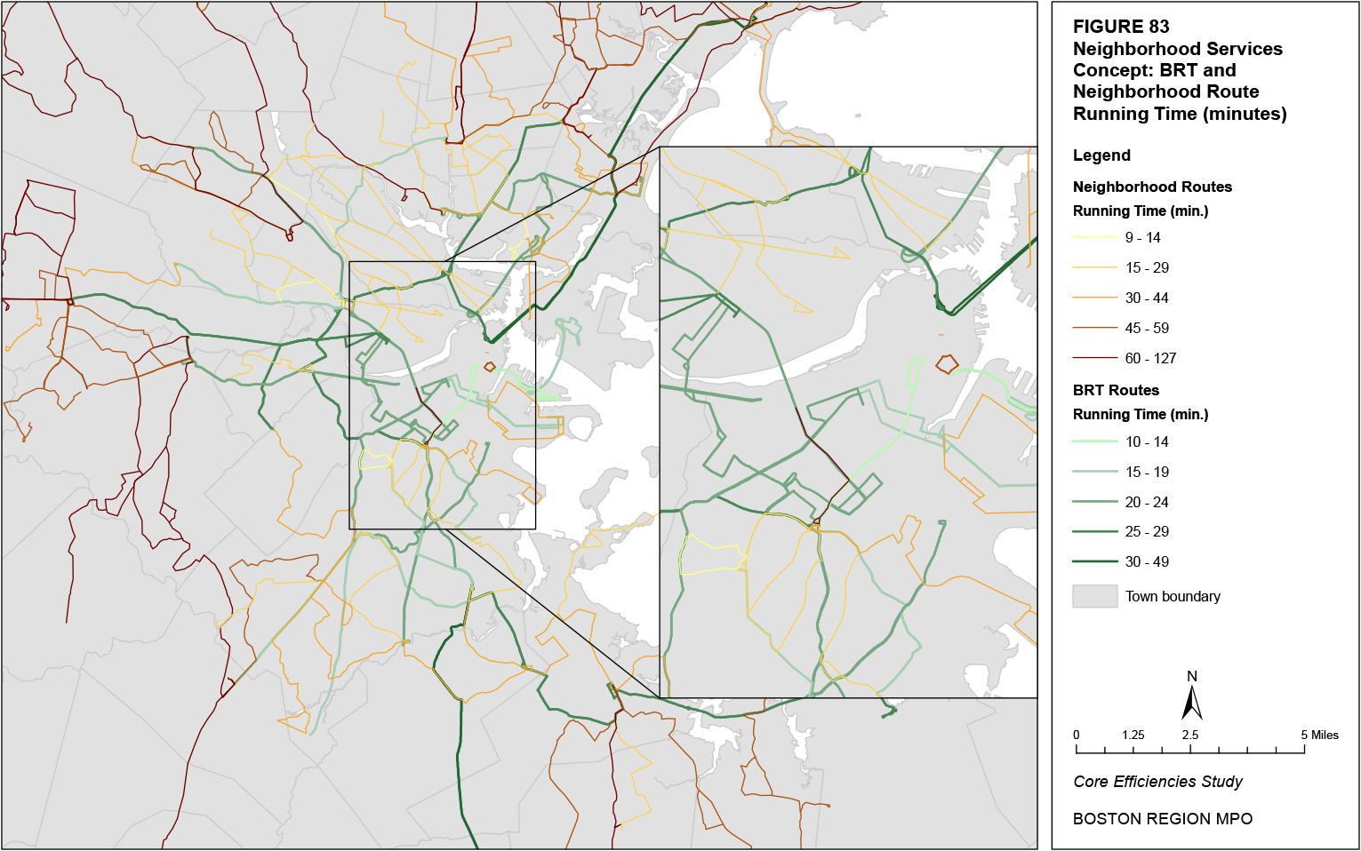
The limited-stop corridor concept would likely offer the smallest ratios of transit to auto travel times for any type of bus route, due to the small number of stops served by the limited-stop routes. The indirectness of each bus route would still increase the ratio to the same extent as in other concepts, however. When combining all factors, it is likely that the limited-stop corridor concept would offer transit travel times along limited-stop corridors that are only slightly greater than comparable auto travel times. Local bus routes, given the shorter distance between stops, would continue to have the greatest transit to auto travel time ratios.
As with the BRT corridor concept, the neighborhood services concept would reduce the ratio of transit travel times to auto travel times for comparable trips when compared to the ratio for existing local bus routes. The reduced ratios would be caused by longer distances between stops and various BRT improvement measures. Several neighborhood bus routes in this concept would likely score worse than existing local bus routes in terms of directness of travel given the route’s path that is necessary to provide coverage to an entire neighborhood.
The various concepts offer a range of probable ratios of transit travel times to comparable auto travel times, governed by the respective concept’s stop spacing as well as the transit route’s directness. The rail extension scenario likely offers the most direct transit service with the longest average distances between stop, followed by limited-stop routes in the limited-stop corridor concept and then the BRT routes in both the BRT corridor concept and neighborhood services concept. Local bus routes in the limited-stop corridor concept and BRT corridor concept would have significantly greater ratios of transit travel times to comparable auto travel times given their shorter distances between stops, while neighborhood routes in the neighborhood services concept would likely have the greatest ratios due to the non-direct nature of their trip paths.
The MBTA does not currently have a standard for ease of use. This standard is typically based on the extent of clock-face headways25 so that the service schedule is easy to remember, the extent to which routes run consistently throughout the day with minimum variations, and several other factors related to technology and training. Routes with headways less than or equal to 10 minutes are assumed for walk-up service where riders are less likely to consult a schedule given the short wait-times. For the MBTA, routes with clock-face headways range from 25 percent to 30 percent of all routes over various time periods. In terms of minimizing variations, the ratio of route variations to general routes is the highest during the weekday, at 2.83, and falls to 1.70 on Saturday and 1.44 on Sunday.
The rail extension concept would duplicate the schedule of the existing rail rapid transit system. On these extensions, trains would operate at headways less than or equal to 10 minutes. Since riders would not typically need to consult a schedule, clock-face headways would not be necessary. The Green Line extension to West Medford is the only rapid transit extension in this concept that will have a variation: some service will serve Union Square in Somerville rather than West Medford. This variation would be unlikely to create confusion as most passengers would already be comfortable with the system of different Green Line branches. The other proposed rail extensions do not have any variations. Finally, the connection of the Blue Line to the Red Line at Charles/MGH Station would likely reduce the current confusion of passengers who must make a double transfer in order to transfer between the two lines.
The BRT corridor concept would offer headways equivalent to those on the rail rapid transit system. Therefore, headways set at or below 10 minutes would make clock-face headways unnecessary. The headways of local bus routes outside the urban core would not change. Many of these routes, due to their reduced frequencies, already use clock-face headways. The BRT corridor concept would also simplify the system in the urban core by reducing the number of bus routes and variations.
The limited-stop corridor concept would likely operate at headways greater than 10 minutes. Given passengers’ desire to know when a local- versus a limited-stop route is approaching, the use of clock-face headways on both types of services would be useful. Because scheduling is largely dependent on route cycle times (which include running and recovery times) and the most efficient use of resources, clock-face headways might not be possible. The addition of limited-stop service would also increase the complexity of the system. Buses would need to clearly indicate whether they were operating local- or limited-stop service. The operation of limited-stop service only in the AM- and PM-peak periods would also increase complexity.
As with the BRT corridor concept, the neighborhood services concept would also offer headways less than 10 minutes for the BRT routes, making the use of clock-face headways unnecessary. The headways of some neighborhood bus routes could also be set at or below 10 minutes given reduced route running times. In routes with headways greater than 10 minutes, clock-face headways are advisable, but, as discussed above, might not always be possible. The neighborhood services concept would also simplify the system by reducing the number of bus routes and variations.
The various concepts likely have varying levels of ease of use. The rail extension scenario would simply extend the existing rail system with the only additional complexity being the Green Line spur to Union Square. Construction of the Red-Blue connector would also eliminate the need for and confusion associated with double transfers between the Red and Blue lines. All proposed BRT routes, either in the BRT corridor concept or the neighborhood services concept, would generally be easier to use given their headways below 10 minutes and the reduced number of routes. Finally, the limited-stop corridor concept would add some complexity to the system by introducing additional route variations and operating only in certain time periods.
The MBTA does not currently have a standard for transfers or waiting time. However, such a standard could be set at a maximum average transfer rate (number of unlinked trips per linked trip26 ) or a maximum average waiting time. Headways below 10 minutes, which characterize walk-up service, are associated with lower average waiting times compared to routes with longer headways, for which riders typically consult a schedule.
The rail extension concept would likely reduce the overall number of transfers. A large number of existing transfers are between buses and the rail rapid transit network. Extending the rail network would allow more passengers to walk or drive directly to rail stations. This concept would also likely reduce the average waiting time, as rapid transit headways below 10 minutes would be extended to additional areas. In addition, the connection of the Blue Line to the Red Line at Charles/MGH Station would eliminate the need to use the Green Line to transfer between the two lines, therefore reducing in half the number of required transfers.
The BRT corridor concept would also likely reduce the overall transfer rate. The elimination of local bus service in the urban core would require more passengers to walk to the nearest BRT corridor. BRT routes would also have headways below 10 minutes, which would reduce the average waiting time for passengers in the BRT service area.
The limited-stop corridor concept would not affect the transfer rate, as this concept does not eliminate any routes or propose new service to any area that is not currently served by transit. However, given the longer headways that would be required on both local- and limited-stop routes in the limited-stop corridors, this would likely increase the average waiting time.
The neighborhood services concept would be likely to slightly reduce the overall transfer rate, as more passengers would likely walk to the nearest BRT corridor. However, neighborhood routes are structured specifically to facilitate transfers to and from rapid transit corridors. This increase in transfers with neighborhood routes would likely partially offset the decrease in transfers with BRT routes. BRT routes would also have headways below 10 minutes while neighborhood routes would have headways greater than 10 minutes. As a result, the average waiting time would decrease for BRT passengers but increase for passengers on neighborhood routes.
The various concepts offer a range of potential effects on the MBTA’s overall transfer rate and average waiting time. The rail extension concept would likely have the greatest decrease in the transfer rate, as greater numbers of passengers would be able to walk or drive directly to rapid transit without needing to transfer from a local bus and the Red-Blue Connector would reduce in half the number of transfers needed to travel between the two lines. The BRT corridor concept and the neighborhood services concept would similarly permit greater numbers of passengers to directly access rapid transit or BRT routes without needing to use a local bus, though the neighborhood services concept would moderate this somewhat by providing neighborhood feeder routes that would increase transfers. The limited-stop corridor concept would be unlikely to affect the transfer rate. In all cases where headways are provided below 10 minutes, this would reduce the average waiting time. As a result, the rail extension, BRT corridor, and neighborhood services concepts would all reduce the average waiting time by increasing the amount of rapid transit service with headways below 10 minutes. The limited-stop corridor would likely increase the average waiting time given the greater headways of local- and limited-stop routes.
Table 95 summarizes the potential effects of each proposed concept (as compared to existing services) with regard to each of the service structure standards.
The rail extension concept would likely have:
The BRT corridor concept would likely have:
The limited-stop corridor concept would likely have:
The radial, circumferential, and neighborhood services concept would likely have:
Table 95
Service Structure Standards: Summary of Potential Effects of Proposed Service Concepts
Standard |
Rail Extension |
BRT |
Limited-Stop |
Neighborhood Services |
Coverage |
↑ |
↓↓↓ |
─ |
↓ |
Stop Spacing |
↑↑ |
↑ |
↑↑↑ |
↑ |
Route Duplication |
↓ |
↓↓ |
─ |
↓↓↓ |
Route Travel Time |
↑↑ |
↓ |
↓↓↓ |
↓↓ |
Ratio to Auto Trip Times |
↓↓↓ |
↓ |
↓↓ |
↓ |
East of Use |
↑↑ |
↑ |
↓ |
↑ |
Transfer Rate |
↓↓↓ |
↓↓ |
─ |
↓ |
Average Waiting Time |
↓↓ |
↓↓ |
↑ |
↓↓ |
Key: “↑” represents an increase, “↓” represents a decrease, and “─” represents no change. |
||||
The span-of-service standard stipulates the exact hours of operation or a minimum range of hours. The MBTA’s weekday span-of-service standards require service to be provided between 6:00 AM and 12:00 AM for heavy and light rail routes and Key Bus Routes and between 7:00 AM and 6:30 PM for local bus routes. According to the 2008 Service Plan, 19 directly-operated weekday MBTA bus routes, composing 11 percent of all service, failed the span-of-service standard.
The rail extension concept would not change the existing rail system’s span-of-service. The areas served by the rail extensions would receive a longer span of service, however, compared to that provided by existing local bus routes that currently end service before 12:00 AM. This would likely require some of the bus routes that would serve the proposed rail stations to extend their current spans of service.
The BRT corridor concept would extend the span of service because all new BRT routes would operate until 12:00 AM. Since BRT routes serve the entire urban core, this would ensure a consistent span of service throughout the urban core. Local bus routes outside the BRT service area would continue to use their existing span-of-service standard, from 7:00 AM to 6:30 PM.
The limited-stop corridor concept would maintain the schedule for local service in the early AM and night time periods, only providing limited-stop service during the AM- and PM-peak time periods. Therefore, this concept would not change existing spans of service for any existing routes.
As with the BRT corridor concept, the neighborhood services concept would also extend the span of service because all new BRT routes would operate until 12:00 AM. Neighborhood routes would likely use the existing span-of-service standard for local bus routes, from 7:00 AM to 6:30 PM.
All but one of the potential service concepts would extend the hours of service in some fashion. The rail extension concept would increase service hours to the areas served by the new stations as well as for some local bus routes serving those stations. All proposed BRT routes, either in the BRT corridor concept or the neighborhood services concept, would use a span of service from 6:00 AM to 12:00 AM while other local or neighborhood bus routes would use the existing local bus route standard of 7:00 AM to 6:30 PM. Finally, the limited-stop corridor concept would not change the system’s span of service, as any changes to the schedule caused by limited-stop routes would only occur during the AM- and PM-peak time periods.
The frequency standard stipulates the maximum headway at which a transit service may operate. The MBTA’s frequency standard requires a maximum 10-minute headway for the services and in the time periods most in demand. This includes AM- and PM-peak trips on light rail, heavy rail, and the Key Bus Routes. A 15-minute maximum headway is required at all other times for these services, with the exception of Key Bus Routes, which operate at a 20-minute maximum headway during the evening and on the weekend. Local bus routes are required to have a maximum 30-minute headway during the peak periods and a maximum 60-minute headway at all other times. According to the 2008 Service Plan, 48 directly-operated weekday MBTA bus routes, composing 27 percent of all service, failed the frequency-of-service standard.
The rail extension concept would ideally use the existing headways on each rail line. This would require putting additional rail vehicles into service in order to maintain current headways.
The BRT corridor concept would use rapid transit headways on all BRT routes; that is, a maximum 10-minute headway during the AM- and PM-peak time periods and a maximum 15-minute headway at all other times. The headways of local bus routes outside the BRT service area would not change from their current levels.
Since the limited-stop corridor concept does not add extra service to existing bus routes, the headways of local bus routes would need to increase to compensate for the new limited-stop variations. While a full service plan would need to be created for each combination of local- and limited-stop routes, it is likely that the headways of the limited-stop routes would be approximately 30 minutes and no less than 20 minutes. This would cause the headways of local-stop routes to increase slightly above 10 minutes. Greater headways for the limited-stop variations would be necessary in order to continue to provide a high level of bus frequency at all local bus stops.
As with the BRT corridor concept, the neighborhood services concept would also use rapid transit headways on all BRT routes; that is, a maximum 10-minute headway during the AM- and PM-peak time periods and a maximum 15-minute headway at all other times. The headways of neighborhood bus routes would vary, as the small distances of some routes would permit greater frequencies. However, in general, neighborhood bus headways would likely range from 20 minutes to 30 minutes in the peak and up to 60 minutes off-peak.
The potential service concepts offer varying changes to existing bus and rail frequencies. The rail extension concept would increase headways on all extended rail lines unless additional rail vehicles could be put into operation. Both the BRT corridor concept and the neighborhood services concept would use existing rapid transit headways on all BRT routes. The headways of local routes in the BRT corridor concept would not change and the headways of neighborhood routes in the neighborhood services concept would generally range between 20 and 30 minutes in the peak and up to 60 minutes off-peak, depending on the route distance. Finally, the limited-stop corridor concept would result in greater headways for both local- and limited-stop variations. The limited-stop headway would likely be 30 minutes and no less than 20 minutes in order to maintain a high level of bus frequency at all local bus stops.
The schedule-adherence standard sets the acceptable number of minutes a service is late or early compared to the scheduled arrival or departure time. The MBTA uses two types of metrics to determine bus route schedule adherence: a timepoint test, which varies based on service frequency, and a route test. The timepoint test for scheduled-departure trips (those with a headway of 10 minutes or more) states that trips must depart the origin timepoint 0-3 minutes late, depart the mid-route timepoints 0-7 minutes late, and arrive at the destination timepoint 3 minutes early to 5 minutes late. The timepoint test for walk-up trips (those with a headway of less than 10 minutes) states that trips must depart the origin and mid-route timepoints within 1.5 times the scheduled headway and arrive at the destination timepoint with a trip running time within 20 percent of the scheduled running time. The determination of route schedule adherence is based on the route test, which states that at least 75 percent of all timepoints on a given route must meet the timepoint test. According to the 2008 Service Plan, the average weekday timepoint on-time percentage weighted across all directly-operated MBTA bus routes by each route’s respective average weekday daily ridership was 59.1 percent.
Generally, the likelihood that transit fails the on-time standard increases with the length of the transit line and the number of stops along the line. This happens when a constant headway between vehicles is not maintained and the first vehicle falls behind schedule for any reason. The vehicle will continue to fall increasingly behind schedule as the number of passengers boarding and alighting at each subsequent stop increases and the vehicle must spend additional dwell time at the stop. As the first vehicle falls further behind schedule, a second vehicle catches up (or “bunches”) with the first vehicle, creating a gap in the schedule between the second and third vehicles. Like the first vehicle, the third vehicle will fall increasingly behind schedule as the number of passengers boarding and alighting at each subsequent stop increases and the vehicle must spend additional dwell time at the stop. The pattern will then repeat. Greater route length and the number of stations or stops create more opportunities for vehicles to fall behind schedule and for those delays to magnify at subsequent stops.
Table 96
Rail Extension Concept: Distances of Rail Extensions
|
|
Distance (mi.) |
Number of Stations |
||
Rail Line |
Extension |
Rail Line |
Extension |
Rail Line |
Extension |
Blue |
Wonderland – Central Square, Lynn |
5.83 |
4.252 |
12 |
1 |
Red-Ashmont |
Alewife – Route 128 |
11.91 |
8.170 |
17 |
5 |
Red-Braintree |
Alewife – Route 128 |
17.91 |
8.170 |
18 |
5 |
Green D Branch |
Newton Highlands – Needham Junction |
8.80* |
4.163 |
16* |
4 |
Orange |
Forest Hills – Route 128 |
11.22 |
7.322 |
19 |
4 |
Orange |
Assembly Square |
11.22 |
N/A |
19 |
1 |
Red-Blue Connector |
Bowdoin – Charles/MGH |
5.83** |
0.475 |
12** |
1 |
Green E Branch |
Lechmere – Mystic Valley Parkway |
5.54 |
4.730 |
20 |
6 |
|
Lechmere – Union Square |
5.54 |
1.136 |
20 |
1 |
Fairmount Line |
South Station - Readville |
9.26 |
9.264 |
4 |
4 |
* Rail line distance and number of stations equal the distance to Newton Highlands Station. |
|||||
The BRT corridor concept would select existing local bus routes for BRT service. Table 97 presents the existing inbound and outbound distances of each of these routes. Routes such as Routes 8, 66, and 86 have a greater potential for delay given their longer lengths and large number of stops. While stop spacing would vary for each BRT route depending on route specifics, most stops would be spaced at a distance of 0.20 to 0.25 miles, reducing the total number of stops, which would improve on-time performance. Finally, various BRT improvements, such as exclusive or dedicated rights-of-way, pre-paid boarding, and TSP, should help these routes maintain a more consistent schedule, as each reduces the potential of random delays. Therefore, in terms of schedule adherence, the BRT corridor concept should improve on-time performance within the urban core.
The limited-stop corridor concept would improve on-time performance for limited-stop routes by reducing the number of stops and passengers served by the route. Table 98 presents the existing inbound and outbound distances of each of these routes. Shorter routes such as Routes 15, 32, and 71 would tend to see less benefit while longer routes such as Routes 34, 70, and 86 would likely have the greatest improvement in schedule adherence.
As with the BRT corridor concept, the neighborhood services concept would also improve the schedule adherence of routes selected for BRT service. In addition, neighborhood routes that have only a small neighborhood service area would tend to have good on-time performance given their shorter route length and their travel on streets with less vehicle traffic.
The potential service concepts offer varying levels of potential schedule adherence compared to the existing system. The rail extension concept would likely increase the possibility of delays due to greater route lengths and additional stations. The three bus-related concepts, on the other hand, would likely improve on-time performance by reducing the number of stops. The BRT corridor concept and neighborhood services concept would increase average stop spacing on BRT routes to between 0.20 and 0.25 miles. The limited-stop corridor concept would increase average stop spacing to 0.50 miles or greater. Finally, the shorter distances of several neighborhood routes in the neighborhood services concept should also reduce the likelihood of delays.
Table 97
BRT Corridor Concept: Existing Route Distances for Selected BRT Routes
|
Route Distance (mi.) |
|
Bus Route |
Inbound |
Outbound |
1: Harvard Sq. - Dudley Sta. via Mass. Ave. |
5.04 |
4.41 |
7: City Point - Otis & Summer Sts. |
3.28 |
2.93 |
8: Harbor Point/UMass - Kenmore Sta. |
7.41 |
7.79 |
9: City Point - Copley Sq. via Broadway Sta. |
4.75 |
3.83 |
11: City Point - Downtown |
4.25 |
4.04 |
15: Kane Sq. - Ruggles Sta. |
4.25 |
4.44 |
16: Forest Hills Sta. - UMass |
4.88 |
4.22 |
21: Ashmont Sta. - Forest Hills Sta. |
3.73 |
3.72 |
22: Ashmont Sta. - Ruggles Sta. via Talbot Ave. |
5.87 |
5.36 |
23: Ashmont Sta. - Ruggles Sta. via Washington St. |
5.24 |
5.11 |
28: Mattapan Sta. - Ruggles Sta. |
5.83 |
6.01 |
31: Mattapan Sta. - Forest Hills Sta. |
3.27 |
3.29 |
32: Wolcott Sq. or Cleary Sq. - Forest Hills Sta. |
3.25 |
3.28 |
39: Forest Hills Sta. - Back Bay Sta. |
4.99 |
4.64 |
47: Central Sq. Cambridge - Broadway Sta. |
5.69 |
5.80 |
57: Watertown Yard - Kenmore Sta. |
5.85 |
5.48 |
66: Harvard Sq. - Dudley Sta. via Brookline |
6.16 |
6.18 |
71: Watertown Sq. - Harvard Sta. |
4.06 |
4.01 |
73: Waverley Sq. - Harvard Sta. |
4.46 |
4.31 |
77: Arlington Heights - Harvard Sta. |
5.82 |
5.74 |
86: Sullivan Sta. - Cleveland Circle |
7.13 |
6.73 |
87: Clarendon Hill - Lechmere Sta. via Somerville Ave. |
4.32 |
4.19 |
88: Clarendon Hill - Lechmere Sta. via Highland Ave. |
4.44 |
3.95 |
89: Clarendon Hill - Sullivan Sta. |
3.41 |
3.53 |
91: Sullivan Sta. - Central Sq. Cambridge |
2.89 |
2.60 |
93: Sullivan Sta. - Downtown via Bunker Hill |
2.82 |
2.49 |
109: Linden Sq. - Sullivan Sta. |
5.47 |
4.89 |
110: Wonderland Sta. - Wellington Sta. |
6.08 |
6.05 |
111: Woodlawn or Bway. & Park - Haymarket Sta. |
4.86 |
3.29 |
116: Wonderland Sta. - Maverick Sta. via Revere |
5.56 |
4.73 |
117: Wonderland Sta. - Maverick Sta. via Beach |
4.95 |
4.58 |
741 Silver Line 1: Logan Airport - South Sta. |
4.06 |
2.52 |
742 Silver Line 2: Boston Marine Industrial Park - South Sta. |
3.02 |
2.07 |
749 Silver Line 5: Dudley Sta. - Downtown |
2.27 |
2.41 |
Table 98
Limited-Stop Corridor Concept:
Existing Route Distances for Limited-Stop Routes
|
Route Distance (mi.) |
|
Bus Route |
Inbound |
Outbound |
1: Harvard Sq. - Dudley Sta. via Mass. Ave. |
5.04 |
4.41 |
15: Kane Sq. - Ruggles Sta. |
4.25 |
4.44 |
16: Forest Hills Sta. - UMass |
4.88 |
4.22 |
22: Ashmont Sta. - Ruggles Sta. via Talbot Ave. |
5.87 |
5.36 |
23: Ashmont Sta. - Ruggles Sta. via Washington St. |
5.24 |
5.11 |
28: Mattapan Sta. - Ruggles Sta. |
5.83 |
6.01 |
32: Wolcott Sq. or Cleary Sq. - Forest Hills Sta. |
3.25 |
3.28 |
34: Dedham Line - Forest Hills Sta. |
15.08 |
14.90 |
39: Forest Hills Sta. - Back Bay Sta. |
4.99 |
4.64 |
57: Watertown Yard - Kenmore Sta. |
5.85 |
5.48 |
66: Harvard Sq. - Dudley Sta. via Brookline |
6.16 |
6.18 |
70: Cedarwood - Central Sq. Cambridge |
8.54 |
8.55 |
71: Watertown Sq. - Harvard Sta. |
4.06 |
4.01 |
86: Sullivan Sta. - Cleveland Circle |
7.13 |
6.73 |
101: Malden Sta. - Sullivan Sta. via Medford Sq. |
5.33 |
5.65 |
111: Woodlawn or Bway. & Park - Haymarket Sta. |
4.86 |
3.29 |
116: Wonderland Sta. - Maverick Sta. via Revere |
5.56 |
4.73 |
117: Wonderland Sta. - Maverick Sta. via Beach |
4.95 |
4.58 |
A description of these measures can be found in section 2.2.2 in the previous chapter.
The MBTA does not currently have standards for any of these measures. However, the MBTA does present information in its monthly online ScoreCard about its performance with respect to these measures. It is not predicted that performance on any of these measures would be different for the proposed concepts as compared to existing services.
Table 99 summarizes the potential effects of each proposed concept (as compared to existing services) with regard to each of the service provision standards.
The rail extension concept would likely have:
The BRT corridor concept would likely have:
The limited-stop corridor concept would likely have:
The neighborhood services concept would likely have:
Table 99
Service Provision Standards: Summary of Potential Effects of Proposed Service Concepts
Standard |
Rail Extension |
BRT |
Limited-Stop |
Neighborhood Services |
Span of Service |
↑ |
↑ |
─ |
↑ |
Frequency of Service |
↓ |
↑ |
↓ |
↑ |
Schedule Adherence |
↓ |
↑ |
↑ |
↑ |
Service Delivery |
─ |
─ |
─ |
─ |
Service Failure |
─ |
─ |
─ |
─ |
Vacancy Rate/Vehicle Availability |
─ |
─ |
─ |
─ |
Accident and Incident Rate |
─ |
─ |
─ |
─ |
Passenger Complaints |
─ |
─ |
─ |
─ |
Key: “↑” represents an increase, “↓” represents a decrease, and “─” represents no change. |
||||
Net cost per passenger, cost effectiveness, and passenger productivity measure service efficiency in three different ways. Net cost per passenger is the ratio of operating costs, minus service revenue, to the number of passengers; cost effectiveness is the ratio of service revenue to operating costs; passenger productivity is the ratio of the number of passengers to the amount of service (measured as the number of trips or revenue-hours). For the MBTA, any bus route for which the net cost per passenger is three times the system average fails the standard (the MBTA does not have a net cost standard for other modes). According to the 2008 Service Plan, 20 weekday bus routes, or 11 percent of all routes, failed the net-cost-per-passenger standard.
According to National Transit Database (NTD) fiscal year (FY) 2010 figures, the net cost per passenger for all heavy rail services (Blue, Orange, and Red Lines) is $1.10 and the net cost per passenger for all light rail services (Green Lines and Mattapan High-Speed Line) is $1.09. All of the proposed rail extensions would have greater operating costs than service revenue. Under the rail extension concept, most of the proposed extensions would likely increase the existing net cost per passenger. Extended service to stations that are, for the most part, at greater distances than existing stations would likely result in proportionately greater increases in the operating costs compared to the number of passengers and resulting service revenue. The exceptions under this concept might be extensions that are largely in the urban core: the Green Line extension to West Medford and the improvements and additional stations on the Fairmount Line.
The BRT corridor concept would likely lower the net cost per passenger for BRT routes. While BRT routes would cost more to operate, due to their greater service frequency, they would likely have a greater proportionate increase in the number of riders and resulting service revenue. This would be achieved by the elimination of existing local bus routes with higher costs and lower ridership, with the effect of moving these riders to the BRT routes. According to NTD FY 2010 figures, the bus system’s average weekday net cost per passenger, in which total bus service revenue is subtracted from total bus operating costs and divided by total bus passengers, is $2.41. According to the 2008 Service Plan, when the weekday net cost per passenger of each bus route is weighted by each route’s ridership, the average net cost per passenger is $1.59. This indicates that a large percentage of bus operating costs are contributed by bus routes with relatively small ridership totals.
Table 100 presents the existing net costs per passenger of the bus routes selected for BRT service under this concept. The weighted average net cost per passenger of these 34 bus routes is $1.02. Only two of these routes exceed the bus system’s average net cost per passenger of $2.41, while only six of these routes exceed the weighted average of $1.59. The weighted average net cost per passenger of the 37 routes selected for elimination is $1.72, indicating that their elimination will lower the bus system’s average cost. However, many of the most costly local bus routes lie outside the BRT service area. Under this concept, these routes would be maintained. Their weighted average net cost per passenger is $2.63.
Table 100
BRT Corridor Concept:
Existing Net Cost per Passenger for Selected BRT Routes
Bus Route |
Net Cost per Passenger |
1: Harvard Sq. - Dudley Sta. via Mass. Ave. |
$0.57 |
7: City Point - Otis & Summer Sts. |
$2.11 |
8: Harbor Point/UMass - Kenmore Sta. |
$2.53 |
9: City Point - Copley Sq. via Broadway Sta. |
$1.58 |
11: City Point - Downtown |
$2.62 |
15: Kane Sq. - Ruggles Sta. |
$0.78 |
16: Forest Hills Sta. - UMass |
$1.24 |
21: Ashmont Sta. - Forest Hills Sta. |
$0.86 |
22: Ashmont Sta. - Ruggles Sta. via Talbot Ave. |
$1.21 |
23: Ashmont Sta. - Ruggles Sta. via Washington St. |
$0.88 |
28: Mattapan Sta. - Ruggles Sta. |
$1.05 |
31: Mattapan Sta. - Forest Hills Sta. |
$1.11 |
32: Wolcott Sq. or Cleary Sq. - Forest Hills Sta. |
$0.97 |
39: Forest Hills Sta. - Back Bay Sta. |
$0.62 |
47: Central Sq. Cambridge - Broadway Sta. |
$2.21 |
57: Watertown Yard - Kenmore Sta. |
$1.31 |
66: Harvard Sq. - Dudley Sta. via Brookline |
$0.90 |
71: Watertown Sq. - Harvard Sta. |
$1.19 |
73: Waverley Sq. - Harvard Sta. |
$1.34 |
77: Arlington Heights - Harvard Sta. |
$2.02 |
86: Sullivan Sta. - Cleveland Circle |
$1.07 |
87: Clarendon Hill - Lechmere Sta. via Somerville Ave. |
$1.14 |
88: Clarendon Hill - Lechmere Sta. via Highland Ave. |
$0.79 |
89: Clarendon Hill - Sullivan Sta. |
$1.05 |
91: Sullivan Sta. - Central Sq. Cambridge |
$1.29 |
93: Sullivan Sta. - Downtown via Bunker Hill |
$1.06 |
109: Linden Sq. - Sullivan Sta. |
$1.29 |
110: Wonderland Sta. - Wellington Sta. |
$1.79 |
111: Woodlawn or Bway. & Park - Haymarket Sta. |
$1.35 |
116: Wonderland Sta. - Maverick Sta. via Revere |
$0.63 |
117: Wonderland Sta. - Maverick Sta. via Beach |
$0.69 |
741 Silver Line 1: Logan Airport - South Sta. |
$0.48 |
742 Silver Line 2: Boston Marine Industrial Park - South Sta. |
$0.15 |
749 Silver Line 5: Dudley Sta. - Downtown |
$0.09 |
Many of the routes selected for limited-stop service with a low net cost per passenger would match those selected for BRT service in the BRT corridor concept. Table 101 lists these routes and their existing net costs per passenger. The weighted average net cost per passenger of these 18 routes is $0.99. While some new riders may be attracted to the limited-stop service, this concept is unlikely to dramatically shift ridership patterns since there would be no change in the actual service coverage. Therefore, the combined net cost per passenger for both the local- and limited-stop variations is unlikely to change. However, depending on the number of vehicles allocated to each variation and the ridership split, one variation will have a greater net cost per passenger than the other.
Table 101
Limited-Stop Corridor Concept:
Existing Net Cost per Passenger for Limited-Stop Routes
Bus Route |
Net Cost per Passenger |
1: Harvard Sq. - Dudley Sta. via Mass. Ave. |
$0.57 |
15: Kane Sq. - Ruggles Sta. |
$0.78 |
16: Forest Hills Sta. - UMass |
$1.24 |
22: Ashmont Sta. - Ruggles Sta. via Talbot Ave. |
$1.21 |
23: Ashmont Sta. - Ruggles Sta. via Washington St. |
$0.88 |
28: Mattapan Sta. - Ruggles Sta. |
$1.05 |
32: Wolcott Sq. or Cleary Sq. - Forest Hills Sta. |
$0.97 |
34: Dedham Line - Forest Hills Sta. |
$1.29 |
39: Forest Hills Sta. - Back Bay Sta. |
$0.62 |
57: Watertown Yard - Kenmore Sta. |
$1.31 |
66: Harvard Sq. - Dudley Sta. via Brookline |
$0.90 |
70: Cedarwood - Central Sq. Cambridge |
$1.85 |
71: Watertown Sq. - Harvard Sta. |
$1.19 |
86: Sullivan Sta. - Cleveland Circle |
$1.07 |
101: Malden Sta. - Sullivan Sta. via Medford Sq. |
$1.22 |
111: Woodlawn or Bway. & Park - Haymarket Sta. |
$1.35 |
116: Wonderland Sta. - Maverick Sta. via Revere |
$0.63 |
117: Wonderland Sta. - Maverick Sta. via Beach |
$0.69 |
As with the BRT corridor concept, the neighborhood services concept would also likely have lower net-cost-per-passenger figures for the BRT routes. Neighborhood routes, like existing local bus routes, would likely have a much greater average net cost per passenger. However, neighborhood routes that operate over shorter distances using fewer vehicles may have a smaller net cost per passenger than routes that extend outside the urban core into suburban areas. Because the ratio of proposed BRT routes to non-BRT routes is equivalent in the BRT corridor and neighborhood services concepts, it is likely that the systemwide net cost per passenger of the two concepts would also be similar.
The various concepts likely have varying impacts on the average net cost per passenger of the entire transit system as well as individual routes. The rail extension concept would probably increase the net cost per passenger of the rail system since rail extensions to largely suburban areas are unlikely to generate new riders that contribute sufficient service revenue to compensate for increased operating costs. However, certain urban rail extensions would likely have a net cost per passenger close to the existing rail system average. All proposed BRT routes, either in the BRT corridor concept or the neighborhood services concept, would likely have lower net costs per passenger due to a greater proportionate increase in service revenue from new riders than in operating costs from additional vehicles. Both of these concepts would also eliminate several local bus routes with greater net costs per passengers. Finally, the limited-stop corridor concept might attract some new riders, but the overall impact on systemwide net cost per passenger would likely be minimal.
The vehicle-load standard sets the maximum ratio of passengers to a transit vehicle’s seating capacity. The MBTA provides a detailed list of vehicle-load standards that depend on the mode, type of vehicle, the time period, and the location. According to the 2008 Service Plan, 23 directly-operated weekday MBTA bus routes, composing 13 percent of all service, failed the vehicle-load standard.
The rail extension concept would likely increase vehicle load throughout the rail line; however, the impacts on crowding would likely be greater closer to the downtown. Most riders use rapid transit to travel to the downtown from outer stations and this concept would intensify this usage pattern. Therefore, along with vehicle loads at downtown stations likely increasing, some existing riders at outer stations would now use the new stations on the rail extension. This would shift the crowding point further up the line. For instance, vehicle loads at Alewife Station, Davis Station, and Porter Station would likely increase as riders who formerly took Route 77 from Arlington Heights and Arlington Center to Harvard Station now boarded the Red Line at these stations. Similarly, riders who currently take a bus from Lynn to Wonderland or downtown would now likely board the Blue Line at the new Central Square, Lynn Station. These shifts would likely make boarding more difficult at stations near the downtown, such as Central Square or Kendall Square on the Red Line. The Green Line extension to West Medford and the Fairmount Line improvements would likely represent exceptions to this pattern, as they are not the same type of “extension.” These extensions would provide practically new rapid transit service to the downtown. Therefore, aside from Lechmere and Science Park Stations on the Green Line, there are no intermediate stations at which crowding is likely to occur.
The BRT corridor concept would increase vehicle loads on selected BRT routes. However, many of the BRT routes would likely use articulated buses or have more frequent service, so the ratio of passengers to seats should not exceed the standard. Of the 34 bus routes selected for BRT service, 10 currently exceed the MBTA’s vehicle-load standard. Local bus routes outside the BRT service area would maintain their existing service levels, so vehicle loads would not be expected to change. Of these 98 routes, only eight currently exceed the vehicle-load standard.
Under the limited-stop corridor concept, crowding would depend on the split of existing and potentially new riders between the local- and limited-stop variations. The stop locations selected for the limited-stop routes represent a minimum of 50 percent of all boardings and alightings. However, a percentage of riders may have either a boarding or an alighting that is not one of the limited stops, so would not use the limited-stop service. While each route would vary, a probable split between the two variations is 25 percent for the limited-stop service and 75 percent for the local-stop service. Of the 18 routes selected for limited-stop service, seven currently fail the vehicle-load standard. Increasing the headways of the local-stop variations of these routes, even marginally, to permit the limited-stop operations could increase crowding. Ideally, the allocation of vehicles and resulting headways for each variation would mirror passenger demand such that vehicle load would not be affected.
As with the BRT corridor concept, the neighborhood services concept would also increase vehicle loads on BRT routes. However, many of the BRT routes would likely use articulated buses or have more frequent service, so the ratio of passengers to seats should not exceed the standard. Neighborhood routes would have many fewer riders, as the service area for some routes is limited to the immediate neighborhood. Therefore, these routes are unlikely to experience crowding problems.
The various concepts are likely to affect vehicle loads and crowding by differing degrees. The rail extension concept would attract additional riders at the new stations, increasing vehicle loads throughout the line but particularly at stations nearer to the downtown. All proposed BRT routes, either in the BRT corridor concept or the neighborhood services concept, would likely have greater vehicle loads; however, crowding would presumably be kept to a minimum by providing these routes with greater frequencies permitted by the elimination of some local bus routes. Neighborhood routes or maintained local bus routes would likely have smaller vehicle loads given their service areas. Finally, the limited-stop corridor concept should not increase crowding on either the local- or limited-stop variations unless the ratio of vehicles to passengers is too low.
Table 102 summarizes the potential effects of each proposed concept (as compared to existing services) with regard to each of the service efficiency standards.
The rail extension concept would likely have:
The BRT corridor concept would likely have:
The limited-stop corridor concept would likely have:
The neighborhood services concept would likely have:
Table 102
Service Efficiency Standards: Summary of Potential Effects of Proposed Service Concepts
Standard |
Rail Extension |
BRT |
Limited-Stop |
Neighborhood Services |
Net Cost per Passenger |
↑ |
↓ |
─ |
↓ |
Vehicle Load |
↑ |
↑ |
─ |
↑ |
Key: “↑” represents an increase, “↓” represents a decrease, and “─” represents no change. |
||||
The MBTA does not currently have a standard for the distribution of revenue equipment. Such a standard would govern policies for the distribution of buses with air conditioning, the average age of buses, and the number of buses at each garage. The BRT corridor concept and the neighborhood services concept could improve the ease with which revenue equipment is distributed by reducing the number of overall bus routes. The rail extension concept and the limited-stop corridor concept would be unlikely to affect the distribution of revenue equipment.
While the MBTA does have a policy for the placement of shelters, it does not currently have standards for the distribution of other transit amenities. Such standards would govern policies for the distribution of amenities such as benches and trash cans. While most proposed rail stations would mirror the facilities of existing rail stations, the characteristics of stations along the Green Line extension to West Medford would more likely mirror those of existing surface Green Line stops. As such, each station would need benches, shelters, and trash cans. Similarly, all BRT stops in the BRT corridor concept and the neighborhood services concept would need these amenities, as would all limited-stop locations in the limited-stop corridor concept. Each concept would therefore increase the distribution of transit amenities.
The four proposed concepts – rail extension, BRT corridor, limited-stop corridor, and neighborhood services – have varying levels of performance when measured against the service standards used by the MBTA and other peer transit agencies. To summarize, the rail extension concept focuses on strengthening the existing radial structure of the heavy and light rail network by extending several rail lines outward. Most extensions would serve areas outside the urban core; however, two extensions are located entirely within Boston and an area of Somerville that is currently only served by buses. As such, this concept would not dramatically change the MBTA’s performance according to most service standards. The BRT corridor concept reduces service in the urban core to high-frequency BRT routes. Coverage in the core would, therefore, decrease and passengers would be required to walk longer distances on average to access transit. However, that transit would offer faster and more efficient trips with reduced headways. Local bus routes outside the BRT service area would remain. The limited-stop corridor concept would add a limited-stop variation to several routes with the largest ridership or longest distances. The vehicles used for this limited-stop variation would be taken away from local-stop service, requiring headways on local-stop service to increase. Passengers for whom both the origin and destination of their trip were served by the limited-stop service would have a significant increase in their trip times. Finally, the neighborhood services concept would also use BRT routes throughout the system. The service area of remaining local routes would largely be limited to specific neighborhoods, and the routes serving them would shuttle riders to the nearest radial or circumferential rapid transit corridor. Each concept therefore has positive and negative aspects, and the choice of which concept to more fully study depends on which service standards are deemed most important.
In the previous chapter, the existing MBTA bus and rapid transit system was analyzed according to how well each transit route served existing (2009) trips and the projected (2030) change in trips27 with an origin and/or a destination in that route’s service area. Using this analysis, the percentage of trips with an origin served by the route that also have a destination served by the route and the percentage of trips with a destination served by the route that also have an origin served by the route were calculated. Greater percentages indicate routes that offer more direct trips with fewer necessary transfers and generally shorter trip times. This section applies the same analysis to the four proposed concepts for trips that would exist in 2009 (if the concept were implemented) and the projected change in trips. The results of this analysis are summarized in Table 103 at the end of this section.
For all existing trips on the MBTA bus and rapid transit system, an average of 50.5 percent of trips that have an origin served by the route used for the trip also have a destination served by that route. The routes with the greatest individual percentages could be grouped into rapid transit lines, service to the Waterfront, local bus service to the Downtown, and express bus service to the Downtown. An average of 38.9 percent of existing trips that have a destination served by the route used for the trip also have an origin served by that route. The routes with the greatest individual percentages could be grouped into rapid transit lines and local bus service to Back Bay, Cambridge, Dorchester, East Boston, Lynn, and Roxbury.
For the projected change in trips, an average of 55.6 percent of trips that have an origin served by the route used for the trip also have a destination served by that route. The routes with the greatest individual percentages could be grouped into local bus service to Allston, Brighton, Brookline, Cambridge, Dorchester, Jamaica Plain, Roxbury, Salem, Somerville, and Quincy. An average of 58.6 percent of the projected change in trips that have a destination served by the route used for the trip also have an origin served by that route. The routes with the greatest individual percentages could be grouped into rapid transit lines and local bus service to Arlington, Back Bay, Belmont, Cambridge, East Boston, Lynn, and the South End.
Figure 84 presents the percentage of trips with an origin served by a route that also have a destination served by the same route. Figure 85 presents the percentage of trips with a destination served by a route that also have an origin served by the same route. In both figures, percentages are presented for existing trips and the projected change in trips and for the entire MBTA system as well as for the rapid transit and bus modal categories.
In all cases, the average percentage for each measure is weighted by existing daily ridership.
The only changes to the existing MBTA system proposed by the rail extension concept are the extensions to several rail lines and various improvements to the Fairmount Line. Therefore, the service areas for all routes in this concept match those of the existing system except for the Blue Line (extension to Central Square, Lynn), Green Line E Branch (extension to West Medford), Red Line (extension to Route 128), Green Line D Branch (extension to Needham), and Orange Line (extension to Route 128 and the new Assembly Square Station). In addition, the service area of the Fairmount Line is included in the list of rapid transit services.
For all trips that would exist (in 2009) on the proposed MBTA bus and rapid transit system if the rail extension concept were in place today, an average of 49.8 percent of trips that would have an origin served by the route used for the trip would also have a destination served by that route. This would represent a decrease of 0.7 percent compared to the existing MBTA system that would largely be composed of declines in the percentage for the Red Line (56.3% to 55.5%), Orange Line (59.3% to 57.5%), and Green Line E Branch (67.3% to 61.5%). The overall rail percentage would decrease from 58.1 percent to 56.7 percent. An average of 38.8 percent of existing trips that would have a destination served by the route used for the trip would also have an origin served by that route. This would represent a decrease of only 0.1 percent compared to the existing MBTA system that would largely be composed of a decline in the percentage for the Red Line (40.5% to 40.2%). The overall rail percentage would decrease from 41.2 percent to 41.0 percent.
For the projected change in trips that would exist if the rail extension concept were in place today, an average of 56.3 percent of trips that would have an origin served by the route used for the trip would also have a destination served by that route. This would represent an increase of 0.7 percent compared to the existing MBTA system that would largely be composed of gains in the percentage for the Blue Line (41.9% to 45.4%), Orange Line (61.6% to 63.8%), Green Line D Branch (57.4% to 58.4%), and Green Line E Branch (60.9% to 64.7%). The overall rail percentage would increase from 54.4 percent to 55.6 percent. An average of 56.7 percent of the projected change in trips that would have a destination served by the route used for the trip would also have an origin served by that route. This would represent a decrease of 1.9 percent compared to the existing MBTA system that would largely be composed of declines in the percentage for the Red Line (61.3% to 59.4%) and Orange Line (72.5% to 60.3%) despite gains for the Blue Line (49.4% to 51.6%) and Green Line E Branch (71.6% to 73.0%). The overall rail percentage would decrease from 63.3 percent to 60.0 percent.
In all cases, the average percentage for each measure is weighted by daily ridership that would exist (in 2009) if the rail extension concept were implemented for all routes with added daily riders for those routes with extensions.
None of the neighborhoods served by new stations in the rail extension concept represent markets that are currently underserved by the existing MBTA system. As a result, the rail extension concept does not appear to dramatically affect the existing percentages of trips with both an origin and destination served by a route. Overall, the projected change in trips with both an origin and destination served by a route similarly does not dramatically change. However, projected trip increases in East Somerville and East Lynn, which are both listed among the top 20 neighborhoods that have the greatest projected increases in origins and destinations, do result in greater projected percentages of the changes in trips with both an origin and destination served by the Green Line E Branch and the Blue Line due to their extensions.
Figure 86 presents the percentage of trips with an origin served by a route that also have a destination served by the same route. Figure 87 presents the percentage of trips with a destination served by a route that also have an origin served by the same route. In both figures, percentages are presented for trips that would exist (in 2009) if the rail extension concept were in place today and for the projected change in trips. Percentages are also presented for the entire MBTA system as well as for the rapid transit and bus modal categories.
This concept proposes significant changes to the bus network within the urban core. Specifically, several existing bus routes would become BRT services, and all other routes within the BRT service area would be eliminated. Local bus routes outside the BRT service area would not be affected. Therefore, within the urban core, this concept would balance a reduction in local bus coverage with an improvement in frequency and capacity on more heavily-used bus routes.
For all trips that would exist (in 2009) on the proposed MBTA bus and rapid transit system if the BRT corridor concept were in place today, an average of 51.3 percent of trips that would have an origin served by the route used for the trip would also have a destination served by that route. This would represent an increase of 0.8 percent compared to the existing MBTA system that would largely be driven by the elimination of several existing local bus routes with lower percentages. For all existing trips on local routes in the urban core that would be eliminated under this concept, 36.9 percent of origins served by these routes would have corresponding destinations that would also be served by these routes. If the BRT corridor concept were in place, 42.3 percent of origins served by the BRT routes proposed in this concept would have corresponding destinations that would also be served by these routes compared to 34.2 percent for the remaining local bus routes. The resulting overall bus percentage would increase from 39.2 percent to 39.6 percent. In addition, since the rail mode has a higher average percentage (58.1%), the elimination of some local bus routes would cause the ratio of rail trips to bus trips to increase from 1.47 to 1.73, thereby weighing the higher rapid transit percentages more heavily than the lower bus percentages. These two factors would increase the overall concept’s percentage.
If the BRT corridor concept were in place today, an average of 39.1 percent of existing trips that would have a destination served by the route used for the trip would also have an origin served by that route. This would represent an increase of only 0.2 percent compared to the existing MBTA system. For all existing trips on local routes in the urban core that would be eliminated under this concept, 36.2 percent of destinations served by these routes would have corresponding origins that would also be served by these routes. If the BRT corridor concept were in place, 36.8 percent of destinations that would be served by the BRT routes proposed in this concept would have corresponding origins that would also be served by these routes compared to 32.4 percent for remaining local bus routes. The resulting overall bus percentage would decrease from 35.5 percent to 35.3 percent. As is the case with origins, since the rapid transit mode would have a higher average percentage (41.2%), the elimination of some local bus routes would cause the ratio of rail trips to bus trips to increase from 1.47 to 1.73, thereby weighing the higher rapid transit percentages more heavily than the lower bus percentages. This would offset the decrease in the overall bus percentage and slightly increase the overall concept percentage.
For the projected change in trips that would exist if the BRT corridor concept were in place today, an average of 55.1 percent of trips that would have an origin served by the route used for the trip would also have a destination served by that route. This would represent a decrease of 0.5 percent compared to the existing MBTA system. For the projected change in trips for all existing local routes in the urban core that would be eliminated under this concept, 63.8 percent of origins served by these routes would have corresponding destinations that would also be served by these routes. If the BRT corridor concept were in place, 58.2 percent of origins that would be served by the BRT routes proposed in this concept would have corresponding destinations that would also be served by these routes compared to 52.1 percent for remaining local bus routes. Since the percentages of the remaining bus routes would be lower than those of the eliminated bus routes, the resulting overall bus percentage would decrease to 56.2 percent. In addition, since the rail mode would have a higher average percentage (54.4%), the elimination of some local bus routes would cause the ratio of rail trips to bus trips to increase from 1.47 to 1.73, thereby weighing the higher rapid transit percentages more heavily than the lower bus percentages and lessening the decrease in the overall concept percentage.
If the BRT corridor concept were in place today, an average of 58.7 percent of the projected change in trips that would have a destination served by the route used for the trip would also have an origin served by that route. This would represent an increase of only 0.1 percent compared to the existing MBTA system. For the projected change in trips for all existing local routes in the urban core that would be eliminated under this concept, 55.9 percent of origins served by these routes would have corresponding destinations that would also be served by these routes. If the BRT corridor concept were in place, 54.4 percent of origins that would be served by the BRT routes proposed in this concept would have corresponding destinations that would also be served by these routes compared to 43.4 percent for remaining local bus routes. Since the percentages of the remaining bus routes would be lower than those of the eliminated bus routes, the resulting overall bus percentage would decrease to 50.8 percent. In addition, since the rail mode would have a higher average percentage (63.3%), the elimination of some local bus routes would cause the ratio of rail trips to bus trips to increase from 1.47 to 1.73, thereby weighing the higher rapid transit percentages more heavily than the lower bus percentages. This would offset the decrease in the overall bus percentage and slightly increase the overall concept percentage.
The BRT corridor concept appears to marginally improve the existing percentages of trips with both an origin and destination served by a route. It does this primarily by eliminating local bus routes that have lower percentages. However, this concept does not provide any improvement in service to neighborhoods with greater projected increases in trips. This is not surprising given that the concept largely replicates the existing rail and bus system, albeit with the elimination of several local bus routes and a different model of service delivery for the remaining routes in the urban core.
Figure 88 presents the percentage of trips with an origin served by a route that also have a destination served by the same route. Figure 89 presents the percentage of trips with a destination served by a route that also have an origin served by the same route. In both figures, percentages are presented for trips that would exist (in 2009) if the BRT corridor concept were in place today and for the projected change in trips. Percentages are also presented for the entire MBTA system as well as for the rapid transit and bus modal categories.
This concept does not alter the service area of any route in the existing system. Routes selected for limited-stop service would have an average stop spacing above 0.5 miles, but for most limited-stop routes the average stop spacing would not exceed 0.75 miles. Therefore, the service area for different stops for limited-stop routes (defined as all TAZs with a centroid within 0.5 miles of the transit stop location) would still overlap. The percentages of existing and projected trip origins and destinations served by each route that have corresponding destinations and origins also served by the same route would not change from the current MBTA rail and bus system.

This concept proposes significant changes to the bus network. Specifically, several existing bus routes would become BRT services, with the routing of some routes modified or extended, such that a network of major radial and circumferential rapid transit corridors would exist. While the routing of some local routes would not change from the current local bus network (particularly those outside the rapid transit service area), other local routes between the radial lines would primarily serve a specific neighborhood, shuttling trips from that neighborhood to the nearest rapid transit lines. This concept also assumes the extension of the Green Line to West Medford and the improvements to the Fairmount Line as additional radial rapid transit corridors.
For all trips that would exist (in 2009) on the proposed MBTA bus and rapid transit system if the neighborhood services concept were in place today, an average of 49.9 percent of trips of trips that would have an origin served by the route used for the trip would also have a destination served by that route. This would represent a decrease of 0.6 percent compared to the existing MBTA system that would be driven by the decline in this percentage for the Green Line E Branch (67.3% to 61.5%) and in the overall bus percentage (39.2% to 38.1%). The decrease in the bus percentage would be caused by the replacement of several existing local bus routes with neighborhood routes that would have lower percentages (36.6% to 32.8%). Note that 38.5 percent of origins that would be served by the BRT routes proposed in this concept would have corresponding destinations that would also be served by these routes. These calculations for this concept also assume a greater reliance on rail rapid transit in which the ratio of assumed rail to bus trips would be 1.52 compared to an existing ratio of 1.47. This increased ratio would weighs the higher overall rail percentage (57.3%) more heavily than the lower bus percentages, thereby lessening the overall decrease in the percentage of existing trip origins served by a route that also have a destination served by the route.
If the neighborhood services concept were in place today, an average of 39.0 percent of existing trips that would have a destination served by the route used for the trip would also have an origin served by that route. This would represent an increase of only 0.1 percent compared to the existing MBTA system that would occur despite a decline in the overall rail percentage (41.2% to 41.1%) and the overall bus percentage (35.5% to 35.0%). The decrease in the bus percentage would be caused by the replacement of several existing local bus routes with neighborhood routes that would have lower percentages (34.2% to 31.0%). Note that 35.8 percent of destinations that would be served by the BRT routes proposed in this concept would have corresponding origins that would also be served by these routes. Given the higher ratio of rail to bus trips assumed for this concept (1.52 versus 1.47), the higher rail percentages would be weighed more heavily than the lower bus percentages, offsetting the small decreases in the overall rail and bus percentages and resulting in a small increase overall.
For the projected change in trips that would exist if the neighborhood services concept were in place today, an average of 56.5 percent of trips that would have an origin served by the route used for the trip would also have a destination served by that route. This would represent an increase of 0.9 percent compared to the existing MBTA system that would be driven by gains in this percentage for the Green Line E Branch (60.9% to 64.7%), for the Orange Line due to Assembly Square Station (61.6% to 64.8%), and in the overall bus percentage (57.3% to 57.5%). The increase in the bus percentage would occur despite the replacement of several existing local bus routes with neighborhood routes that would have lower percentages (56.1% to 54.9%). Note that 59.1 percent of origins that would be served by the BRT routes proposed in this concept would have corresponding destinations that would also be served by these routes. Given the higher ratio of rail to bus trips assumed for this concept (1.52 versus 1.47), the higher rail percentages would be weighed more heavily than the lower bus percentages, thereby augmenting the increases in the overall rail and bus percentages.
If the neighborhood services concept were in place today, an average of 57.6 percent of the projected change in trips that would have a destination served by the route used for the trip would also have an origin served by that route. This would represents a decrease of 1.0 percent compared to the existing MBTA system that would be driven by a decline in this percentage for the Orange Line (72.5% to 67.7%) and in the overall bus percentage (51.5% to 49.6%). The decrease in the bus percentage would be caused by the replacement of several existing local bus routes with neighborhood routes that would have lower percentages (48.8% to 45.9%). Note that 50.8 percent of destinations that would be served by the BRT routes proposed in this concept would have corresponding origins that would also be served by these routes. While there is an overall percentage decrease, the Green Line E Branch would have an increase (71.6% to 73.0%). Given the higher ratio of rail to bus trips assumed for this concept (1.52 versus 1.47), the higher rail percentages would be weighed more heavily than the lower bus percentages, thereby lessening the decrease in the overall rail and bus percentages.
The neighborhood services concept appears to marginally decrease the existing percentages of trips with both an origin and destination served by a route. This decrease largely occurs as a result of the replacement of several existing local bus routes with neighborhood routes that have lower percentages. These lower percentages are due to the fact that several neighborhood routes have smaller service areas caused by their shorter route length. Despite the overall decrease in the bus percentage, the proposed BRT routes consistently have greater percentages. Similarly, this concept appears to marginally decrease service to neighborhoods with greater projected increases in trips. Once again, this decrease is caused by the replacement of several existing local bus routes with neighborhood routes. Neighborhood routes serving areas that have greater projected increases in trips, such as a local Somerville service and a local Brighton service, have greater projected percentages; however, overall, most neighborhood routes have smaller percentages. As with existing trips, the proposed BRT routes generally serve greater percentages of the projected change in origins and destinations.
Figure 90 presents the percentage of trips with an origin served by a route that also have a destination served by the same route. Figure 91 presents the percentage of trips with a destination served by a route that also have an origin served by the same route. In both figures, percentages are presented for trips that would exist (in 2009) if the neighborhood services concept were in place today and for the projected change in trips. Percentages are also presented for the entire MBTA system as well as for the rapid transit and bus modal categories.
Table 103 presents a summary of the figures presented in the previous sections. None of the proposed concepts would dramatically improve or worsen the percentages of origins or destinations served by the routes compared to the existing MBTA system. The rail extension concept would slightly lower these percentages for trips that would exist (in 2009) but would increase them for the projected change in trips. Unlike 2009 trips, for which the potential rail extensions would not serve any identified missing market, the locations of projected trip increases in East Somerville and East Lynn would be well served by their rail extensions. The BRT corridor concept would marginally improve the percentages of trips that would exist (in 2009) with both an origin and destination served by a route and would not affect service to neighborhoods with greater projected increases in trips. The 2009 changes would be caused by the elimination of some local bus routes within the BRT service area. The limited-stop corridor concept would not alter the service area of any route in the existing system. Finally, the neighborhood services concept would marginally lower the percentages of both the trips that would exist (in 2009) and the projected change in trips with both an origin and destination served by a route. This is caused by the replacement of several existing local bus routes with neighborhood routes that would have lower percentages. However, as with the BRT corridor concept, the individual BRT routes proposed in the neighborhood services concept would offer greater percentages for both 2009 trips and the projected change in trips.
Table 103
Summary of Modeled Trip Analysis
|
Ratio of Rail Trips to Bus Trips |
Percentage of Trips with an Origin Served by a Route that also have a Destination Served by the Same Route |
Percentage of Trips with a Destination Served by a Route that also have an Origin Served by |
||
Concept |
Existing/ |
Projected Change in Trips |
Existing/ |
Projected Change in Trips |
|
Existing MBTA System |
1.47 |
50.5% |
55.6% |
38.9% |
58.6% |
Rapid Transit |
|
58.1% |
54.4% |
41.2% |
63.3% |
All Bus |
|
39.2% |
57.3% |
35.5% |
51.5% |
Rail Extension Concept |
1.54 |
49.8% |
56.3% |
38.8% |
56.7% |
Rapid Transit |
|
56.7% |
55.6% |
41.0% |
60.0% |
All Bus |
|
39.2% |
57.3% |
35.5% |
51.5% |
BRT Corridor Concept |
1.73 |
51.3% |
55.1% |
39.1% |
58.7% |
Rapid Transit |
|
58.1% |
54.4% |
41.2% |
63.3% |
All Bus |
|
39.6% |
56.2% |
35.3% |
50.8% |
BRT Routes |
|
42.3% |
58.2% |
36.8% |
54.4% |
Local Routes |
|
34.2% |
52.1% |
32.4% |
43.4% |
Eliminated Routes |
|
36.9% |
63.8% |
36.2% |
55.9% |
Neighborhood Services Concept |
1.52 |
49.9% |
56.5% |
39.0% |
57.6% |
Rapid Transit |
|
57.3% |
54.8% |
41.1% |
62.0% |
All Bus |
|
38.1% |
57.5% |
35.0% |
49.6% |
BRT Routes |
|
38.5% |
59.1% |
35.8% |
50.8% |
Neighborhood Routes |
|
32.8% |
54.9% |
31.0% |
45.9% |
Replaced Routes |
|
36.6% |
56.1% |
34.2% |
48.8% |
The MBTA currently faces a challenging future with regards to its finances. Both in terms of its operating and capital budgets, the MBTA currently faces deficits, and these deficits are projected to increase in the coming years. While bus and rapid transit fares make up only approximately one-fifth of total operating revenue, with the dedicated sales tax as the single largest source with more than half of all operating revenue, cost savings in the bus and rapid transit systems are one potential way to reduce the deficit. This section will briefly describe the financial situation faced by the MBTA in 2011 and present several potential future financial scenarios, including potential budgets for bus and rapid transit service. Each service concept discussed in previous sections will then be analyzed according to these financial-constraint scenarios.
MBTA finances can be broken down into operating and capital categories. The MBTA faces existing and future deficits in both. Over the next five fiscal years (2012 to 2016), the average projected operating expense is approximately twice the average projected capital expense. This does not include debt expenses, which are projected to add nearly an additional 25 percent to total capital plus operating costs. In terms of revenue, operating revenues exceed currently available capital revenues by nearly 40 percent. The inclusion in the total operating budget of non-operating revenues from dedicated assessments and the sales tax results in an increase in operating revenues of more than 200 percent. Table 104 presents total operating and capital expenses and revenues and the resultant differences. The projected average annual operating and capital deficit between FY2012 and FY2016 is over $500 million.
Source |
Expenses |
Revenue |
Difference |
Capital |
-$694.0 |
$368.2 |
-$325.8 |
Operating |
-$1,399.1 |
$515.5 |
-$883.6 |
Non-Operating |
$0 |
$1,161.3 |
$1,161.3 |
Debt |
-$464.0 |
N/A |
-$464.0 |
Total |
-$2,557.1 |
$2,045.1 |
-$512.0 |
Table 105 compares the FY2012─FY2016 budgeted and FY2001─FY2010 actual average annual percentage changes for several components of the operating budget’s revenues and expenses. As seen in the table, the current budget forecasts most revenue sources to increase at a lesser rate between FY2012 and FY2016 than they did from FY2001 to FY2010. For instance, operating revenue from transportation (including the entire bus, rapid transit, commuter rail, and paratransit systems) is assumed to increase between FY2012 and FY2016 by 1.2 percent on average per year. This is less than the actual average annual percentage increase of 6.0 percent from FY2001 to FY2010 in operating revenue from transportation. Note that this time period included two fare increases in 2003 and 2007. One exception is revenue from dedicated local assessments. The historical average annual increase is 0.4 percent while the MBTA budget to FY2016 assumes an average annual increase of 1.9 percent. In terms of dedicated sales tax revenue, when the substantial increase in sales tax revenue from FY2001 to FY2002 is removed from the average, the annual increase in this measure is reduced to 1.8 percent from 3.1 percent. The MBTA budget assumes an average annual increase in dedicated sales tax revenue of 2.1 percent.
|
Assumed |
Actual |
Difference |
Revenue |
1.2% |
5.0% |
-3.8% |
Total Operating Revenue |
0.9% |
6.1% |
-5.2% |
Revenue from Transportation |
1.2% |
6.0% |
-4.7% |
Other Operating Revenue |
-1.2% |
7.7% |
-8.9% |
Total Non-Operating Revenue |
1.4% |
4.7% |
-3.3% |
Dedicated Local Assessment Revenue |
1.9% |
0.4% |
1.4% |
Dedicated Sales Tax Revenue |
2.1% |
3.1% |
-1.1% |
Expenses |
4.1% |
5.0% |
-0.9% |
Total Operating Expenses |
4.4% |
5.4% |
-0.9% |
Wages |
1.8% |
3.6% |
-1.8% |
Fringe Benefits |
3.9% |
7.1% |
-3.2% |
Payroll Taxes |
1.6% |
5.3% |
-2.6% |
Materials, Supplies, and Services |
8.6% |
5.6% |
3.0% |
Casualty and Liability |
1.6% |
5.3% |
-3.7% |
Purchased Commuter Rail Expenses |
3.9% |
5.5% |
-1.5% |
Purchased Local Service Expenses |
9.8% |
13.8% |
-4.0% |
Financial Services Charges |
5.1% |
18.9% |
-13.8% |
Total Debt Service Payments |
3.3% |
4.5% |
-1.2% |
Interest Payments |
2.7% |
4.8% |
-2.1% |
Principal Payments |
6.3% |
7.2% |
-0.9% |
Lease Payments |
-14.8% |
1.8% |
-16.7% |
In terms of expenses, as seen in the table, the MBTA budget to FY2016 generally assumes annual percentage increases that are smaller than those averaged between FY2001 and FY2010. For instance, fringe benefits are forecast to increase by 3.9 percent per year on average while the actual average annual increase in fringe benefits from FY2001 to FY2010 was 7.1 percent. The difference between forecasted and actual average annual percent changes for total operating expenses is 4.4 percent versus 5.4 percent. Total debt service expenses are also projected to increase at a lesser amount compared to the actual FY2001─FY2010 average annual increase.
Figure 92 presents several potential financial scenarios for FY2012 to FY2016 based on the comparison of the MBTA’s FY2011 budget to the actual FY2001─FY2010 figures. Scenario 1 equals the MBTA assumptions for both revenue and expenses. Scenario 2 replaces the MBTA’s assumed percentage increase in revenues with the actual FY2001─FY2010 percentage change but equals the MBTA assumptions for expenses. Scenario 3 equals the MBTA assumptions for revenue but replaces the MBTA’s assumed percentage increase in expenses with the actual FY2001─FY2010 percentage change.
According to the FY2011 MBTA operating budget (Scenario 1), the average annual deficit between FY2012 and FY2016 is projected to be $186.3 million. This projected deficit ranges from $42.0 million in FY2012 to $311.4 million in FY2016. Over the entire five-year period, the deficit is projected to total $931.5 million. A comparison of the FY2011 MBTA budget for expenses with the actual FY2001─FY2010 percentage change in revenue (Scenario 2) results in a projected surplus between FY2012 and FY2016. The surplus occurs because the actual percentage change in revenue exceeds the budgeted percentage change by a significant amount (5.0% vs. 1.2%). The resulting average annual surplus equals $17.8 million while the total surplus over the entire five-year period equals $89.2 million. Finally, a comparison of the FY2011 MBTA budget for revenues with the actual FY2001─FY2010 percentage change in expenses (Scenario 3) results in an average annual deficit between FY2012 and FY2016 of $204.1 million. This potential deficit ranges from $50.1 million in FY2012 to $333.8 million in FY2016. Over the entire five-year period, this potential deficit totals over $1.0 billion dollars. This deficit is greater than the budgeted deficit because the actual percentage change in expenses exceeds the budgeted percentage change (5.0% vs. 4.1%).
Figure 92
Potential MBTA Deficits (Revenues minus Expenses), FY2012─FY2016
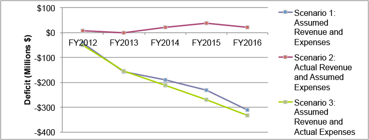
According to these three financial scenarios, the size of the potential deficits that the MBTA will need to address in coming years could vary significantly. If the MBTA continues to face deficits between its annual expenses and revenues similar to what it has budgeted or worse, however, it is likely that some of that total deficit will need to be addressed through fare increases to increase operating revenues and/or service changes to reduce operating expenses. The deficit between expenses and available revenues in the capital budget is an additional financial issue that, while not typically addressed by measures on the operating side, does affect where the MBTA is able to dedicate resources.
Potential changes to the bus and rapid transit system alone will obviously not address this entire financial deficit. According to the FY2011 budget, all bus and rapid transit services currently contribute approximately $310.9 million, or one-fifth of the MBTA’s total existing operating revenues. In terms of expenses, the FY2010 recovery ratio (the percentage of operating expenses that is recouped by operating revenues) can be used to calculate the total bus and rapid transit operating expense for FY2011 based on the corresponding total operating revenue. Dividing $310.9 million by the recovery ratio (37.8%) results in a total estimated bus and rapid transit operating expense of $822.2 million, or 48.5 percent of all operating expenses. Therefore, the net cost of MBTA operations (costs minus revenue) equals $511.3 million.
Addressing the MBTA financial constraints with changes to the bus and rapid transit system could therefore be achieved through changes to operating revenues, operating expenses, and/or the relationship between revenues and expenses, or the recovery ratio. Fare increases would increase operating revenues while keeping expenses constant, thereby increasing the recovery ratio. Improvements in cost efficiency would increase the recovery ratio. These improvements could be achieved by cutting inefficient services or reorganizing services in a more efficient manner. The following sections will analyze each of the proposed concepts with respect to their potential for using each of these potential measures.
The primary financial implications of this concept would be on the capital side. However, the extended rail lines would require longer trip times and a greater number of operators. Table 106 lists the estimated capital cost and weekday operating cost along with the estimated daily ridership and net riders (new transit riders minus riders attracted from other existing transit modes) attributed to each proposed rail extension, along with the resulting cost-per-net-rider figures. These figures are from the 2003 PMT. Note that most if not all of these estimates have changed since the 2003 PMT; however, the relative differences between the various extensions likely remain consistent.
Of the various extensions, the most costly for both capital and operating expenses is the Red Line extension to Route 128. The new station at Assembly Square on the Orange Line is not estimated to result in greater operating expenses. The Blue Line extension to Charles/MGH (the Red-Blue Connector) is also estimated to have a relatively low operating cost per new rider. The next tier of projects in terms of the operating cost per new rider includes the Blue Line to Wonderland, the Green Line to West Medford, and the Fairmount Line improvements. Relatively large cost-per-new-rider ratios are estimated for the extensions of the Green Line D Branch to Needham, the Orange Line to Route 128, and the Red Line to Route 128.
Table 107 applies these ridership and revenue estimates to the existing ridership and revenue totals from FY2010. As seen in the table, the various heavy and light rail extensions increase costs more than revenue, increasing the net cost per trip and reducing the recovery ratio. The total net cost (costs minus revenue) caused by the sum of the proposed rail extensions is estimated to increase by $83.8 million.
Since this scenario includes only extensions, improvements, or new stations, and since each extension costs additional money to construct and operate, it is difficult to envision this scenario being pursued given the uncertainty of future finances. Indeed, only in a financial situation where the MBTA did not run a regular operating deficit, such as Scenario 2, would the MBTA likely even consider these various extensions. The MBTA has already committed to three of these projects: Assembly Square Station on the Orange Line; the Green Line extension to West Medford; and the Fairmount Line improvements. Each of these projects is included in the MBTA’s current capital budget. The Green Line extension to College Avenue (not Mystic Valley Parkway) and the Fairmount Line improvements are both in the State Implementation Plan (SIP) and are federally required to be funded by the Commonwealth. Assembly Square Station on the Orange Line has secured some funding from the federal New Starts Program and a developer, though approximately $8.9 million in undedicated funding remains, according to figures presented in the MBTA’s draft FY2012─FY2016 Capital Investment Program (CIP). With the construction of these three rail projects, if the deficits of Scenarios 1 or 3 appear, the MBTA would likely be forced to raise fares by a substantial amount, eliminate a significant amount of service, or implement a combination of both measures with slightly less substantial fare increases or service cuts.
As noted previously in this memorandum, in the section analyzing each concept under the net-cost-per-passenger standard, the average net cost per passenger for the routes selected for BRT service is less than other local routes that are eliminated: $1.02 versus $1.72. The elimination of these routes with higher costs, along with various improvements to BRT corridors, will shift more passengers onto the BRT routes, lowering their average cost per passenger. Local bus routes outside the BRT service area would not be eliminated, and these routes have a much greater net cost per passenger of $2.63. Assuming existing net-cost-per-passenger values, the systemwide weighted average net cost per passenger for all existing bus routes would be $1.55. This represents a 35.8 percent decrease compared to the FY2010 net cost per passenger for the entire bus system.
Table 106
Rail Extension Concept: Estimated Capital and Operating Costs and Riders
Rail Extension |
Capital Cost (Millions) |
Weekday Operating Cost |
Daily Ridership Increase |
Net Increase in Daily Ridership |
Capital Cost/ New Transit Rider |
Weekday Operating Cost/ New Transit Rider |
Blue Line to Wonderland |
$357.6 |
$72,500 |
21,000 |
7,900 |
$45,300 |
$9.20 |
Red Line to Route 128 |
$749.3 |
$121,800 |
6,700 |
1,700 |
$440,800 |
$71.70 |
Green Line to Needham |
$123.9 |
$16,600 |
3,400 |
500 |
$247,800 |
$33.30 |
Orange Line to Route 128 |
$342.8 |
$94,900 |
4,700 |
2,000 |
$172,300 |
$47.70 |
Orange Line at Assembly Sq. |
$29.3 |
$0 |
1,700 |
1,100 |
$26,900 |
$0 |
Blue Line to Charles/MGH |
$174.6 |
$7,200 |
6,500 |
2,800 |
$63,500 |
$2.60 |
Green Line to W. Medford |
$375.0 |
$41,700 |
8,400 |
3,500 |
$105,900 |
$11.80 |
Fairmount Line |
$70.0 |
$2,800 |
6,500 |
220 |
$318,180 |
$12.70 |
Table 107
Rail Extension Concept: Revenue Scenarios
Mode |
Scenario |
Trips |
Costs |
Fare Revenue |
Costs minus Revenue |
Recovery Ratio |
Net Cost per Trip |
Heavy Rail |
Existing |
139,039,529 |
$306,460,723 |
$153,168,117 |
$153,292,606 |
50.0% |
$1.10 |
|
Extensions |
3,297,145 |
$76,296,000 |
$5,603,187 |
$70,692,814 |
7.3% |
$21.44 |
|
Total |
142,336,674 |
$382,756,723 |
$158,771,304 |
$223,985,420 |
41.5% |
$1.57 |
Light Rail |
Existing |
65,471,593 |
$140,761,339 |
$69,637,279 |
$71,124,060 |
49.5% |
$1.09 |
|
Extensions |
1,020,000 |
$14,866,500 |
$1,734,000 |
$13,132,500 |
11.7% |
$12.88 |
|
Total |
66,491,593 |
$155,627,839 |
$71,371,279 |
$84,256,560 |
45.9% |
$1.27 |
Table 108 presents several potential scenarios for directly-operated bus revenues as well as existing ridership and revenue totals from FY2010. If, under the BRT concept, the same number of bus riders was served as in the existing system, the total net cost of the bus system (costs minus revenue) would decrease by $92.4 million and the recovery ratio would increase to 31.7 percent. If the fares for BRT routes under this concept were increased in proportion to the ratio of the current rapid transit fare ($1.70) to the existing local bus fare ($1.25) while all local routes maintained the existing fare, the weighted average fare for all bus routes (BRT and local) would increase by an estimated 24.0 percent. This percentage increase in the average bus fare would result in a loss in ridership but an increase in fare revenue (assuming a fare elasticity of -0.33). Under this scenario, the total net cost of the bus system (costs minus revenue) would decrease by $103.3 million and the recovery ratio would increase to 36.2 percent.
This concept is revenue neutral, meaning that no change in costs or fare revenue is anticipated. No additional vehicles or operators would be needed, as buses used for limited-stop service would be removed from local-stop service, reducing the frequency of this service but having no other effect. While some change in ridership may occur ─ either a decrease caused by the reduced frequency of local-stop service or an increase caused by the introduction of limited-stop service ─ the overall change is not expected to be substantial. This concept also assumes that fares on the limited-stop and local-stop services would both be the same as the current local bus fare. The same fare is justified in that limited-stop service has the benefit of faster trip times but the detriment of reduced coverage and frequency, while local-stop service has the benefit of greater coverage and frequency but the detriment of longer trip times. As a result, this concept would not be useful in terms of addressing the MBTA’s financial situation.
As with the BRT corridor concept, the neighborhood services concept would also likely have lower net-cost-per-passenger figures for the BRT routes but a greater average net cost per passenger for non-BRT routes. Under the route structure assumed for the neighborhood services concept, there would be 26 BRT routes and 82 neighborhood routes. Assuming $1.00 as the net cost per passenger for BRT routes, $2.50 as the net cost per passenger for neighborhood routes and a ratio of five to one in terms of the number of riders on BRT routes compared to neighborhood routes, this would result in a weighted average net cost per passenger for the directly-operated bus mode of $1.58. This represents a 34.5 percent decrease compared to the FY2010 net cost per passenger for the entire bus system. This concept also includes three rail improvements: the Green Line extension to College Avenue, Assembly Square Station on the Orange Line, and the improvements to the Fairmount Line. As mentioned in the financial analysis of the rail extension scenario, these extensions would increase costs more than revenue for the heavy and light rail modes.
Table 109 presents estimates for the potential effects of the neighborhood services concept on existing ridership and revenue totals from FY2010. As seen in the table, the proposed rail projects do not dramatically affect total heavy rail costs and revenue while the proposed Green Line extension increases the light rail net cost per trip and lowers the light rail recovery ratio. The proposed bus system in the neighborhood services concept lowers the net cost per trip and increases the recovery ratio of the directly-operated bus mode. When all modes are combined, the net cost per trip does not change compared to the existing system while the recovery ratio increases slightly. Under this scenario, the total net cost of the entire system (costs minus revenue) would decrease by $79.9 million.
The four proposed concepts – rail extension, BRT corridor, limited-stop corridor, and neighborhood services – have varying levels of impacts on MBTA finances. The rail extension concept would increase the net cost (costs minus revenue) while the BRT corridor concept and the neighborhood services concept would decrease the net cost. The limited-stop corridor concept is structured to be revenue neutral, meaning that net costs should not change. Reductions in the net cost of operations could address a portion of the average annual operations deficit that is projected for the next five years. If costs and revenues match MBTA budget projections, this average deficit would equal $186.3 million per year. Estimated reductions in the net cost of core transit services under the neighborhood services and BRT corridor concepts range from $79.9 million to $103.3 million, respectively. Therefore, these potential savings could address between 42.9 percent and 55.5 percent of the projected average annual deficit.
Table 108
BRT Corridor Concept: Revenue Scenarios
Scenario |
Trips |
Costs |
Fare Revenue |
Costs minus Revenue |
Recovery Ratio |
Net Cost per Trip |
Existing |
107,071,648 |
$335,275,968 |
$76,926,402 |
$258,349,566 |
22.9% |
$2.41 |
BRT Concept: Service Changes |
107,071,648 |
$242,887,456 |
$76,926,402 |
$165,961,054 |
31.7% |
$1.55 |
BRT Concept: Service & Fare Changes |
98,591,573 |
$242,887,456 |
$87,867,830 |
$155,019,627 |
36.2% |
$1.57 |
Table 109
Neighborhood Services Concept: Revenue Scenarios
Mode |
Scenario |
Trips |
Costs |
Fare Revenue |
Costs minus Revenue |
Recovery Ratio |
Net Cost per Trip |
Heavy Rail |
Existing |
139,039,529 |
$306,460,723 |
$153,168,117 |
$153,292,606 |
50.0% |
$1.10 |
|
Concept |
139,376,129 |
$307,174,723 |
$153,740,337 |
$153,434,386 |
50.0% |
$1.10 |
Light Rail |
Existing |
65,471,593 |
$140,761,339 |
$69,637,279 |
$71,124,060 |
49.5% |
$1.09 |
|
Concept |
66,364,093 |
$151,394,839 |
$71,154,529 |
$80,240,310 |
47.0% |
$1.21 |
Bus |
Existing |
107,071,648 |
$335,275,968 |
$76,926,402 |
$258,349,566 |
22.9% |
$2.41 |
|
Concept |
107,071,648 |
$246,119,808 |
$76,926,402 |
$169,193,406 |
31.3% |
$1.58 |
Total |
Existing |
311,582,770 |
$782,498,030 |
$299,731,798 |
$482,766,232 |
38.3% |
$1.58 |
|
Concept |
312,811,870 |
$704,689,370 |
$301,821,268 |
$402,868,102 |
42.8% |
$1.58 |
The Core Efficiencies Study has three major objectives. The first is to review the Service Delivery Policy and determine whether existing standards should be revised and/or new standards should be added that would help to identify the most efficient services. The second objective is to consider the MBTA system in light of these standards, as well as development, trip, and financial patterns. The third objective is to propose concepts for how the system might be adjusted or potentially redesigned to respond to the prioritized service standards or demonstrated patterns.
In terms of service standards, those currently used by the MBTA—coverage, span of service, frequency of service, schedule adherence, vehicle load, and net cost per passenger—provide a satisfactory assessment of the existing level of service. Other peer agencies use additional standards to measure aspects of service structure (stop spacing, route duplication and competition, route travel time, directness of travel, ease of use, and number of transfers and transfer waiting time), service provision (the percentage of scheduled service hours that are delivered, the average number of miles between service failures, the employee vacancy rate, the average number of miles between accidents and incidents, and passenger complaints), service efficiency (cost-effectiveness and passenger productivity), and physical infrastructure (the distribution of revenue equipment and transit amenities). The MBTA could include some of these as standards or guidelines in its Service Delivery Policy to provide an additional level of assessment of the level of service.
This study also assessed some demographic, trip, and financial characteristics that are likely to affect MBTA service both today and in the future. Demographic trends in population and employment density and in the number of zero-vehicle households indicate areas where existing and future transit demand may be the greatest. Modeled trips between neighborhoods also demonstrate the existing and future areas where people are expected to want to travel. Finally, the financial situation currently facing the MBTA will limit the amount of operating expenditures that can be devoted to transit, and may require that service is provided in even more cost-efficient ways.
Four different concepts are proposed as modifications or alternatives to the existing structure of MBTA service. The rail extension concept essentially maintains the existing service structure with extensions of the radial rail network, while primarily using buses as feeder routes or to serve circumferential trips. The BRT corridor concept replaces local bus service in the urban core with a reduced number of high-frequency, BRT-level services, while local bus service outside the core would remain the same. The limited-stop corridor concept replaces local bus service with a combination of local- and limited-stop service during the peak travel periods along Key Bus Routes and other major routes that travel a long distance. The neighborhood services concept presents an entirely revised bus network, with new BRT routes along major radial and circumferential corridors, and other bus routes linking local neighborhoods to these corridors and the rail lines.
Each of the four proposed concepts and the existing MBTA structure have varying levels of analyzed performance with respect to the various service standards and indicators of transit demand. The coverage standard, in terms of the walking distance to the nearest transit service, is met for most required areas with the existing service. The BRT corridor concept would increase this walking distance in the urban core where service would only operate along BRT corridors and all other local service would be eliminated. None of the proposed concepts would dramatically alter the span of service of any transit routes, though areas with new rapid transit service would receive greater hours of service. The frequency of service would increase on BRT routes in either the BRT corridor concept or neighborhood services corridor concept. The implementation of limited-stop service would necessitate the decrease in the frequency of local-stop service. Vehicle loads and crowding would likely increase in the rail extension concept throughout the lines but particularly at stations nearer to the downtown. Finally, the rail extension concept would likely increase the net cost per passenger while the BRT corridor concept and neighborhood services concept would likely decrease the net cost per passenger.
In terms of other standards used by peer agencies, all of the proposed concepts would lengthen the average distance between stops and reduce or have no effect on route duplication. All concepts except the rail extension concept would decrease route running times and all concepts would decrease the ratio of in-vehicle transit travel time to the comparable auto travel time. All concepts except the limited-stop corridor concept would improve the ease of use and all concepts would decrease or have no impact on the transfer rate. None of the proposed concepts would likely have a significant impact on service delivery, service failure, the employee vacancy rate, vehicle availability, the accident and incident rate, and passenger complaints. The BRT corridor concept and the neighborhood services concept could improve the ease with which revenue equipment is distributed by reducing the number of overall bus routes, and each concept would likely increase the distribution of transit amenities.
Each of the concepts was also analyzed according to the demographic, trip, and financial indicators. Both the data on population density and the modeled trips demonstrate likely increases in transit demand in the neighborhoods of East Somerville, East Cambridge, the Waterfront, and East Lynn, among others. While the existing MBTA system provides service to these neighborhoods, the cost of these transit trips is typically greater than the systemwide average. The BRT routes proposed in the BRT corridor concept and the neighborhood services concept do have greater percentages of origins and destinations served by the routes. The rail extension to West Medford provides service to the East Somerville neighborhood. However, the effects at the systemwide level are marginal. Finally, if the MBTA continues to face deficits between its annual expenses and revenues similar to what it has budgeted or worse, it is likely that some of that total deficit will need to be addressed through fare increases and/or service changes to increase operating revenues or service changes to reduce operating expenses. Of the proposed concepts, the BRT corridor concept offers the greatest financial savings.
In conclusion, each of the proposed concepts, as well as existing MBTA service, performs better with some service standards and transit indicators and worse with others. If coverage is the primary goal, the existing system performs just as well if not better than all of the proposed concepts. The rail extension concept makes transit compare more favorably to automobile travel in certain areas, reducing transit travel times and the number of transfers. The rail extension to West Medford in particular addresses service to a neighborhood with significant projected increases in trips. The BRT corridor concept prioritizes frequency, schedule adherence, and net cost per passenger, resulting in the greatest cost savings of any concept. The primary goal of the limited-stop corridor concept is reduced trip times. Finally, the neighborhood services concept includes BRT routes as well as the rail extension to West Medford, the new station at Assembly Square, and improvements to the Fairmount Line. This concept therefore prioritizes many of the same service standards and transit indicators as the rail extension concept and the BRT corridor concept, such as coverage and service to neighborhoods with greater transit demand as well as frequency, schedule adherence, and net cost per passenger. Each concept therefore has positive and negative aspects, and the choice of which concept to more fully study depends on which characteristics are prioritized.
1 The MBTA addresses accessibility for persons with disabilities through other processes.
2 Chicago Transit Authority, “Service Standards,” July 2001, www.transitchicago.com/assets/1/miscellaneous_documents/servicestandards129737.pdf
3 King County Metro Transit, “Transit Service and Facility Guidelines,” June 2008, www.kingcounty.gov/transportation/kcdot/
PlanningAndPolicy/TransitPlanning
4 Greater Vancouver Transportation Authority, “Transit Service Guidelines,” June 2004
5 Nashville Metropolitan Transit Authority, “Appendix C: MTA Service Delivery Policy,” August 2009, www.nashville.gov/mta/docs/
StrategicTransitMasterPlan/14AppendixCMTAServicePolicy.pdf
6 York Region Transit, “Transit Service Guidelines,” May 2006, www.yorkregiontransit.com/assets/pdfs/2006_Transit_Guidelines.pdf
7 SEPTA, “Service Standards and Process,” March 2007, http://www.septa.org/reports/pdf/standards.pdf
8 SFMTA, “Proposed FY10 Service Standards and Milestones,” www.sfmta.com/cms/rstd/documents/6-26-09Item15FY10
ServiceStandardsChangesPROPOSED.pdf
9 Toronto Transit Commission, “Service Improvements for 2003,” October 2002
10 AC Transit, Board Policy, “Service Standards and Design Policy,” Policy No. 550, January 2008
11 Regional Transportation District, “Service Standards,” December 2002, www.rtd-denver.com/PDF_Files/Service_Standards_12_02.pdf
12 Miami-Dade Transit, “Service Standards,” November 2009
13 Central Transportation Planning Staff, MBTA Title VI Report. Boston, MA, 2008.
14 Data from the MBTA HASTUS database, spring 2010 quarter.
15 Data from the MBTA HASTUS database, spring 2010 quarter.
16 Data from MBTA Line Statistics, fall 2010 quarter.
17 Data from the MBTA’s AFC database.
18 Data from the MBTA Revenue Department.
19 Data from CTPS ridecheck, fall 2009 quarter.
20 Origin timepoints have a three-minute on-time window and may not be early; however, the on-time standard for origins is the easiest to meet, given the recovery time allocated to bus routes. Destination timepoints have an eight-minute on-time window and may be early, while mid-route timepoints have a seven-minute on-time window and may not be early. Therefore, of the three types of timepoints, the on-time standard for mid-route timepoints is the most difficult to meet.
21 The Green Line “central subway” includes 13 stations: Lechmere, Science Park, North Station, Haymarket, Government Center, Park Street, Boylston, Arlington, Copley, Prudential, Symphony, Hynes, and Kenmore.
22 “Directly-operated” refers to bus routes that the MBTA operates; that is, routes for which the MBTA does not contract with a private carrier to operate the service.
23 A decrease is actually projected for trips from South Dorchester to destinations not in the Red Line service area.
24 “Characteristics of Bus Rapid Transit for Decision-Making.” Page ES-5. Federal Transit Administration (August 2004). www.nbrti.org/docs/pdf/Characteristics_BRT_Decision-Making.pdf
25 Clock-face headways are ones that correspond to regular increments on the face of an analog clock, for example, a 20-minute headway with departures at :00, :20 and :40 past the hour.
26 Linked trips represent the travel between a trip’s origin and destination, regardless of how many different transit vehicles a rider must use to make that trip. Unlinked trips represent the travel on each transit vehicle. Thus, a linked trip with one transfer equals two unlinked trips.
27 As determined using the Boston Region MPO’s travel demand model set.