Core-Capacity Constraints
Accommodating Growth on Greater Boston’s Congested Roads and Crowded Transit System
Project Manager
Bruce Kaplan
Project Principal
Scott Peterson
Report Author
Bill Kuttner
Data Analysts
Brynn Leopold
Drashti Joshi
Ian Harrington
Tom Humphrey
Graphics
Ken Dumas
Jane Gillis
Cover Design
Kate Parker-O’Toole
The preparation of this document was supported
by the Federal Highway Administration through
MHD 3C PL contracts #32075 and #33101.
Central Transportation Planning Staff
Directed by the Boston Region Metropolitan
Planning Organization. The MPO is composed of
state and regional agencies and authorities, and
local governments.
This study examines the capacity of road and transit facilities in the Boston Region Metropolitan Planning Organization’s (MPO) core area. The study relates these capacities to current and projected levels of traffic and ridership, and determines the location and severity of congestion and crowding in the core area.
Travel demand is projected to increase significantly by 2040 in response to regional demographic growth and expanded economic activity in the core area. In this report, MPO staff discuss the historical and projected demographic trends that inform travel-demand projections; identify specific major developments that will contribute to this growth; and present historical trends of traffic and transit ridership.
The study relates projected 2040 travel demand to the system capacity expected to be available at that time. Where sufficient data is available, the study quantifies impacts attributable to a set of specific large developments. For some transportation modes and services, adding new capacity is straightforward and for others it is problematic. In this report, we discuss the opportunities and challenges of adding capacity for each transportation subsystem.
In Massachusetts, a major development or business expansion often requires some actions on the part of the developer or business to mitigate, in part, the impacts on the transportation system that are attributable to the project. Chapter 6 includes a review of the large variety of such mitigation programs that have been implemented in the core area. We give special attention to mitigation involving new transit investment or operating subsidies. The chapter concludes with a discussion of expanded mitigation programs that are used in other states, but which would require legislation to be implemented in Massachusetts.
2.1 The Urban Core after Suburbanization
2.2 The Study Area Municipalities
2.3 Population and Employment Trends
2.4 Considering Large-Impact Development Projects
3.1 Commuting by Study Area Resident
3.2 Travel Trends in the Transportation Subsystems
4.1 Roadway Capacity and Congestion
4.2 Base Year and Projected Roadway Congestion
4.3 Congestion Associated with the Key Large-Impact Projects
5.1 Projected Rapid Transit Ridership
5.2 Measuring Capacity and Crowding on Rapid Transit Lines
5.3 Rapid Transit Capacity as it is Actually Experienced
5.4 Peak-Period Crowding on the Rail Rapid Transit Lines
5.5 Peak-Period Crowding on Bus Vehicles
5.6 Peak-Period Crowding on Commuter Rail
6.1 Broad-Based Travel Growth and Individual Developments
6.2 Mitigation Strategies and Techniques
6.3 Modifying Tax and Fee Structures
Table of FIGURES
Figure 1 Study Area, Boston MPO Region, and Travel Demand Model Region
Figure 2 Regional Development Database
Figure 3 Trip Estimation Process
Figure 4 Representative Sample of Traffic Analysis Zones (TAZs)
Figure 5 Location of Large-Impact Projects and AM Congested Roadway Links
Figure 6 Location of Large-Impact Projects and PM Congested Roadway Links
Figure 7 Red Line AM Peak Crowding: Alewife to Braintree/Ashmont
Figure 8 Red Line PM Peak Crowding: Ashmont/Braintree to Alewife
Figure 9 Red Line AM Peak Crowding: Ashmont/Braintree to Alewife
Figure 10 Red Line PM Peak Crowding: Alewife to Braintree/Ashmont
Figure 11 Orange Line AM Peak Crowding: Oak Grove to Forest Hills
Figure 12 Orange Line PM Peak Crowding: Forest Hills to Oak Grove
Figure 13 Orange Line AM Peak Crowding: Forest Hills to Oak Grove
Figure 14 Orange Line PM Peak Crowding: Oak Grove to Forest Hills
Figure 15 Green Line AM Peak Crowding: Lechmere to Kenmore/Symphony
Figure 16 Green Line PM Peak Crowding: Symphony/Kenmore to Lechmere
Figure 17 Green Line AM Peak Crowding: Symphony/Kenmore to Lechmere
Figure 18 Green Line PM Peak Crowding: Lechmere to Kenmore/Symphony
Figure 19 Blue Line AM Peak Crowding: Wonderland to Bowdoin
Figure 20 Blue Line PM Peak Crowding: Bowdoin to Wonderland
Figure 21 Blue Line AM Peak Crowding: Bowdoin to Wonderland
table of TABLES
Table 1 Historical and Projected Population, 1970–2040E
Table 2 Historical and Projected Employment, 1970–2040E
Table 3 Population and Employment per Square Mile, 1970–2040E
Table 4 Density Trends: Change in Population and Employment per Sq.Mile per Year
Table 6 Study Area Commuting Trends, 1980–2010E
Table 7 Study Area Mode Choice Trends, 1980–2010E
Table 8 Regional Commuting Trends, 1991–2011
Table 9 Study Area Commuting Patterns in 2011
Table 10 MBTA Average Weekday Ridership Trends, 1990–2013
Table 11 Vehicle-Miles Traveled on Limited-Access Highways, 1970–2010
Table 12 Major Roadway Congested Miles, 2012–2040E
Table 13 Historical and Projected Weekday Rapid Transit Ridership, 1990–2040E
Table 14 The Impact of Available Passenger Floor Space on Rapid Transit Service
Table 15 Passenger Capacities and Crowding on Rapid Transit Vehicles
Table 16 Total Daily Rapid Transit Capacity
Table 17 Base Year Bus Vehicle Crowding on Radial Routes–Peak AM Hour, 2012
Table 18 Base Year Bus Vehicle Crowding on Radial Routes–Peak PM Hour, 2012
Table 19 Base Year Bus Vehicle Crowding on Non-Radial Routes– Peak AM Hour
Table 20 Base Year Bus Vehicle Crowding on Non-Radial Routes– Peak PM Hour
Table 21 Year 2040 Bus Vehicle Crowding on Radial Route–Peak AM Hour
Table 22 Year 2040 Bus Vehicle Crowding on Radial Route–Peak PM Hour
Table 23 Year 2040 Bus Vehicle Crowding on Non-Radial Routes–Peak AM Hour
Table 24 Year 2040 Bus Vehicle Crowding on Non-Radial Routes–Peak PM Hour
Table 25 Crowding on Most-Heavily Used Inbound Commuter Trains, 2012
Table 26 Crowding on Most-Heavily Used Outbound Commuter Trains, 2012
Chapter 1—Introduction
At any particular point in time, the capacity of a region’s transportation system may be considered as fixed. The various parts of a roadway network can only carry a certain number of vehicles, and these maximum traffic levels are reached on important parts of the system during peak periods each day. Similarly, the fixed-guideway transit systems—commuter rail, rapid transit, and underground busway—have a maximum number of vehicles that can operate safely on each part of the system at any given time.
It is possible to increase the carrying capacities of transportation system elements by improving efficiency or constructing additional physical capacity. Efficiency improvements tend to be incremental, and adding physical capacity generally is a long-term strategy. For public transportation, there is a medium-term strategy: expanding the capacity of the transit vehicle fleet by either increasing the number of vehicles or replacing existing vehicles with larger ones.
The adequacy of transportation capacity in a metropolitan region has important ramifications for the region’s economic health and quality of life, both in the present and the future. Capacity and utilization of the Boston Region MPO’s transportation system are the subjects of this study. The central part, or “core,” of the Boston Region MPO area is densely developed, and a great deal of regional travel either begins, ends, or passes through the core-area municipalities, which are the focus of this study. Figure 1 shows the 101-municipality Boston Region MPO area, the nine study-area municipalities, and the 164-municipality travel demand model region that staff uses to estimate travel in the MPO region.
The purpose of this study is to analyze travel demand, available capacity, and associated congestion in the key transportation subsystems serving Boston’s core area, with the goal of finding opportunities to increase the capacity of each subsystem. Staff began with the 2012 Base-Year travel demand, and projected it to 2040, while estimating crowding and congestion expected in the year 2040.
Figure 1
Study Area, 101-Municipality Boston Region MPO
and 164 Municipality Travel Demand Model Region

We used an analysis of historical and projected population and employment trends as a context for the crowding and congestion analyses. Staff projected significant demographic growth and associated new travel demand within the study area and the rest of the metropolitan region. Much of this anticipated growth is based on a set of specific large projects; the crowding and congestion attributed to this group of specific projects represents an important finding of this study. We have estimated the transportation impacts of these projects as a group for each mode and submode, where possible.
A third set of findings relates to the scope and nature of mitigation arrangements between developers and municipalities, or operating agencies, in the study area. There are legal and practical limits to mitigation in Massachusetts, which staff contrasted with mitigation options that are available in other states.
The report begins by providing the demographic and land use context for the study. We present historical and projected population and employment trends, and analyze regional land use patterns and trends by using density calculations. Staff used an extensive regional land use database to identify a set of specific large development projects, mentioned above, whose collective transportation impacts are estimated in later sections.
Chapter 3 reviews historical transportation trends. Transportation trends with a reliable historical record include numbers of commuters, commuting mode choice, average commute distance, total transit ridership by submode, and total vehicle-miles traveled on limited-access highways.
The next two chapters analyze Base Year and 2040 congestion and crowding in the study area’s roadway network and major transit submodes: rapid transit, bus vehicle service, and commuter rail. Staff developed distinct metrics for each mode based upon data availability and operational characteristics. For the roadway network and the four rapid transit lines, sufficient data were available to allow staff to estimate the combined transportation impact of the selected large-impact developments.
The study concludes with an analysis of current and potential mitigation practices. Some of the most significant mitigation arrangements in the study area are profiled in Chapter 6, and a thorough compilation of study-area mitigation practices is included in an appendix.
Chapter 2—Demographic and Development Trends
In the United States, suburbanization was largely the dominant developmental pattern of the previous century. Population grew more rapidly in the less developed areas surrounding densely populated city centers. In many places, the population in city centers actually declined. This pattern of slower growth or possibly decline in city centers also was reflected in employment trends.
Even during periods of economic difficulty, the central core of a metropolitan region generally contains important transportation hubs upon which regional travel and commerce depend. Given the central location of these facilities, there always is congestion and physical wear on core-area infrastructure because of regional travel, even without strong core-area growth.
Demographic and economic growth continues to increase the demands placed upon US regional transportation systems. While growth continues in the nation’s suburbs, its dense urban core areas currently are growing faster than they had in the past.
One implication of revitalized growth in the urban core is that the resulting incremental transportation burdens are perceived differently by the public and policymakers than they were when suburban development was prevalent. Earlier suburban developments often were undertaken at locations where traffic congestion was not considered a major issue. But, over time, lengthy travel to and from these developments added to regional traffic, which, combined with travel generated by other suburban developments, has resulted in the pervasive regional congestion we see today.
In contrast, most new developments in urban core areas are constructed at locations where congestion already may be a problem—for roadways, transit services, or both. While some of this traffic is generated locally, a significant amount of regional traffic funnels through many urban core locations.
New development in urban cores is not spread uniformly across core-area municipalities. In addition, sometimes an area viewed as a major development is, in fact, a group of smaller, closely located developments that are proceeding on similar schedules. These project clusters can represent a variety of activities and land uses. The re-use of large tracts of previously industrial land can result in a large development cluster. Removing existing structures, such as parking garages, also can create opportunities for large-scale development.
An important goal of this study is to quantify the transportation impacts of a sample of planned large-impact urban core development projects. While the sample projects all contain major transportation impacts, they should be considered in the context of historical growth trends, projected 2040 conditions, and the overall development underlying these trends.
Even with the intense appetite for building up the urban core, significant development still is underway throughout the Boston Region MPO area. All envisioned regional development affects availability of core-area transportation capacity to some extent, and all regional development is reflected in the planning forecasts presented in this study. For the purpose of this study, however, we have selected a group of municipalities that constitutes the formal study area.
In addition to Boston, eight adjacent or nearby municipalities agreed to cooperate in this study, and shared detailed planning and mitigation programs as part of a project-working group. These municipalities are Arlington, Boston, Brookline, Cambridge, Chelsea, Everett, Medford, Revere, and Somerville (see Figure 1).
Table 1 cites the region’s population trends from 1970 to 2040 (estimated), which are significant for their direction, not for their magnitude. Between 1970 and 1980, every area listed in the table lost population. Between 1980 and 1990, four study-area municipalities were growing, and the entire study area added population. Population growth in the study area accelerated after 1990, but by 2010 had not yet returned to its 1970 level.
Several factors contributed to this population decline. Since the 1950s, many first-time homebuyers viewed the auto-oriented suburbs as more desirable than the older, dense cities. In the 1970s, regional economics exacerbated this trend. In addition, many residents of Boston and its suburbs moved to distant sun-belt locations.
Another important trend during this period is the gradual decrease over the last few decades in average household size nationwide. This trend contributes to population decline in many municipalities, especially those with little new-housing starts. Many parents choose to stay in their ample homes even after grown children move out. Unless the property is sold to another, larger family, the population can decline. As perceptions of urban living improve, fewer “empty nesters” in dense urban areas feel the need to move and downsize.
Table 1
Historical and Projected Population, 1970–2040E
| Municipality |
1970 |
1980 |
1990 |
2000 |
2010 |
2040E |
|---|---|---|---|---|---|---|
Boston |
641,071 |
562,994 |
574,283 |
589,141 |
617,594 |
743,967 |
Cambridge |
100,361 |
95,322 |
95,802 |
101,355 |
105,162 |
123,808 |
Somerville |
88,779 |
77,372 |
76,210 |
77,478 |
75,754 |
101,971 |
Brookline |
58,689 |
55,062 |
54,718 |
57,107 |
58,732 |
72,613 |
Medford |
64,397 |
58,076 |
57,407 |
55,765 |
56,173 |
64,380 |
Revere |
43,159 |
42,423 |
42,786 |
47,283 |
51,755 |
73,696 |
Arlington |
53,523 |
48,219 |
44,630 |
42,389 |
42,844 |
45,159 |
Everett |
42,485 |
37,195 |
35,701 |
38,037 |
41,667 |
60,434 |
Chelsea |
30,625 |
25,431 |
28,710 |
35,080 |
35,177 |
42,054 |
Study Area |
1,123,089 |
1,002,094 |
1,010,247 |
1,043,635 |
1,084,858 |
1,328,082 |
Rest of MPO |
1,890,626 |
1,882,618 |
1,912,687 |
2,022,759 |
2,076,854 |
2,272,301 |
Entire MPO |
3,013,715 |
2,884,712 |
2,922,934 |
3,066,394 |
3,161,712 |
3,600,383 |
E = Estimate.
Source(s): US Census (historical data), and Boston Region MPO Long-Range Transportation Plan (projections, 2015).
Population in the 92 non-study area municipalities declined only a little between 1970 and 1980 and by 2010 had increased 10 percent compared to 1970’s population. Relative to the rapidly growing metropolitan areas in the Southwest during the same period, this would be modest growth, but it was enough to reinforce ongoing concerns about suburban sprawl. The theory and practice of realizing successful concentrated development has been an important aspect of the Boston region’s land use and transportation-planning efforts.
The year 2040 projections in Table 1 show a 22 percent population increase in the study area, compared with only a nine percent increase in the outer 92 municipalities. These forecasts depend partly on how many potential developments studied by local and regional planning officials actually would be realized, and whether they would be residential or commercial.
Table 2 contains historical employment data collected by municipality as part of the federal ES-202 program. Except for the 2010 recession year, employment generally has increased in all locations.
Table 2
Historical and Projected Employment, 1970–2040E
| Municipality |
1970 |
1980 |
1990 |
2000 |
2010 |
2040E |
|---|---|---|---|---|---|---|
Boston |
450,628 |
505,360 |
537,664 |
583,922 |
552,369 |
646,947 |
Cambridge |
80,016 |
92,044 |
103,278 |
115,612 |
105,861 |
123,396 |
Somerville |
16,633 |
17,949 |
20,136 |
23,206 |
21,258 |
32,839 |
Brookline |
17,184 |
17,112 |
18,123 |
16,421 |
15,368 |
20,740 |
Medford |
14,144 |
15,176 |
19,513 |
20,262 |
17,190 |
19,255 |
Revere |
6,359 |
7,644 |
8,176 |
8,777 |
9,163 |
8,878 |
Arlington |
6,716 |
7,668 |
9,153 |
8,605 |
8,009 |
8,790 |
Everett |
11,346 |
13,163 |
12,086 |
10,398 |
11,952 |
17,043 |
Chelsea |
10,385 |
9,667 |
9,670 |
13,116 |
13,544 |
17,138 |
Study Area |
613,411 |
685,783 |
737,799 |
800,319 |
754,714 |
895,026 |
Rest of MPO |
616,974 |
814,120 |
961,259 |
1,075,520 |
1,063,560 |
1,135,938 |
Entire MPO |
1,230,385 |
1,499,903 |
1,699,058 |
1,875,839 |
1,818,274 |
2,030,964 |
E = Estimate.
Source(s): Boston Region MPO Long-Range Transportation Plan (projections, 2015), and Bureau of Labor Statistics Form ES-202 (historical data).
National employment trends reinforced this pattern, as the numerous baby boomers born between 1946 and 1964 entered the workforce in the 1970s. In the 1990s, a combination of demographic, policy, and economic conditions brought large numbers of new workers into the job market. Programs such as Job Access and Reverse Commute (JARC) complemented this wave of workforce entrants.
The study area, particularly Boston and Cambridge, contains important regional job centers, though its share of regional employment appears to have permanently declined. In 1970, the study area contained 37 percent of the MPO region’s residents, but 50 percent of the jobs. By 2010, only 34 percent of the region’s residents lived in the study area, but the percentage of jobs had dropped to 42 percent. The 2040 projections show the study area returning to 37 percent of the population, with employment rising only to 44 percent.
Thus, the study area’s projected shares of population and employment reflect well-recognized trends: Subject to the cost of housing and its availability, cities are becoming popular places to live. Downtown areas also are attracting new classes of white-collar workers, sometimes referred to as “knowledge” or “creative” workers in research, design, software, and marketing, adding upward pressure on commercial real estate prices.
This study examines and estimates the transportation impacts of adding major new developments in locations that already may experience serious congestion. Clearly, urban density is a factor in creating new or mitigating already-congested conditions in Boston regional transportation systems.
MPO staff used the values presented in Tables 1 and 2 to estimate 20-year density trends. Dividing selected fields in these two tables by the size of their respective land areas results in the population and employment densities shown in Table 3. The entire MPO area covers 1404 square miles, of which the study-area municipalities make up only 91 square miles. The largest city, Boston, is 49 square miles and Chelsea, the smallest, is only 2.2 square miles. Study-area and non-study municipal land areas are listed in Appendix A.
Table 3
Population and Employment per Square Mile, 1970–2040E
|
|
Population |
Employment |
||||||
|---|---|---|---|---|---|---|---|---|
| Municipality |
1970 |
1990 |
2010 |
2040E |
1970 |
1990 |
2010 |
2040E |
Boston |
13,164 |
11,792 |
12,682 |
15,277 |
9,253 |
11,040 |
11,342 |
13,284 |
Cambridge |
15,440 |
14,739 |
16,179 |
19,047 |
12,310 |
15,889 |
16,286 |
18,984 |
Somerville |
21,653 |
18,588 |
18,477 |
24,871 |
4,057 |
4,911 |
5,185 |
8,010 |
Brookline |
8,631 |
8,047 |
8,637 |
10,678 |
2,527 |
2,665 |
2,260 |
3,050 |
Medford |
8,050 |
7,176 |
7,022 |
8,048 |
1,768 |
2,439 |
2,149 |
2,407 |
Revere |
7,441 |
7,377 |
8,923 |
12,706 |
1,096 |
1,410 |
1,580 |
1,531 |
Arlington |
10,293 |
8,583 |
8,239 |
8,684 |
1,292 |
1,760 |
1,540 |
1,690 |
Everett |
12,496 |
10,500 |
12,255 |
17,775 |
3,337 |
3,555 |
3,515 |
5,013 |
Chelsea |
13,920 |
13,050 |
15,990 |
19,115 |
4,720 |
4,395 |
6,156 |
7,790 |
Study Area |
12,382 |
11,138 |
11,961 |
14,643 |
6,763 |
8,134 |
8,321 |
9,868 |
Rest of MPO |
1,439 |
1,456 |
1,581 |
1,730 |
470 |
732 |
810 |
865 |
Entire MPO |
2,146 |
2,081 |
2,251 |
2,564 |
876 |
1,210 |
1,295 |
1,446 |
E = Estimate.
Source: Central Transportation Planning Staff.
In Table 3, it is clear that the densities do not vary as widely as do the cardinal values in Tables 1 and 2. For population, the densest study-area municipality is Somerville, with 18,477 residents per square mile. For employment, Cambridge is densest, with 16,286 workers per square mile. Somerville and Cambridge still are projected to be the densest municipalities in 2040, by an even a wider margin than they are today.
Table 3 indicates that the study-area population density is always a little less than ten times the density of the outer 92 municipalities. For employment, the study-area density is always more than ten times that of the outer 92 municipalities, though in 2010 it was barely so.
One way of appreciating the problem of adding development in areas that already are largely developed is to look at changes in density over time. MPO staff used the data in Table 3 to arrive at the values in Table 4, which shows how population and employment density have changed since 1970, and how they are projected to change in the future.
The meaning of density trends may be illustrated by a specific example. In the case of Somerville’s population, each year between 1970 and 1990 every square mile in the city lost an average of 153 residents. During a 20-year period, this represents a loss of 3,060 residents per square mile. There are 4.108 square miles in Somerville, resulting in a total decline of 12,569 residents, from 88,779 in 1970 to 76,210 in 1990, as shown in Table 1.
Somerville’s population declined slightly between 1990 and 2010, but between 2010 and 2040, staff expect the city to add an average of 213 residents per square mile each year. This translates to 6,390 more residents per square mile than in 2010; and accounts for the density increase shown in Table 2, from 18,477 in 2010 to 24,871 residents per square mile in 2040. As shown in Table 1, the citywide population is projected to reach 101,971 in 2040.
Table 4 shows that, expressed as density trends, historic and projected changes in MPO-region population and employment are not particularly dramatic and are reasonably aligned with recent trends. Even with the economic downturn in 2008, the region still managed to add four jobs per square mile per year between 1990 and 2010. From this low rate, a slight increase to five additional jobs per square mile per year is projected between 2010 and 2040.
Table 4
Density Trends—Change in Population and
Employment per Square Mile per Year, 1970–2040E
|
|
Population |
Employment |
||||
|---|---|---|---|---|---|---|
| Municipality |
1970–1990 |
1990–2010 |
2010–2040 |
1970–1990 |
1990–2010 |
2010–2040 |
Boston |
-69 |
+44 |
+86 |
+89 |
+15 |
+65 |
Cambridge |
-35 |
+72 |
+96 |
+179 |
+20 |
+90 |
Somerville |
-153 |
-6 |
+213 |
+43 |
+14 |
+94 |
Brookline |
-29 |
+30 |
+68 |
+7 |
-20 |
+26 |
Medford |
-44 |
-8 |
+34 |
+34 |
-15 |
+9 |
Revere |
-3 |
+77 |
+126 |
+16 |
+9 |
-2 |
Arlington |
-86 |
-17 |
+15 |
+23 |
-11 |
+5 |
Everett |
-100 |
+88 |
+184 |
+11 |
-2 |
+50 |
Chelsea |
-44 |
+147 |
+104 |
-16 |
+88 |
+54 |
Study Area |
-62 |
+41 |
+89 |
+69 |
+9 |
+52 |
Rest of MPO |
+1 |
+6 |
+5 |
+13 |
+4 |
+2 |
Entire MPO |
-3 |
+9 |
+10 |
+17 |
+4 |
+5 |
E = Estimate.
Source: Central Transportation Planning Staff.
However, the projected population and employment increases are not uniform across the MPO region. Dramatically more residents and workers are forecasted to squeeze into each square mile each year in the study area than in the 92 outer municipalities. The outer municipalities will continue to add population at a steady rate, but employment growth is predicted to drop from four to just two additional jobs per square mile per year between 2010 and 2040. This is the problem addressed in this study: the greatest increases in density will be in areas that already are dense.
Much of the projected growth described in the previous section will be realized through a large number of smaller projects as well as more intense usage of existing structures. This type of development will happen throughout the region, but its effect will be felt most intensely in the study area. Not only are the study-area municipalities already densely developed, they also are projected to add further substantial population and employment. Moreover, many of the new trips generated in the suburbs need to pass through parts of the study area.
Some of the region’s largest development sections are in the study area, and a representative sample of these is the focus of this study. These locations can be individual projects or groups of projects. Their individual and collective scale makes them especially relevant for several reasons:
The demographic growth described in the previous section will present major challenges to the region’s transportation systems. While much of the growth will come from small- and medium-sized developments, it is useful to evaluate the large-impact projects as a group to estimate the nature and extent of their impacts on regional transportation.
All large-impact projects are required to mitigate their environmental impacts, including the burden of increased transportation demand, to some degree; yet, it is not clear if mitigation requirements are efficient, effective, or even sufficient. Projecting the combined impacts of these developments may be useful when reviewing mitigation programs in the study area.
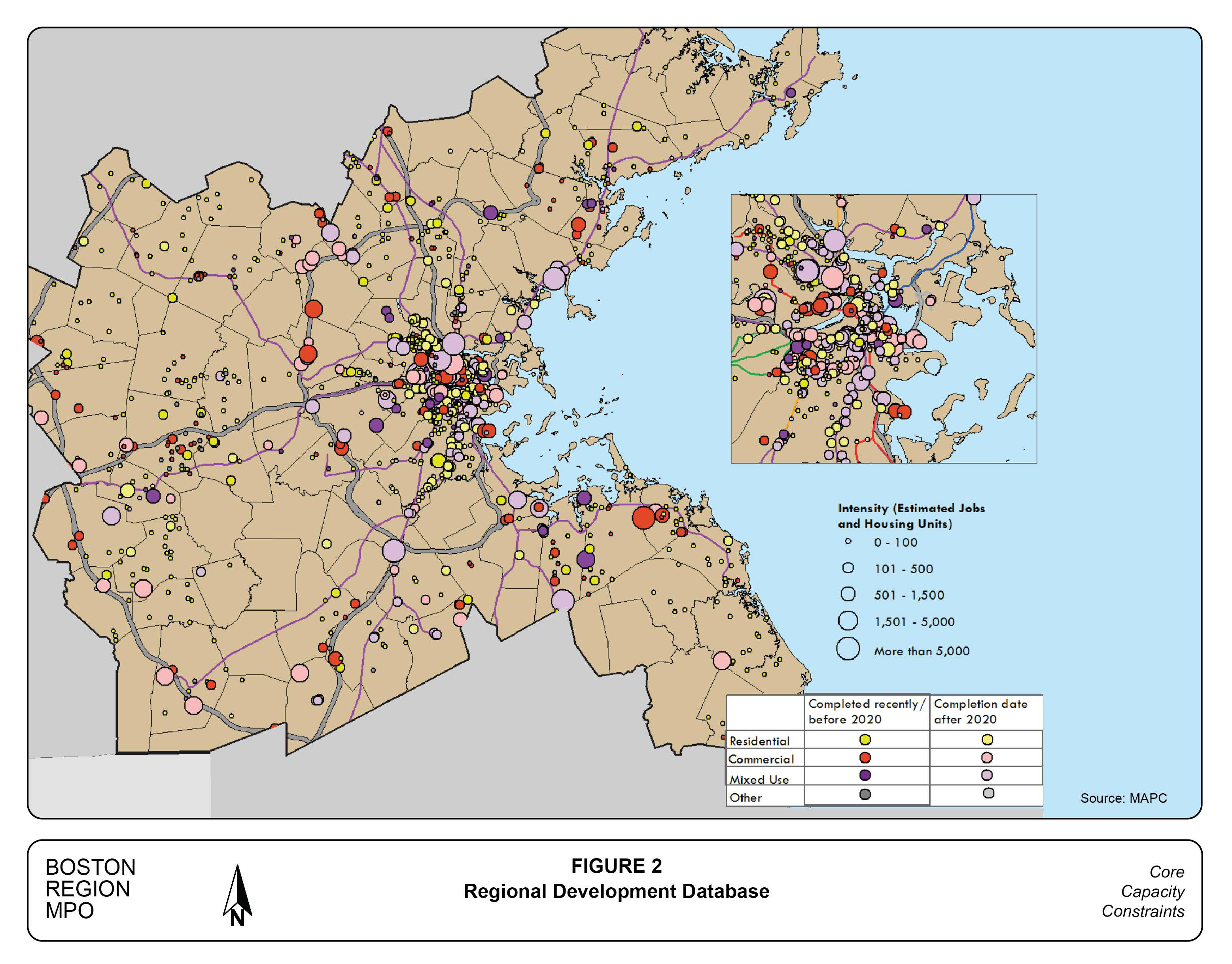
One of the inputs used in developing the 2040 demographic projections is a database of regional development projects maintained by the Metropolitan Area Planning Council (MAPC). This database contains approximately 3,000 projects that are planned, under construction, or recently completed. The database contains project descriptions, which allows for a preliminary estimate of the demographic and transportation impacts of each project. If all 672 projects listed for the study area were completed as described, these projects alone could add 180,000 new residents and more than a quarter-million new jobs. The entire database is shown graphically in Figure 2.
The 2040 demographic projections that were developed for the MPO’s Long-Range Transportation Plan (LRTP) also consider trends in broad-based demographic metrics such as household size and percentage of the population that is working or seeking work—that is, the labor-force participation rate. The development database and the LRTP trends both envision strong growth in the
nine study-area municipalities. The development database is necessary, however, to identify and characterize the specific projects that are included in the sample of large-impact developments.
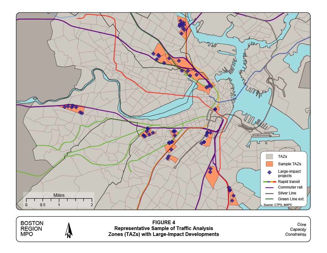
The regional travel demand model now used by MPO staff cannot model travel for an individual location. Instead, the164-municipality model region (see Figure 1) has been divided into 2,727 transportation analysis zones (TAZs). Staff estimate the number of trips that begin or end in a TAZ based on the types of households and employment presently, or projected to be, located in the TAZ.
Estimating travel demand for individual developments is not necessary because staff analyze an entire TAZ. Indeed, most large developments are actually groups of developments with different owners, investment strategies, and permit and construction timetables. For this study, staff identified 20 TAZs within which the expected development projects would generate large numbers of trips.
Figure 2
Regional Development Database
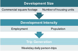
Estimating the number of trips that a planned project would generate involves three steps (Figure 3). First, staff characterize projects in MAPC’s regional development database according to their projected number of housing units and square feet of non-residential floor space. Second, the numbers of workers by industry sector are calculated using floor-space-per-worker values. Population estimates are based on local household sizes. Finally, weekday person-trips by purpose are generated from population and employment figures. In this analysis, staff used trip-generation formulas estimated with data from the 2011 Massachusetts Travel Survey.
Figure 3
Trip-Estimation Process
Source: Central Transportation Planning Staff.
Figure 4 cites the 20 TAZs selected for the representative sample, as well as the 72 specific large-impact projects planned for these TAZs. The TAZs selected are not necessarily those with the greatest projected increase in trips, but those that have not been studied recently. The regional impacts of developments in the South Boston Waterfront, Allston interchange, and Everett casino areas have been and continue to be studied exhaustively, and TAZs from these areas were not included in the sample. Projects within the 20 sample TAZs are important both individually and collectively, but if they were studied at all previously, it was primarily to understand their local impacts. For this study, the new projects in the sample TAZs are analyzed as a group and their regional impacts as a group are estimated.
Future travel-demand forecasts that include the 72 large-impact projects in the 20 sample TAZs are considered to be the Build scenario; which travel demand conditions reflect the LRTP demographic forecasts shown in the previous section. If the number of assumed 2040 trips were reduced by the trips that would be generated by the 72 large-impact projects, this reduced level of trips would be the No-Build scenario. In this study, the term “build” refers to adding travel demand through development rather than adding system capacity.
The locations of the 20 sample TAZs—all in Somerville, Cambridge, or Boston—are shown in Table 5, and are arranged roughly from north to south. Descriptions of large-impact projects, both within and outside the sample TAZs, are presented in Appendix A.
Table 5
Sample TAZ Locations, as of 2016
| City |
Project or Local Feature |
City |
Project or Local Feature |
|---|---|---|---|
| Somerville |
Assembly Row |
Boston |
Downtown Crossing |
| Somerville |
Assembly Square |
Boston |
Landmark Center |
| Somerville |
Prospect Hill |
Boston |
Yawkey Way |
| Somerville |
Union Square |
Boston |
Christian Science Center |
| Somerville |
Brickbottom |
Boston |
Ink Block |
| Somerville |
Inner Belt |
Boston |
Harrison/Albany |
| Cambridge |
North Point |
Boston |
Northeastern University |
| Boston |
West End |
Boston |
Tremont Crossing |
| Boston |
Old Boston Garden site |
Boston |
South Bay |
| Boston |
Brighton Landing |
Boston |
Morrissey Blvd./JFK |
TAZ = Transportation analysis zone.
Source: Central Transportation Planning Staff.
Figure 4
Representative Sample of Traffic Analysis Zones (TAZs)
with Large-Impact Developments
The demographic trends since 1970 presented in the previous section have added a significant amount of travel demand to the study area and the region as a whole. The challenge of more residents has been compounded by a gradual increase in labor force participation and these trends have resulted in longer commute times and distances.
Table 6 presents a summary of commuting statistics for the study area. The first row of the table indicates the total study-area population for 1980 and 2010, taken from Table 1. The population increase during this 30-year period was 8.3 percent. One of the trends of this period was greater labor force participation, reflected here by an increase in the percent of residents employed. The number of employed residents rose by 20.8 percent, representing increases in both population and labor force participation.
Table 6
Study Area Commuting Trends, 1980–2010
|
1980 |
2010 |
30-Year Increase |
Percent Increase |
Study Area population |
1,002,100 |
1,084,900 |
82,800 |
8.3% |
Employed residents |
459,800 |
556,300 |
96,500 |
20.%8 |
Percent of residents employed |
45.9% |
51.3% |
5.4% |
-- |
Average commute time (in minutes) |
24:30 |
28:00 |
3:30 |
14.6% |
These data had been compiled by the US Census as part of the decennial census and were summarized in its Journey-to-Work database. After year 2000, commuting data was collected as part of the American Community Survey (ACS) sample. These survey efforts by the Census are comparable and allow the calculation of the 30-year trend shown in this table.
Source: US Census Bureau.
The last row in Table 6 cites the average of commute times reported to the Census by study-area respondents. The average 2010 commuting time was more than three and a half minutes longer than it was in 1980. The addition of almost 21 percent more commuters definitely would add congestion and slow traffic. The average commute distance also increased during the 30-year period; and there was a small relative decrease in commuting by auto, which still is the fastest commuting mode.
The Census also asks about the usual commuting mode, and these results are summarized in Table 7 for 1980 and 2010. Four commuting options grew by a larger percentage than did growth in employed residents. Commuting via private vehicle grew by only 15 percent, and the use of “other modes,” such as taxi and employer van declined.
Table 7
Study Area Mode Choice Trends, 1980–2010
Commute Mode |
1980 |
2010 |
30-Year |
Percent |
Commuting Options: |
||||
Private vehicle |
243,000 |
280,000 |
37,000 |
15% |
Transit |
135,400 |
165,200 |
29,700 |
22 |
Walk |
59,000 |
72,400 |
13,400 |
23 |
Bicycle |
9,000 |
12,700 |
3,700 |
41 |
Other modes |
7,300 |
5,800 |
(1,500) |
(21) |
Work at home |
6,100 |
20,200 |
14,100 |
234 |
Employed residents |
459,800 |
556,300 |
96,500 |
21 |
Mode Shares: |
||||
Private vehicle |
52.9% |
50.3% |
(2.5)% |
-- |
Transit |
29.5 |
29.7 |
0.2 |
-- |
Walk |
12.8 |
13.0 |
0.2 |
-- |
Bicycle |
2.0 |
2.3 |
0.3 |
-- |
Other modes |
1.6 |
1.0 |
(0.5) |
-- |
Work at home |
1.3 |
3.6 |
2.3 |
-- |
All Commuting Options |
100.0% |
100.0% |
0.0% |
-- |
Source: US Census Bureau.
Use of transit and walking as commuting modes grew by 22 and 23 percent, respectively, slightly faster than the growth of employed residents. Standout growth was posted by the bicycle and “work at home” commuting options, growing by 41 and 234 percent, respectively.
Looking at the increase in actual numbers, commuting during the 30-year period tells a somewhat different story. There were 96,500 more employed residents in the study area in 2010 than in 1980. New telecommunications technologies have made it possible for 14,100 of these added workers to work at home and avoid commuting on a typical workday. Yet despite these new technologies, the other 82,400 additional workers had to travel to their primary workplaces.
Commuting by private auto was the choice of 37,000 additional commuters. While this was an increase of only 15 percent, it still represents the largest increase in absolute numbers of any mode. Conversely, the strong 41 percent increase in commuters by bicycle resulted from only 3,700 added commuters using this mode.
This analysis points to the need to accommodate a significant increase in vehicular traffic and transit ridership during peak commuting times. The non-motorized modes continue to be increasingly popular, and technology has made working from home a viable option. However, a substantial amount of future employees will be using the study area’s road and transit systems.
The lower half of Table 7 expresses the mode share trends as percentages, which did not change dramatically during the 30-year period. Work at home, which is an option rather than a mode, per se, is now a more popular option than commuting by bicycle. While it grew in absolute numbers, commuting via private vehicle is now the choice of barely over half of commuters.
MPO staff used detailed data from two large-scale household surveys to calculate commuting distance trends; Table 8 cites increases in commuting distances for motorized travel modes. In order to construct reliable comparisons, staff calculated commuting distances for the entire 164-municipality model region (see Figure 1).
Table 8
Regional Commuting Trends
Average Miles between Residence and Primary Workplace, 1991–2011
Commute Mode |
1991 |
2011 |
20–Year Increase |
Percentage Increase |
Auto |
8.5 |
9.4 |
0.9 |
10.0% |
Drive-access transit |
13.3 |
15.6 |
2.3 |
17.3 |
Walk-access transit |
4.9 |
5.8 |
0.9 |
18.4 |
All motorized modes |
8.4 |
9.4 |
1.0 |
11.9 |
Source(s): 1991 Household Travel survey, and 2011 Massachusetts Travel Survey.
Over and above demographic growth, commuters’ need to travel farther to reach their workplaces adds significantly to the burdens placed on the region’s transportation systems. We expect that commutes would lengthen for a number of reasons. First, added housing or jobs in outer suburbs would make for possible long commutes, as workers seek their ideal job match. While the study area is projected to experience robust growth, we expect the outer suburbs also to continue to grow. In addition, regional land values suggest that new, lower-cost housing more likely would be built in areas farther from the urban core.
Building housing near employment is seen as a development strategy that might reverse or slow the trend of gradually increasing commuting distances. While this is a reasonable expectation, it needs to be viewed in context. If a couple acquires a residence at the location of one person’s workplace, the other partner still may need to commute by auto or transit. People change jobs or are relocated by their employer, and new job opportunities are constantly being created throughout the region. The problem is that it is simple to locate an individual near a job, but it is almost impossible to locate an entire household somewhere with short commuting distances for all household members.
The longest-distance commuting option shown in Table 8 is drive-access transit, which increased from an average distance of 13.3 miles in 1991 to 15.6 miles in 2001. Another development strategy that could reduce transportation impacts is transit-oriented development; and new and existing suburban housing developments are advertised routinely as being convenient to the expanding commuter rail system. Since 1991, commuter rail service has been introduced to distant commuting markets in Newburyport, Middleborough and Plymouth, and service to Worcester and Providence has been greatly increased. As in the previous example, one household member may have a convenient commute by transit to the urban core, but other household members might commute to any regional location.
We may form a more complete picture of study-area commuting by using information from the 2011 Massachusetts Travel Survey to divide 2010 Census commuting data into distinct commuting patterns. Commuting trends are difficult to estimate reliably at this level of detail, and only the 2011 commuting data has been summarized in Table 9.
About one-fourth of the employed study area residents make what is referred as a “reverse commute,” meaning that they reside in a defined urban core but commute to work in an outlying area. Most of these 142,500 commuters drive to work, as shown in the right-most column of Table 9.
Table 9
Study Area Commuting Patterns in 2011
Commute Mode |
Radial Commutes |
Within |
Reverse Commutes |
Commuting Options: |
|||
Private vehicle |
174,500 |
153,100 |
126,900 |
Transit |
150,600 |
153,300 |
11,900 |
Other modes |
15,800 |
87,200 |
3,700 |
Work at home |
N/A |
20,200 |
N/A |
Total Commuters |
340,900 |
413,800 |
142,500 |
Mode Share Percentages: |
|||
Private vehicle |
51.2% |
37.0% |
89.1% |
Transit |
44.2 |
37.0 |
8.4 |
Other modes |
4.6 |
21.1 |
2.6 |
Work at home |
N/A |
4.9 |
N/A |
All Commuting Options |
100.0% |
100.0% |
100.0% |
N/A = Not applicable or available.
Source(s): US Census Bureau, and 2011 Massachusetts Travel Survey.
The three-quarters of employed study-area residents who also work in the study area make up 55 percent of the study area’s workforce, and their travel mode preferences are shown in the middle column of Table 9. Because these commutes both begin and end in the study area, the use of “other modes” is comparatively popular. These include walking, bicycling, and traveling by taxi, all of which are generally used for shorter trips than auto or transit. As seen in the lower part of Table 9, 21 percent of “other modes” are used for commutes entirely within the study area. At 37 percent, autos have their lowest share in this commuting market segment.
The remainder, 45 percent, of the study area workforce lives outside of the study area and makes a traditional “radial” commute—that is, with the workplace in the urban core and the residence in a suburb. At 42 percent, transit achieves its highest mode share in this market segment, but still is exceeded by driving, the choice of 51 percent of these commuters. Because of the longer commuting distances, the use of “other” modes is limited in this market segment.
In Table 9, the commuting is concentrated during the AM and PM peak periods, and represents in aggregate the capacity and congestion burden that the region’s transportation systems must bear. The demographic and commuting trends discussed above clearly imply that these burdens will increase substantially in the future.
As shown in Table 7, 22 percent more study-area residents commuted by transit in 2010 than they did 30 years earlier in 1980. This figure agrees generally with the MBTA system ridership trends summarized in Table 10. During the 23-year period between 1990 and 2013, weekday use of all the MBTA’s fixed-route services increased by 17 percent.
Table 10
MBTA Average Weekday Ridership Trends, 1990–2013
Mass Transit Subsystem |
1990 |
2013 |
23-Year Increase |
Percent Increase |
Red Line |
181,800 |
237,800 |
55,900 |
31% |
Orange Line |
67,600 |
74,300 |
6,700 |
10 |
Green Line |
117,300 |
150,100 |
32,800 |
28 |
Blue Line |
50,200 |
52,300 |
2,100 |
4 |
Northside commuter rail |
14,400 |
25,000 |
10,600 |
74 |
Southside commuter rail |
23,200 |
41,900 |
18,700 |
81 |
Bus |
377,900 |
388,600 |
10,600 |
3 |
Total System Entries |
832,400 |
970,000 |
137,600 |
17% |
Source(s): MBTA Ridership and Service Statistics, Fourteenth Edition, 2014, and National Transit Database.
While the combined 17 percent ridership growth reflects overall commuting trends, the individual subsystems have experienced a wide range of growth. Because many transit trips require one or more transfers, too much should not be concluded from these growth differences. However, employment growth in places like Kendall Square and the Longwood Medical Area has contributed to strong Red and Green Line usage. In addition, ridership growth on the commuter rail is partly a result of system expansion and increased service on key lines. Growth in bus use appears low partly because in the 1990s buses substituted for Green Line service on the heavily used E Branch during its reconstruction.
The MBTA has been able to accommodate this growth to some extent by adding capacity in parts of its operations. The implications for system congestion because of added capacity can vary, and depend on the nature of the capacity added. Often, a highly visible capacity expansion would be to introduce a new fixed-route service in a previously underserved area. New services since 1990 include the three Old Colony commuter rail lines and the extension of commuter rail service to Newburyport. The Silver Line tunnel from a Red Line connection at South Station into the Seaport District also represents a new service to an underserved area. (Silver Line ridership is reflected in Table 10 in the bus and Red Line statistics.) These expanded services have been successful in attracting new commuters to transit during peak periods. However, most of the new commuters must travel through the urban core to complete their trips, thus increasing congestion on already heavily congested transit lines.
Increasing the maximum number of passengers that the transit system can carry at peak periods is a critical type of capacity expansion. While these types of expansions often lack the public flair of a ribbon cutting, they help determine the comfort, convenience, and ultimate success of transit services. Purchasing double-decked commuter rail coaches and lengthening the Blue Line platforms to accommodate six-car trains were important and highly visible peak-period capacity increases. Older Orange and Red Line station platforms were lengthened prior to 1990 to accommodate six-car trains. For a time, six-car trains were operated during peak periods and four-car trains at other hours of the day, but by the early 1990s, six car trains were the norm. Transit ridership outside of the peak periods has increased steadily over the years; and the Red, Orange, and Blue Lines now operate with six car trains at all hours.
Several institutional issues had restricted the amount of commuter service that could be offered on the Worcester and Providence commuter rail lines. Before these issues were resolved, service to these major New England cities was mostly concentrated during peak periods. New institutional arrangements have allowed significantly expanded service on these lines, much of which, however, has been added outside of peak periods.
Finally, the extension of many Silver Line buses to Logan Airport has been very successful and has accommodated a significant amount of Logan’s recent passenger growth. Travel to Logan Airport by both the Silver Line and the Blue Line is distributed throughout the day.
Limited-access express highways are critical corridors that make vehicular travel practicable between and across the study area and its outer suburbs and Massachusetts as a whole. Because of its importance, extensive and detailed historical data for the express highway system in Massachusetts have been developed and published by MPO staff. These data were developed for average weekdays; a summary of statistics relevant to this study is presented in Table 11 1.
Table 11
Vehicle-Miles Traveled on Limited-Access Highways:
Thousands of Vehicle-Miles on an Average Weekday, 1970–2010
1970 |
1980 |
1990 |
2000 |
2010 |
Average Annual Increase |
|
Study Area |
2,800 |
3,800 |
4,600 |
5,200 |
5,700 |
73 |
Outer suburbs |
14,700 |
21,400 |
33,600 |
42,100 |
44,700 |
750 |
Rest of state |
5,800 |
8,900 |
13,400 |
17,700 |
20,000 |
355 |
Statewide |
23,300 |
34,100 |
51,600 |
65,000 |
70,400 |
1,178 |
Source: Central Transportation Planning Staff.
MPO staff can allocate traffic volumes to specific regions using the express highway historical database. In Table 11, the area cited as “outer suburbs” refers to 155 municipalities outside of the nine in the study area that altogether form the Boston Region MPO travel demand model region (see Figure 1), and includes most of the area generating commuter trips into the study area.
Using weekday traffic on express highways to articulate traffic growth trends has certain implications. First, traffic on express highways is only a portion of overall traffic. The working assumption of this analysis is that overall traffic growth is roughly proportional to growth on the express highways. All traffic on limited-access highways must begin and end travel some place on the surface roads, so traffic growth on the express highways generally is accompanied by growth on the surface roads.
Another important implication of using weekday traffic as a measure is the way congestion is accounted for. As shown in Table 11, daily vehicle-miles traveled have steadily increased in all geographical areas. This is despite the fact that numerous locations on the express highway system, many of which are in the study area, reach their maximum capacity during the AM and PM peak periods.
Increased daily traffic volumes impact already-congested roads in several ways. At the congested locations, the duration of peak congested conditions lengthens, as do the queues of traffic waiting to pass through the various bottlenecks. In addition, as queues lengthen at locations that have reached their maximum capacity, drivers seek alternate routes to bypass the bottlenecks. These alternate routes may be on a different express highway or on a parallel surface road. Over time, these alternate routes in turn can become congested.
The underlying data presented in Table 11 are not of a nature that could inform the design of specific highway system elements. Their purpose is to illustrate the fact that traffic and associated congestion have been steadily increasing, though at a more moderate pace than in previous decades.
Chapter 4—Roadway Capacity Issues
The ability of study-area roadways to absorb additional traffic generated by anticipated future development is a major concern of this study. The capacity of the roadway system has been evaluated by estimating the linear extent of congested traffic conditions on major study area roadways during the AM and PM three-hour peak periods in the 2012 Base Year and the 2040 future year in two distinct growth scenarios.
Staff used the Boston Region MPO travel demand model to estimate the extent and severity of traffic congestion for both 2012 and projected 2040 traffic conditions. The model includes a representation of all of the region’s express highways and arterial roadways and many local streets. Each segment of the roadway system represented in the model is characterized by a capacity based on its physical design, expressed as a maximum number of vehicles per hour. In Appendix B, we discuss the preparation and use of the travel demand model.
The model estimates the amount of traffic on every segment of the roadway system for each modeled scenario by time period. The estimated volume of traffic is compared with the capacity of each roadway segment; this volume-to-capacity ratio is the measure used to identify the presence and severity of traffic congestion. A volume-to-capacity ratio of less than 0.85 is sufficiently below capacity to allow acceptable vehicle speeds, whereas a value greater than 0.85 is, for the purpose of this study, approaching capacity and is considered congested.
As traffic on a roadway segment increases to greater than 0.85 of capacity, traffic slows, with the negative impact of each added vehicle increasing its travel time. As traffic slows to a crawl, fuel efficiency declines and emissions per mile of pollutants and greenhouse gases increase. Queues usually form behind a congested section, with vehicles creeping up to a bottleneck on a road section that normally would have adequate capacity.
There are about 502 miles of limited-access express highways and arterial streets in the nine-municipality study area. In the 2012 Base Year, an estimated 123 miles of these roads carried more than 0.85 of their capacity during the AM peak period, meaning that 24.5 percent of the study area’s major roadways were congested during this period (see Table 12). Base- and future-year congested roadways are listed and shown graphically in Appendix C.
Table 12
Major Roadway Congested Miles, 2012–2040E
|
AM Peak Period |
PM Peak Period |
||
Scenario |
Miles |
Percent of Miles |
Miles |
Percent of Miles |
2012 Base Year |
123 |
24.5% |
197 |
39.2% |
2040E No-Build |
157 |
31.3 |
242 |
48.1 |
2040E Build |
169 |
33.7 |
255 |
50.8 |
E = Estimate.
Source: Central Transportation Planning Staff.
In 2012, during the PM peak period, 197 miles, or 39.2 percent of study-area major roadways were congested, significantly greater that the amount of congestion during the AM peak period. This is because most of the traffic during the AM peak is part of a commute to work, whereas during the PM peak, commuting home is supplemented by a substantial amount of non-commuting traffic.
The 2040 No-build scenario reflects all of the regional demographic and travel growth projected for the Boston Region MPO’s Long-Range Transportation Plan, except for the 72 key large-impact developments that were discussed previously. Even without these large-impact developments, the model results in Table 12 show that there will be 34 more miles of congestion on study-area major roadways during the AM peak period in 2040—157 congested miles, or 31.3 percent of the total miles.
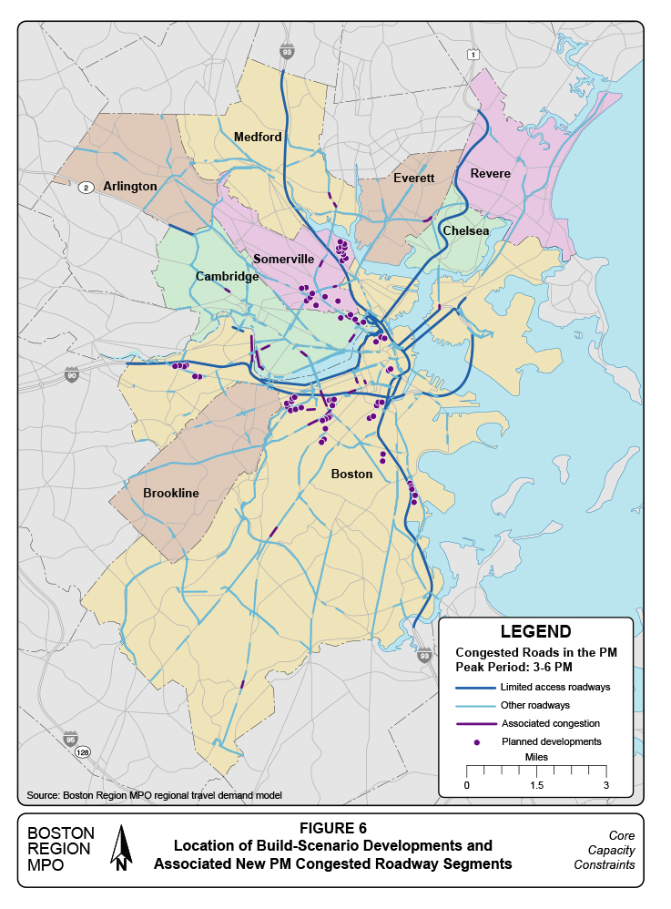
The growth impact is even greater during the PM peak period, with an additional 45 miles of major roadway exceeding 0.85 of capacity in 2040. With a projected 242 congested miles, almost half of the total study-area major roadway miles would be congested during the PM peak.
The 2040 Build scenario includes all the regional demographic and travel growth projected for the Boston Region MPO’s Long-Range Transportation Plan, including travel generated by the 72 key large-impact developments. With these large-impact developments included, the analysis shows an additional 12 miles of congested major roadway during the AM peak period, 169 miles compared with the 157 congested miles in the No-build scenario.
Including the large-impact projects adds an additional 13 miles of congestion during the PM peak in the Build scenario, comparable to the 12 miles of congestion added by these projects during the AM peak period. Taken altogether, more than of half the major roadways would be congested during the PM peak in the Build scenario.
The nine study-area municipalities and major roadways are shown graphically in Figures 5 and 6. The 157 roadway miles congested during the AM peak period in the 2040 No-build scenario are highlighted in orange and red in Figure 5. Figure 6 highlights in two shades of blue the 242 congested miles during the PM peak period in the No-build scenario.
The locations of the 72 key large-impact projects also appear in both figures, in purple. The same shade of purple is also used to highlight in each graphic the major roadway segments where traffic volumes edge above the 0.85 of capacity mark because of adding the traffic from the Build-scenario projects. This added congestion is referred to as “associated congestion” because it exists in association with completing the Build-scenario projects.
Most of the associated congestion appears on radial arterials feeding traffic into the urban core and the sample large-impact projects. The purple line segments in Figure 5 total around 12 miles for the AM peak period and in Figure 6 they amount to around 13 miles for the PM peak period. While most of these segments are pointing into the urban core, much of the associated congestion is on segments at some distance from the large-impact projects. This illustrates the fact that, because of many vehicle trips are long, the traffic impacts of a development can be widespread.
The traffic impacts across the study area result from two factors. First, incremental traffic generated by large-impact projects may travel to or from relatively distant locations, pushing some borderline roadway segments along the travel route to greater than the 0.85 capacity level. Second, much of the newly generated traffic must use already-congested roads, some near the new projects. As the severity of existing congestion increases, traffic unrelated to the new development seeks less-congested routes farther from the new development, further spreading out the traffic impacts.
Also not apparent in these figures are non-congested roadways that are nearing the 0.85 capacity level. While traffic conditions at these locations may be satisfactory in the 2040-Build scenario, the ability to accommodate additional traffic is reduced. (This traffic growth could be either regional in nature or associated with projects envisioned for that particular area.)
Figure 5
Location of Build-Scenario Developments and
Associated New AM Congested Roadway Segments
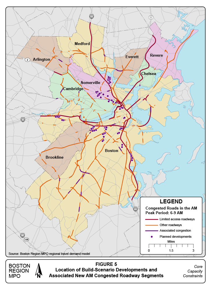
Figure 6
Location of Build-Scenario Developments and
Associated New PM Congested Roadway Segments
In conclusion, large-impact projects spawn traffic impacts throughout the region. When they are near a development site, the impacts can be more clearly attributed to a particular project. Farther from the development site, the added traffic is dispersed and is indistinguishable from the collective impact of smaller projects.
Chapter 5—Transit Capacity Issues
The analysis of transit capacity begins with the region’s complex and heavily used rail rapid transit system: the Red, Orange, Green, and Blue lines The average weekday ridership numbers for the four MBTA rail rapid transit lines shown in Table 10 are also presented in Table 13. These numbers represent entrances to the system at stations with fare gates and show an increase of 97,600 riders between 1990 and 2013, for an average increase of about 4,200 weekday riders each year.
Forecasts for the four rail rapid transit lines are shown in Table 13. The 2040 ridership estimates are derived from the demographics and development forecasts presented in section 2 of this study, and the ridership forecasting methodology is described in Appendix B. The 2040 No-Build ridership estimates assume that all projected 2040 growth takes place except for the 72 large-impact projects in the 20 sample TAZs. The 2040 Build ridership estimates assume that these 72 projects are completed as well. These developments are listed in Table 5 and their locations are shown in Figure 4.
Table 13
Historical and Projected Weekday Rapid Transit Ridership
Rapid Transit Line |
1990 |
2013 |
2040 |
2040 |
Red Line |
181,800 |
237,800 |
337,000 |
359,000 |
Orange Line |
117,300 |
150,100 |
184,000 |
228,000 |
Green Line |
67,600 |
74,300 |
77,000 |
105,000 |
Blue Line |
50,200 |
52,300 |
63,000 |
63,000 |
Total boardings |
416,900 |
514,500 |
661,000 |
755,000 |
Source(s): Central Transportation Planning Staff, and MBTA Ridership and Service Statistics, Fourteenth Edition, 2014
In the No-Build scenario, weekday rapid transit station entrances are projected to increase by 126,500 during the 27 years between 2013 and 2040, to total 661,000 outside entrances. This would represent an increase of about 5,400 weekday riders each year, substantially greater than the 4,200 additional riders added each year before 2013. If all the projects in the Build scenario are completed, weekday station entrances are projected to reach 755,000 for these four lines, implying an annual increase of 8,900 weekday riders.
Increased ridership will impact all time periods, lines, and directions. However, crowding likely would be a problem during the AM and PM peak periods. In this section, we discuss the relationship of crowding to overall system operations, and identify the time, locations, and severity of peak period crowding.
The capacity of a transit line is calculated as the number of trains operated during a time period times the number of vehicles per train times a benchmark number of passengers per vehicle. In the short term, all three of these factors are fixed operational characteristics of a transit line.
The maximum number of passengers a rapid transit vehicle can carry depends only partly on fixed characteristics such as vehicle size, number of seats and their arrangement within the vehicle. In addition to accommodating a passenger in each seat, it is assumed that during peak periods there also will be a substantial number of standing passengers. When the number of standees reaches a maximum acceptable level, the vehicle may be considered to be operating at capacity even though there still might be room for “one more passenger.”
Transit equipment manufacturers provide estimates of a maximum theoretical capacity of their vehicles, which are based on design factors such as strength of the undercarriage and power of the electric motors; but these are not of value in service planning.
For the purposes of this analysis, we have defined three distinct crowding levels:
The concept of “acceptably full” is a characteristic of all three crowding levels. The availability of 3.76 square feet for each standing passenger is used as the cutoff point in determining when a vehicle is acceptably full. Staff selected this value based on published industry standards that are summarized in Table 14.
Table 14
Impact of Available Passenger Floor Space on Rapid Transit Service
Square Feet per Standee |
|
MBTA Operations Perspective |
10.8 and above |
|
|
5.4 to 10.8 |
|
|
4.3 to 5.3 |
|
|
3.2 to 4.2 |
|
|
2.2 to 3.1 |
|
|
Less than 2.2 |
|
|
Source: Adapted from Transit Capacity and Quality of Service Manual, 3rd Edition. 2
As described in Table 14, the quality of a transit user’s experience is diminished as the number of riders in a vehicle increases. Conversely, the transit system operator benefits from carrying a greater number of passengers, but only up to a point. With too much crowding, unloading and loading passengers at stations can be time consuming and make it difficult to adhere to schedule. The selection of 3.76 square feet per standee as the definition of an acceptably full vehicle represents a balance between passenger comfort and operational efficiency.
The MBTA operates several distinct vehicle fleets on its four rail rapid transit lines. Currently, most of these vehicles are configured with so-called “perimeter seating”—that is, most seating installed along the sides of cars to allow for a large number of standees. Dividing the available standing space by 3.76 square feet per passenger gives the maximum number of standees in an acceptably full vehicle. Adding the number of seats to the number of standees gives the total passenger load of a rapid transit vehicle.
Table 15 summarizes transit vehicle capacities for the MBTA fleets for the different congestion levels used in this analysis. For the Red and Green Lines, where the MBTA uses more than one type of vehicle, the figures in Table 15 represent average values for the line.
Table 15
Passenger Capacities and Crowding on Rapid Transit Vehicles
Transit Line |
Seating Capacity |
Apparent Crowding |
Acceptably Full |
Maximum Acceptable |
Physical Limit |
Red |
57 |
114 |
142 |
160 |
202 |
Orange |
58 |
116 |
124 |
138 |
171 |
Green |
45 |
90 |
100 |
112 |
139 |
Blue |
35 |
70 |
76 |
85 |
105 |
Source: Adapted from MBTA Ridership and Service Statistics, Fourteenth Edition, 2014.
The first column in Table 15 shows the number of seats available for a typical car on each line. The Orange Line cars have the greatest number of seats despite being smaller than the Red Line cars. This is because all Orange Line cars have only three doors on each side and have not had seats removed to create specific locations to secure wheelchairs. In contrast, many of the Red Line cars have a fourth door on each side and locations for wheelchairs, both of which reduce space available for perimeter seating.
The second column in Table 15 shows the number of seats multiplied by two, and indicates the “overburdened” crowding level, at which crowding becomes apparent to riders but still is considered an acceptable, even efficient level of vehicle utilization. Vehicles with this many riders are, on average, within 12 percent of the acceptably full benchmark.
When the number of riders exceeds the acceptably full benchmark, the vehicle is considered to be overcrowded. When there are fewer than 3.11 square feet per standee, the level of crowding is considered unacceptable; the maximum acceptable number of passengers for each type of MBTA transit vehicle is shown in the fourth column of Table 15. The maximum acceptable loads, on average, are about 12 percent higher than the acceptably full benchmark and approximate the maximum load specified by the MBTA Service Delivery Policy.
The right-most column in Table 15 approximates a practical physical limit of a vehicle’s passenger load and assumes only 2.20 square feet per standee. At greater than this level, a point is reached where the motive power or vehicle suspension is inadequate for safe operation. Crowding approaching so-called “crush loads” can occur after sports events or during peak periods if a train needs to be taken out of service.
Using the acceptably full passenger load benchmark, it is possible to calculate a total capacity for each of the four rail rapid transit lines, as summarized in Table 16. The first column in Table 16 shows the average number of weekday trains that operated on each transit line in May 2011. These numbers were obtained from direct observation rather than calculated from schedules. For the Blue and Red Lines, the number of observed trains exceeded 97 percent of the scheduled trains. The number of Orange Line trains observed was less than 93 percent of scheduled trains. Comparable information for the Green Line was not developed.
Table 16
Total Daily Rapid Transit Capacity
Transit Line |
Number of Daily Trains in Each Direction |
Cars per Train |
Acceptably Full Car Capacity |
Total Daily Capacity |
Red |
205 |
6 |
142 |
175,000 |
Orange |
149 |
6 |
124 |
111,000 |
Green |
562 |
2 |
100 |
112,000 |
Blue |
171 |
6 |
76 |
78,000 |
Source: Central Transportation Planning Staff.
The second column shows the number of cars per train, with six cars being standard for the Red, Orange, and Blue Lines. On weekdays, almost all the Green Line trains have two cars. The third column is the acceptably full car capacity benchmark from Table 14. Multiplying these three columns gives the total number of passengers that each rapid transit line could move in each direction over the course of a weekday if all vehicles were acceptably full, shown in the right-most column.
The total capacities in Table 16 represent the daily capacity as currently operated. The MBTA schedules as much service as practicable during the AM and PM peak periods, and then reduces service somewhat during the off-peak periods. Capacity during the peak periods will be constrained by either the number of transit vehicles available or the design of the signaling and safety systems.
We may conclude from Table 16 that the Red Line provides significantly more raw capacity than the other lines. In theory, more off-peak service could be added on the other lines. However, if increased off-peak travel demand warranted increased service, then off-peak trains likely would be added to all four lines, maintaining the Red Line’s capacity advantage.
Increasing the carrying capacity of a rapid transit line clearly has the potential to reduce crowding. These types of efforts have been ongoing for decades; and opportunities to increase capacity will be discussed in later in this report in analyses of the individual lines. For the purpose of this study, however, we assume the vehicle capacities and train configurations shown in Tables 15 and 16 in evaluating expected future crowding.
The raw physical capacity calculated in Table 16 is available for use between the service end points of each rapid transit line. In daily use, however, more passengers board trains at certain stations than others and only travel a portion of the route. At each intermediate station passengers both board and alight, and the number of daily boardings on a line does not relate directly to its raw capacity. This may be seen by comparing 2013 weekday ridership of the four lines in Table 13 with their total weekday capacities calculated in Table 16. Usually, however, higher-capacity transit lines can accommodate more boardings and longer trip distances before crowding becomes a problem.
Observed rapid transit operations also deviate from published schedules in that trains are often unable to arrive at regular time intervals. The dwell time required at station stops varies, often as a result of a large number of passengers transferring from a just-arrived connecting train. If a longer than anticipated station stop results in a slightly delayed departure, the result is greater numbers of riders accumulating on station platforms down the line, which in turn can lengthen dwell times at these stations.
Conversely, the train immediately behind a delayed train may have shorter dwell times as it gets closer to the slower train in front because fewer riders have had a chance to accumulate on the station platforms. This standard operating problem of a slower train causing the following trains to speed up is referred to as “bunching.”
Bunching results in some trains being significantly more crowded than others. The effects of bunching do not balance out: the aggravation of waiting longer for a crowded train more than counterbalances any satisfaction of a short wait for less crowded train. Commuters tend to be in a hurry and often will try to push their way onto a crowded train rather than trust that another train is right behind. Because more passengers are carried in the more crowded trains, statistically more riders likely would end up on the crowded trains. In a recent study, Measuring the Impacts of Transit Reliability on Transit Ridership3 , the unpredictability of wait times on the MBTA’s rapid transit lines was shown to increase the perceived travel times that riders consider when choosing a travel mode.
Not only does bunching cause crowding but also crowding causes bunching. Any delay can set in motion the bunching process. As shown in Table 14, crowding increases the amount of time required for riders to leave and enter a train. If a transit line has ample carrying capacity, it can accommodate a certain amount of variation in station boardings. If the transit line is operating without any reserve capacity, then even small increases in boardings at a particular station might throw the train off schedule and begin the bunching process.
For the Impacts of Transit Reliability study, the number of trains was observed by 15-minute interval on each line and direction for all 21 weekdays in May 2011, and these observations formed the dataset with which the capacity statistics for this study were developed. Appendix D shows the average number of weekday trains by 15-minute peak-period interval that operated during these 21 weekdays.
These data were then used to calculate of the number of trains that operated between every pair of rapid transit stations with faregates by 15-minute interval for each of the 21 weekdays. Averaging the numbers trains between each station-pair gives an estimate of the amount of train service between each station-pair on a usual weekday by 15-minute interval.
The numbers of riders entering these stations by 15-minute interval can also be known because of the electronic faregates, and data and analytical methods exist to estimate the portion of riders boarding trains in each available direction and the most probable exit stations. Staff performed this analysis for all system ridership for one day in 2011, and calculated average boardings and alightings for a typical weekday by station, direction, and 15-minute interval. From these data the total number of passengers traveling over a segment was calculated for every pair of stations with faregates during every 15-minute interval during the AM and PM peak periods. These ridership data are summarized in Appendix E.
Dividing the total number of passengers expected to be riding between a station-pair during a 15-minute interval by the number of transit vehicles expected to serve the station-pair during the same interval gives a number of passengers per vehicle. These passenger-per-vehicle values will indicate the presence of crowding based on the vehicle capacity breakpoints shown in Table 15. Detailed information about Base Year passenger loads by station-pair and 15-minute interval are found in Appendix F.
Transit vehicle crowding is depicted graphically for the Base Year and the 2040 No-build and Build scenarios for each of the rail rapid transit lines in a set of 16 graphics, Figures 7 through 22. Each of the four rail rapid transit lines has a set of four figures, two depicting AM peak crowding (one figure for each direction) and two depicting PM peak crowding. The content and organization of these graphics may be illustrated using the Red Line, Figures 7–10, as an example.
Figure 7 shows crowding on Red Line trains originating in Alewife and ending at either Braintree or Ashmont stations during the AM peak period, for the three hours between 6:00 and 9:00 AM. The Red Line and its stations are shown on the left, with the north-most station, Alewife, appearing at the top. The Red Line operates over two branches; the branch between JFK/UMass and Ashmont is shown separately near the bottom of the figure.
Figure 7
Red Line AM Peak Crowding: Alewife to Braintree/Ashmont
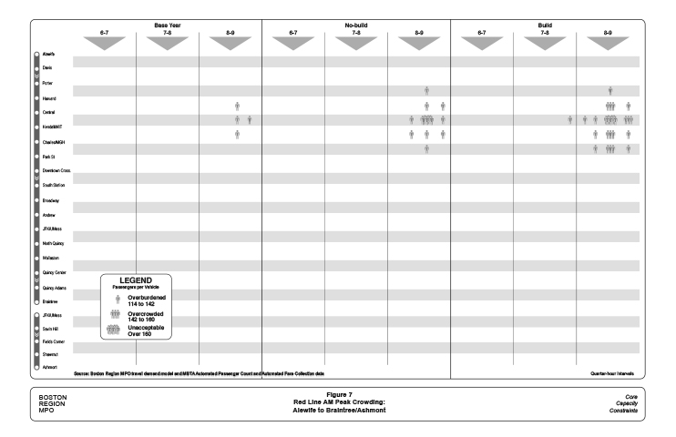
Figure 8
Red Line PM Peak Crowding: Ashmont/Braintree to Alewife
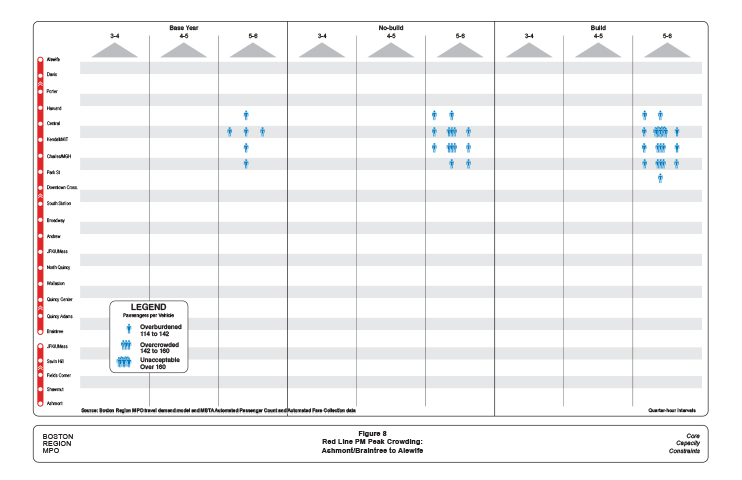
Figure 9
Red Line AM Peak Crowding: Ashmont/Braintree to Alewife
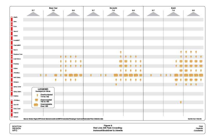
Figure 10
Red Line PM Peak Crowding: Alewife to Braintree/Ashmont
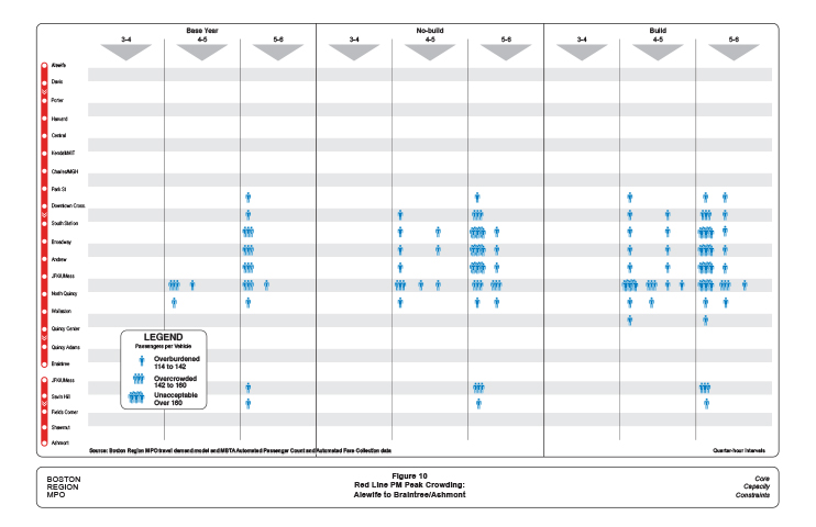
Figure 11
Orange Line AM Peak Crowding: Oak Grove to Forest Hills
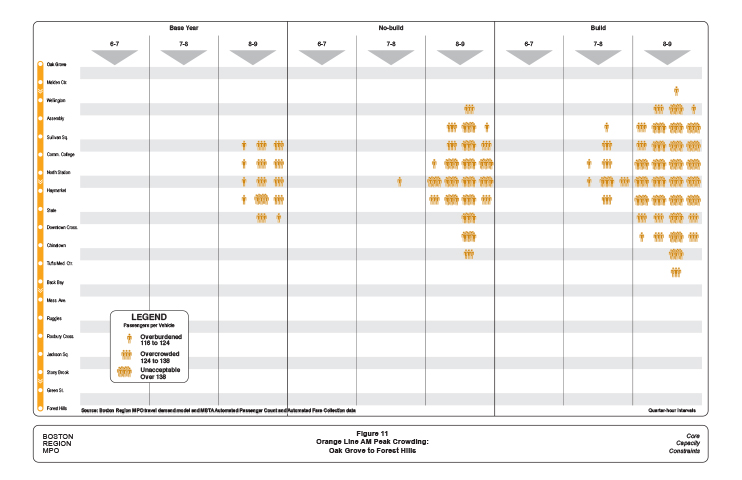
Figure 12
Orange Line PM Peak Crowding: Forest Hills to Oak Grove
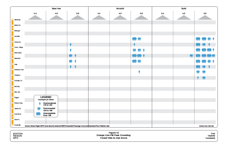
Figure 13
Orange Line AM Peak Crowding: Forest Hills to Oak Grove
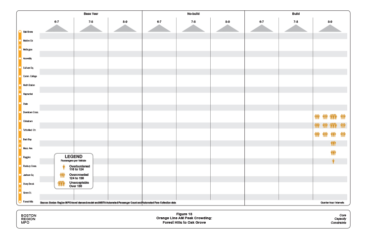
Figure 14
Orange Line PM Peak Crowding: Oak Grove to Forest Hills
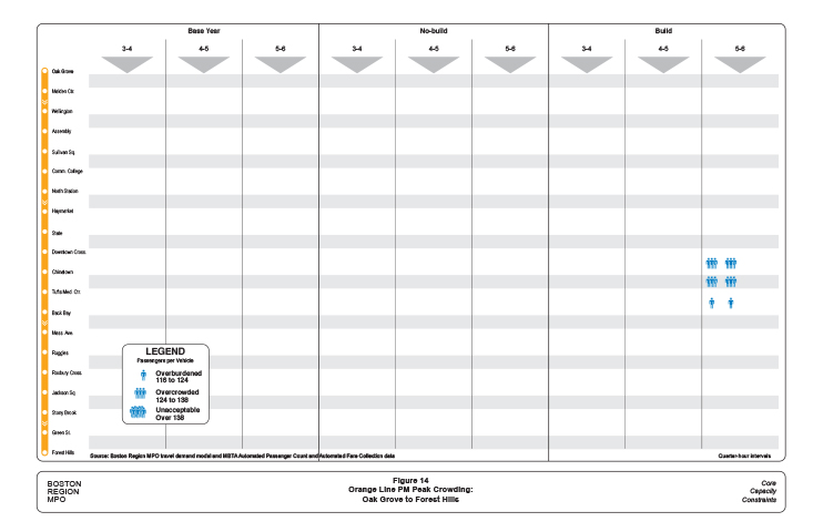
Figure 15
Green Line AM Peak Crowding: Lechmere to Kenmore/Symphony
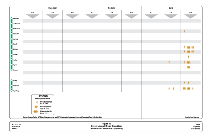
Figure 16
Green Line PM Peak Crowding: Symphony/Kenmore to Lechmere
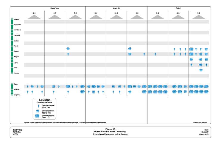
Figure 17
Green Line AM Peak Crowding: Symphony/Kenmore to Lechmere
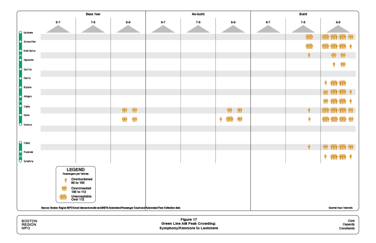
Figure 18
Green Line PM Peak Crowding: Lechmere to Kenmore/Symphony
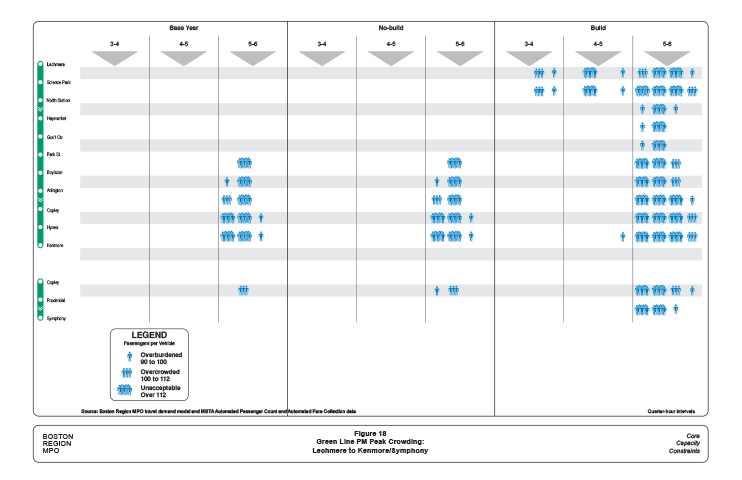
Figure 19
Blue Line AM Peak Crowding: Wonderland to Bowdoin
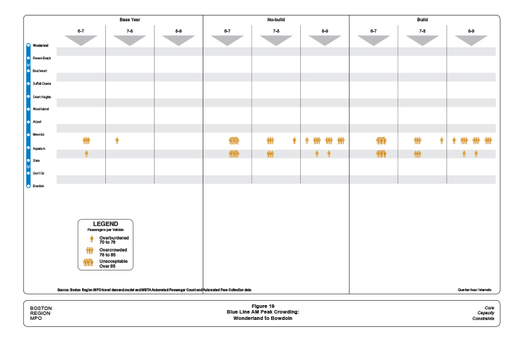
Figure 20
Blue Line PM Peak Crowding: Bowdoin to Wonderland
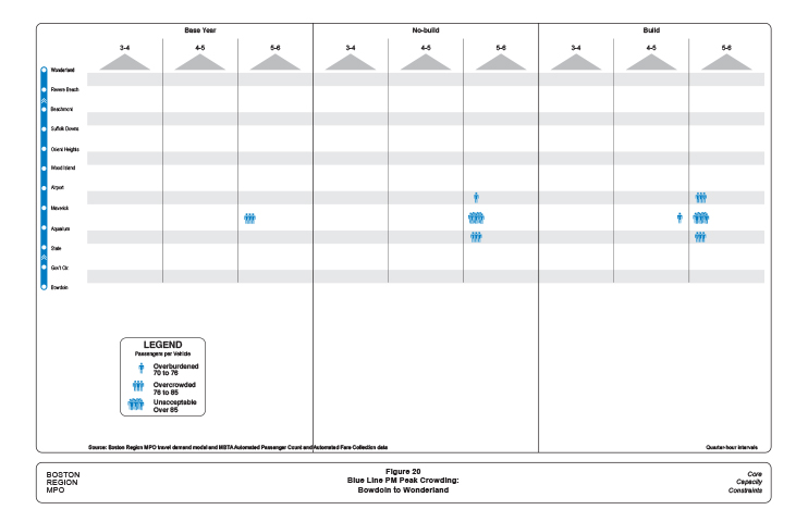
Figure 21
Blue Line AM Peak Crowding: Bowdoin to Wonderland
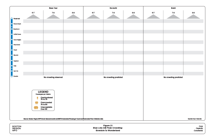
Figure 22
Blue Line PM Peak Crowding: Wonderland to Bowdoin
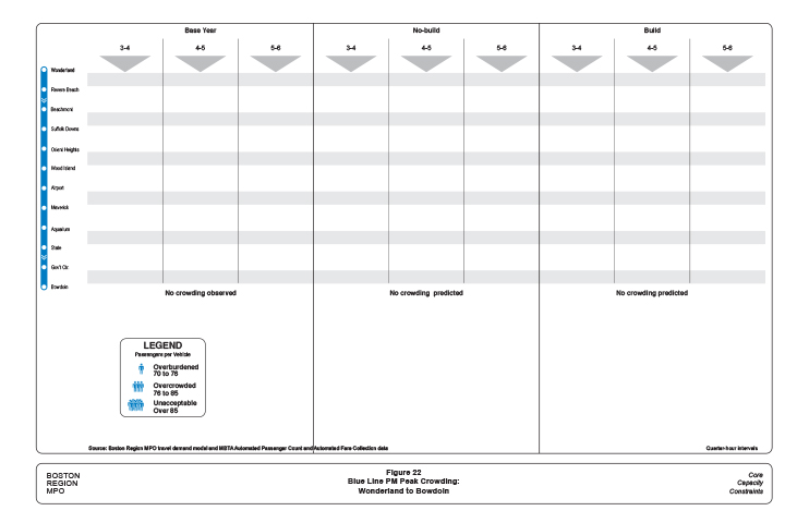
The three scenarios, Base Year, No-Build and Build appear at the top. The three AM peak-period hours are shown below each scenario name, and beneath the hours, there are arrows indicating the direction of travel. Alewife station appears at the top of all Red Line figures, but the direction of travel, indicated by the arrows, is away from Alewife in Figures 7 and 10 and towards Alewife in Figures 8 and 9.
Within each one-hour column are four positions where a crowding icon might be placed. The crowding icons are shown in the legend and indicate levels of crowding specific to Red Line vehicles as defined in Table 15. For instance, in the Base Year for travel between Central and Kendall/MIT crowding is apparent, with more than 114 passengers per vehicle between 8:30 and 8:45 AM, and between 8:45 and 9:00 AM. Two icons indicating “Overburdened” are placed in these two positions.
More crowding icons appear between 8:00 and 9:00 AM in the No-Build scenario, reflecting substantial regional growth and a large increase in Red Line ridership, as shown in Table 13. In this scenario, crowding between Central and Kendall/MIT begins at 8:15 AM, and between 8:30 and 8:45 AM there are more than 160 passengers per vehicle, indicated by the “Unacceptable” crowding icon. Detailed information about 2040 No-Build scenario passenger loads by station-pair and 15-minute interval are found in Appendix G.
The Build scenario includes trips generated by the 72 large-impact projects in the 20 sample TAZs. Both the duration and severity of AM congestion in this direction are greater than in the No-Build scenario; and the “Overcrowded” icon appears, indicating that the average vehicle is carrying more passengers than the “acceptably full” level shown in Table 15. Detailed information about 2040 Build scenario passenger loads by station-pair and 15-minute interval are found in Appendix H.
Figure 8 functions as a companion graphic to Figure 7. It shows PM peak-period congestion in the opposite direction as Figure 7, suggesting congestion on the homebound leg of a daily commute. The times at the top of the figure show the three hours between 3:00 and 6:00 PM, and the arrows indicate that the travel is towards Alewife. In addition, the color of the crowding icons changes from ochre (for AM) to azure (PM). Analysis and implications of Red Line crowding are discussed in a later section that considers the individual rapid transit lines.
Figure 9 shows AM peak crowding but in the direction from Braintree and Ashmont towards Alewife as indicated by the direction of the arrows at the top of the figure. Figure 10 shows PM peak crowding in the return direction with the arrows pointing away from Alewife. The figures for the other three rapid transit lines are organized in the same manner as for the Red Line.
There are instances in Figures 7 through 22 where crowding seems to jump way up or totally disappear for no obvious reason. At some stations, especially those where major transit services intersect, a big change in crowding is to be expected. At other locations, the change in crowding seems out of proportion to the importance of the station. Similarly, big changes in crowding are seen between adjacent 15-minute intervals.
To the extent practicable, the MBTA attempts to dispatch rapid transit trains according to predetermined schedules. As a weekday peak period progresses, some deviation from the schedule becomes inevitable. By averaging the number of trains between station-pairs over a month, this analysis comes closer to approximating service with the intended train frequencies. Even then, crowding levels at some station-pairs and time periods do not seem to have a clear explanation.
This randomness in a sense represents a finding of this study. Some of the apparently random crowding patterns identified for the Base Year may have causes such as arrival schedules of connecting services or the influence of the distance between stations, but these causes may not be clear at this level of analysis. In general, we do not discuss these crowding idiosyncrasies here unless there is a probable and relevant explanation.
The analysis in this study extends the crowding patterns observed in the Base Year to the two 2040 transit ridership scenarios. Accommodating substantially increased ridership with essentially the same capacity inevitably will increase crowding, but the crowding idiosyncrasies in 2040 could very well be at different station-pairs and times.
Another random effect is the day-to-day variation in crowding. The crowding shown in Figures 7 through 22 is based on average station-pair frequencies calculated using all 21 observed weekdays. Staff noticed significant day-to-day variation in crowding for individual station-pairs within the 21-day ample period.
Transit users board and alight at numerous combinations of Red Line stations throughout the day and in both directions. However, because of strong radial commuting patterns, the Red Line experiences crowding on trains as they approach downtown stations during the AM peak period, and as they leave these stations during the PM peak period.
The importance of the downtown stations invites consideration of the Red Line as two interconnected but distinct systems. The northern section brings commuters from the northwest including Cambridge, Somerville, and Arlington to Boston in the morning and returns them home in the evening. The southern section brings commuters from the southeast including South Boston, Dorchester, Milton, Mattapan, Quincy, and Braintree into Boston in the morning and returns them home in the evening. Current and projected crowding that the north-side commuters might experience is shown in Figures 7 and 8, and crowding that south-side commuters might experience is shown in Figures 9 and 10.
Figure 7 shows that, in the Base Year during the last hour of the AM peak period, the Red Line is overburdened between Harvard and Charles/MGH for one 15-minute period. This mild crowding condition continues for a second 15-minute interval in the segment between Central and Kendall/MIT. The Red Line has the largest vehicles in the MBTA’s fleet, and has been operating six-car trains since the 1980s (see Table 16). Consequently, the Red Line is well positioned to accommodate future growth in this particular commuting market. Crowding during the PM peak period for the reciprocal trip home (Figure 8) shows moderate patterns similar to AM peak-period crowding.
As seen in Figure 4, none of the selected 72 large-impact developments modeled in the Build scenario is on the northern section of the Red Line. Nevertheless, congestion is predicted to increase in the Build scenario. These added riders could be residents living near the northern section and using the Red Line to reach one of the large-impact developments elsewhere on the rapid transit system. Alternatively, new riders might live in a large-impact development and be traveling to existing job locations in Cambridge or Somerville.
Crowding is a greater problem on the southern part of the Red Line, as seen in Figures 9 and 10. The southern section of the Red Line divides into two branches south of the JFK/UMass station. Only about half of the peak-period trains serve the five stations on the Braintree branch and the four stations on the Ashmont branch. The Red Line’s full capacity is only available north of the junction of the two branches at JFK/UMass station.
The crowding that results from operating on two branches is shown in Figure 9. In addition to having one more station than the Ashmont branch, all five Braintree branch stations were built with large parking facilities, and the line has substantially more ridership than the Ashmont branch. Even in the Base Year, the Braintree branch trains that leave Wollaston Station are overburdened for about an hour, and there is crowding between North Quincy and JFK/UMass for most of the AM peak period, a half-hour of which is at the “unacceptable” level.
Based on this analysis, Base-Year crowding virtually disappears north of JFK/UMass, as service is augmented by the much-less crowded Ashmont trains. Admittedly, passengers on crowded Braintree trains will not get out at JFK/UMass simply to transfer to an uncrowded Ashmont train. However, ample total capacity is available to carry any commuters wishing to board an inbound train at JFK/UMass.
North of JFK/UMass, are the heavily used Andrew and Broadway stations in South Boston. Even with the entire Red Line capacity available here, inbound Red Line trains become overburdened for more than an hour after they add passengers at Andrew.
The widespread regional growth projected for the No-Build scenario will add substantial ridership to the Red Line, generally exacerbating the Base-Year crowding patterns. Several of the 72 large-impact projects are near the Red Line and the Build scenario shows further increase in crowding with more than an hour of unacceptable crowding between North Quincy and JFK/UMass. Even the segment of the Ashmont branch north of Savin Hill becomes overburdened on the inbound approach to the junction with the Braintree branch.
The evening peak period for this commuting market is shown in Figure 10.There is pronounced commuter outflow starting at 5:00 PM and Base-Year trains are overcrowded from South Station all the way to Quincy. Even trains on the Ashmont branch are overburdened during this time period.
The regional growth of the No-Build scenario results in an unacceptable level of crowding between South Station and JFK/UMass, and some overcrowded conditions on the Ashmont branch. The added ridership in the Build scenario extends the unacceptable crowding level south of JFK/UMass into Quincy.
The Red Line has operated exclusively with six-car trains since the 1980s, and scheduled frequencies reflect a maximum that is appropriate for safe operations. By the early 2020s, an older generation of vehicles is expected to be replaced with new vehicles, which will have fewer seats and allow for more standees; this would increase slightly the average vehicle capacity numbers shown in Table 15.
Like the Red Line, the Orange Line also serves distinct north- and south-side commuting markets. It is also serves transferring Red and Blue Line riders as they commute to Back Bay locations. Figures 11 and 12 show crowding experienced by north-side commuters, and Figures 13 and 14 show south-side crowding.
The northern section of the Orange Line brings commuters from the north including Charlestown, Everett, Somerville, Medford, Malden, and Melrose. Many of these commuters connect with buses, notably at Wellington, Sullivan Square, and Haymarket.
As seen in Figure 11, in the Base Year the Orange Line is overcrowded during the last half hour of the AM peak period between Sullivan Square and Downtown Crossing, and reaches an unacceptable level of crowding between Haymarket and State. Base-Year crowding is much less severe during the PM peak period, as seen in Figure 12.
The widespread regional growth projected for the No-Build scenario will add substantial ridership to the Orange Line, significantly increasing the Base-Year crowding patterns. Crowding will be unacceptable between North Station and Haymarket for an entire hour, and between 8:30 and 8:45 AM between Assembly and Chinatown.
Many of the 72 large-impact projects summarized in Table 5 and shown in Figure 4 will be served directly by the Orange Line. These include Assembly Row, Assembly Square, North Point, West End, Old Boston Garden, Downtown Crossing, and Northeastern University. The combined impacts of these projected developments would impact the Orange Line severely if it is still operating with today’s capacity, as depicted Figure 11. Indeed, if peak-period Orange Line capacity is not expanded meaningfully, then more than half of the congested situations in the AM peak period will be congested at the unacceptable level. The reciprocal congestion during the PM peak period mirrors the AM peak congestion but at a slightly lower level of severity, as seen in Figure 12.
The MBTA is planning to procure new Orange Line vehicles jointly with the new Red Line vehicles, which will expand its vehicle fleet by about 25 percent, and vehicle capacity by 10 percent. With better equipment utilization resulting from a much lower average vehicle age, the Orange Line might be able to move 40 percent more passengers during peak periods. This increased capacity will reduce the duration and severity of crowding greatly, but even this amount of added capacity would not eliminate unacceptable levels of crowding completely.
The Orange Line vehicle fleet could be expanded further and operated safely beyond what is planned currently. However, with a more ambitious expansion program, equipment storage and maintenance capacity also would need to be addressed.
The southern section of the Orange Line brings commuters from the southwest neighborhoods of Boston including the South End, Fort Hill, Mission Hill, and Jamaica Plain. Commuters from Roslindale and Hyde Park can take buses that connect at Forest Hills.
No congestion was observed in this commuting market in the Base Year, and none is projected for the 2040 No-Build scenario. The current amount of Orange Line capacity is sufficient for the traditional neighborhood-to-downtown radial commute in this corridor, and will continue to be adequate with widespread regional growth in the No-Build scenario.
The large-impact projects envisioned in the Build scenario will elevate ridership in this commuting market and unacceptable crowding conditions would develop, especially between Back Bay and Downtown Crossing. This illustrates the regional nature of congestion. Although the large-impact developments would be built mostly at other locations on the Orange Line, scarce peak-period capacity would be exhausted first between Back Bay and Downtown Crossing stations. A lesser amount of congestion also appears in the PM peak period in the Build scenario, as seen in Figure 14.
The ridership by time period value used to estimate crowding for this study was developed from faregate data. On the above-ground sections of the four Green Line branches, vehicle access is usually controlled by the driver, sometimes assisted during the AM peak period by station-platform staff. Riders entering vehicles at stations without faregates neither could be tracked nor their numbers estimated, and the crowding depicted in Figures 15 through 18 reflects only the stations with faregates.
Of the four branches of the Green Line, the B, C, and D branches join at Kenmore, the western-most station with faregates. The E branch has two underground stations with faregates, at Symphony and Prudential, north of which it joins with the other three branches at Copley. Access to all of the Green Line stations east of Copley is controlled by faregates.
The Green Line’s faregated section analyzed here connects directly with the other three rail rapid transit lines, and commuter rail at North Station. This faregated section also closely tracks the “high spine” of concentrated Boston development, passing through Government Center and major Back Bay developments before emerging from the tunnels to serve Brighton, Brookline, Newton, and the Huntington Avenue corridor with above-ground stations. These connections and alignment suggest how this part of the Green Line is utilized to move riders in the core area.
The passenger flows suggested by congestion seen in Figures 15 through 18 do not reflect traditional radial commutes, as in the Red and Orange Line analyses. Instead, this part of the Green Line largely is distributing passengers from more distant locations to specific stops in this densely developed corridor. The passengers may have originated on one of the Green Line’s four branches, or they may have transferred at Park Street, Government Center, Haymarket, or North Station.
A significant amount of Green Line crowding goes undetected in these analyses because of limitations in the type of service data that was available. The time of passengers’ departure at the outer end of the four branches was recorded, but not the time that they entered the underground system at Kenmore or Symphony stations. The time that the train reversed direction also was not recorded, nor was the time when the train returned to its starting point.
Given the sketchy available service data, the average number of trains per 15‑minute interval must be calculated using the times that the trains begin their trips. Train frequency estimates developed from these data will not reflect schedule-adherence difficulties encountered on the lengthy above-ground sections of these lines, or typical train bunching in the subway. These relatively smoothed-out estimates of train headways were used to calculate the crowding conditions in Figures 15 through 18, but it is important to consider that some 15‑minutes intervals or station-pairs will see many more or fewer trains than others, with corresponding crowding levels.
The available service data also do not accurately reflect the available capacity between Park Street and Lechmere. The Green Line schedules assume that most trains reverse direction at an intermediate station such as North Station or Government Center, rather than at Lechmere, the end of the line. This creates a “pinchpoint,” with significantly less service provided beyond the scheduled turnaround point. This condition is exacerbated by the common operational practice during peak periods to have some inbound trains reverse direction before reaching the scheduled endpoint. These so-called “short turns” are not recorded but have a major impact on available capacity and crowding at that particular location and time interval. Since the number of short turns is not known, the capacity calculations in Figures 15 through 18 assume that the trains provided service to their scheduled endpoints.
Despite the optimistic capacity and headway assumptions necessitated by the limitations of service data, the crowding analysis presented here still identifies crowding pinchpoints, and locates future capacity challenges. Figures 15 and 16 depict crowding conditions for peak-period commutes on the Green Line coming from the direction of Lechmere in the morning and returning towards Lechmere in the evening.
Figure 15 shows no Base-Year crowding in this leg of these commutes. Most commuters taking the Green Line in this direction would have transferred from another MBTA service such as a bus at Lechmere, commuter train at North Station, the Blue Line at Government Center, or the Red Line at Park Street. Only the E branch trains serve Lechmere in the Base Year, and they provide sufficient capacity, without showing any crowding, to accommodate riders who connect from buses.
Commuters arriving at North Station have a choice of boarding the Orange Line or the Green Line, which is served here by both E and C branch trains. The Orange and Green Line services work as a crowding “safety valve” for the other lines for a number of important destinations between North Station and Northeastern University. If a commuter train arrives and transferring passengers fill a Green Line train, other Green and Orange Line trains will arrive during the 15-minute interval, keeping the average vehicle load down for the entire interval.
All four Green Line branches served Government Center in the Base Year. In combination, these four services represent the total carrying capacity of the Green Line, as calculated in Table 16, the second highest of the four MBTA rail rapid transit lines. This capacity was able to accommodate commuters transferring from the Blue Line at Government Center and the Red Line at Park without showing any crowding. The fact that Blue and Red Line commuters can transfer at State and Downtown Crossing largely explains the absence of any crowding in this direction during the AM peak period.
The extension of the Green Line into Somerville is assumed in both the No-Build and Build scenarios, and many riders transferring from buses at Lechmere will board at the new stations in Somerville instead. The improved service that the extended Green Line will provide is anticipated to increase the total amount of transit ridership in this corridor beyond what would have been expected from demographic and economic growth alone.
To meet this growth, current plans include extending D branch service beyond its present turnaround point at Government Center all the way to College Avenue in Somerville. This change will effectively double the amount of service between Lechmere and North Station and increase service between North Station and Government Center by 50 percent. Inbound service from Lechmere during the AM peak will not experience any crowding, even in the Build scenario. Only at North Station will the combined effects of all the large-impact projects served by the Green Line generate crowding.
The combined effects of the Build scenario developments produce significant crowding west of Park Street, where no added service is planned. In addition to the increased transit mode share from Somerville, large-impact projects throughout the region will be feeding new ridership onto the Green Line at this point, much by way Red Line transfers. Crowding extends throughout this part of the Green Line, including the Huntington Avenue corridor, which is served only by the E branch.
The reciprocal PM peak-period crowding shown in Figure 16 mirrors the AM crowding, but with somewhat more intensely. Even in the Base Year, the E branch is hard pressed during the PM peak period to move commuters out of the Huntington Avenue corridor, including the Prudential Center. A proposed new entrance to the Hynes Convention Center station may offer some of these commuters an attractive alternative to Prudential station.
Figure 16 shows PM peak-period crowding only as far Park Street station. It is mild in the Base Year and No-Build scenarios, and then becomes severe only in the Build scenario. This is optimistic in two respects. First, bunching and associated crowding is a greater problem on the approach to Park Street than is suggested here because the available service data implied reasonably regular headways. Second, short turns during the PM peak significantly reduce capacity north of Park Street station, resulting in both crowding and riders’ fear of missing connecting commuter rail trains at North Station. Figure 16 does imply clearly that if all service were operated to its intended endpoint, then PM peak capacity in this direction would be fully adequate.
The Base-Year AM peak-period crowding shown in Figure 17 reflects a portion of a more traditional suburb-to-downtown commute. Inbound passengers fill trains operating above ground through residential neighborhoods along the B, C, and D branches. At Kenmore, the three branches join, and the result shown here is 30 minutes of overcrowded conditions between Kenmore and Copley stations.
Unfortunately, because of limited capacity, high-ridership levels and potential bunching on the individual surface lines, vehicles on some lines may be severely crowded by the time they reach Kenmore. The random arrival sequence of trains from the three branches at Kenmore limits the ability of the combined services to minimize crowding during the AM peak period. Figure 17 suggests that crowding ends east of Copley. This reflects the overly optimistic calculation of capacity based on the total number of trains that were dispatched from their western origins during the 15-minute intervals. In fact, some trains remain crowded east of Copley while others remain below the crowding thresholds.
The neighborhoods served by the B, C, and D branches are mature, and the regional growth projected in the No-Build scenario adds little additional congestion. In contrast, the large-impact developments envisioned in the Build scenario are projected to reinforce this commuting pattern strongly. New housing near Kenmore, Symphony, and Prudential stations will add inbound commuters during the AM peak period. At the same time, developments near North Station and the new Green Line stations at Lechmere and in Somerville will significantly increase commuting to jobs at this end of the Green Line.
As in the No-Build scenario, crowding will be most severe as trains approach Copley, after which crowding will gradually diminish as workers alight to reach their work locations. Park is both a destination station and an important transfer point, and with all four branches continuing at least to Government Center, no crowding is projected for this section of the Green Line.
Only three of the branches are planned to operate north of Government Center, and only two branches would go past North Station to Lechmere. This lower service level combined with commuters transferring from the Blue Line at Government Center or the Orange Line at North Station would cause the unacceptable levels of crowding shown north of North Station in the Build scenario.
The reciprocal PM peak-period crowding shown in Figure 18 mirrors the AM crowding but with significantly greater severity. The demands on the Green Line for this commuting leg are so great that even the optimistic crowding calculations necessitated by service data limitations do not smooth out the unacceptable crowding levels experienced in the Base Year west of Park Street after 5:00 PM. In the Build scenario, unacceptable levels of crowding are predicted after 5:00 PM throughout the entire faregated system. The duration of severe congestion will lengthen, especially on the two branches serving Lechmere.
As with the Orange Line, the carrying capacity of the Green Line could be expanded by increasing the size of the vehicle fleet. However, unlike the Orange Line, the frequency of peak-period Green Line trains cannot be appreciably increased because of the current signaling and safety systems. Meaningfully changing the frequencies would require replacing much of the existing signal system at considerable expense in addition to the cost of any additional vehicles.
Instead of increasing frequencies, there is the potential of operating three-car trains over parts of the Green Line system. Each of the four branches has different design and operating characteristics, which strongly influence the suitability of operating three-car trains on the branch. Factors such as the design of rights-of-way used in surface running and the location of vehicle storage for the branches can determine whether three-car trains are appropriate or even feasible. Given these constraints and considerations, there may be potential pairs of service endpoints, possibly at intermediate points in the system, which could readily accommodate three-car trains and alleviate anticipated crowding.
Like the Orange Line, the Blue Line is a single line without branches. However, unlike the Orange Line, it does not extend through downtown, so it only serves a strong flow of radial commuters entering downtown from one direction. There are eight stations serving residential neighborhoods in East Boston and Revere across Boston Harbor from downtown Boston. Almost all commuters start at these neighborhood stations and commute to jobs near the State, Government Center, or Bowdoin stations, or connect with the Orange or Green Lines.
Any crowding on the commute between the cross-harbor neighborhoods and downtown is depicted in Figures 19 and 20. There is very little reverse commuting from downtown to work locations in these neighborhoods and no crowding icons appear in Figures 21 and 22. Airport station serves both the East Boston neighborhood and a large number of passengers using Logan Airport. Travel to and from the airport happens throughout the day, however, and causes no crowding in the reverse-commute direction.
What little inbound crowding that occurs on the Blue Line is mostly on the section between Maverick station in East Boston, under the Boston Harbor, to Aquarium station (Figure 19). Maverick anchors several heavily used bus lines, which results in a large number of transfers to the Blue Line. While Aquarium is not a major destination, enough riders alight there to reduce the crowding level.
It is noteworthy that most of the crowding occurs during the first hour of the peak period, unlike the other lines in which the last AM peak hour is most severely crowded. One theory for this is that a large portion of Blue Line commuters work in trades and services characterized by relatively early workdays.
The region-wide demographic trends are projected to result in crowding throughout the AM peak period. Crowding during the first AM peak hour seen in the Base Year will reach unacceptable levels in 2040.Some level of crowding between Maverick and the Financial District will be experienced for the second and third peak-period hours as well. None of the large-impact projects are served directly by the Blue Line, and Build-scenario crowding will be in the same general range as in the No-Build scenario.
The moderate crowding experienced during the outbound PM peak-period commute (Figure 20) occurs at 5:00 PM, about the time when crowding is most severe on the other rail rapid transit lines. Some increased crowding is expected for the No-Build scenario, with a further increase in the Build scenario. Altogether, Blue Line crowding appears mild when compared with the other lines. This is largely a result of introducing six-car trains in 2007.
Unlike rapid transit vehicles, buses are designed so that even at periods of peak ridership, most riders will be able to use an available seat. Having some standees is considered normal and acceptable, especially on urban bus routes with relatively short travel distances. The MBTA considers that a maximum acceptable load is 1.4 times the number of seats. If this level of ridership is exceeded on a regular basis, additional peak-period bus trips should be scheduled. This is consistent with an industry-recommended maximum of 1.5 bus riders per seat. 4
There are practical reasons for limiting the numbers of standees on buses. Buses accelerate, brake, and turn more quickly than rail rapid transit vehicles, impacting the safety and comfort of standees. In addition, most buses only have two doors, with almost all entrances at the door next to the driver and most exits at the rear door. Excessive crowding limits circulation within a bus and can cause delay and exacerbate the bunching problem.
Implementation of automated passenger counting (APC) equipment on an increasing number of MBTA buses has improved the availability of reliable bus ridership data by trip and trip segment. The APC equipment counts both boardings and alightings, making it possible to calculate the number of riders at any point on a bus trip.
Because of the large number of bus routes and bus stops, staff aggregated and organized the APC ridership data differently than for the analysis of crowding on rail rapid lines. The bus services chosen for analysis have been divided into radial and non-radial routes. Base-Year ridership for the radial routes is presented in Tables 17 and 18, for the AM and PM peak periods, respectively, and in Tables 19 and 20 for the non-radial routes. The MBTA bus vehicle services in this sample include the 15 “key routes,” the three crosstown (CT) routes, the four Silver Line (SL) routes, and seven additional heavily used bus routes.
The way that staff derived this data may be seen with a numerical example from the initial entry in Table 17: MBTA bus route 9 operating during the AM peak period from City Point in South Boston to Copley Square in the Back Bay. For one hour during the AM peak period, Route 9 will experience its highest ridership. The peak-period AM hour intervals of the different bus routes can differ from each other and do not necessarily coincide with an exact clock hour.
The first data entry for Route 9 is the number of buses that left City Point during the AM peak hour, in this case 13. The standard number of seats in an MBTA bus is 39; multiplying 13 by 39 equals 507 seats, the total seat capacity available for this route and direction during the AM peak hour. Some routes operate with buses with seating capacities larger or smaller than the standard 39 seats, and these routes are noted with an “L” or an “S,” respectively, next to the number of buses.
Following the total seats is a column labeled “Total Riders.” Over the course of a one-way trip, each of the 13 buses will pick up and drop off riders at the many stops along its route. At some point along the route, each bus will reach its highest load, after which point more passengers will be leaving than entering and the number or passengers on the bus will decline. Each of the 13 buses during this hour will reach its own peak load at some point on the route. The sum of the 13 peak loads appears in Table 17 as Total Riders.
Table 17
Base-Year Bus Vehicle Crowding on Non-Radial Routes,
Peak AM Hour of Each Route
| Route | Inbound Start | Inbound End | Buses | Total Seats | Total Riders | Riders /Seat | Outbound Start | Outbound End | Buses | Total Seats | Total Riders | Riders /Seat |
| 9 | City Point | Copley | 13 | 507 | 667 | 1.32 | Copley | City Point | 7 | 273 | 185 | .68 |
| 15 | Kane Sq. | Ruggles | 15 | 585 | 459 | .78 | Ruggles | Kane Sq. | 10 | 390 | 113 | .29 |
| 16 | Forest Hills | Andrew | 6 | 234 | 215 | .92 | Andrew | Forest Hills | 7 | 273 | 252 | .92 |
| 21 | Ashmont | Forest Hills | 7 | 273 | 294 | 1.08 | Forest Hills | Ashmont | 7 | 273 | 240 | .88 |
| 22 | Ashmont | Ruggles | 8 | 312 | 323 | 1.03 | Ruggles | Ashmont | 8 | 312 | 228 | .73 |
| 23 | Ashmont | Ruggles | 12 | 468 | 542 | 1.16 | Ruggles | Ashmont | 13 | 507 | 347 | .68 |
| 28 | Mattapan | Ruggles | 9 L | 513 | 477 | .93 | Ruggles | Mattapan | 6 L | 342 | 155 | .45 |
| 31 | Mattapan | Forest Hills | 13 | 507 | 455 | .90 | Forest Hills | Mattapan | 12 | 468 | 109 | .23 |
| 32 | Wolcott Sq. | Forest Hills | 20 | 780 | 787 | 1.01 | Forest Hills | Wolcott Sq. | 20 | 780 | 539 | .69 |
| 39 | Forest Hills | Back Bay | 14 L | 798 | 636 | .80 | Back Bay | Forest Hills | 11 L | 627 | 344 | .55 |
| 57 | Watertown | Kenmore | 15 | 585 | 662 | 1.13 | Kenmore | Watertown | 11 | 429 | 318 | .74 |
| 70 | Waltham | Central | 7 | 273 | 277 | 1.01 | Central | Waltham | 5 | 195 | 206 | 1.06 |
| 71 | Watertown | Harvard | 9 S | 279 | 416 | 1.49 | Harvard | Watertown | 9 S | 279 | 271 | .97 |
| 73 | Waverley | Harvard | 12 S | 372 | 655 | 1.76 | Harvard | Waverley | 10 S | 310 | 205 | .66 |
| 77 | Arlington Hgts | Harvard | 10 | 390 | 368 | .94 | Harvard | Arlington Hgts | 7 | 273 | 180 | .66 |
| 111 | Woodlawn | Haymarket | 17 | 663 | 712 | 1.07 | Haymarket | Woodlawn | 9 | 351 | 221 | .63 |
| 116 | Wonderland | Maverick | 8 | 312 | 315 | 1.01 | Maverick | Wonderland | 9 | 351 | 139 | .40 |
| 117 | Wonderland | Maverick | 8 | 312 | 306 | .98 | Maverick | Wonderland | 3 | 117 | 91 | .78 |
| SL1 | Logan | South Station | 7 | 266 | 183 | .69 | South Station | Logan | 7 | 266 | 332 | 1.25 |
| SL2 | Design Ctr. | South Station | 13 L | 611 | 92 | .15 | South Station | Design Ctr. | 13 L | 611 | 610 | 1.00 |
| SL4 | Dudley | South Station | 7 L | 399 | 379 | .95 | South Station | Dudley | 7 L | 399 | 193 | .48 |
| SL5 | Dudley | Downtown Xing | 11 L | 627 | 578 | .92 | Downtown Xing | Dudley | 10 L | 570 | 290 | .51 |
| Total of Major Routes | 241 | 10,066 | 9,797 | .97 | Total of Major Routes | 201 | 8,396 | 5,566 | .66 |
L = Large bus (more than 39 seats). S = Small bus (fewer than 39 seats)
Source: Central Transportation Planning Staff.
Table 18
Base Year Bus Vehicle Crowding on Radial Routes
Peak PM Hour of Each Route
| Route | Inbound Start | Inbound End | Buses | Total Seats | Total Riders | Riders /Seat | Outbound Start | Outbound End | Buses | Total Seats | Total Riders | Riders /Seat |
| 9 | City Point | Copley | 6 | 234 | 145 | .62 | Copley | City Point | 9 | 351 | 444 | 1.26 |
| 15 | Kane Sq. | Ruggles | 7 | 273 | 159 | .58 | Ruggles | Kane Sq. | 7 | 273 | 241 | .88 |
| 16 | Forest Hills | Andrew | 4 | 156 | 155 | .99 | Andrew | Forest Hills | 5 | 195 | 206 | 1.06 |
| 21 | Ashmont | Forest Hills | 6 | 234 | 178 | .76 | Forest Hills | Ashmont | 5 | 195 | 210 | 1.08 |
| 22 | Ashmont | Ruggles | 5 | 195 | 199 | 1.02 | Ruggles | Ashmont | 6 | 234 | 246 | 1.05 |
| 23 | Ashmont | Ruggles | 9 | 351 | 269 | .77 | Ruggles | Ashmont | 11 | 429 | 411 | .96 |
| 28 | Mattapan | Ruggles | 7 L | 399 | 229 | .57 | Ruggles | Mattapan | 7 L | 399 | 416 | 1.04 |
| 31 | Mattapan | Forest Hills | 13 | 507 | 212 | .42 | Forest Hills | Mattapan | 13 | 507 | 381 | .75 |
| 32 | Wolcott Sq. | Forest Hills | 16 | 624 | 393 | .63 | Forest Hills | Wolcott Sq. | 16 | 624 | 567 | .91 |
| 39 | Forest Hills | Back Bay | 10 L | 570 | 431 | .76 | Back Bay | Forest Hills | 10 L | 570 | 554 | .97 |
| 57 | Watertown | Kenmore | 7 | 273 | 299 | 1.10 | Kenmore | Watertown | 9 | 351 | 422 | 1.20 |
| 70 | Waltham | Central | 7 | 273 | 285 | 1.04 | Central | Waltham | 7 | 273 | 342 | 1.25 |
| 71 | Watertown | Harvard | 7 S | 217 | 143 | .66 | Harvard | Watertown | 7 S | 217 | 315 | 1.45 |
| 73 | Waverley | Harvard | 12 S | 372 | 227 | .61 | Harvard | Waverley | 12 S | 372 | 536 | 1.44 |
| 77 | Arlington Hgts | Harvard | 8 | 312 | 177 | .57 | Harvard | Arlington Hgts | 8 | 312 | 307 | .99 |
| 111 | Woodlawn | Haymarket | 13 | 507 | 376 | .74 | Haymarket | Woodlawn | 15 | 585 | 615 | 1.05 |
| 116 | Wonderland | Maverick | 4 | 156 | 133 | .85 | Maverick | Wonderland | 6 | 234 | 225 | .96 |
| 117 | Wonderland | Maverick | 3 | 117 | 96 | .82 | Maverick | Wonderland | 4 | 156 | 192 | 1.23 |
| SL1 | Logan | South Station | 7 | 266 | 348 | 1.31 | South Station | Logan | 7 | 266 | 259 | .97 |
| SL2 | Design Ctr. | South Station | 13 L | 611 | 553 | .91 | South Station | Design Ctr. | 7 L | 329 | 102 | .31 |
| SL4 | Dudley | South Station | 7 L | 399 | 205 | .51 | South Station | Dudley | 7 L | 399 | 235 | .59 |
| SL5 | Dudley | Downtown Xing | 11 L | 627 | 369 | .59 | Downtown Xing | Dudley | 11 L | 627 | 503 | .80 |
| Total of Major Routes | 182 | 7,673 | 5,580 | .73 | Total of Major Routes | 189 | 7,898 | 7,728 | .98 |
Source: Central Transportation Planning Staff
Table 19
Base Year Bus Vehicle Crowding on Radial Routes Peak AM Hour of Each Route
| Route | Start | End | Buses | Total Seats | Total Riders | Riders /Seat | Start | End | Buses | Total Seats | Total Riders | Riders /Seat |
| 1 | Harvard | Dudley | 8 | 312 | 346 | 1.11 | Dudley | Harvard | 8 | 312 | 328 | 1.05 |
| 47 | Central | Broadway | 9 | 351 | 469 | 1.34 | Broadway | Central | 4 | 156 | 108 | .69 |
| 66 | Harvard | Dudley | 7 | 273 | 364 | 1.33 | Dudley | Harvard | 8 | 312 | 365 | 1.17 |
| 86 | Sullivan | Reservoir | 6 | 234 | 208 | .89 | Reservoir | Sullivan | 6 | 234 | 299 | 1.28 |
| CT1 | Central | BU Medical | 4 | 156 | 172 | 1.10 | BU Medical | Central | 4 | 156 | 107 | .69 |
| CT2 | Sullivan | Ruggles | 4 | 156 | 197 | 1.26 | Ruggles | Sullivan | 4 | 156 | 119 | .76 |
| CT3 | Beth Israel | Andrew | 7 | 273 | 29 | .11 | Andrew | Beth Israel | 7 | 273 | 183 | .67 |
| Total of Major Routes | 45 | 1,755 | 1,784 | 1.02 | Total of Major Routes | 41 | 1,599 | 1,509 | .94 |
Source: Central Transportation Planning Staff
Table 20
Base Year Bus Vehicle Crowding on Non-Radial Routes Peak PM Hour of Each Route
| Route | Start | End | Buses | Total Seats | Total Riders | Riders /Seat | Start | End | Buses | Total Seats | Total Riders | Riders /Seat |
| 1 | Harvard | Dudley | 9 | 351 | 396 | 1.13 | Dudley | Harvard | 9 | 351 | 375 | 1.07 |
| 47 | Central | Broadway | 4 | 156 | 157 | 1.00 | Broadway | Central | 5 | 195 | 252 | 1.29 |
| 66 | Harvard | Dudley | 7 | 273 | 309 | 1.13 | Dudley | Harvard | 7 | 273 | 305 | 1.12 |
| 86 | Sullivan | Reservoir | 4 | 156 | 186 | 1.19 | Reservoir | Sullivan | 4 | 156 | 162 | 1.04 |
| CT1 | Central | BU Medical | 3 | 117 | 76 | .65 | BU Medical | Central | 3 | 117 | 89 | .76 |
| CT2 | Sullivan | Ruggles | 3 | 117 | 112 | .96 | Ruggles | Sullivan | 3 | 117 | 157 | 1.34 |
| CT3 | Beth Israel | Andrew | 6 | 234 | 134 | .57 | Andrew | Beth Israel | 7 | 273 | 59 | .22 |
| Total of Major Routes | 36 | 1,404 | 1,370 | .98 | Total of Major Routes | 38 | 1,482 | 1,398 | .94 |
Source: Central Transportation Planning Staff
Technically, the Total Riders number represents the total number of riders on the 13 buses who were riding when the peak load was reached. Other riders may have both boarded and alighted before or after the peak load was reached, but these riders do not enter into this calculation. In addition, the 13 buses do not necessarily reach the maximum load at the same point on the route. For instance, the route 9 buses tend to have the greatest loads near where they cross the Red Line at Broadway station. Some buses are at their peak when they reach Broadway, and have more alightings than boardings at that stop. Other buses actually pick up more riders at Broadway, and the peak load point for these buses comes after Broadway.
The final element of the crowding analysis is the ratio between Total Riders and Total Seats. In this case, we highlighted the value of 1.32 with salmon-colored shading. Only two levels of crowding are highlighted in these tables. Riders per seat ratios that are greater than 1.25 but less than 1.4 are indicated in salmon, and are referred to here as overburdened. We used dark pink to indicate where crowding exceeds the 1.4 passenger standard, referred to as overcrowded.
The riders per seat ratios used in these tables indicate the general level of peak-period ridership relative to the capacity deployed on these routes. Since loads build and ebb on various parts of these routes, the crowding implied by these statistics will be experienced only on the most heavily patronized stretches of a particular bus route. Conversely, riders do not arrive at bus stops at a uniform rate and buses do not arrive at regular intervals, and some buses will be appreciably more crowded than others will. The “overburdened” crowding standard reflects this: 1.25 riders per seat may not be excessively crowded, but during the peak hour, some individual buses likely would be overcrowded if the route as a whole is overburdened.
The radial bus vehicle services in Tables 17 and 18 are arranged by direction, with the inbound service direction shown on the left halves of the tables and the outbound service direction shown on the right. During the AM peak hour, almost all of the routes have more riders and riders per seat in the inbound than in the outbound direction.
For all but a few routes, the inbound riders and riders per seat are higher in the AM peak than during the PM peak period. Conversely, during the PM peak the outbound routes shown on the right side of Table 18 have, with only two exceptions, more riders than their inbound counterparts on the left side of the table. The major exception to the strong AM inbound and PM outbound pattern is the pair of Silver Line Waterfront routes, SL1 and SL2, that distribute commuters connecting with the Red Line and commuter Rail at South Station to the growing South Boston Waterfront employment centers.
The only other exception to the stronger AM peak-period inbound ridership pattern is route 16 between Forest Hills and Andrew stations. It has the highest peak-hour ridership in the direction from Andrew to Forest Hills during both the AM and PM peak hours. The AM outbound peak crowding is caused by large numbers of trips to schools near the Forest Hills end of the route. The PM peak period is also strong in that direction because of conventional outbound work trips, which occur later than the PM school trips. Also of note is the fact that Route 70 is more crowded during the AM peak hour outbound than inbound. This is because only five buses operate outbound compared with seven buses inbound. Inbound ridership is still stronger on this route.
Seven bus routes included in this analysis are characterized as being non-radial routes, and Base-Year ridership for these routes is presented in Tables 19 and 20 for the AM and PM peak periods, respectively. Total seats, total riders, and riders per seat are calculated in the same manner as for the radial routes. These tables differ in organization from Tables 17 and 18 in that the left side of the tables shows travel in the counter-clockwise direction around downtown Boston, and the right side shows travel in the clockwise direction.
The non-radial services do not show the pronounced change in direction between the AM and PM peak periods. This can be seen by comparing the total of these seven routes’ total peak-hour riders with analogous numbers in other tables. The 1,784 riders traveling in the counter-clockwise direction shown in the last row of Table 19 is 18 percent higher than the 1,509 riders traveling in the clockwise-direction. During the PM peak period, these totals are almost identical: 1,370 and 1,398 riders, respectively. In contrast, the 9,797 total inbound riders in the last row of Table 17 exceed the 5,566 outbound riders by 76 percent. Similarly, the outbound PM total at the bottom of Table 18 exceeds its inbound counterpart by 38 percent.
Several of the bus vehicle services in Tables 17 through 20 show some level of crowding. The overcrowded condition is seen only on routes 71 and 73, which use vehicles with only 31 seats. During the AM peak period, the overburdened condition occurs only on radial route 9, discussed above, and on four of the non-radial routes: 47, 66, 86, and CT2. During the PM peak, the overburdened condition occurs again on route 9 and non-radial routes 47 and CT2, as well as radial routes 70 and SL1.
Schedulers of bus systems are able to revise timetables periodically to match available vehicles with drivers in an effort to limit severity of bus crowding during peak periods. The Base-Year crowding calculations reflect this in that the riders per seat ratios in the stronger peak-period direction tend to cluster between the values of 1.00 and 1.30, while the numbers of peak-period buses on each route vary much more widely.
Staff prepared projections, incorporated into Tables 21 through 24, of bus vehicle ridership for the year 2040. They include calculations of the level of crowding that would occur if the same amount of service as in the Base Year were operated.
Forecasting bus vehicle ridership at the individual route and stop level was beyond the scope of this study. However, recent travel demand forecasts developed in support of MPO and statewide planning efforts suggest a general range of bus ridership growth that might be expected given the assumed long-range demographic and trip-generation trends.
The Total Riders numbers shown in Tables 17 through 20 are projected to increase by either 8, 12, or 16 percent depending on the route. These forecasts assume that all of the projected Build-scenario developments are completed. The Silver Line services have been studied more extensively than the conventional bus routes, and recent modeling suggests that ridership on the Silver Line might increase slightly more than 15 percent (for this study, an increase of 16 percent is assumed).
The 25 conventional bus routes were assigned a ridership increase of either 8 percent or 12 percent based on each route’s proximity to the large-impact projects shown in Figure 4, and other high-growth locations such as the former Allston railroad yards. Ridership on 13 of the conventional bus routes is projected to increase by the higher 12-percent level. These include seven radial routes: 9, 39, 57, 70, 111, 116, and 117. All non-radial routes except Route 1 also are projected to add 12 percent more riders.
Because the allocation of peak-period bus capacity already approximates the needs of the numerous routes, even the moderate projected bus vehicle ridership increases have the potential to cause or exacerbate crowding on some routes. This can be seen for the AM peak radial bus vehicle services by comparing Tables 21 and 17. Routes 71 and 73, already overcrowded in the Base Year, will need to accommodate eight percent more riders in 2040, with standees on Route 73 almost equaling the number of seats. Route 9 goes from overburdened to overcrowded, and Routes 23 and 57 are shown as overburdened in 2040.
Table 21
Year 2040 Bus Vehicle Crowding on Radial Routes Peak AM Hour of Each Route
| Route | Inbound Start | Inbound End | Buses | Total Seats | Total Riders | Riders /Seat | Outbound Start | Outbound End | Buses | Total Seats | Total Riders | Riders /Seat |
| 9 | City Point | Copley | 13 | 507 | 747 | 1.47 | Copley | City Point | 7 | 273 | 207 | .76 |
| 15 | Kane Sq. | Ruggles | 15 | 585 | 495 | .85 | Ruggles | Kane Sq. | 10 | 390 | 122 | .31 |
| 16 | Forest Hills | Andrew | 6 | 234 | 233 | .99 | Andrew | Forest Hills | 7 | 273 | 272 | .99 |
| 21 | Ashmont | Forest Hills | 7 | 273 | 317 | 1.16 | Forest Hills | Ashmont | 7 | 273 | 260 | .95 |
| 22 | Ashmont | Ruggles | 8 | 312 | 349 | 1.12 | Ruggles | Ashmont | 8 | 312 | 246 | .79 |
| 23 | Ashmont | Ruggles | 12 | 468 | 585 | 1.25 | Ruggles | Ashmont | 13 | 507 | 375 | .74 |
| 28 | Mattapan | Ruggles | 9 L | 513 | 515 | 1.00 | Ruggles | Mattapan | 6 L | 342 | 168 | .49 |
| 31 | Mattapan | Forest Hills | 13 | 507 | 491 | .97 | Forest Hills | Mattapan | 12 | 468 | 118 | .25 |
| 32 | Wolcott Sq. | Forest Hills | 20 | 780 | 850 | 1.09 | Forest Hills | Wolcott Sq. | 20 | 780 | 582 | .75 |
| 39 | Forest Hills | Back Bay | 14 L | 798 | 713 | .89 | Back Bay | Forest Hills | 11 L | 627 | 385 | .61 |
| 57 | Watertown | Kenmore | 15 | 585 | 741 | 1.27 | Kenmore | Watertown | 11 | 429 | 356 | .83 |
| 70 | Waltham | Central | 7 | 273 | 310 | 1.13 | Central | Waltham | 5 | 195 | 230 | 1.18 |
| 71 | Watertown | Harvard | 9 S | 279 | 449 | 1.61 | Harvard | Watertown | 9 S | 279 | 293 | 1.05 |
| 73 | Waverley | Harvard | 12 S | 372 | 707 | 1.90 | Harvard | Waverley | 10 S | 310 | 221 | .71 |
| 77 | Arlington Hgts | Harvard | 10 | 390 | 398 | 1.02 | Harvard | Arlington Hgts | 7 | 273 | 194 | .71 |
| 111 | Woodlawn | Haymarket | 17 | 663 | 797 | 1.20 | Haymarket | Woodlawn | 9 | 351 | 247 | .70 |
| 116 | Wonderland | Maverick | 8 | 312 | 353 | 1.13 | Maverick | Wonderland | 9 | 351 | 156 | .44 |
| 117 | Wonderland | Maverick | 8 | 312 | 343 | 1.10 | Maverick | Wonderland | 3 | 117 | 102 | .87 |
| SL1 | Logan | South Station | 7 | 266 | 212 | .80 | South Station | Logan | 7 | 266 | 385 | 1.45 |
| SL2 | Design Ctr. | South Station | 13 L | 611 | 107 | .17 | South Station | Design Ctr. | 13 L | 611 | 708 | 1.16 |
| SL4 | Dudley | South Station | 7 L | 399 | 440 | 1.10 | South Station | Dudley | 7 L | 399 | 224 | .56 |
| SL5 | Dudley | Downtown Xing | 11 L | 627 | 670 | 1.07 | Downtown Xing | Dudley | 10 L | 570 | 336 | .59 |
| Total of Major Routes | 241 | 10,066 | 10,822 | 1.08 | Total of Major Routes | 201 | 8,396 | 6,186 | .74 |
Source: Central Transportation Planning Staff
Table 22
Year 2040 Bus Vehicle Crowding on Radial Routes Peak PM Hour of Each Route
| Route | Inbound Start | Inbound End | Buses | Total Seats | Total Riders | Riders /Seat | Outbound Start | Outbound End | Buses | Total Seats | Total Riders | Riders /Seat |
| 9 | City Point | Copley | 6 | 234 | 162 | .69 | Copley | City Point | 9 | 351 | 497 | 1.42 |
| 15 | Kane Sq. | Ruggles | 7 | 273 | 172 | .63 | Ruggles | Kane Sq. | 7 | 273 | 260 | .95 |
| 16 | Forest Hills | Andrew | 4 | 156 | 168 | 1.07 | Andrew | Forest Hills | 5 | 195 | 223 | 1.14 |
| 21 | Ashmont | Forest Hills | 6 | 234 | 192 | .82 | Forest Hills | Ashmont | 5 | 195 | 227 | 1.16 |
| 22 | Ashmont | Ruggles | 5 | 195 | 215 | 1.10 | Ruggles | Ashmont | 6 | 234 | 266 | 1.14 |
| 23 | Ashmont | Ruggles | 9 | 351 | 291 | .83 | Ruggles | Ashmont | 11 | 429 | 444 | 1.03 |
| 28 | Mattapan | Ruggles | 7 L | 399 | 248 | .62 | Ruggles | Mattapan | 7 L | 399 | 450 | 1.13 |
| 31 | Mattapan | Forest Hills | 13 | 507 | 229 | .45 | Forest Hills | Mattapan | 13 | 507 | 411 | .81 |
| 32 | Wolcott Sq. | Forest Hills | 16 | 624 | 424 | .68 | Forest Hills | Wolcott Sq. | 16 | 624 | 612 | .98 |
| 39 | Forest Hills | Back Bay | 10 L | 570 | 482 | .85 | Back Bay | Forest Hills | 10 L | 570 | 620 | 1.09 |
| 57 | Watertown | Kenmore | 7 | 273 | 335 | 1.23 | Kenmore | Watertown | 9 | 351 | 473 | 1.35 |
| 70 | Waltham | Central | 7 | 273 | 319 | 1.17 | Central | Waltham | 7 | 273 | 383 | 1.40 |
| 71 | Watertown | Harvard | 7 S | 217 | 154 | .71 | Harvard | Watertown | 7 S | 217 | 340 | 1.57 |
| 73 | Waverley | Harvard | 12 S | 372 | 245 | .66 | Harvard | Waverley | 12 S | 372 | 579 | 1.56 |
| 77 | Arlington Hgts | Harvard | 8 | 312 | 191 | .61 | Harvard | Arlington Hgts | 8 | 312 | 332 | 1.06 |
| 111 | Woodlawn | Haymarket | 13 | 507 | 421 | .83 | Haymarket | Woodlawn | 15 | 585 | 689 | 1.18 |
| 116 | Wonderland | Maverick | 4 | 156 | 149 | .96 | Maverick | Wonderland | 6 | 234 | 252 | 1.08 |
| 117 | Wonderland | Maverick | 3 | 117 | 107 | .91 | Maverick | Wonderland | 4 | 156 | 214 | 1.37 |
| SL1 | Logan | South Station | 7 | 266 | 404 | 1.52 | South Station | Logan | 7 | 266 | 300 | 1.13 |
| SL2 | Design Ctr. | South Station | 13 L | 611 | 641 | 1.05 | South Station | Design Ctr. | 7 L | 329 | 118 | .36 |
| SL4 | Dudley | South Station | 7 L | 399 | 238 | .60 | South Station | Dudley | 7 L | 399 | 273 | .68 |
| SL5 | Dudley | Downtown Xing | 11 L | 627 | 428 | .68 | Downtown Xing | Dudley | 11 L | 627 | 583 | .93 |
| Total of Major Routes | 182 | 7,673 | 6,215 | .81 | Total of Major Routes | 189 | 7,898 | 8,546 | 1.08 |
Source: Central Transportation Planning Staff
Table 23
Year 2040 Bus Vehicle Crowding on Non-Radial Routes Peak AM Hour of Each Route
| Route | Start | End | Buses | Total Seats | Total Riders | Riders /Seat | Start | End | Buses | Total Seats | Total Riders | Riders /Seat |
| 1 | Harvard | Dudley | 8 | 312 | 373 | 1.20 | Dudley | Harvard | 8 | 312 | 354 | 1.14 |
| 47 | Central | Broadway | 9 | 351 | 525 | 1.50 | Broadway | Central | 4 | 156 | 121 | .78 |
| 66 | Harvard | Dudley | 7 | 273 | 408 | 1.49 | Dudley | Harvard | 8 | 312 | 408 | 1.31 |
| 86 | Sullivan | Reservoir | 6 | 234 | 233 | .99 | Reservoir | Sullivan | 6 | 234 | 335 | 1.43 |
| CT1 | Central | BU Medical | 4 | 156 | 193 | 1.23 | BU Medical | Central | 4 | 156 | 120 | .77 |
| CT2 | Sullivan | Ruggles | 4 | 156 | 221 | 1.42 | Ruggles | Sullivan | 4 | 156 | 133 | .85 |
| CT3 | Beth Israel | Andrew | 7 | 273 | 33 | .12 | Andrew | Beth Israel | 7 | 273 | 205 | .75 |
| Total of Major Routes | 45 | 1,755 | 1,985 | 1.13 | Total of Major Routes | 41 | 1,599 | 1,677 | 1.05 |
Source: Central Transportation Planning Staff
Table 24
Year 2040 Bus Vehicle Crowding on Non-Radial Routes Peak PM Hour of Each Route
| Route | Start | End | Buses | Total Seats | Total Riders | Riders /Seat | Start | End | Buses | Total Seats | Total Riders | Riders /Seat |
| 1 | Harvard | Dudley | 9 | 351 | 428 | 1.22 | Dudley | Harvard | 9 | 351 | 404 | 1.15 |
| 47 | Central | Broadway | 4 | 156 | 175 | 1.12 | Broadway | Central | 5 | 195 | 283 | 1.45 |
| 66 | Harvard | Dudley | 7 | 273 | 346 | 1.27 | Dudley | Harvard | 7 | 273 | 342 | 1.25 |
| 86 | Sullivan | Reservoir | 4 | 156 | 208 | 1.34 | Reservoir | Sullivan | 4 | 156 | 181 | 1.16 |
| CT1 | Central | BU Medical | 3 | 117 | 85 | .73 | BU Medical | Central | 3 | 117 | 99 | .85 |
| CT2 | Sullivan | Ruggles | 3 | 117 | 126 | 1.08 | Ruggles | Sullivan | 3 | 117 | 176 | 1.50 |
| CT3 | Beth Israel | Andrew | 6 | 234 | 150 | .64 | Andrew | Beth Israel | 7 | 273 | 66 | .24 |
| Total of Major Routes | 36 | 1,404 | 1,519 | 1.08 | Total of Major Routes | 38 | 1,482 | 1,551 | 1.05 |
Source: Central Transportation Planning Staff
Silver Line SL1 service jumps from an unremarkable 1.25 riders per seat all the way to the overcrowded condition in 2040.
Comparing Tables 22 and 18 shows the increased crowding projected in 2040 during the PM peak period for radial services. Route 70, connecting Cambridge with communities to the west, becomes overcrowded, joining Routes 71 and 73 in this busy market. Route 57, also serving Watertown, becomes overburdened. South Boston and the Waterfront currently are served by the overburdened Routes 9 and SL1, both of which are expected to be overcrowded.
Ridership and crowding projections for the seven non-radial bus routes are presented in Tables 23 and 24 for the AM and PM peak periods, respectively. In the Base Year, four AM peak-period bus routes and two PM peak bus routes are considered overburdened. All six of these routes are predicted to be overcrowded by 2040. It is noteworthy that Route 66, predicted to increase from overburdened to overcrowded in the AM counterclockwise direction, will become overburdened in the AM clockwise direction as well as in both directions during the PM peak. Route 86 also will begin to experience overburdened conditions.
If ridership is expected to increase by 10 percent, increased peak-period crowding might be avoided simply by adding 10 percent more buses and drivers during the peak periods. This is appropriate for many, but not all, routes served by buses. If a heavily used route currently experiences bunching, increasing the frequency of service will not necessarily reduce bunching. Using larger buses on these routes can carry more passengers, reduce crowding, and often make bunching problems less severe. Higher-capacity articulated buses are expected to make up a larger portion of future vehicle purchases by the MBTA.
In the same manner as with rail rapid transit, bus vehicle capacity can be increased by reducing the number of seats in order to accommodate more standees. Reducing the number of seats also improves internal circulation within buses and allows improved, mandatory accommodation of wheelchairs, as well as baby strollers and personal shopping carts. The MBTA uses a policy standard of 1.4 passengers per seat, which is stricter than the 1.5-passenger standard respected in parts of the public transit industry. Current MBTA plans anticipate purchasing new standard-sized buses with fewer than 39 seats, and load policy standards will be revisited in conjunction with future procurements.
Bus vehicle crowding also may be lessened through route improvements. An example of this is the new Silver Line Gateway service that will operate between South Station and the Mystic shopping mall in Chelsea. This new service will add needed capacity in the Silver Line tunnel approaching South Station, where the Silver Line experiences the most crowding. However, the added commuters from Chelsea will be using the tunnel in the inbound direction, where it has capacity to spare. Silver Line Gateway service also will reduce pressure on nearby bus Routes 111, 116, and 117, which are approaching the overburdened level
In recent decades, the commuter rail system serving Boston has seen the greatest growth in ridership of the several public transportation submodes. This growth, summarized in Table 10, was the result of several factors including system expansions, schedule improvements, and new equipment purchases. Some of these actions may be considered one-time improvements, and the growth shown in Table 10 cannot necessarily be extrapolated. However, the commuter rail system is configured to serve regional travel and gradually lengthening commutes. 5
Trips on commuter rail tend to be longer than trips via rapid transit or buses, and are more concentrated during the AM and PM peak periods. Most trains operate from the most distant station on the line; the journey between this outermost point and one of the downtown stations usually requires at least an hour. Within real and inflexible operating constraints, train schedules are designed to bring riders to employment centers at preferred starting times, and leave these core stations soon after the close of business.
Typically, one inbound train in the AM peak and one outbound train in the PM peak will be the most crowded for each line. These specific trains have been identified, and this section focusses on their crowding levels. However, commuter rail ridership can be strong throughout the peak periods, and adding additional conveniently scheduled peak-period trains remains an ongoing challenge to system schedulers in Boston and other metropolitan areas, especially when track capacity needs to be shared with Amtrak or freight trains, as in Boston.
Because of the comparatively long travel times, commuter rail coaches are designed to maximize the number of seats. Some amount of standing is permissible, but ridership exceeding 1.1 times the number of seats is considered excessive by the MBTA. No trains in the Boston commuter rail system have ridership that is considered excessive by this criterion. Many standees are regularly observed, however, often because they wish to be near a door when he train arrives at their destination, or they were unable to find a seat to their liking.
The key crowding metric used for this analysis is the necessity of using the unpopular middle seats, a standard feature on almost all MBTA commuter rail coaches. Coach seating is configured with two seats on one side of the aisle and three on the other, implying that about 20 percent of a train’s seating capacity consists of the middle seat of the three-seat side. With the exception of parties traveling as a group, the middle seats are generally the last taken. When a train reaches this 80 percent threshold, boarding riders perceive a crowded condition, as they must now either take a middle seat or, as many do, just stand. While capacity that can safely be utilized is clearly available, the perception of crowding is important because commuter rail is sometimes considered a premium service.
Crowding on the most heavily used inbound trains on each of the commuter rail lines is summarized in Table 25. The commuter rail system has several branches and endpoints; these have been grouped into 13 services in Table 25. They are arranged starting with the Rockport/Newburyport trains in the northeast, proceeding counterclockwise, and ending with the Greenbush trains in the southeast. The commuter rail system is shown graphically in Figure 23.
The first column shows the time that each trip is scheduled to arrive at its downtown station terminus. The first four services terminate at North Station and the other nine end at South Station. These popular arrival times cluster around 8:00 AM, with the earliest arrival being a Greenbush train at 7:36 and the latest being a Stoughton train at 8:32 AM.
The second column shows the number of seats that were available in the coaches that were assigned for use in these peak-period trains. The commuter rail operator assesses ridership demand and organizes the coach fleet into individual trains referred to as “consists.” The largest consists have 1,356 seats, and are used on the AM peak trains from Worcester and Franklin.
Each AM peak-period commuter train accumulates passengers as it approaches North or South Stations. At some point, each train will reach its peak load for that trip; the number of passengers a train is carrying at this point appears in the next column. Morning peak-period trains are not necessarily carrying this peak load when they reach the final stop because on some lines a significant number of riders can alight at a close-in station convenient to local job centers.
Table 25
Crowding on Most Heavily Used Inbound Commuter Trains, AM Peak Period
Inbound Service |
Trip End Time |
Trainset Seating Capacity |
Number of Riders at Peak Load |
Required Middle Seats |
Number of Required Standees |
Minutes of Crowding |
Rockport/Newburyport |
7:58 |
798 |
854 |
159 |
56 |
27 |
Haverhill |
8:00 |
570 |
469 |
13 |
-- |
3 |
Lowell |
7:40 |
684 |
580 |
33 |
-- |
13 |
Fitchburg |
8:22 |
750 |
582 |
-- |
-- |
-- |
Framingham/Worcester |
8:23 |
1,356 |
1,171 |
86 |
-- |
20 |
Needham |
8:14 |
706 |
678 |
113 |
-- |
15 |
Franklin |
7:59 |
1,356 |
1,074 |
-- |
-- |
-- |
Providence |
8:10 |
1,260 |
1,096 |
88 |
-- |
25 |
Stoughton |
8:32 |
938 |
722 |
-- |
-- |
-- |
Fairmount |
8:20 |
706 |
123 |
-- |
-- |
-- |
Middleborough |
7:56 |
864 |
552 |
-- |
-- |
-- |
Plymouth/Kingston |
8:12 |
996 |
833 |
36 |
-- |
21 |
Greenbush |
7:36 |
864 |
596 |
-- |
-- |
-- |
Total Peak AM Trains |
-- |
11,848 |
9,330 |
529 |
56 |
120 |
Source: Central Transportation Planning Staff.
The inbound train of the Rockport/Newburyport service has 798 seats, of which an estimated 159 are middle seats. Because the total riders on this train exceeds the total number of seats, all 159 middle seats are shown here as being “required” to accommodate the passengers. Even with this level of ridership, it is common for passengers to stand voluntarily, and for many of the 159 middle seats to go unused.
To accommodate all 854 riders, at least 56 riders would need to stand even if all 798 seats were occupied. The ratio of total riders to total seats is only 1.07, less than the 1.1 ratio considered the maximum allowable load for commuter rail service. This was the only train identified during either the AM or PM peak period for which the number of passengers exceeded the number of seats.
This train started in Rockport but ran express from Salem to Boston, the part of the trip where the peak load was observed. According to the schedule, the duration of travel under crowded conditions was 27 minutes. This section of the Rockport/Newburyport Line is highlighted in Figure 23, as are all parts of the commuter rail system that meet the definition of crowding during either the AM or the PM peak period.
Figure 23
Commuter Rail System and Locations with Crowding
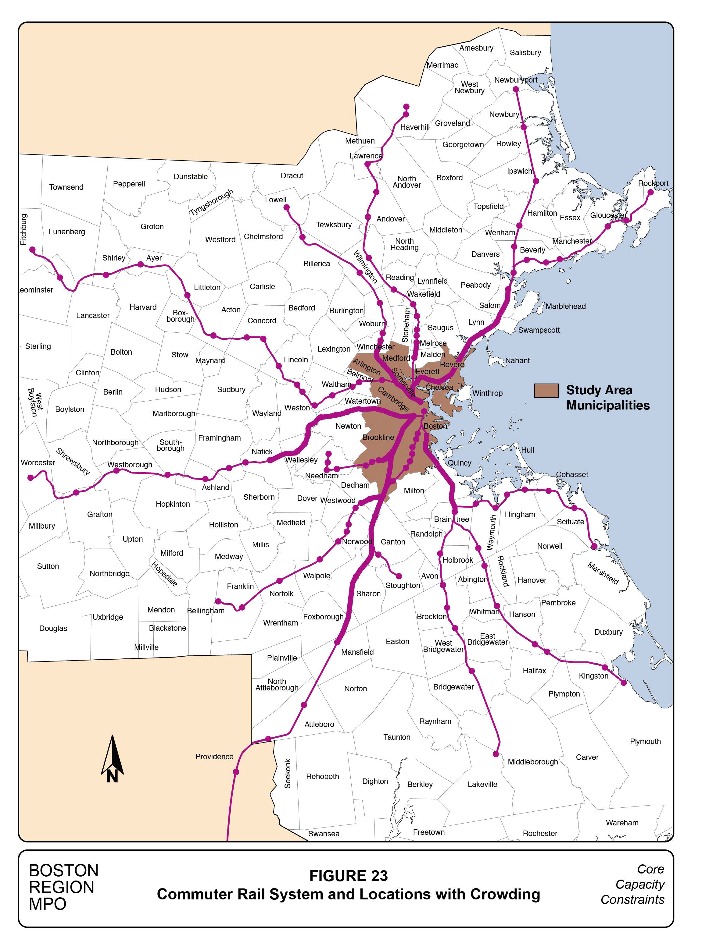
The most crowded train, from Haverhill, is crowded only for a three-minute stretch between Wyoming Hill and Malden Center. At Malden, enough passengers alight and go to a local destination or transfer to the Orange Line, making the use of middle seats on the commuter train no longer necessary to seat all passengers. Not only was the crowding brief, it was not particularly severe. With 570 total seats, 80 percent, or 456 riders can find seats without resorting to a middle seat. There were 469 total passengers, and the need to use 13 middle seats meets the crowding definition used here.
In addition to the express train from Salem, express trains from Natick on the Worcester Line and Mansfield on the Providence Line also were crowded for 20 and 25 minutes, respectively. The train from Lowell was crowded for the 13 minutes it required to travel from its last suburban station in West Medford to North Station. The Needham train was crowded for four stops from Bellevue to Back Bay station, but carried its peak load from Forest Hills station to Ruggles station, where many commuters alight.
Crowding on the Plymouth/Kingston Line presents an interesting situation. The need for middle seats extends from South Weymouth, through Braintree and as far as JFK/UMass. At JFK/UMass, enough people alight to make using the middle seats unnecessary. This service connects with and parallels the Red Line from Braintree north. Commuter rail passengers boarding at Braintree must pay a Zone 2 commuter rail fare, substantially more than the fare on the Red Line. The heavy use of this portion of the commuter rail system may be explained, in part, by the unacceptable level of Red Line crowding during the AM peak period, as shown in Figure 9.
It is important to note that other peak-period trains also may have similar crowded conditions as defined here, although they likely would have fewer riders at their peak loads than the trains discussed in this section. However, if they were operating with smaller equipment consists, then some level of crowding might be experienced.
Table 26 identifies crowding conditions on outbound commuter rail trains. The table is organized in the same manner as Table 25, except that the times in the first column are the times that the trains leave North or South Station. The earliest departure shown is at 5:00 PM and the latest is at 5:40 PM.
Table 26
Crowding on Most Heavily Used Outbound Commuter Trains, PM Peak Period
Outbound Service |
Trip Start Time |
Trainset Seating Capacity |
Riders at Peak Load |
Required Middle Seats |
Required Standees |
Minutes of Crowding |
Rockport/Newburyport |
5:15 |
798 |
658 |
20 |
-- |
20 |
Haverhill |
5:35 |
684 |
481 |
-- |
-- |
-- |
Lowell |
5:10 |
684 |
647 |
100 |
-- |
16 |
Fitchburg |
5:20 |
750 |
558 |
-- |
-- |
-- |
Framingham/Worcester |
5:00 |
1,356 |
1,023 |
-- |
-- |
-- |
Needham |
5:20 |
703 |
698 |
136 |
-- |
18 |
Franklin |
5:10 |
1,356 |
1,106 |
21 |
-- |
15 |
Providence |
5:40 |
1,260 |
1,220 |
212 |
-- |
22 |
Stoughton |
5:15 |
938 |
761 |
11 |
-- |
10 |
Fairmount |
5:10 |
864 |
119 |
-- |
-- |
-- |
Middleborough |
5:12 |
864 |
585 |
-- |
-- |
-- |
Plymouth/Kingston |
5:38 |
996 |
621 |
-- |
-- |
-- |
Greenbush |
5:20 |
864 |
546 |
-- |
-- |
-- |
Total Peak PM Trains |
12,117 |
9,023 |
499 |
none |
114 |
Source: Central Transportation Planning Staff.
Six commuter rail services experience crowding during the PM peak period. Four services that are crowded in the inbound direction also are crowded in the outbound direction over much of the same track: Newburyport trains from North Station to Lynn, Lowell trains from North Station to Wedgemere, Needham trains from Back Bay to Bellevue, and Providence trains from Back Bay to Sharon. The duration of crowded conditions for these four services is 80 minutes in the inbound direction and 76 minutes in the outbound direction.
A small number of middle seats are required for the peak outbound Franklin and Stoughton trains. Both of these trains reach a slightly crowded condition when they pick up passengers at Ruggles and continue on a rail line that they share with Providence trains. The Stoughton train is crowded for only 10 minutes until it reaches Hyde Park, still on the main line. The Franklin train is crowded for 15 minutes until it reaches Dedham Corporate Center, the second station after switching from the main line to the Franklin branch.
The commuter rail system is well positioned geographically to serve the anticipated growth in regional travel demand. Comparing Figures 2 and 23 shows how the regional patterns of residential and commercial growth mirror the regional extent of the commuter rail system. Developments including both housing and employment are envisioned in the 2040 No-Build scenario in the suburbs as well in study-area locations like the South Boston Waterfront, which were not included in the 2040 Build scenario. The Build scenario envisions 72 additional large-impact developments (see Figure 4) in the study area, which also includes both housing and employment.
Including both housing and jobs in a concentrated development area encourages walking and bike riding as commuting modes. Building employment centers close to suburban commuter rail stations enables reverse commuting, which is the pattern where the commuter rail system has capacity to spare. However, it should be anticipated that demographic, economic, and development trends will add a significant amount of peak-period radial commuting and that the commuter rail system should be expected to accommodate a significant share of this radial commuting growth.
The analysis in this section suggests that crowding on the commuter rail system is not severe at present. Only on one peak-period train is it necessary for some riders to stand. On about half of the most heavily used peak-period trains is there some level of perceived crowding because of the need to use a middle seat, or to stand to avoid doing so. Any perceived crowding will, in most cases, be less severe on the less heavily used peak period trains.
Broad-based growth in commuter rail ridership will result in involuntary standing on some lines. For instance, the 5:10 PM Lowell train is only 37 new passengers away from filling its 684 seats. The gradual introduction of bi-level coaches to trains operating out of North Station as older single-level coaches are retired will allow these trains to manage crowding well into the future.
Accommodating growth without crowding will be more difficult for services that already use large equipment consists with eight coaches, seven or eight of which are bi-level. For these services, it would be necessary to add trains, optimize schedules, or both. In these cases, adding useful capacity may involve diverse institutional, operational, infrastructure, and safety issues.
The Commonwealth’s acquisition of the Worcester Line, and relocation of the very active CSX intermodal operations from Allston to Worcester, have made some service and capacity improvements possible. However, the Boston Landing station, now under construction, will both add ridership and require operational adjustments. Ongoing efforts to improve operations and capacity on this line should be expected.
The Providence Line is shared by Needham, Franklin, and Stoughton commuter trains as well as Amtrak’s trains to New York and Washington, DC. The large, heavily used commuter rail consists serving Franklin and Providence need to use this busy corridor that has virtually no capacity to spare given the applicable safety standards. One proposal is to add a second commuter rail platform at Ruggles station, which would simplify the safe movement of peak-period trains serving this increasingly popular commuting destination.
The three Old Colony services, Middleborough, Plymouth/Kingston, and Greenbush, do not yet experience severe crowding and, in the near future, could deal with any capacity issues by operating larger consists. The problem with these services is the current need to operate on a part of the commuter rail system that is mostly single-tracked. This presents two general problems. First, seemingly minor events, such as a particularly large crowd loading at a station could create schedule problems that are difficult to recover from in a single-tracked system. Second, it is more difficult to design schedules with attractive departure and arrival times if they need to allow time windows for trains going in the opposite direction to pass at some point.
Designing schedules that are convenient for commuters is a problem on any fully utilized commuter rail line, including the Worcester Line and the four services sharing the Providence Line. The effort required to add a platform at Ruggles station might not necessarily allow for an added Providence train. However, it might allow a train that currently operates with capacity to spare to be operated safely in a more popular time slot, thereby attracting more riders. Extending some of the double-tracked sections of the Old Colony Line not only would improve reliability, but also could allow for designing more attractive schedules.
Chapter 6—Transportation Mitigation Policies
Broad-based demographic and economic growth and major large-impact developments in the study area and surrounding region will add substantial travel demand across all modes. Financing any additional capacity required to accommodate this growth is a topic of ongoing policy concern.
The challenge today is that important parts of the regional transportation system are utilized at levels close to their maximum capacity. Increased travel demand at these locations, whether caused by nearby developments or regional travel growth can require significant capital investment. This problem is exacerbated by accelerating repair costs for those parts of the system that are nearing the end of their designed lifespan.
New workers, businesses, and property owners will pay to use publicly provided transportation capacity directly through gasoline taxes, roadway tolls, and public transportation fares. The projected new transportation consumers also will provide financial support indirectly through income and property taxes allocated to transportation and other public services via the political process, and through the same funding mechanisms as transportation users do now.
Although new users would use the entire regional transportation system in the same manner as existing users, local and state regulators recognize some level of special responsibility in cases where an increase in demand associated with a particular development or business expansion is sufficiently large that the quality of existing transportation at that location would be materially reduced. Policies and programs where the development or expanding business is expected to help accommodate, to some degree, the added transportation demand are referred to generally as mitigation.
Mitigation arrangements usually focus on impacts near where the new travel demand is generated. New travel demand would affect the entire region, albeit at lesser levels the further away it is from where new demand is generated. Parts of the transportation system that are reaching capacity can be pushed to their limits by the combined impacts of numerous new or expanding trip generators scattered throughout the region. The user fees and region-wide taxes mentioned above that are common to both existing and prospective transportation users are expected to contribute to the expansion of regional capacity and subsidized services. However, it is easier to both justify and effectively plan mitigation at the source of the new demand. Moreover, municipalities can only arrange for mitigation within their municipal boundaries.
The next section of this chapter describes various types of mitigation policies and programs, which are organized into three general groups: traffic systems management (TSM), transportation demand management (TDM), and transit mitigation. These groupings do not have strict boundaries and mitigation efforts can have a range of effects. A review of the mitigation strategies and techniques that are being utilized by the nine study-area municipalities and state and regional operating agencies is included in Appendix I. This chapter concludes with a discussion of possible changes to fee and tax structures related to new developments.
The longest-standing mitigation practice involves improving the street system near a new development or business expansion. While the nearby roadway system and site access may be in technical compliance with applicable traffic engineering standards, introducing a major new trip generator provides an opportunity and potential to make more substantial roadway improvements, optimize the street system for the new development, and perhaps make other transportation improvements not directly related to the new development.
Barring a sustained economic downturn, a new development will result in some level of increased traffic because of increased activity at the site. A successful mitigation program will accommodate this traffic and minimize speeding, queuing, or diverting traffic into nearby neighborhoods. Optimizing the locations of bus stops is another aspect of TSM efforts and can make the transit mode more attractive. In addition, improving the pedestrian and bicycle travel environments will encourage use of non-motorized modes. Possible TSM actions include:
Transportation Demand Management
As its name implies, transportation demand-management policies and programs are designed to change the transportation demand associated with a major trip generator. This can involve reducing the number or lengths of trips, encouraging use of certain modes, changing the timing of trips, and in some instances encouraging trips to specific preferred endpoints.
The most common TDM goal is to reduce the amount of auto use at a location for a given level of activity. Large, successful developments and businesses require access by large numbers of people using all modes. TDM seeks to reduce both peak-period and daily auto use without jeopardizing the economic viability of a location. While use of transit generally is encouraged, sometimes strategies to move transit use away from crowded peak periods to less-crowded times are sometimes used.
There is a wide variety of TDM tools representing a mix of facility improvements, specialized travel services, work options, travel incentives, pricing strategies, and providing information. These tools are discussed below, in five groups generally by mode.
1) Actions that reduce the need to travel at all, or the need to travel during peak periods, including:
2) Actions related to parking (the supply, cost, and management of parking is arguably the most powerful TDM tool available), including:
Some TDM programs seek to encourage the use of public transportation. Meaningfully improving the public transit system may not be expected of the businesses or institutions applying TDM tools.
3) Actions at a location that could increase transit use, including:
Another group of TDM activities provide or promote services configured specifically for the needs of an employer or development. Sometimes the term “paratransit” is used for services where medium-sized vehicles are shared efficiently to offer high-quality mobility services.
4) Facilities that specifically benefit the needs of an employer or development, including:
The last TDM group includes actions aimed at encouraging the non-motorized modes, walking and bicycling.
5) Conditions that can encourage non-motorized modes, including:
Developers or their business, or institutional tenants would be able to implement all of the TDM measures mentioned in this section. Some of these TDM actions also could be realized on a much larger scale via government action, and could be expected to impact transportation demand over a much larger part of the travel market than just individual development locations. City- or region-wide change in parking costs is an example of this. Congestion pricing within an urban core also could have a major impact on travel demand. This type of policy clearly would need to be executed on a governmental rather than individual-project basis.
Transit Mitigation
The third family of mitigation strategies is transit mitigation. This is a wide-ranging topic, which is presented here in two parts. In this subsection, we discuss transit-mitigation actions that are roughly analogous to the TSM and TDM strategies described above. These include mitigation options that can be negotiated with developers within the framework of the current laws and regulations that enable and limit TSM and TDM strategies in Massachusetts. In the next section, we discuss options for changing fee and tax structures relating to development impacts.
As with TSM and TDM, transit mitigation can be ambitious in scope and expense, but it focuses on improving transit services near a development or business expansion. While transit mitigation may be structured as a regulatory demand upon a developer, it may be framed as directly beneficial to the development, lending a strong legal, political, and economic basis to such programs. Transit mitigation actions of this scale include:
Given the cost of transit infrastructure and the expenses of daily transit operations, the mitigation expected of a typical development will have only a limited impact on the system as a whole even if it is effective in the project area. However, several especially large projects have enabled some major improvements with system-wide benefits. Four of these large-scale mitigation efforts are described briefly here, and are discussed more fully in Appendix I.
As part of the agreement to build two buildings in the Cambridge Center complex, Boston Properties funded major improvements to the Kendall/MIT Red Line station. The most important improvement was lengthening the station platforms to allow service with six-car trains. Station interiors were upgraded and entrances relocated. Boston Properties also agreed to operate and maintain Nowiszewki Plaza in front of the station entrance on Main Street.
As part of the agreement to build the Assembly Row complex adjacent to the existing Assembly Square mall in east Somerville, the developer, Federal Realty Investment Trust, paid a significant portion of the costs of building the recently completed Assembly Orange Line station. While this major improvement facilitates the use of transit at this rapidly developing area, it actually exacerbates the Orange Line crowding problem.
As athletic gear-maker, New Balance, develops its new world headquarters in a formerly industrial section of Allston, it is constructing a new station on the Worcester commuter rail line. As part of its mitigation agreement, New Balance also committed to covering station maintenance costs for several years in exchange for two guaranteed peak-period trains in each direction stopping at the new station on weekdays.
The Wynn casino project in Everett is the largest project to date in which the MBTA has actively engaged in discussions about transit impacts based on new trips generated to the site. Potential mitigation measures are not yet finalized, but would focus on better utilizing the existing transit infrastructure. Measures that have been suggested include operational subsidies for expanded Orange Line or bus service, and roadway changes to improve bus access to Sullivan Square Station.
Requirements for developers and expanding businesses to support public transportation financially in Massachusetts are generally limited to the broad-based taxes and mitigation arrangements discussed in the previous section. Other financing mechanisms have been enacted and applied in other states and these efforts are briefly described in this section.
One approach, referred to broadly as “value capture,” is more often used to finance service expansion than reconstruction. Where public transportation infrastructure investments increase adjacent land values or increase the potential for development, communities can use some of the increase in property values, property sales, and income taxes to help finance the capital, debt service, or operating costs of that infrastructure. Strategies for capturing the increase as a result of the local infrastructure are varied, and include joint-development agreements, special-assessment districts, and tax-increment financing (TIF), which captures the growth in property tax revenue resulting from improved transit service, and uses these funds for debt service or other public investments.
The TIF approach also has been used to finance other public enhancements such as open-space improvements, site redevelopment, and historic preservation. Seattle property owners agreed to help fund half of the cost of the South Lake Union streetcar expansion through a special assessment within the Local Improvement District. Construction of Phases I and II of the Washington Metropolitan Area Transit Authority (Washington, DC) Metro Silver Line was funded in part by special assessments on nonresidential property around future transit stations. Denver used a 30-year TIF district around the Union Station rail hub to support station rehabilitation and transit expansion, where property taxes generated from neighborhood development in the 20 acres surrounding the station are devoted to debt service on federal loans.
Another example of transit mitigation financing is impact fees on new developments, or significant renovations in an area with transit service. The availability of transit service to these projects implies that they could meaningfully increase transit ridership, the costs of which would be recovered only partially through user charges. Impact fees support a transit-only improvement fund that can be used to pay for capital expenses or, less commonly, operating expenses of the transit service. Often, the agency receiving these fees can use the funds anywhere in the system.
San Francisco enacted a Transit Impact Development Fee (TIDF) in 1981 that is charged to nonresidential developments of more than 3,000 gross square feet in order to help fund transit service that can offset the traffic impacts created by developments, with no time limit on the use of collected fees. The TIDF covers only a small portion of operating and capital costs of the San Francisco Municipal Transportation Agency, the “Muni,” which operates the city’s bus and streetcar network. Originally implemented in the downtown area to boost peak capacity for office commuters, TIDF was expanded in 2004 to cover the entire city.6 In July 2015, legislation was introduced to the city council to replace TIDF with a new Transportation Sustainability Fee that includes residential developments larger than 20 units under the fee structure. 7 This fee will pay for maintenance and expansion of the Muni fleet, upgrading Bay Area Rapid Transit and Caltrain rolling stock, and improving bike lanes and intersections.
Similar to San Francisco, Huntington Park, California, in Los Angeles County, requires a Transit Mitigation Fee as a condition of project approval that covers the costs of facilities required to be constructed to service the development.8 The Portland, Oregon Transportation System Development Charge applies, in varying rates, to new developments and property-use changes and is used to finance only qualified projects in the city’s Capital Improvement Plan that increase the capacity of the transportation system.
Seattle offers a slightly different approach to transit mitigation. As Washington’s Growth Management Act restricts the use of impact fee funds to roadway improvements only, Seattle used the State Environmental Policy Act (SEPA) process to create a voluntary multimodal program. The city asks developers to fund planned multimodal transportation facilities through development impact mitigation payments. In response, developers then are relieved of traditional impact fees required as part of an environmental review conducted through SEPA. Improvements do not need to reduce or eliminate existing deficiencies, only account for the development’s impacts. 9 Funds received through transportation mitigation payments are earmarked specifically for projects on a list predetermined by the city and negotiated with the developer. The funds are kept in a special reserve account; if not used within five years for the specified projects, they will be refunded with interest, unless the delay can be attributed to the developer. 10
The limited Massachusetts transit mitigation actions described in the previous section can meaningfully improve access to transit and the user experience. The overall condition of the transit system, financial requirements of its operations, and envisioned system expansion can only be marginally addressed through transit mitigation as practiced today in Massachusetts.
The Governor’s Special Panel to Review the MBTA issued a report in April 2015, which commented on virtually every aspect of MBTA finance and operations. One finding concerned the modal equity of mitigation as currently practiced in Massachusetts:
“Having new development projects located near MBTA transit stations financially support MBTA service [could be included] as part of the developer mitigation process. While mitigation payments for roadway improvements are a routine and common practice in Massachusetts, the equivalent support for MBTA operations almost never occurs. Mitigation payments for MBTA improvements would become an established practice.” 11
The Governor’s Panel report also mentioned funding mechanisms that would require legislation. It suggests “exploring the use of District Improvement Financing (DIF) for municipalities, and pledging a portion of incremental property tax collections to cover a portion of the costs for major MBTA capital projects, especially debt payments over time.” 12
In practice, DIFs would function as TIF districts. DIFs can fund public infrastructure ranging from waste water facilities, transit stations, seawalls, street lights, playgrounds, brownfield mitigation, and parking garages. For those potentially placed around MBTA stations, station enhancement and system upgrades are all eligible because they are owned by a public entity.
Another funding mechanism that would require legislation is impact fees, a practice now legal in a number of other states. The need for legislation was established by a court case in 2000 concerning a school-impact fee levied on developers in the town of Franklin. The Massachusetts appeals court found Franklin’s fee to be an impermissible tax rather than a municipal fee valid under its Home Rule Amendment. The decision limits individual municipalities’ ability to collect funds for public improvements that are necessary as a result of development.
Enabling legislation for value-capture and impact fees would pose a number of equity issues. Congestion is caused by the combined burdens of both existing users and new users. The expectation that a higher level of financial support would be derived from new users than from existing users would need to be vetted in the political process. Implementation of value-capture would require resolution of similar issues, such as the fairness of defining project beneficiaries by drawing a boundary.
Without legislation that enables value-capture or impact fees, municipal officials and operating authorities must use currently available mitigation arrangements that focus on the location of individual developments and business expansions. If the congested bottleneck is not near the development, then currently there is no mechanism to apply the mitigation funds to the bottleneck. Even if a congested bottleneck happens to be at a new development, the cost of significantly expanding capacity may far exceed any potential mitigation payment.
Chapter 7—Summary and Conclusions
A recurring theme in this study is that both the generation and impacts of increased travel demand are regional. If new travel demand is generated at one location at a sufficient scale, the impacts of this incremental demand can be estimated and appropriate responses may be available to accommodate the added demand at that location. As the added travelers move farther from a new development, they add their travel to the regional travel congestion regardless of the mode, or modes, they utilize.
Because the available data and operational characteristics vary significantly between the various transportation modes and subsystems, we have analyzed each part of the transportation system individually. The Base Year and year 2040 capacity and travel demand were analyzed together for each subsystem, and where possible, travel demand that could be directly attributed to the selected large-impact projects also was analyzed. Some of the findings of these analyses include:
Three types of mitigation—traffic systems management, transportation demand management, and transit mitigation—represent distinct approaches to the problem of how best to accommodate a large increase in trip generation in an already congested area. These three approaches include a wide assortment of planning and program options that can be implemented successfully at a range of price points. With close collaboration between developers, planners, and permitting authorities, mitigation programs can meaningfully reduce or modify transportation impacts. However, any new development or increase in business activity will add some amount of regional travel demand.
The most ambitious mitigation agreements often require a significant expenditure, such as constructing or re-constructing a rail transit station. The recent construction of the Assembly Orange Line station by the Assembly Row developers is an example of a significant improvement to the transportation system financed through a mitigation agreement with a developer.
The construction of a new station near a new development conforms to current mitigation practices in Massachusetts. The new station makes transit an attractive mode for users of the new development, which is the express purpose of the new station. However, these new users travel throughout the transit system, contributing to congestion across the entire network.
With new legislation, funding mechanisms such as value-capture or impact fees could allow funds derived from a new development to be used in parts of the transit system not directly related to the development itself. It would be possible for investments funded through mitigation to be focused on an important pinchpoint rather than simply improving the area of the funding development. Even with this flexibility, the funds derived from a single developer would be insufficient to expand the entire system’s capacity meaningfully. Ultimately, user fees and broad-based revenue sources will be required to add capacity to the region’s transportation systems.
1 Traffic Volumes on Major Highways in Massachusetts, May 2007.
2 Transportation Research Board, Transit Capacity and Quality of Service Manual, 2013, http://onlinepubs.trb.org/onlinepubs/tcrp/tcrp_rpt_165ch-05.pdf.
3 Measuring the Impacts of Transit Reliability on Transit Ridership, Boston Region MPO, July 2013.
4 Transportation Research Board, Transit Capacity and Quality of Service Manual, 2013, http://onlinepubs.trb.org/onlinepubs/tcrp/tcrp_rpt_165ch-05.pdf,
5 Exploring the 2011 Massachusetts Travel Survey: Focus on Journeys to Work, Boston Region MPO, April 2014 http://bostonmpo.org/Drupal/exploring_2011_survey.
6 http://www.sf-planning.org/ftp/files/legislative_changes/new_code_summaries/120523_TIDF_Transportation_Impact_Development_Fee_Update.pdf
7 http://www.sf-planning.org/ftp/files/plans-and-programs/emerging_issues/tsp/tsp_TSF_Fact_Sheet_072115.pdf
9 http://www.westernite.org/Sections/washington/newsletters/Samdahl%20multimodal%20impact%20fees.pdf
11 Governor’s Special Panel to Review the MBTA. Back on Track: An Action Plan to Transform the MBTA. (April 8, 2015). http://www.mass.gov/governor/docs/news/mbta-panel-report-04-08-2015.pdf.
12 Governor’s Special Panel to Review the MBTA. Back on Track: An Action Plan to Transform the MBTA. (April 8, 2015). http://www.mass.gov/governor/docs/news/mbta-panel-report-04-08-2015.pdf.